31 December, 2013

Matisse' Birthday


Henri Matisse


This quote is from the essay, The Role and Modalities of Color, 1945.

Born December 31st., 1869.

30 December, 2013

28 December, 2013

My 2013 Year In Review


Self Portrait with Broken Glasses
@12" x 9"
Charcoal & Pastel on Prepared Paper
Casey Klahn


No year where your art improved even a little bit can be called a bad year.  I add to that my exhibits, workshops, travels, and outdoor painting trips, and I realize that this was a very busy and happy year for me.

Seven years of blogging at The Colorist has been a fabulous experience, and I hope for at least 7 more and I hope you'll stick around, too!  I wrote about this year's events and experiences in my annual blog birthday letter, posted here.  It does the job of bringing the past year into focus, and what remains for me now is to dream about 2014.  

What should I do with the new year?  Start a studio remodel?  Continue to advance into new subjects, such as the figure, and Yellowstone National Park?  Teach across the US, especially in the South and in the East?  How about Europe and Canada for new workshops?  Too much to ponder in one sitting.

Thanks for reading here this past year, friends.  May God bless you, your loved ones, and also your studio life in the coming year.


7 Year Letter and Year in Review.
My Top 13 Artworks of 2013.
13 Plus Small Works from 2013.


25 December, 2013

Christmas Nativity


The Adoration of the Kings, 1564
43.7" x 32.68"
Oil on Board
Pieter Bruegel the Elder
Click on the image to open full size.


24 December, 2013

20 December, 2013

White Christmas!

I get nostalgic, here.  It's snowing today.

We love Christmas movies at my house, and the wartime and post war movie White Christmas is no exception.  As a matter of fact, it's one of my favorites.  Those who know me best, know I have a soft spot in my heart for WW II G.I.s and everyone from that generation.  My father's army division, the TenthMountain Division, returned home and founded the American ski industry almost from scratch.  Rope tow and T-Bar hills became ski lift-served resorts.  Those were the salad days for the ski industry, but it came on the heels of K ration days at the battlefront.

You see the parallel to my father's experiences in the movie White Christmas.  It is a vehicle, really, for Bing Crosby's wartime hit song by the same name.  I read this year about how Bing was visiting a UK airbase during the war, but was too emotional to go on stage after witnessing the bombing deaths of children.  You think he was an elite Hollywood star, but he saw some things.  The movie is sappy to some, but there was a reason for spreading some peace and harmony for my parent's cohort.  

Plus, my dad was overseas at Christmas in 1944.  Reason enough to remember the season and to cherish the good times we live in now.  If you dig the Olive Drab version, like me, these first 2 short videos have that.  I added the glorious version from the end of the movie, because that's the way the old timers wanted to experience it.  The clip dialogue is dubbed auf Deutsch, and the song remains as recorded - it is wonderful to watch at high resolution.


17 December, 2013

Little Town


The Census at Bethlehem, 1566
Peter Bruegel The Elder, 152?-1569
Color on Panel


This post was first published in 2011.

13 December, 2013

12 December, 2013

13 Small Works from 2013


Casey Klahn Art - Intimate Sizes


Juniper Dance
@10 x 7
Pastel & Charcoal
Casey Klahn


Blue Water
10" x 5"
Pastel
Casey Klahn


Granite State Light
5" x 7"
Pastel & Charcoal
Casey Klahn


High Draw
5" x 7"
Pastel
Casey Klahn


Black Earth with Yellow
4" x 3.75"
Pastel & Charcoal
Casey Klahn


Rock Group
6" x 9"
Pastel & Charcoal
Casey Klahn


Shoulder at Twilight
5" x 9"
Pastel
Casey Klahn


Fog
3.5" x 4.5" (4x6)
Pastel
Casey Klahn


Late Winter
3.5" x 4.5" 
Pastel & Charcoal
Casey Klahn


Tracks
@5" x 6"
Pastel
Casey Klahn 


Sky Window Prairie
@7" x 10"
Pastel
Casey Klahn


The Feathers Shadow
4" x 6"
Charcoal & Pastel
Casey Klahn


Upper Church
4" x 6"
Pastel & Conte Pencil
Casey Klahn


Bonus Four Images!

Rocks Vignette
4" x 6"
Pastel
Casey Klahn


Green Sky, Pink Field 
6" x 10.5" 
Pastel
Casey Klahn


Iridescent Horizon
4"x6" 
Pastel
Casey Klahn


Overcast Lumens, Fall, 2013
@7" x 7"
Pastel
Casey Klahn


Inquiries welcome.


11 December, 2013

10 December, 2013

Contemporary Christmas Chorale

***


We stood on the hills, Lady,
Our day’s work done,
Watching the frosted meadows
That winter had won.

The evening was calm, Lady, 
The air so still, 
Silence more lovely than music 
Folded the hill.

There was a star, Lady,
Shone in the night,
Larger than Venus it was
And bright, so bright.

Oh, a voice from the sky, Lady,
It seemed to us then
Telling of God being born
In the world of men.

And so we have come, Lady,
Our day’s work done,
Our love, our hopes, ourselves,
We give to your Son.


09 December, 2013

Time and Grace


Saying Grace, 1951. Norman Rockwell.


I'm proud to describe myself as mostly self-taught.  My only formal art schooling was the unusual program founded by Norman Rockwell and his peers: the Famous Artists School for Talented Young People.  It was a matchbook correspondence course, but I noticed, to my lifelong delight, that the courses placed a high premium on the finer qualities of art, both contemporaneous and historical.  I recall that the first leafed picture in my big binder was a landscape by Vincent van Gogh.  

Norman Rockwell has enjoyed the popular confidence of the American public, but his narrative style has also been roughly handled by gatekeepers of the fine arts.  Turns out Rockwell is more eclectic than they.  Here is a quote describing his take on larger place in art:

I don’t see things the way modernists do, even though I enjoy studying their work.

He studied their work?  Go on!  I can tell, because he organized his paintings with incredible intelligence and an eye for the formal elements of art.

Norman Rockwell's painting, Saving Grace, 1951, achieved the mammoth auction price of forty-six million dollars at Sotheby’s on Wednesday, December 4th.

Rockwell agonized over his painting; he probably lost money on it, but he was the only one who did.  - David Apatoff.

Can illustrative art rise to the heights of the numinous descriptor "fine art?"  What about representational work, which has also been denigrated as too pedestrian for upper-strata tastes? The best commentary I've read is by blogger David Apatoff.  You will find some depth to this story at Apartoff's blog; do have a look. This sale is indeed a newsworthy event, and it is a thumb in the eye of Rockwell's host of detractors over the years.  

When will we ever learn?  The subjective parts of painting are important, but should they consume our every critical thought about a painting?  Even a formalist can appreciate, and indeed love, the form of Norman Rockwell's brilliant work.  His keenly observed art rises to the fine, and challenges the boilerplate of how art "must" be done. 

Norman Rockwell sells for $46 Million.

WARRING WITH TROLLS, part 5.

Illustration Art, by David Apatoff.

About the Famous Artists School Founders.

06 December, 2013

Top 13 of 2013


<><><>


Here are my favorite artworks from 2013.  It is never easy to self-select or judge, but it is a rewarding process.  I hope you'll try it for your own artworks, or perhaps for your Pinterest Board on art.  

The blue lettered images are still available.  Inquiries here.


Long Remembered New Vision


Net House Glare


Alders on Winter Ground


Off The Shoulder


Darkly, He Writes


The River Blue


Canola Panorama


Vardøgr (Forest Vardogr)


Green & Gray Forest


Japanese Garden


Illuminated Umber Slope


Slope with Light Splash


Madison River Turnout


04 December, 2013

Banners & Graphics Revealed

This post is updated from 2012.


Placing a new banner on your blog is the fastest way to brand your blog.  Why do this?  Because you want (I think) to make your blog instantly recognizable for the "click-through" audience that you are reaching.  The banner should identify you, and set up the visual character of your blog and your art.

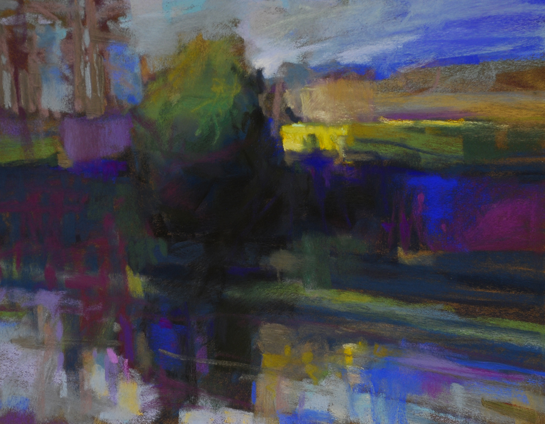
This post features my new e-mail banner, and at the top of The Colorist you will see my newest blog banner.  I used Photoshop to create these, and I recommend that you get good with whatever design tool you have and learn how to work with layers.  Once I cracked the code on layers, my design life improved dramatically, and I have fun making these things, whereas before it was like pulling teeth for me!  The links at the bottom of this post shed light on using Photoshop: working with layers and making graphic products.

There are so many You Tube vids for this topic, that you ought to be able to find one that makes sense for you.  My only advice is that you match the tutorial to your design software.  Many videos show how to make a blog header with freeware, but find one for your tool.  Also, if the tutorial shows how to upload the banner to Blogger, realize that the latest version of Blogger is dirt easy to use for headers. Just open Design, and use the widgets at the top of the template.  You should do fine.  I use the header widget, and then I add a banner photo below that.

The widgets for your header or banner offer three options: 
Behind title and description
Instead of title and description
Have description placed after the image

For Pastel Workshop, my instruction blog, I chose the "Instead of..." option.  I created it this way so that clicking on the banner brings the reader back to the home page.  Here at The Colorist, I add the blog title and description above the header.  This makes it clear that the reader is at my flagship blog, and clicking on the title and subtitle/description brings one back to home. The oversize header works as a logo for The Colorist, and lets the reader understand instantly what blog they have landed on.

Experiment with different settings for your header.  Many bloggers choose a low profile header, which gets the content on the screen and above scroll.  Have fun!


    Your version of pse may vary from the video.

Note:  I took an online workshop to learn how to make a business card with Photoshop.  It was inexpensive and has served me in making all of my graphics.  I think that instructor has moved on to other tutorials, but I recommend that type of thing for those of you who, like me, aren't completely computer savvy.

Update:  I am now using Creative Cloud, which is much more powerful than my old Elements platform.  It puts me into a new learning curve, but it is very fun.

01 December, 2013

2014-2015 WORKSHOPS

<><><>


Some of these workshops are already full, or are reserved.  When you contact me, I will usually refer you to the hosts of the venue.  If it is a proposed workshop, meaning I haven't got a date or a venue yet, then when you contact me I will put your name in a file and get back to you when the event gets firmed up.
Abstract Expressionism, Art Criticism, Artists, Colorist Art, Drawing, History, Impressionism, Modern Art, Painting, Pastel, Post Impressionism