
"I have a larger picture of the village church-an effect in which the building appears to be violet-hued against a sky of simple deep blue color, pure cobalt; the stained-glass windows appear as ultramarine blotches, the roof is violet and partly orange. In the foreground some green plants in bloom, and sand with the pink flow of sunshine in it. And once again it is nearly the same thing as the studies I did in Neunen of the old tower and the cemetery, only it is probably that now the color is more expressive, more sumptuous." van Gogh to his sister Wil.

The Old Cemetery Tower at Neunen, 1885
van Gogh
I am indebted to Wikipedia's entry about this image, featuring the letter and the two images that VG is writing about. Also, Katherine Tyrrell brought this church painting to my attention as a possibility for color ideas for my own The Old Man Rounds the Corner pastel.
Remember that you can review VG's letters here, and his paintings here.
Now, I want to list my observations about the church at Auvers by van Gogh:
- As always, VVG describes his paintings more by the color composition than by any other descriptors.
- He has noted two paintings that center and focus on a tall structure. I learned to do this in Italy to succeed in handling complex architectural subjects.
- He eschews perspective by minimizing aerial effects (lighter, less yellow as an object recedes to the background); rather he wants to concern himself with full intensity of color as much as possible.
- I feel that separating compliments, such as orange and blue, or violet and yellow by some intermediate colors or objects, still allows these combinations to pop. Similarity in value helps.
- Character in the structure (is it similar to a person?) is provided by loose rendering, crooked lines, and amorphous masses.
- He uses shadows here, which is less common for him. That's good since I don't use them much, but need to in my painting.
Is the "old world" going around the corner? Is the church relevant to today? What about Italy? What is it's place in modernity? Is my painting too dear, sympathetic or nostalgic? Do those feelings have any place in art, today?
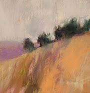
I actually have completed the small sized painting of the old man and bell tower. It, along with 3 or 4 works are ready to be posted, once the photos are produced. But, this smaller one is part of my Colorist Italian Landscapes; 100 Paintings project. I wish to create a bigger one for my VG project.
I am intrigued by Katherine's assumption of the old man's marks and tools. But, I guess I have enough on my plate for now, and will have to be satisfied with discovering his color process in my painting.







2 comments:
I think he also probably minimises and simplifies across the painting as a whole - probably no bad thing to also try and incorporate in yours. Not that you over-complicate - but you might want to try simplifying yet again maybe?
Well, as it now stands, I am under-painting a 11" x 16" sheet of Wallis Museum.
I actually shopped it to stretch and size it accurately, but it keeps the level of detail that was in the small one. Good idea on you, as I will be keeping the detail low.
The weird part will be doing the flat color fields, as I bounce from my colorist American landscapes, back to realism, and now this VG attempt.
I imposed a grid in photoshop, and copied my original drawing out in two halves, then made an overlay with glassine, then underdrew the image through the glassine.
I have decided that my first drawing is freshest, and the bigger one must stay the same.
The most interesting thing is the study by imitation of a master. It's been a long, long time since I have done anything like this. My first impulse was to utilyze a little of VG, but my own style and end goal. Now, the farther I go with this project, the more interested I am in greater imitation. It seems the fuller lesson that way.
Post a Comment