02 February, 2008
Composition Posts - Abstract Saturday
For those few of you who may have missed them, the posts at Vivien Blackburn's and Katherine Tyrrell's blogs regarding composition are a mini education on the subject. I thought I would add my own example to the fray, since these posts made me reflect on what compositional elements I use.
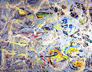
My observations on the abstract above are that I created this artwork at a workshop on abstract pastels, and had a decidedly empty mind about color choice and composition at the time. Old habits are ingrained in an artist's mind and hands, though. This one turns out to be an approximate of the Golden Rectangle, and the Golden Spiral can be well placed with it's starting point in the lower left hand portion.
Additionally, I notice that the high key red gestures pull the eye down from that spiral's center and into the high contrast zone of the light blue. Mitigating that is the weight of the dark zones above, creating balance. There are multiples of thirds, if you will. High key red, "Browned up" reds with blue and gray highlights, and the high key blue "frame" create thirds of hue, and thirds of value. There are gestural areas too, if you divide the area into thirds vertically, and also horizontally.
Who ever said that abstraction was chaos? It is anything but.
I want to draw your attention again to a nifty site where you may figure the sides of your Golden Rectangle instantly. Very useful: http://www.mathopenref.com/rectanglegolden.html
I checked the image in Photoshop. If the short side measured 7.2", then the long would require 11.65" to be the Golden Rectangle. It is about that ratio, in fact. I cropped it, arbitrarily, at 10.97", but if one takes the original (Tiff format photo) it may have easily been cropped at 11.6". It helps, when making these abstracts with an empty mind, to have a calibrated eyeball.
If you need the Fibonacci Spiral, here it is.
http://vivienb.blogspot.com/
http://makingamark.blogspot.com/search/label/composition
An essay on my Abstract Reds Over Blues work.
Labels:
Art Process,
Links,
My Abstracts
Subscribe to:
Post Comments (Atom)
Abstract Expressionism, Art Criticism, Artists, Colorist Art, Drawing, History, Impressionism, Modern Art, Painting, Pastel, Post Impressionism






9 comments:
thank you for the honourable mention Casey :)
and for adding an extra dimension too - it's an interesting topic and you are absolutely right that it's vital to consider it in abstraction as well.
Hey, your post was especially interesting with Degas and with your own very nice abstracts.
Casey - at the end of February I'm going to be publishing a round-up blog post of all those blog posts on other blogs which have been triggered by the composition project. Your's is now listed in the draft!
I'll also probably add them into my squidoo lens on composition and design - at the very least I'll be adding in that blog post.
Thank you, Casey. You've inspired me to make myself a little tool. I took a white index card and trimmed it to the Golden Ratio. If I place a ruler on the diagonal I can extend the rectangle to any size I wish, maintaining the proportions. On the other side of the card I drew the Fibonacci Spiral - and that was an interesting exercise, because I'd never realised before that you actually find that sweet spot by drawing a square in the rectangle and what is left is the next rectangle in which you draw a square and so on....
Very cunning.
I can't always stay within the GR, but then I notice artists will create a rectangle within the picture plane at the point of interest.
There is another secret to the balance of my images that I will reveal in a later post.
Thanks, Katherine. Your series has set the standard for a clear presentation of this subject.
Another great post Casey. Followed the links and am currently seeing the application for my glazing. Thanks!
Great, John.
Since Katherine's readers are here, today, I re-read this post. It appears that I promised to reveal another secret to my balance in composition. Stay tuned for a post on this, as it is rather interesting and I think a little bit unique.
Post a Comment