It is my opinion that patrons of art don't thrill to see the machinations and intricacies of the art making life. Ever watched sausage being made?
But, in an effort to please the base, I am finally starting a link roll that will be titled: "Of Interest to Artists". The direction of The Colorist is solidly embedded and a little art business bone won't hurt. These links aren't new to many of you, but I use them and new artists in blogging will want to check them out.
Empty Easel
ArtBizBlog
Wet Canvas
The Painter's Keys
BTW, I already have a blogroll that is "About Art", which list web sites that take a third person view of art news and art subjects.
Shelley's Art History Blog
Modern Art Notes
The Intrepid Art Collector
Art News Blog
Art Business
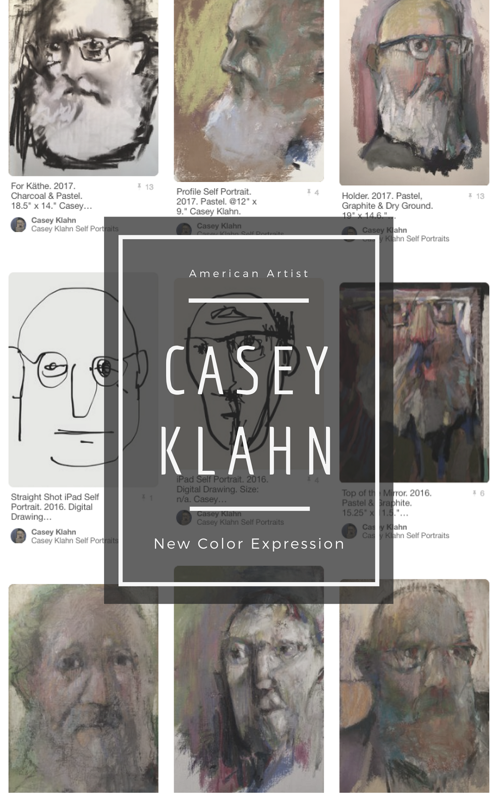
While we're on the subject of art business, then, I want to share the following documents with you. They are my One Sheet, which has been suggested is a good option for the artist in today's information-overload society (thanks, Alyson). The object is to get your blurb out there quickly with an image, contact info, brief resume and statement.

One Sheet 1.0 (click on to read)

One Sheet 2.0 (click on to read)
Here are my two revise proofs. I had my awesome-businesswoman spouse helping me with this last night. I gathered from her that the best goal is to stand out in a unique enough manner that the page will actually get read. I see that I need to punch the award profile forward some more.This One Sheet would have come in handy yesterday morning, when I needed to respond to a patron's e-mail inquiry, and had the need for a really mild "horn-toot" in order to support the patron's decision. Instead of inserting a gratuitous "brag" in the e-mail, I could have simply attached this One Sheet!
Your input, please. Which is best? Other details?







14 comments:
Aloha. I like the layout of No. 1 the best. I like the art to the left of the contact information. I know the goal is to have someone read the entire sheet, but not making them search for the contact information seems like a plus. I also wonder why you put the awards above your artist statement. Is that common practice?
hi casey
cor! hasn't spring & the thaw come to chez-toi yet? IMO, this is winter work ....& yes, every respectable artist is always behind & late the with manufacturing of blurb & promo.
Both your images are lovely in both CV's (but hate the drop shadow frame in the first, yuck) use a newspaper style layout of text alternating with images? use a warm & cool. I did this one my pdf CV of 2005 (which needs updating, aheemmm ;)
you can see it at CV 2005
Thanks, Miki. I feel that the resume is above the statement. Perhaps for the reason that art statements are less well understood/received.
My awards are my most attractive (non-image)element, IMO. And that may be true for most artists, BTW.
Thanks, Adam. We have snow remnants on every north slope. This week I was digging stuck trucks out on my road!
I'll look at the one w/o the shadow - I appreciate that crit. very much. I don't understand the newspaper text & image point. I think one strong image at top is best - and likely the only thing that'll get seen 90% of the time.
Ah. Warm and cool - that's a great idea.
Hey, I have a doc around here somewhere that looks like your CV. Very nice! Mine is meant as a 1 page brochure. Slightly nuanced from a One Page, perhaps.
I like the narrative approach, rather than bullets. For my One Page, though, I'll want the bullets. Again, One page versus brochure.
I like the bottom one the best. I'd make the photo bigger and put your name above it. Thanks for the mention, Casey! You're very lucky to have a spouse-helper.
Thanks, too, Alyson. I'll try it the way you suggest.
I'm focused on the actual bullets, now, too.
Thanks everyone who looked. I think in the end it'll turn out nicely.
OK even more 'zen', even more sparse white space.
re-awards, oh those little medals...
so you mean a one page is
1 one large leader image
2 co-ordinates
3 awards
4 artists statement
the 'funnel' ie the point that you wish people to follow is your co-ordinates.
my one page has descriptive blurb on it as I hang it in exhibitions as well, & it answers most questions as well as orientating people to what tradition/position in painting I am to be found. Most people need some text to help them here & as well as helping them to talk in words about the images.
the newspaper layout breaksup the single column approach, although is somewhat cramped. rquires about two minutes reading time in general whilst i imagine you want a one page reading time of less than thirty seconds?
best
adam
Oh, I see the newspaper bit means two columns or so? I did do that on my brochure.
I just found out about the One Sheet (OS) @ Alyson's ArtBizBlog, so I'm only interpreting what it should do for me. My brochure goes in the front of my gallery packet, in case the viewer never opens the CD, they have some images even before the cover letter. My statement, with an image of myself, goes in the art booth-almost a uniform thing these days.
So, I guess the OS is a quick, down and dirty way to get the salient info out to a viewer. My brochure doesn't say it all (image-centric) and the statement is, of course, typically ana!.
White space is a great point. I guess that's why Alyson likes the second version. I will definitely do that, and post the next iteration for all to see.
I don't understand co-ordinates (dude, you've been thinking in French too long!). Does that mean address and e-mail (contact info)?
I very much do get the funnel approach. Very crafty!
You are good at this, Adam. Besides being a top notch plein airist, you must have a graphic background, too. I suffer from being an artist only, and make up the graphics. That's dangerous!
Thanks, again.
Casey,
Great information...I've added you under my links.
Thanks, Jean!
My two cents (exactly what it is worth): like the layout of #1, but the art of #2. I'd combine the two. Don't like the drop shadow either.
Thanks, Risha. Some other paperwork is in the way, but I'll have to post an update to these soon.
Casey - speaking as one who has been trained in "The art of the Press Release" by a City Editor of a well known newspaper over here. He used to get oodles of them every day and would leaf through them while standing over his rubbish bin (just conjure what that actually means for a second!) Basically you have about two lines or 10 seconds to produce a hook to get them to read the rest.
Plus the Neilsen convention (on how people read pages) suggests that text should always occupy the left hand column. I wrote about this recently but can't remember in which post.
I like the idea of a two column format with an image top right
Or you could have a four cell table format and then have image top or bottom right and your hook top left.
I get, I think, the idea of a single block of text (single column) being perhaps too monolithic. It may be off-putting. But (and I am not trained in graphics) two columns makes me think of even more data and more complicated.
But, trusting you I will mock one up.
It does strike me that the two paragraphs are written as though the reader is motivated to tackle them, which may be a mistake. I want the eye to see: "Awards - Juror's Choice - Karlson/Gray Galley - One Man Show, etc."
Much appreciated, Katherine.
Hi... I may be a bit late for this. I prefer the top one - personal choice I suppose but I'm not too keen on centred lines.
I wondered as for the artist statement if you could not include positives rather than the couple of negatives... i.e., lose 'the intention is not to flatten...' and 'otherwise everything may fall apart' - I personally would be interested in knowing what you do (which you do say, but maybe more so?) rather than what you avoid... hope this helps...
Post a Comment