I am making a fine recovery from my operation on Tuesday. It will be a while before I am 100%, as my medical professional wife and I agree, it would be hard to find a more painful operation to have done. Meanwhile, enjoy a re-posting of this Barn subject essay.
Elijah Shifrin at Art & Critique has written about my barn and rural building subjects in his article, "Casey Klahn: Barns And The Abstract Wizard Of Washington".
Elijah is thoughtfully focused on the abstract qualities of my building paintings. I have carefully tried to avoid being cast as "the barn guy". The reason is that sentiment is so easily attached to this great American symbol, and yet sentiment is bygone content in contemporary art. The challenge has been to de-construct this awe inspiring structure and make it relevant for today's art.
Working against my efforts to keep the barn image down have been a number of forces. Sales, believe it or not, has been a force tugging at my shirt tail. The popularity of this theme and image, the American Gambrel barn, has been so high that sales of anything barn related are a fairly easy turn. The great thematic content that is associated with the barn is reflected by the book cover that has my Red Barn with Ramp image on it: An Anthology of American Literature, by McMichael. Another force is the fact that I live out here in the rural landscape where every farm has a big barn.
Here in Davenport, WA, the barn isn't just American myth writ large, but an actual part of our lives. To be sure, the way of life is changing. The Heath family pioneered this farm at a spot about five minutes walk down canyon from my house. When the internal combustion engine started to replace livestock for locomotion, the farmers were able to build their houses and outbuildings uphill and farther from spring water sources. My family are the third owners of this farm, and the agricultural roots are gradually being eclipsed for a number of reasons. How wonderful for us to not see another house from ours!
I'm heartened that Elijah has seen the abstract elements that are key to these building paintings. Shapes, colors and position are the content, more than the buildings themselves. Don't get me wrong. I'm as much a sucker for the deep meaning of the American barn as the next guy. My father built a barn once upon a time. And, the building in my iconic painting is my own barn.
The architect who designed the Gambrel barn was a flat out genius. The way the barn structure occupies the open land in rural America is stunning in scope and even vision. My barn, which is no longer used for any working good, occupies a side hill and commands a territorial view. I have some pride in owning it, but the Great Horned Owl that frequents it seems to have a bigger claim by virtue of time spent there.
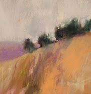
Wolf Kahn uses the barn image a great deal in his work. He has taken it down to the pictorial elements with content that describes the position of the building on a slope or prominence, and elements like through-looking doors and windows, and severe value gradients.
The story of my Red Barn with Ramp image I have told many times. I received a box of twelve "Wolf Kahn" Terrage pastels made by Diane Townsend, and in a first moment of inspiration I made a very small thumbnail sketch with the colors. It was the barn image just as it is seen on the book cover, except that sketch was about 1 inch square. I was in the moment, entranced by pure color and by the tactile qualities of the big, thick pastel sticks. Abstract shapes were the tools, and color was the content.
Elijah has written a good back story to the barn and building themes. The literary link to The Wizard of Oz is apt. The elemental truth of my surroundings is hard to contradict. Wind, sun, sky and agriculture. Can an artist overcome his environment long enough to forge content that aspires to higher art? I suggest not thinking too hard, but letting the hand and eye draw intuitively. Maybe that's the only way.
Subscribe to:
Post Comments (Atom)
Abstract Expressionism, Art Criticism, Artists, Colorist Art, Drawing, History, Impressionism, Modern Art, Painting, Pastel, Post Impressionism






21 comments:
Wishing you a speedy recovery Casey.
You've had more than your share of medical procedures this year, Casey. I trust you will soon be comfortable, healthy and painting up a storm.
Every time I look at Violet Oil Drum I wish it were mine.
Yikes, sorry to hear about the op. Good that it's over, and great to see you posting. I'm new to your blog(s) and work, so I've got lots to keep me busy visiting for the next month. Also wishing you a speedy recovery.
Hi Casey. Best wishes for a speedy complete recovery! As a painter of rural landscape I constantly hear that drumbeat in my head about sentiment and relevancy. However, you make a point in passing that I think is worth exploring further- your barns and my landscapes are very real parts of the contemporary world- perhaps not to the city dweller but to millions of people who live in small towns and rural areas. I cannot see how they become irrelevant simply because someone in NYC doesn't have an opportunity to see a barn everyday or understand how it remains a valuable useful part of rural life- not just merely a quaint symbol. How you transform your barn into a work of art is what artists do with the raw material provided -and clearly there is a difference between sentiment and sentimentality. Sentiment - of all kinds- is humaness. I strive to make images which will touch my viewers - evoke sentiment- if you will , but always hope to avoid sentimentality. OK, enough- be well!
Thank you, everyone. John, Robyn, Clive and Deborah. Also thanks to Alyson S. who wrote an e-mail.
Deborah, I am usually so impressed with your technical skill, after I am inspired by the beauty of your landscapes. Sentiment doesn't cross my mind on your work.
I am not against sentiment, nor am I against narrative - such as Norman Rockwell exemplifies. actually, I am a huge fan of NR.
But, the direction my art takes is abstract enough that it begs formal things. I need to be less stuck-up and admit that once in a while an old building, or a Civil War soldier, are something that I WANT to paint.
And I very much take to heart your thoughts on one's surroundings - small "e" environment. Elijah Shifrin made me see the influences that I have that I didn't see. I ought to think about these things more.
I want all of you watercolorists out there to go to Clive's blog and see the definitive way that mountains should be done. He is local to me, on the big island of Vancouver, and his take on mountains, especially, is perfect, IMHO.
Glad to see you are recovering well, Casey. It's nice to see these drawings again, too. Hope you'll be back in action again in the studio soon!
Thank you very much, Brian. You've been a kind friend through this.
I guess a common post-op problem is a sore back - although I dodged that bit on my two previous ops. I have a sore back this time, and only on day 3 did it start to resolve.
Muddling along and doing my PT and taking my meds. Turns out I can sit in a certain chair with a hot pack in front of the PC. I had some books lined up, but it's not comfortable to read, so I read in short sessions.
Glad to hear your recovery is going well. I am amazed at how prolific you have managed to be despite all -- very admirable artist work ethic!! Feel well soon and thanks for the great posts!
Good to hear from you, Eden.
hi Casey --- best wishes & take care of yourself.
Fauvist barns .... they're not going to go away whilst there's still agriculture so Deborah Paris' point about barns being too rural ie irrevelant for city folk remains.
Why would one wish to raise about one's place in Time & Space? Where we are & the road we took to get there is what makes us unique.
And that also includes 'abstraction', with or without the suggestion of a barn or not.
Well, actually as guy who owns one of these barns, I have to admit they are redundant. We use them for storage, but agriculture is a lot more high tech these days!
I agree 100% about the place and time meme. No matter how "automatic" one makes his art, the environment will become evident. Maybe it is okay for me to pursue Fauvist themes 100 years late for that very reason!
Well barns are still being built in my commune here in SW France, though mostly in light-weight polythene. Tobacco. As I write the neighbour's gas blow-driers are roaring away as they dry off their crops. There's alot of processing & transforming of crops after their harvest. Wine, fois-gras, tobacco... so the barns are like mini-factories. Not very high-tech but more like the small holdings that started to die off in the fifties. Certain ecologists would like a return to small holdings as they aren't don't require so much capital investment, create more employment & thus communities & tend to prioristise labour rather than gas-gazzouling hi-tech. Wendell Berry for instance...Why don't I paint these new barns? Why are old barns more worthy of a painting? Nostalgia?
I haven't thought it through 100 PERCENT but I have feeling that maybe artists who work with images of rurality have two basic directions. One is make it picaresque & pardiscal, for example like a pretty Kincaid, a beautiful Claude Lorrain or a formalist abstraction. Or go the other direction, which is basically that of the realist programme, where one actually paints what is there, the realities of unadorned everyday life, without making it an asethetic entity. Without dressing it up, as it were.
Hope you are feeling good today.
I feel that the architecture in that old Gambrel barn is something wonderful. On the other hand, when I paint a whole farmstead, I have to hide or obscure the tin sheds.
I have posted recently about our local star, Rachel Maxi, who does realist garbage containers, called "dumpsters". It's a contemporary and unified theme.
Such beautiful barn paintings/drawings, Casey!! They are so luscious.
I take it you've had some sort of painful medical thing--hoping you feel better soon.
Thanks for commenting on my most recent pastel. I had actually planned on asking you what, if anything, you do to make the computer images of your pastels still look so good. Even when I fiddle in Photoshop, the result just never really looks like vibrant, luscious, real pastel.
My wife, Lorie, is the great photographer.
First, the mid gray background on your blog is fine for judging value, but a white background adds light and pop to your images at the blog. Who remembers when I had the Colorist up for @ 6 months in mid blue-gray before I tried white? BTW, trying new looks is easy and (in my experiences) risk-free.
Then, we use a very nice Nikon D80 camera - which I think we still don't have the 100% perfect knowledge of as far as settings. I feel we sometimes get the temperature too warm - maybe the white balance setting?
Then, your 2 light stands at 45 degree angles with kelvin bulbs just the right temperature (5000 or 2500 - your photographer needs to figure it out). we bracket.
My big effort then is to judge them accurately after they are taken. I have her take them in RAW, at 4000 dpi, and save that and then do any work on the new image. No loss, they say.
For me, if I have to go into photoshop to adjust anything other than crop and size, then I feel it needs a re-take. I am hardly ever able to make a "wrong exposure" work after the fact.
Hope that's a start for you!
Casey,
thanks so much for your photographic advice. My photographer, alas, c'est moi--not quite as technically gifted as yours! (The artistic photos you have on your website seem to be hers...they're gorgeous.)
I will experiment with a white background on my blog tomorrow. I didn't know you used to have gray too! Perhaps my problem with the pastels images is more about not taking the pics correctly in the first place. I have a pretty nice digital camera too, and I do take them in RAW and manipulate them in Photoshop afterward to try to get them to look more like they are supposed to.
The issue of what color one's blog page background should be is quite interesting...of the various options, I figured that: one does not want an actual hue (blue, yellow, e.g.), since that would influence the painting's local colors too much; a black background really makes the images pop but it's too hard to read text on it; "neutral" is best, I thought, in the sense that neutral color and value should, ideally, prove the best foil for colorful paintings, and that the most neutral one could get in those senses would be mid-gray...no?? Now I'm all curious about it. Bedtime now, though...good night and thanks again for responding.
Another trick that I try is to create a blog that is for experimental posts. No one needs to see it, just you. It is easy to copy and paste from that blog - even the jpegs.
Another good idea! Sometime when you get a chance, I'd love to know what your opinion (especially as The Colorist!) is on the "neutral" colors issue. Thanks.
I took a look again at your blog today - left a commment regarding Halfie and hope I didn't close the box too soon and lose it. My regards on that sad event.
Well, I agree that black is too hard to read, although it pays nice compliment to some art. Half of an art blog is the copy. A fair number of artists do choose black, though.
I agree that neutral gray is a good choice for revealing or judging the technical truths of an artwork.
But, my blog really sprang to life in white - the reason was that it was like proper lighting at an exhibit. The amount of light around the page is remarkably better.
I suppose someone could make an argument about starting with this or that goal for the blog. The beautiful brick-a-brack crafter blogs, such as one sees in the magazine (what's it called? beautiful blogs?) are served by filigree frames and such. Some art blogs are a work of art in themselves - what works best for that?
Now that this blog will be two years old on Dec. 16th., I think it fair to say I've found my niche. I want a platform to express artistic direction, both my own and global. And, a showcase for my art within that context.
The white then reads as a platform for information, and a spotlight for the images.
Thanks, Casey. Your comment about Halfie did indeed appear on my blog, thank you. So it sounds like you have gone through the same thing with a beloved feline. I'm very sorry. :(
Thanks for taking the time to think about my blog and its background color. I am still going to try white one of these days too, to see how it looks. (I have no idea what you're talking about with the "bric-a-brac beautiful blogs"...???) but it's interesting that when I mat my own pastels I use a white mat. Perhaps that should tell me something.
Post a Comment