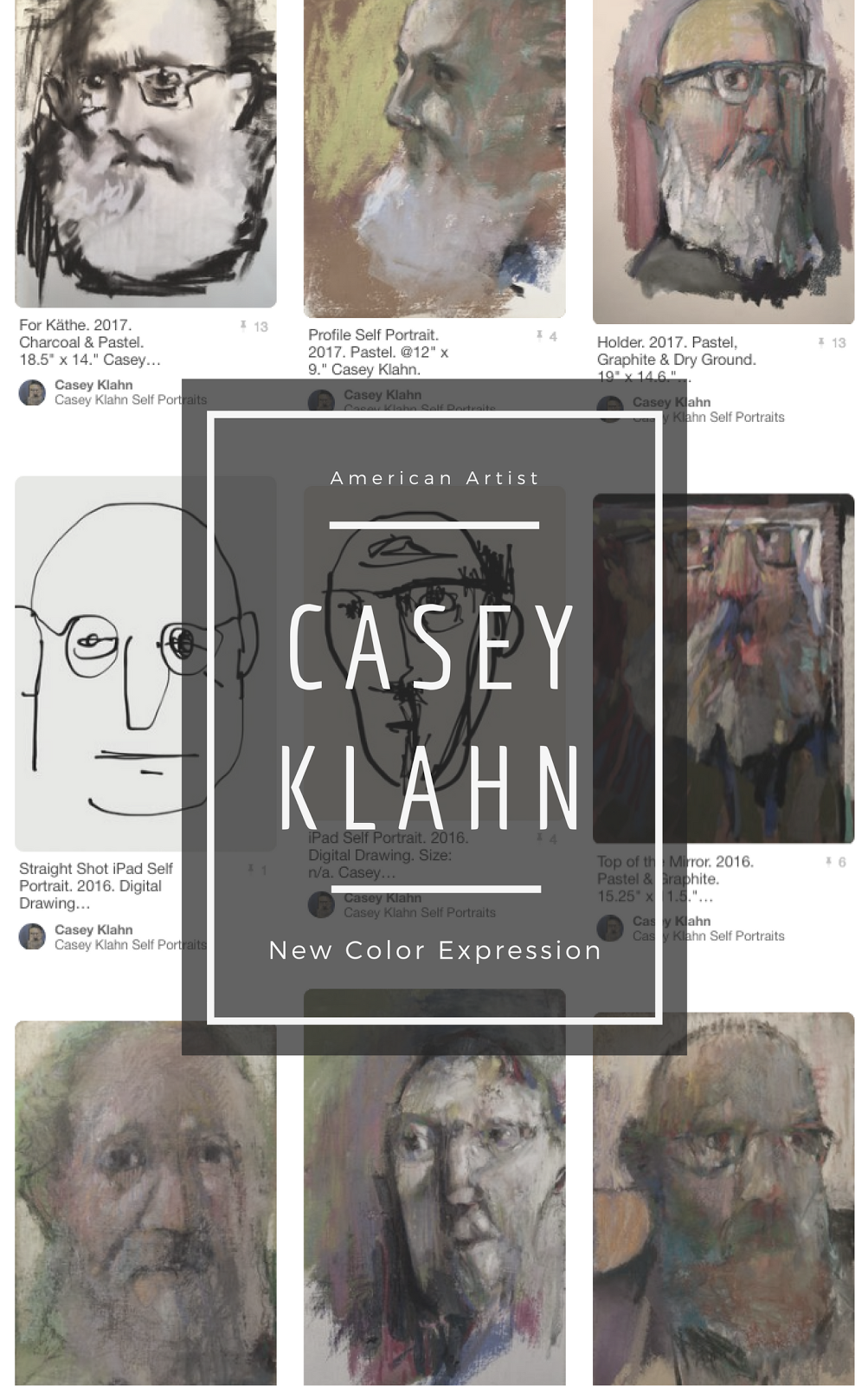
The Colorist blog is undergoing a remodel, and that includes new tabs, a sidebar clean up and a new banner. The strategic concepts were aided by the rigorous mind mapping which I posted about here and here.
One thing already accomplished is a revamp of my profile by:
- Killing the blogger profile widget and adding a picture that links to my blogger profile;
- Updating my picture at my profile (and then I had to go around to my other communities, like Twitter, etc., and change those to match);
- Cleaning up my blogger profile page;
- Placing the profile in my tabs rather than in the sidebar.
Further cleaning will involve deleting as many sidebar widgets as possible. I have added a few that I feel I will want after the clean-up, so it looks more crowded than usual now. My criteria are that they have utility. I value widgets that link within the blog, those that link to other content I have placed on the web, such as an artist statement, other blogs, website or whatever, and those that link to other authors' blogs. Next, there are the blog awards, which gives a reader a sense that "this blog has enough merit for me to read." There is the Follow widget, which I have found to be my easiest way to read around the blogs I like. Ditto the bloglist with thumbnails, although I find it to be so space-filling that I keep mine short. Time to clean that one up to reflect current blogs, too.
More widgets are there, as well, but I admire blogs like Steven LaRose whose blog Fish or Cut Bait, is so devoid of marginal clutter that the result is a page that reflects a graphic statement I like very much. It points more readily to his content, but I also love the contrast it provides to his rigorous abstract art. Cool.

Tech crazy, yet?
Labels have become a tag cloud, thanks to the input of my readers who voted for this. For now, I opted for the blogger version. Maybe a better one will appear later.
Next post: Banner Banter (including a How To make a banner and post it).
Still to come: Keeping Tabs. Find out what have I decided to do for blogger tabs.


10 comments:
Wow! I should do the same. I look forward to seeing the new product.
All good changes Casey. And I should (will) follow your lead. I've been blogging since June and already, the clutter!
Interesting to watch your blog de-clutter. I look forward to see the finished product. Maybe I will take your lead.
Casey
I'm going to express my opinion...
I think you should:
1. Spend more time on your art & less time on your blog. Personally I'd like to see more of your great pastels!
2. I suspect that you would find it easier & more efficent if you had a static web-site (which you could keep uncluttered) & a blog for anything that comes into your mind, full of creative clutter. Blogs by their nature are cluttered! The problem for blogs centres around visitors finding your old posts.
"Out of clutter, find simplicity" - einstein
Just my opinion.
I feel much the same way, Adam. My solution, though, is right now centered on getting the "me" less prominent, and the art content and ideas more up front.
Not to say that people don't want to know about the artist - but the self centeredness is like an anvil around the neck - I am as guilty as any of wearing this.
So, my (previously undisclosed) idea is to get the "me" things (news releases, statement, profile) in the static tabs, and the old posts and content things in the side bar.
I feel that static sites simply don't get looked at.
BTW, a dozen artworks await photographing, so stay tuned for those. Thanks.
Ahh, that'll explain the disappearnce of the pink nose ;-) (on your profile image).
RE ARTIST PERSONALITY VS ART WORK :
One must hope that people will look kindly upon the self-promoting trumphet-blowing of artists... it is rather indulgent. Anyone who has ever been to large group show opening-night & seen how artists carry on will take it all with a pinch of salt.
RE BLOGS VS WEBSITES : I consider my static website (the art part) as my showcase & it's by way of visits to this www.artists-atelier.com that most of my web based sales etc. are done. Not via the blog.
I reckon that most visits to our mutual blogs are by random google organic searches. My stats show that most visitors don't stay long. Visitors on average will psend four to five times longer on the website than blog.
What blogs do best is being able to follow an artist's development over time. It's been pleasure meeting you in the 'ether'. Blogs are after all a social medium. IMO, I don't think that side-bar clutter makes a big difference to this... I'd rather spend an afternoon painting or writing an in-depth post.
Again, these are of no interest to the smash & grab surfers, who are just moving through, a bit like people on a sidewalk. That's OK & what one must expect when one puts things out in the public for the public in it all it's diversity.
Yeah, I like the smash and grab analogy. The numbers on my stats are difficult to impossible to make sense of. I can say (happily) that my stats have doubled since September, and that started because of an art fair - rather than because of the webs.
I know that 90% or some very high number of my traffic is via subscription. That speaks well to content and frequent posting. Song and dance. Bombast. Yada yada yada stuff helps a little, but you are so right that the art and the ideas are the best attractant.
One thing I hope this current series on banners and remodels does is open The Colorist up to searches on the general subject of blogging - out of genre readers.
Maybe because I never maintained my web site I can't speak well to their effectiveness.
Here's a good place to open an inquiry. What do you all feel about the troubles of self promotion, blogs and websites?
Kathy, Loriann and Lisa - I hope you all get some inspiration from this blog-centered series!
I find it interesting that you state the blogger awards entice people as an item of merit. To be honest, that is the one thing I totally ignore when searching out blogs. I tend to read at least 5 or 6 pages back to see if the content interest me, if it does I will bookmark it and occasionally check back to see if it still holds my interest. The banner I use as a visual memory note. Kinda like when shopping, if I find a brand I really like I tend to memorize the packaging picture with good ingredient and pleasant taste, so when companies change their packaging they usually lose me as a customer cause then I end up buying some other brand, likewise with blogs, that is unless I have attached to the "follow". As for twitter, at this point I don't read tweets.
That happened to me with diapers. When the brand changed the baby on the box(ethnic switch) I totally lost track of which ones to buy!
I could go on with stories like how we moved the repair counter at REI and I watched a customer stand in front of the old (now completely blank) spot and waited for his service counter help. Art fairs changing venues can have a huge effect on patronage - we are consumers of habit, eh?
You make some great points @ how we read our pc feeds. One thing I get is the need to capture attention fast, and with something worthwhile. Then, if you are lucky enough to get readers, how do you support their valuable time? Good content.
Post a Comment