10 December, 2007

Winter Panorama


New Studio Project in Winter
Click on to See Larger Image

Those of you who reside in cities often have a limited understanding of the rural
lifestyle. New Yorkers think we still live in log forts out here and trade with the Indians. Volcanoes explode periodically.

This photo will probably not disabuse you of your idealized view of us out here in the hinterlands. Eastern Washington is very thinly populated. Where I live, man is far, far outnumbered by North American Whitetail Deer and Coyotes.


This panorama features my new studio, which is a converted 14 foot by 60 foot house trailer. How redneck can you get? Robyn Sinclair has the most beautiful, Old World, little studio space in Tuscan Italy. I have the biggest space one can imagine, in the New World wilderness. Well, it has its own beauty.

07 December, 2007

Darkness Gone?

New Memorial Design, USS Oklahoma

USS Oklahoma, Pearl Harbor

The author William Manchester wrote a cracking good book, his personal memoir of his USMC service in the Pacific, Goodbye Darkness, a Memoir of the Pacific War, 1980. If you're after a dynamic read about the Pacific Theater battles of WWII, this is your best choice. He skillfully weaves himself throughout all of the island campaigns, even though his participation was limited to three of the island battles. A great idea by a great author and an even greater military man, having earned the Navy Cross. (The Navy Cross medal was designed by James Fraser, who sculpted The End of the Trail, as well)

Today we remember during Pearl Harbor Day the treacherous attack by Japan on the US fleet in Hawaii back in 1941. That may seem like an eternity ago for my younger readers, but consider that our veterans of this battle still walk among us. I can't miss them because they stand about twelve foot tall (in my mind's eye). And those are the clerk typists and dining room orderlies. The guys with combat jobs stand even taller. You might take a little time today to consider the painful and sacrificial toil of that Greatest Generation.

On the art front, the design for a new memorial has been made. I gather that Kevin King is the designer. The battleship USS Oklahoma was sunk in that Dec. 7th battle, along with the better known USS Arizona and several other capitol warships. Here's my congratulations for this memorial to the veterans of that infamous day and that courageous ship. Their strife is honored by many today.

Bloggers on Pearl Harbor Day.

06 December, 2007

Electricity & An Artist Interview

New electrical panel to the new studio.

There is now electricity to my new studio! Woo Hoo! Look out, art world! More on my new studio project soon.

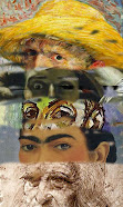
If you don't read my other blog, Pastel, you haven't heard about the interview I did for Giselle Borzov at Art Now. There is much new to read there about Colorist art that you haven't read at this blog, so pull up a cup of tea and enjoy reading. The collage above is a collection of my art that Giselle curated for her article. Interesting what another person will choose to represent one's body of work. I am pleased.

05 December, 2007

Fine Crafts

Pottery*

Here at the Klahn
household, we collect fine crafts. Raku pottery is our favorite, and handmade quilts are even-up with that. My goal is to start on an art glass collection.

All of this to say that I love Fine Crafts, but haven't had any links to craft blogs in my blogroll. I did try to right this a while back, and went searching for the websites/blogs of my friends who do pottery, and not a single one had a web presence. So, I put the project on hold.

Today you will see the beginnings of my craft links in my blogroll area. Hoo-ray for Cynthia! Anyone know how to shrink these data fields on the right margin of the blog? I want to keep the links big, but wish to shrink/truncate my labels, which look way out of control.

Admin Note:

Laketrees has listed your favorite blog, The Colorist, in the Top 40 of the Top 101 Artist's Blogs. I still don't know how she compiles her data, but I'll take it.


* Permission is granted to copy, distribute and/or modify this document under the terms of the GNU Free Documentation License, Version 1.2 or any later version published by the Free Software Foundation; with no Invariant Sections, no Front-Cover Texts, and no Back-Cover Texts. A copy of the license is included in the section entitled "GNU Free Documentation License".

04 December, 2007

Art Links

It looks as if the evils of linking in a gratuitous fashion are many. It has been termed farming, and some definitions of this can be found here and here. Although placing one's blogroll into your posts seems more targeted and on-topic than the strict definitions of blind link exchanges, I also see that Blogger and Google may cut with a dull knife, if you will.

Because of a complaint about my Art Link Letter, I will discontinue its use. Sorry to those of you who may have felt uncomfortable or feared damage from having been in my link cloud at the ends of my posts.

Content should be the basis of blogging, and especially original content. And someday I'll figure out the technology part of this gizmo called the Internet...

It still remains to be seen if I will start a blog or website of art links. It occurs to me that a need exists, but that there are mysterious pitfalls that accompany the execution aspects of these things.

03 December, 2007

Tilt!

Winter
10.5" x 7.5"
Soft Pastel
Casey Klahn


Before the era of the personal computer, we used to describe being overloaded by yelling: "tilt!" It had something to do with arcade games. And, it describes my artist's life at the moment. Gallery show in a month, magazine interview, slide deadlines, electricity projects in my new studio and in my home at the same time, winter storms coming through, and on and on.

Yesterday we were sans the Internet due to weather, and also had a blackout for a couple of hours. Just when I had to change into wool socks, the lights came back on.

On the near horizon in blogland, I want to offer the following content:

Northwest School artists, such as Tobey and Callahan
Drawing book reviews of the Classical Drawing Atelier and Figure Drawing, Anthony Ryder
Drawing projects in my Moleskine and also "Cast" studies of my deer skull collection
A whole separate list for Pastel
The Colorist 1-year Anniversary

Meanwhile, my "Link Farm" experiment is going very well with the Art Link Letter generating page loads and Technorati authority like a charm. But don't worry, I still intend to offer content worthy of your readership. As a for instance, the artwork posted today is posted at this blog for the first time.

01 December, 2007

Colour Lens


In the last month, I have been posting some general information about color theory. The take home message that I tried to bring was that the Internet is prejudiced, or at least heavily weighted, towards the colors that computers are limited to. The color theory ("additive") that the CRT, and much of print media, is slaved to is RedGreenBlue.

Take this post, in particular. In it, I attempt to indict the bias of illuminated screens. Possibly my best support is provided by Jusko's link where he supports my argument
for the artist to keep the RedYellowBlue color theory in mind before you buy the RGB/CMYK theories first.

There is nothing "subtractive" about adding one hued pigment to another to create a third hue. Perhaps there is subtraction if you begin with the dominant idea of light-based "mixing" created in your computer or camera.

Theories based on light rather than human perception are what I call "light-dominant" theories. I prefer to think of the experiential side of human interaction with light. Stone age man did not crack a laptop computer, he rubbed colors on stone. BTW, he mixed the pigments in hollowed out "mortars" of stone.

Regarding light versus perception, see the following quote from the Wiki on color:

These physical or physiological quantifications of color, however, do not fully explain the psychophysical perception of color appearance.

Clearly the digital and information era is the dominant paradigm of our day, and art created in the context of this era is every bit as new and legitimate and creative as the "Old School" methods of painting ever were in past eras of history.

But tearing down or redacting the old does no good for advancement. That dialectic is tired and disproven. Painting is the foundation of visual art and must remain intact in it's theories, not re-written or ignored by the newest thing.

The Wikipedia entry on the Munsell Theory has a fine example of the computer's inherent inability to reproduce artist's colors here:

Note that the Munsell Book of Color contains more color samples than this chart for both 5PB and 5Y (particularly bright yellows, up to 5Y 9/20; that is twice as much chroma the 5Y 8/10 square to the left), however they are not reproducible in the sRGB color space, which has a limited color gamut designed to match that of televisions and computer displays.

Now, with all of that in mind, I have found after my series on color theory has been written a new, wonderful resource for all things color theory. See Colour - Resources for Artists, a new Squidoo Lens by Katherine Tyrrell.

Her blurb on the lens is here:


This lens is assembling links to information and advice about colour and how to understand and analyse it as an artist. Also listed are various books concerned with colour.


And for goodness sake, crack a book about color and don't rely on the Internet only! Katherine has listed many books throughout her wonderful lens, and also I would prefer the links that are from artist's paint manufacturers, such as Gamblin. Put another way: just take all Internet sights about color theory with a grain of salt.

Admin Note:

My Technorati Authority did dip to 20 on the wear-out of 90 day old links, but I picked up 2 more links and am now at 21. Probably I had another 1 wear out, for a net gain of 1.

On the positive side of things, I have been listed in the Top 101 Artist's Blogs, apparently on the authority of Technorati. The list is compiled at Laketrees.blogspot. And, I have no idea how she conducts her research to rank these Technorati-listed art site, but as they say, "there you have it".

30 November, 2007

January Gallery Installation - Karlson/Gray

Light in Branches
21" x 13"
Original Pastel
Casey Klahn


Those of you in close proximity to Whidbey Island, Washington, will be able to see an installation of my pastels in January. The newly remodeled Karlson/Gray Gallery has a blurb on it at this
website. The gallery location is the former Gaskill/Olsen in Langley.


28 November, 2007

Sketch Box & Bag

Sketch Box & Bag
Graphite in Moleskine
Casey Klahn

There is much on the horizon for me, but little time for posting. Next month I'll celebrate the 1 year anniversary of The Colorist, and will probably take advantage of this event to reflect on art blogging, and on the state of "colorist art" as a contemporary style. Also, I will be posting soon about a gallery opening in Western Washington, and an interview in an online magazine.


26 November, 2007

Art Link Letter, An Art Bloggger's ViralLink & Viral Tags


The Art Link Letter was originally an idea I had to start a blog that would be just a link cloud of art sites. However, in researching ways to increase my Technorati authority, I came across what may be a path for doing my links program, and for giving a boost to my (and your) blog. The authority of TheColorist has gone from @32 to 21 in the past month, and although 21 is nothing to sneeze at, I for some reason want it to improve. Call me an overachiever wannabe.

Here is the way it would work. If you elect to participate, you simply cut and paste into your posts the "Art Link Letter" that I have created at the bottom of this post. Then, change the name of the host to your own link, which will contain your URL and anchor text (Three words or less, please). Replace a Viral Tag with your link in the same way, and you're in business. When you get a ping somehow that someone has you in their ViraLink, reciprocate by pasting them in your matrix.

You can place this viral link "cloud" in a post, after your footer, or anywhere you like. It is suggested that within posts would create less clutter, and according to the techies increase hits to your blog. This is known as a ViraLink, and the idea is referenced here and here.

It may be effective to just do this once a week, or every few days, if you don't wish to clutter up your blog pages with this "Link Cloud" on every post. Here are the simple rules:
  1. No Porn
  2. Don't change other peoples URLs in the link text
  3. Keep the links to the Arts. I will be culling out ones that I copy from your posts which stray from the subject of art, but I will stay broad.
  4. One link per person
The value of this to our art blogging community will be to increase the links to every blog involved. There are some blogs in our community, mine included, who hold a strict policy regarding whom they link to. Content and quality are the main motives. This is an experiment in increasing my own and your Technorati (and perhaps Google) rank, but I am hoping that the "Art Link Letter" can maintain some of these qualities in the fact that each blogger can edit the content as they wish.

Cut & Paste Below This Line:
----------------------____________________-----------------------

Art Link Letter

I removed the link cloud due to the phenomenon of "Link Farming" being a red flag at Google. Although I consider my blogroll to be a targeted link tool, and because it is hand generated, I felt "on-topic" with putting it within the post structure. But, you can't fight city hall.

23 November, 2007

Best Pastel of All Time - Award

Referencing my previous post on the Best Pastel of All Time, you may be interested in seeing my considered and freely given opinion at Pastelsblog.blogspot.

Happy Black Friday


Here is a shout out to all of my people in the retail industry on this Black Friday. I toiled in retail, myself, for something over twenty years and it is a memorable piece of my life's history. Please try to be kind to those clerks and managers who shovel goods during the bust Christmas season. Maybe even thank them if you notice good performance - I always do. And when I receive substandard service? Well, at least at Christmas time I try to be a little more gracious than the rest of the year!

On subject, I am warming up to the very popular blog, Lines and Colors, by Charlie Parker. Early in my blogging I found it, but sort of overlooked it as a drawing or illustration blog. Turns out that I am returning to my own drawing roots as part of my own process, and it also turns out that Parker's blog covers a broader, more eclectic set of art subjects than I originally thought. That's a nice discovery.

Speaking of art topics, the magazine Contemporary Art Gallery (CAGZINE) is a fine read and I recommend it for modern art and artists content. I found it through Giselle Borzov, whose blog Art Now is a regular read of mine. Read this article where Cagzine celebrates it's one year anniversary, which I will also do in a couple of weeks here at The Colorist. Read this article to gain an understanding of their content and direction.

Looking forward at The Colorist, I am about to reveal a new tool that I hope will become a meme for art blogs in the broad community. It will be known as the Art Link Letter, and looks to be a great opportunity for artists to gather blog traffic, and admirers to search a list of sites of interest to the artists linked through the "letter".

22 November, 2007

Turkey Day

This is the old school way of getting a turkey. Happy Thanksgiving!

21 November, 2007

The Rational Versus the Irrational


Superman Comics features the idea of a Bizarro World, where everything is the opposite reality. Sort of a bizarre dimension of opposites. Well, here is my Bizarro World: a blog called Rational Color.

Keep in mind that if The Colorist theory exists as the opposite pole of Rational Color, that makes me the Bizarro side of the equation. Hmm. Feels funny. Me so happy.

18 November, 2007

Pink

Pink Forest
7.3" x 5.3"
Pastel

Casey Klahn


Pinks & Greens
7.8" x 6"
Pastel
Casey Klahn


Hill with Red Sky
12.5" x 9.5"
Pastel
Casey Klahn


The Four Seasons, Winter
14” x 10”

Pastel
Casey Klahn


The color pink is interesting for being really just light red, yet it has it's own name! Do blue and yellow demand equal treatment? Is it fair that light blue is just that, "light blue"?

The web is replete with sites that say things about pink, but I wish to avoid them. Their general bent is to assign meaning to the color, and I prefer to let you make your own associations. And my direction as a "colorist" artist leads me to avoid assigning meaning to any color. I am more interested in how pink interacts with other colors, and what the value ranges do to change these interactions.

The story of these paintings in pinks and greens is that I visualized doing an artwork with these colors, but it took me months of failure to finally get it the way I liked it. Then, what I learned from that first success (entitled "Pinks & Greens," above) enabled me to create more of them with this color composition.

17 November, 2007

Karlson/Gray

I am happy to announce that I will be participating in a landscape exhibit at the Karlson/Gray Gallery in Langley, Washington in January of 2008.

The Karlson/Gray was formerly the Gaskill/Olsen, which enjoys a long and fine reputation in the Seattle & Puget Sound region. A noteworthy element of the Langley location is that it anchors the southern end of Whidbey Island and that area is an artist's colony. Perhaps the biggest in the state.

On a personal note, hanging next to my own work at the Karlson/Gray Gallery will be the oil paintings of Whidbey Island landscapes by Pete Jordan. Pete's work is well-known in our region, and I am having a hard time finding the words to say how fantastic it is. Let's just say incredible and top, top, top drawer. Further, Pete is a friend and mentor of mine since the days when I only dreamed of being a working artist. His advice and encouragement has been a tremendous boost for me, and now he's going to have to suffer hanging with me at his home gallery. I am humbled.

Also, his spouse Joan Govedare is a Raku Potter whose work is featured at the Karlson/Gray, and over the years I have bugged/volunteered with Joannie at the Bellevue Art Fair and other venues. Those were the days when I wondered "how do you break into these art fairs?" Both hers and Pete's art grace our own home, and so I am happy that we'll get to be in a show together. A milestone for me.

Did I mention that you will (probably) have to ride the ferry to get there?

Karlson/Gray, 302 First Street in Langley on Whidbey Island.

15 November, 2007

Genius Widget


Genius cuts two ways, sometimes. I added this widget to my right column:
The Blog Readability Test - What level of education is required to understand your blog?
If you dare to follow the link, you may add the URL of your blog in a window, and a mysterious calculator will score your efforts.

Since it looks like a total gimmick, I decided to try a few other URLs just to see if everyone gets a "genius" score. First, I entered the well-known blog that won best blog in last year's Weblog Awards, just to see if there was a political slant to this thing. In my cunning, I thought that this would show prejudice. That one scored low: High School. Hmmn, I liked this widget.

Then I tested a few of my peers. Undisclosed results showed a range of scores. Alright, my blog scores "genius". On the one hand, give yourself a big pat on the back if you're a regular reader of The Colorist. You read at a genius level. On the other hand, if I were truly a "genius", I would be writing this blog at a Junior High School level, so that I would have more readers.

BTW, I have had the standard set of I.Q. tests, and they are mildly gratifying. My wife is smarter than I, and over the years I have noticed that quite a few of my friends are, too. Lucky me.

14 November, 2007

More Input Requested - (Bump) - Best Pastel Ever?

At the Theater
(also known as Lydia Cassatt Leaning on Her Arms, Seated in a Loge)
Mary Cassatt
Pastel
1879-1880


The "Greatest Pastel" question has raised a lot of interest, and you all know my own choice has been the Degas painting posted below. At Making a Mark, the subject is being raised again and moderated by Katherine Tyrrell on this post.

Someone at one of the forums that Katherine linked to mentioned the Cassatt work of Lydia Cassatt, and I was amazed at how much alike the contemporary Degas Green Singer work was to this.


La Chanteuse Verte, 1884
23.75 " x 18.25"
The Green Singer
Pastel
Edgar Degas

Which do you like better? I will offer my own opinion in a future post.

Note: See today's post at Pastel reviewing the Diane Townsend Pastel line.

12 November, 2007

Intersections


Stumbling upon
an artist that you like is a wonderful thing. I found Rachel Dory of Seattle via the Seattle Art Blog this morning. She has a show currently up at the Gallery 3131.

Her very fresh work floods in a host of thoughts, intersections and associations for me. The
U-Turn, To The Gorge and Back hanging is a narrative of driving out of the city and heading east over the Cascade Mountains and into the climatically different Eastern Washington. "Gorge" refers to the Columbia River's deep cut and is a major landmark of our region. Her urban themes remind me of what Rachel Maxi has done for Seattle urban-themed art.

This theme is reminiscent of David Gutersons's novel
East of the Mountains, which covers the theme of a journey from Seattle to the east. I don't care for Guterson's books, but I like the theme he brought to mind. Western Washington, whose urban anchor is Seattle, is geographically a water-drenched and forested environment that is fundamentally different from east-of-the-mountains Washington. The inland side is substantially more arid, agriculture-centric and rural. Population density, politics, landforms-everything is different.

My own life story is a parallel to this "going east" theme. I was born and raised in the rainy
coastal city of Hoquiam, and now reside in the easternmost part of the state. Extreme rain versus wide-open spaces. Gray versus color, if you will. Growing up in the west, my artistic efforts were centered on the pencil, line and shape. Maturing as an artist, I now use pastels and focus on color.

Bruce Morrow has a classic American road trip theme at the Karlson/Gray, a gallery in which I will be hanging my art soon. I sense a theme here. Progress along a linear feature.

I have always been attracted by the river passage theme, myself. I am visualizing a Hoquiam River theme, but for some reason I am gravitating towards a realist style for that. It would be a traveling from the headwaters of the humble waterway near Mt. Hoquiam to it's mouth and the harbor that it empties into on the Pacific Ocean. The issues involved there are many. But, that's for another post. Will an idea not pinned to a roadway speak to the masses?


Links:
Animated panorama of the sight where I painted the Hoquiam Shipyard scene.
Try this one of the rugged coast of the Pacific Ocean.


Hoquiam Shipyard 1
6" x 4.5"
Original Pastel
24 October, 2007
Casey Klahn

11 November, 2007

Veterans

The Portal
4.75" x 4.5"
Graphite
Casey Klahn

The story of this graphite work of a tiny outbuilding in North Italy is a dear and personal one. My late father, Kenneth Klahn, fought in a battle here in WWII as a member of the elite 10th Mountain Division. This little building was adjacent to a tram that was installed during the battle, and it served as the temporary mausoleum for dead soldiers of both sides. I visited the site with veterans of the 10th, and snapped a photo of this historic structure that I had seen in the history books all of my life.

In my drawing, the uneven ground of the Apennine Mountains is evident as our vine-bordered pathway leads down and past the evacuation point structure, through the wooded opening beyond, and then upward to the heights of the rock escarpment Americans call Riva Ridge. For the men of the Mountain Division, this was their first battle of the war, and a portal to their experiences in combat. For the wounded and dead, a different kind of portal. Did their souls rise on high from this very spot?


School children from an Italian Hill Town (Gaggio Montano), some wearing pins honoring the American veterans, sing their national anthem and remember WWII.

The heroes of the Tenth Mountain Division on a reunion trip to Italy.

A son (your author) and a daughter of veterans of the battles in North Italy lay a wreath in the waters of Lake Garda to honor the fallen who perished in and around this large Alpine lake.

When I was a younger man, and as a youth, the veteran was a guy who fought in World War II. The reason, of course, is that the generation preceding my own was that generation upon whose shoulders it fell to serve in that great conflagration. Now-a-days, the number of men who have served in the armed forces has dwindled tremendously. Attrited by age, and smaller armies in the post-war era.

Don't think for a moment that these men (yes, and a great number of women who donned the uniform) served so that you would remember them. They served out of an old fashioned thing called obligation. And patriotism. Look it up in the dictionary. It has to do with ideas and values greater than your own self and your self existence. It has to do with love of your family and your neighbor and that includes your whole country of neighbors. The catch phrase was "way of life", and it has more than an arbitrary or abstract meaning.

That selflessness and humility is what stands out for me about my elder veterans. On this Veteran's Day I honor the recent returnees from the world war we are involved in now, and I remember vaguely that I wore the uniform part-time for ten years as a National Guardsman, but mostly I think of my own father's service in Italy in the Second World War.

World War II Memorial in Washington D.C.
Tenth Mountain Division of WWII.
Google Map of the Riva Ridge area. (working on this...)

05 November, 2007

Tower of Babel


For those of you wondering whether my translation widget (thanks, Google) has produced a result, my Stats do show an increase in international "hits". Too soon to claim more page views, and since I am not sure it is trouble free, I won't link it's source, yet. Anyway, it is easy enough to find by searching.

Note: The above flag gifs will animate if you click on the image. Why they are static on my blogger page is a mystery to me.

02 November, 2007

Bloggers of Note - Illustration/Drawing/On-Site

Fans of fantasy illustration and art in general will appreciate that James Gurney has a blog. He is the artist of Dinotopia fame.

His posts are outrageous and funny.

Katherine has made me aware of the SketchCrawl, and I am eager to look at good Moleskine and other sketchbookers that post stuff I like.

Those of you who value the Guerrilla Painter products like I do will be happy to see that a blog has sprung up to cover "from life" art.

26 October, 2007

Virtual Event - Bump!


The need for a virtual hanging struck me. Enjoy. All works soft pastel, originals by Casey Klahn.

For those who have seen this post back in July, bear with me as I use this display again for reference.

25 October, 2007

Celebrate!


Happy Artist's Day! Celebrate by making art, buying art, or even just re-hanging that art you already own and enjoying it. Go to a museum at lunch. Buy a new box of crayons for the kids. Woo-Hoo!

Click on the gif above to watch the fireworks burst.

23 October, 2007

New Book


My new drawing book purchase has made it's way (by pony express) all the way to Spokane. Now, it will ride with the passengers and mail bag on the stagecoach to my little stop in the country.

The book is:
Classical Drawing Atelier
A Contemporary Guide to Traditional Studio Practice
Juliette Aristides


I will be able, I hope, to dive into the Atelier as part of my intentions to get back to realist figures. This will be my "hobby," since the strong art statement that my Colorist American Landscapes makes satisfies my fine art side, for now. Another hobby of mine is plein air work.

Don't forget to drop me an e-mail with your post address if you would like my new card, free. Of course, I don't share your address with anyone, and you will be on my humble mailing list. My e-mail is in the right marginal part of this blog page. Thanks!

And by the way, I will be reviewing the book for the drawing book review project coordinate with Making a Mark.

22 October, 2007

Book & Postcard


This year's copy of American Art Collector, the book, has arrived at my mail box. It is the third or fourth year in a row that I have been juried into this attractive book, although this year it is a national catchment, rather than regional. My prior entries are in the West Coast editions.

I appreciate the effort and high quality that goes into the Alcove Books publications, and it never ceases to amaze me the wonderful art and crafts that my peerage all around the US are creating. Fun this year to see the national examples.


The postcards that I receive with my book also look wonderful. This years' cards represent the first year that my submission was with a digital camera image. Even though the pink and magenta are very difficult to represent, the card seems to have come out to my liking. If any of you who read my blogs would like to be included on my mailing list (post - rather than e-mail), I will be happy to mail an enclosure to you with my new postcard and an assortment of my older cards (two or three total) as long as I have the old cards available. This would put you on my mailing list, which receives a mailing from me about twice a year, although I would like to increase that to 3 or 4 mailings a year. Write me an e-mail (see the right column of this blog) and include your snail mail address.

Upcoming:

An interview with artist Sheila M. Evans at Pastel.
My book review of a Wolf Kahn exhibition catalog featuring large works in pastel.
Abstract Expressionism, Art Criticism, Artists, Colorist Art, Drawing, History, Impressionism, Modern Art, Painting, Pastel, Post Impressionism