 DetailSoft PastelCasey Klahn
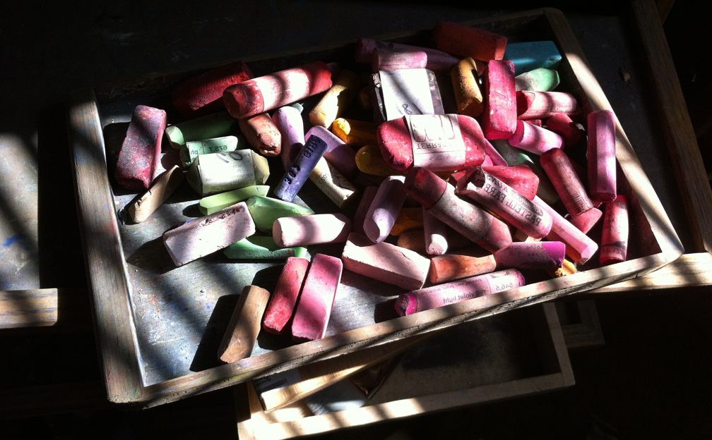
Say what you will, the French have certainly cornered the art media market, big time. I cannot do without my
Sennelier pastels ( A L'Ecu ) and my La Carte sanded
paper.
Oh yes, I suppose one could stay with some very excellent American products and make out quite well. For instance, I feel that the Diane Townsend Artist's
Pastels (Pennsylvania) and the Kitty
Wallis' ( Oregon) Sanded papers are maybe the best products in their field anywhere.
But, when I scumble a DT Terrage pastel over the vegetable matter surface of a La Carte card, I have experienced a technique that is unrepeatable, to my knowledge, by any other set of tools. The Wallis is superior for other things, but not that particular move.
And, those Sennelier extra soft pastels are the best for keeping to the original characteristics of each pigment as much as possible. Sure, the sticks break easier in certain colors. But it is all about the color, isn't it? It's better, in Gustave Senneliers' mind (by modern extension, his company's collective mind) to keep the color of the pigment, than to satisfy the needs of consistent handling from stick to stick.
This is as close to artistic integrity as it can get, I think. It's absolutely none of my business, but if I were a Frenchman, I would want a Sennelier for President of France.
I am no chemist, nor am I anything more than a punter when it comes to making pastel sticks, but I hold the Diane Townsends and the Sennelier up as my two favorite sticks. Why not stay with just the DT's, which have the more pleasing shapes and overall characteristics? Because there are certain intensities of color that Sennelier has that I find no where else. Also, those big, monster size Sennelier sticks are off the hook.
Sure, Sennelier sticks are expensive, but when I purchase powdered pigment at retail, and roll my own sticks, the value of how much blue is in a Sennelier Ultramarine pastel stick becomes well apparent. In fact, when I find a Senneleir standard or
jumbo stick on sale, I feel that the thing is coming to me at a net loss to Sennelier. That is when compared to what it costs me to buy the pigment to make them, without even factoring in the cost of my labor. Until I find a shipwreck of pigment jars washed up at the beach, or figure out which dumpster to dive to get pigment cheaper, the Senneliers seem like a great value to me.
Postscript: The Jerry's Artarama link (jumbo) above has an old picture of the Jumbo Senneliers in a wood box. Those are not being produced, I understand, and are replaced by the La Grande, which is still a big stick. I have some of all three sizes, and the monster ones rock. If you find some on clearance, buy them. You are taking them at way under cost.


 Casey's Palette


 Pink Forest
 The Four Seasons, Winter
 Untitled,
 Beware the dominance of computer medias' views of color, dear friends. Ink, mass media, and the light on your computer screen do not reflect the totality of knowledge about color. The "Old School" color understandings that artists have known for a few centuries are not the end-all, be-all of color, either. However, the artist's eye on the two dimensional surface, and his pigments applied there upon, are very different from the use of color in the mass and digital arenas. I'm only saying that the knowledge contained on the Internet regarding color seems to me to be biased towards the digital media.


 The left over dust from your easel can be segregated at time of gathering to be mostly red, green or whatever. Or, if you just mix them all together, you will get a beautiful gray result. Pour out that jar of tailings onto your smooth-surface work area. Best to have your latex or vinyl gloves and dust mask on, as pigment can be harmful to one's health. Simple precautions should suffice.
 Put a paper towel around that spray bottle with a rubber band, so that you can change it out for the next color that you want to mix cleanly. Make a mashed potato-like pile (or a mini volcano, if you will) and spray water into your pigment.
 Roll the paste in your hand until you achieve a stick. If it's too wet, dab it with a paper towel. If it has cracks, then add a little water at a time until you get it like I show above. I take the extra effort of forming it up against a right angle of glass that I have taped to my glass surface in order to make it square. Many reasons support the square model, but I do it mainly to differentiate my sticks from most store-bought ones. I make them big.
 The drying process takes days. Three or more in marine climates (Western Washington, England, etc.) and about three where I live in Eastern Washington (almost out of the marine zone, dryish climate). I took over an old food dehydrator that we had for the purpose, which I'm still in the doghouse with my spouse about ;) You can still test the color even when it's wet, though.
 The Bunkhouse
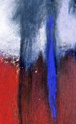
 Detail


