
The old saying goes,"if it ain't broke, don't fix it!"
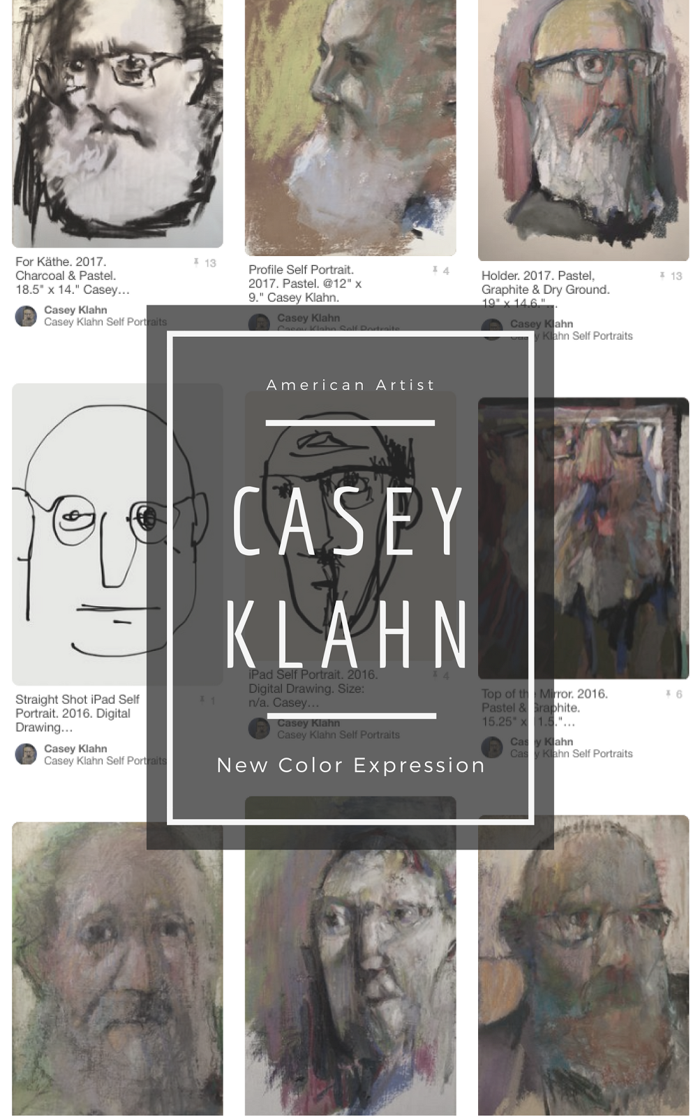
Without regard for that sage advice, I wanted to at least try an image on my header. I have monkeyed around with different images, especially a blue palette tray. Because blogger works for the new picture in some other templates, I tried them out. The confines were too, well, confining.
So, I feel like the page can breath better with this classic template. But, to overcome the little picture creep on the right side, I had to re-size the header image, and go with a white background.
We'll have to see how this look "feels". I will miss the blue background, for now. I did like a neutral tone background to make images look brighter.
So, enjoy the red palette tray and the white background.






3 comments:
I don't work in pastels but honest to God I look at this photo and it just screams to me BUY SOME! I actually have a few to use in mixed media pieces but right now looking at this I am feeling quite color deprived!
Hey, Terri. Good to see you!
Do I hear a faint sound of harp music in the distance?
more like a violin!
Post a Comment