How do you, my daily readers, feel about the new white background, versus the old blue-gray one?
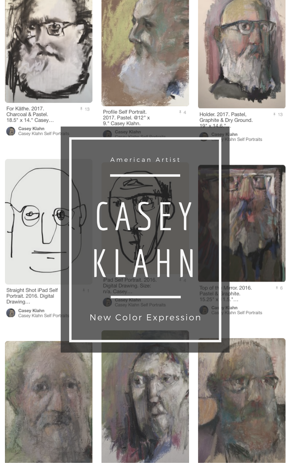
I know that the old color was sort of a signature part of my layout and look. The argument for the new white bg is that it facilitates the header image, which blogger simply won't justify to center.
Any geeks out there with a suggestion on that issue?
Look here tomorrow for my weekend Colorist Landscape, and don't forget to see my other blog for my 100 paintings of Italy posting.
02 March, 2007
Subscribe to:
Post Comments (Atom)
Abstract Expressionism, Art Criticism, Artists, Colorist Art, Drawing, History, Impressionism, Modern Art, Painting, Pastel, Post Impressionism






8 comments:
Hi Casey, I am partial to the white background. Of course now I am unable to recall exactly what the other one looked like. However, I think your images look more vibrant on white and the header image is wonderful. It makes me yearn to be able to understand how to add one to my own blog:)
I'm not tellin'...
Just kidding. Here you go. http://paulstamatiou.com/2005/11/06/
how-to-make-a-blog-header-graphic/
I got there via bloggerfordummies.
Yes, we certainly mat our work in white, and I guess the blue color does put a cast on the images.
I was all hung up on the mid-tone popping the brights thingy.
Thanks, I'll check it out, but don't hold your breath waiting for an image. These things take forever for me to figure out:)
In the meantime, I'll just enjoy your photo of beautiful pastels. Seeing them makes me want to pull mine out and get to work.
I serve to inspire, my friends.
I'll share this story. A pastellist that I have admired for some time, Jane Lincoln (from somewhere up by the Great Lakes), had a picture of her palette, or tray of pastels, on her website.
I went, "Ohhhh, cool..." Which is about all one could do, since no such product exists on the market.
Two home-made trays and one waist high table later, I continue to use this great layout for my own studio set-up.
I agree with Tracy, everything looks vibrant against the white and the header is beautiful. I might try one myself. I could be gone for some time!
Thanks, Robyn.
I spent last night on a little troll around of ex-patriots (American) who blog from Italy.
Lots of fun.
I like the white--colors show up well against it and the text is much easier to read....lookin' good!
Post a Comment