Pastel
Casey Klahn
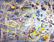
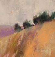
In thinking about the Orange post by artist Kate Beck, I wanted to revisit my own responses to orange. None of my artworks shown here are based on orange, but they rely on it to stay together.
Put a different way, orange misused can ruin a color composition. Orange is a poison, or a pleasure - it depends on how you use it. I did some orange based works a few years ago, but I don't have a record of them. They were rather crude, I think, but their color compositions held together.
One comment I'll make about the artworks posted above is that they don't resort to blue or green to counter-poise the orange. I'm happy about that, as those colors are too obvious and I want to say "easy" to turn to when making an orange composition.
Consider this a post where I begin to formulate my ideas on an orange-based series. It has been a long time coming, and I think Kate's post has given me the inspiration to git'r dun.
As a point of reference, here is a page with many Wolf Kahn orange-influenced works. Kahn has admitted that "Orange is a vulgar color, more than a little pushy." It takes an adventurous artist to play with orange!







6 comments:
Orange, yellows, and the "hues-in-between" these are very nice. I like this.
From the "other side of the country"-Happy painting!
JR.
Interesting to read your thoughts here, Casey. What is your favourite orange to use? Mine would be cadmium.
Thanks for the comments, Julianne and Elizabeth.
Elizabeth, we don't typically use the chemical or even the given names in pastels. usually they have a number! Diane Townsend does use those terms, I think.
I try to spread my orange love around, because I get the best results. I value a "hot" orange, very bright and high key, but I don't reach for it often.
Hi Casey - I like orange very much - a very vibrant colour. Yet I tend to use more subdued colours in my palette. My "Reminiscence" painting project yet was something completely different. It literally forced me to use a completely different palette and it was soooo much fun.
You might like to check out this painting, which I called "Naranja":
http://tinyurl.com/5l2fbo
I hope you will like this one - entirely in orange simply because the wall was painted in orange - LOL
Btw - I like all 3 examples of YOUR "response to orange"
Very cool, Petra!
I love orange but you are right it is hard to work with (at least for me). ACtually purple and orange have been disasters for me. I love how you have incorporated them into your work and yes they hold the pieces together without dominating.
Post a Comment