This Tree School post is a re-write of the one that was originally posted at Pastelsblog in January, 2009.
With a couple of exceptions, every landscape I have done has trees. But don't expect to see green trees in these pictures. I want to convince you to almost never use green as your departure point in painting trees.
The color of your trees will either establish or enhance your overall color composition. You want unity, and you want a proper color statement. Sometimes, green just isn't part of that structure.
Green will key the color composition for you. If you wish green as a major element in your image, then use it. If not, then do a color study of your composition first to determine what color you will be making your trees. The local color of trees is usually green, but if you think about it, there are other local colors of trees. Brown, orange, silver, gray and black are present. Trace or hints of red and blue are very evident to me in trees. Cast colors include violet and blue. When we view our trees in this manner, any color becomes part of the natural palette associated with trees.
Remember that color has much more value than associations with objects. Some assign emotional value to color, but I also think of it's plastic qualities.
Don't become a victim of the tyranny of green.
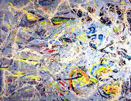
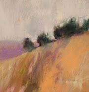
All images in pastel, by Casey Klahn.
1. Blue & Gray River 10" x 14.5"
2. Clear River 7.5" x 9"
3. Violet & Green Tree 5" x 4.5"







16 comments:
for fifteen years I commuted along a stretch of I-70 that cuts through rolling farm land and new growth forested areas. I was not actively painting then, but every morning and evening I was looking at the landscape change with the light and the season. Every trip was like driving though a huge painting. I always tried to figure out what colors I would use for the orangey ochre grasses, the extraordinarily dark shadows in the late afternoon and the multitude of colors that appear green to the casual eye but are really blue, purple, red, orange.
In fact, I was seeing exactly what you're talking about!
Hmmmm....I started a new tree painting yesterday and today put on the first layers of color. No green so far. Shale, a little blue, and then naples yellow in the high points. Now that I read this I think I'll continue it with no green. I'll let you know how that goes.
Good point!!
Kaylyn. One of the many things I like about your story is the way you looked so intently at this scene over a period of time. Very artistic looking, IMO.
Thanks, Kathy!
Hey, Lisa! I look forward to seeing that painting.
very cool article---UNSOLICITED SUGGESTION: Bigger images, smaller type. geez it's like an eye chart. lol.
j/k
beautiful tree paintings.
Thank you, Celeste. Your younger eyes don't need the large type like mine do. Har ahr.
Actually, don't get me started on the new blogger posting template. It still doesn't act like I'd wish it to. I especially don't like the preview as a pop out - am I missing a setting to get it back the old way?
Perhaps I'll ditch the justified right images. One thing I know is that it may look fine on my screen, but not on all. I appreciate the crit ( I always do) and I also know that the larger "catch line" I gave up awhile back is another problem. The stupid blogger html expresses it as a percentage, and that never works right.
Hi Casey, So seldom are trees really GREEN...especially in the distance. I love that orange river tree.
Thanks for visiting and commenting, Loriann. You are a busy person, and I hope the workshop is going well.
So true. So many artists are afraid of color, particularly men. Nice read and I totally agree!
CASEY - you'd love the trees here right now.
SPRING8
Every techni-coloured blossom imaginable. Pinks, yellows, reds, even blue & violet!
Not much green knocking about...
Maryanne - great to meet you. Glad you are art blogging!
Hey, Adam. That sounds great - I have mixed feelings @ spring. The colors - good. The sun? Bad for me - I can't seem to get excited about sunshine, but by the same token I am big on the shadows. Must be that Twilight upbringing.
Uhhmm, I imagine that it is quiet easy to confuse a snow-flake with a cherry blossom ;-)
re-spring sunlight. so bright here in southern latitudes! can sting the eyes after the winter gloom.
keep on making it, Casey
So glad I stopped by from Jala's blog. I've enjoyed reading a number of your posts and I love your paintings.
Just starting up the studio day - after a 3 days' absence.
Adam - keep the Matisse view in mind, and your eyes will be delighted (with the rest of us -delighted at your vineyards!).
Carol - glad to meet you, and thanks.
I love your bold color and particularly your color harmony which is often missing in otherwise sound paintings.
Thank you for saying this about color harmony, Mary. I was reading something about that this weekend, and maybe I'll write a post about the methods I use for harmony.
Post a Comment