

Previous Post: Colorist Methods - My Thoughts On The Subject Of Color.
This is the second post of an undetermined number of posts about the subject of color use.

There is some danger in this subject for both of us. For me, I risk either writing inanity, banality or nonsense. For you, probably the worst risk is that you will become convinced that these theories I write will impart some method. There will be no methodology about color use here. Just ideas, tips, and histories. That is about as good as it can get, because we enter this aware of the personal nature of one's color use, called color sense, and it is known by many who study color that people see and respond to color in a manner different each from the other. If there is any commiseration on color feelings, then these ideas are already widely known.

Some Thoughts:


- Starting with a color idea involves, for me, either choosing one bright, pure color, or designing a color triad in my mind at the very first part of the process.
- Reacting to the previous color involves intuitive choice, and/or some reference to known color properties, such as what compliments or what harmonizes the colors already laid down.
- Keep looking at the work and making adjustments as you progress.
- Respond to problems to create the harmony that you seek.

Fauvism is the first school or movement we think of when we are faced with funny color in artwork. The Fauvists were a crazy bunch of Frenchmen, mostly, who painted in the Modern era. Among their ranks were Vlamink, Rouault, Derain, and the King of the Fauves, Henri Matisse. The ideas they shared involved a reaction to earlier movements and the late Impressionist school of thought. They wanted bright, pure colors versus enhanced local color and an explanation of light. Their work was also considered painterly in the use of bold brushstrokes.
There will be no methodology about color use here.
I don't seek color that is a response to local color, meaning that that I don't choose a color that is purposefully not the actual (local) color. I just choose the color I want, and usually for personal reasons. It may often be the local color, and that is perfectly okay with me, especially because I am now set to react to the color I just used. I am a terrible reactionary in the artistic sense!
This approach, I think, is better than aiming for the "wrong" color or the opposite of the local color, because these methods can be formulaic. One is required to prejudice his choice when he will not choose the local color.
Watch here for more on color choices in future posts.
This approach, I think, is better than aiming for the "wrong" color or the opposite of the local color, because these methods can be formulaic. One is required to prejudice his choice when he will not choose the local color.
Watch here for more on color choices in future posts.


8 comments:
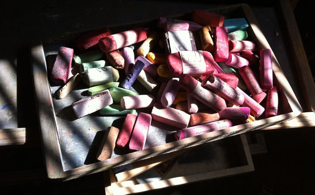
This is a really interesting post. I'll be waiting to hear more about the use of color in my own paintings, which is still a weak area for me. Thanks, and I LOVE the photos!
These were taken with an iPhone, and are the boxes of pastels that I skimmed off my full studio palette, which I took with me to Seattle last week for the workshop. I thought they looked gorgeous as piles of mixed colors.
Somewhere in these color posts I hope you'll find some ideas that you can use personally. Thanks for reading, Katherine.
Interesting post Casey. I always find it fascinating to learn about other painter's methods.
Paint on ..those instinctive methods work wonderfully for you!
My thanks, Loriann, and thanks for reading.
Thank you for posting this. Very interesting.
Hi Casey,
someone said: Learn all about the theory and then forget it. As a painter it is very important to trust your gut feeling. Very good post.
Hi Casey,
someone said: learn all the hteory and then forget about it.
As a painter I think it is very important to trust your gut, no matter what the theory says.
Karin & Asti, Danke.
Post a Comment