20 October, 2007

If I Were Rothko

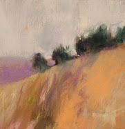
Untitled,
6.5" x 4"
Original Pastel
10 June 2007
Casey Klahn

The image above was part of my Rothko study earlier in the year.

This blog is getting hits at Google with this quote by me:
Does it serve the artist to know about color theory, or to hold an opinion about which theory he finds correct? I tend to think the answer is no. More on why I feel that way later.
Of course it serves to know color theory when mixing paint, or establishing a mood in an illustration or a narrative piece. Actually, the times when knowing the science of color serves the artist at his craft are numerous. But that's just it: craft. The mystical quality that floats the painting up into what we describe as fine art is where we part ways with the science of color.

How did the artist establish that setting or feeling in a particular work? Was it done with algorythms and juxtapositions? Did it emanate from his soul? For sure it had less to do with the science of color placement, and more to do with the heart.

That's my opinion on color theory.


19 October, 2007

Degas

Edgar Degas

Have a look at the following web site, artst.org, for great images by famous artists. Stunning quality.

Then, after you get an eye full of Degas' great art, see my post about the old boy's best work at my blog: Pastel.

17 October, 2007

Back "In Pocket"


Back from my mini vacation and ready to roll with more on the color wheel.

Here's some food for thought at our ever faithful Wikipedia: Color Theory.

Look again at the wheel on the left, above. Green for a primary, anyone?

12 October, 2007

Color Theory - Continued

Beware the dominance of computer medias' views of color, dear friends. Ink, mass media, and the light on your computer screen do not reflect the totality of knowledge about color. The "Old School" color understandings that artists have known for a few centuries are not the end-all, be-all of color, either. However, the artist's eye on the two dimensional surface, and his pigments applied there upon, are very different from the use of color in the mass and digital arenas. I'm only saying that the knowledge contained on the Internet regarding color seems to me to be biased towards the digital media.

Here is a great, yet simple interactive lesson on the color wheel. It comes from Iowa State University (I think). Good on them.

Here's one that painters will need to use with some consideration of it's computer bias. But, it could be a slick way to create a rough composition for one's "analogue" artwork. William Lehman has begun working with an e-tablet for drawing. I really like what he's doing and look forward to keeping tabs on his progress. I had a neighbor at an art fair who was doing digital realist art with a stylus directly on the computer screen, and I was most fascinated by it. If I were to go that direction, I can see the possibilities for commercial art. In fact, I can't conceive of not going that direction for commercial, or applied, art.

More to follow on the subject of color theory.

11 October, 2007

Color Theory


There are about as many color theories as there are scholars with a dollar. Which one is the best? The one I was taught, of course.

A theory of color is an organized observation of the phenomenon of color. It serves the practical value of giving us guidance in "coloring" things, and in understanding aspects and purposes of color. Mixing paint. Illuminating computer images. Object recognition. Does it serve the artist to know about color theory, or to hold an opinion about which theory he finds correct? I tend to think the answer is no. More on why I feel that way later. For now, lets evaluate and critique what things are being said about color in the academic world.

The present day, which is very different from "my own day", is dominated by the computer. The Information Age, I have heard it called. I fear many young people are being brought up with the prejudices that the computer gives to the understanding of color. They are taught that the three primary colors are red, green and blue. If this is you, I challenge you to go get those three colors in jars of acrylic paint, and mix yellow for me.

If we dig deeper, we find out that these three colors (called RGB), when projected as light, produce a "white" light. Be still my beating heart. Now, to be fair, the digital media are the new and cutting edge direction of our civilization. Digital art will be, and maybe already is, a major contributor to the direction of contemporary art. At my gut level, true to the caveman that I am, I am made weak by the idea that projected light will be our new world of color. It is too limiting, in my opinion. Too flat, pardon the pun!

Proponents of the computer models of color argue that pigment mixing is imperfect to produce colors, and that the CRT screen is easier to use for them in achieving various colors, especially if they wish to create equal intensities or values of a given color. This is a straw man. Colors for the artist are pigment based, not mixed from three primaries alone. Yes, there is craft to achieving the range of colors. But, the science of making a full range of colors as say, tubes of paint, is not dependent upon mixing alone. It is tied to available pigments - environmentally driven, if you will.

Brown University has the following site which purports to represent the e-based and the pigment based theories of color. After the first page, you'll begin to see the bias preferring the RGB color model, though.

Conversely, here is a color theory site that digs into the shortfalls of e-based color production. Thanks, Don Jusko. See how he compares the RGB model for values of yellow, and the way an artist darkens the same yellow. He indicts the inability of the RGB scale to create Naples yellow, for instance.


I trust that if you have read this post closely, you will see that I am mainly giving you an introduction to the arguments that exist regarding current color theory. There are many more theories of color , and all a fascinating read. I hope to post and comment on them in the next few days. There will be some "out of pocket" time for me, as I will be hosting Deer Camp starting tonight.

We will be digging into the artist's theories of color, the value of these theories and relative merits of each. My opinion? Freely given, of course!

10 October, 2007

Quote

"Anybody who paints and sees a sky green and pastures blue ought to be sterilized."
Adolph Hitler

Thanks, ArtLex, for the quote to link.

Thanks, to my late father, his army unit and his generation, for putting a stop to the evil chancellor Hitler.

08 October, 2007

Post of Merit

You really have to see my post, today, over at Pastel. It's a multi-media corker, with a good deal of mystery and international flavor. The subject is the superlative Henri Roche Pastels, how to find them, and a video note from the maker.

Enthusiasm Linked


Terri West, the Epiphany Artist, has an inspiring post on enthusiasm (October 5th, 2007).

07 October, 2007

Art is Invisible - Weblog Awards Still Uncultured


Is art dead? Looks like it is in the minds of the Weblog Awards. Purposely not linked.

Here is what I wrote in the forum section at the Weblog Awards:

Congratulations on the Weblog awards for 2007. It is a shame that my blogs, and the blogs of countless others in my blog community, will not be eligible. Of course, we are talking about the art blogs.
No, not photo blogs! Please, for the love of all that is decent good in this world, we are trying to have a civilization here!
Notice that I stopped short of declaring the blog awards "uncultured"!
Never mind. I can see that art is, as the critics have claimed, dead.
Now that I have, hopefully, made you feel silly, let's get busy and include this category in your awards. By the way, I will inform you (and this is painfully necessary) that "art" is not photography, but does include fine art photography, and is separate from the category of "culture". However, it goes without citation, that culture's greatest asset has been art - at least for a couple of millenia.
Back to the art category: Wikipedia has correctly suggested art as having two broad categories: "Visual Art" and "Arts".
Thanks for your attention to this, Weblog Awards.
This cause is not about me or my friends getting another award. It goes to the perception of art in civilization. Many simply don't see it on their radar screen even in an abstract sense. I have come off snotty, probably, which isn't helping the cause of art in general. Maybe some of you gentle readers can add to my thread at the forum, or even better, add a few threads. Registration required, but painless. Act now, since the nominations have been opened.

BTW, I "cap off" on photography because the category of photography is included, but art has no mention whatsoever that I could find.

05 October, 2007

Helen Frankenthaler

Photo: Lieberman, Alexander

Here is a link to a new exhibition of one of my Abstract Expressionists, Helen Frankenthaler. It's at the Ameringer-Yohe Gallery currently.

Her school of art was known by some as Post Painterly Abstraction. Whatever. She painted in New York, she knew Jackson Pollock, she studied with Hans Hofmann, end of story. I will still place her in Abstract Expressionism, at least until I write my doctoral thesis on schools of art.

The following wisdom from Frankenthaler should be burned in your heart if you want to be an artist who paints well and freely:

"A really good picture looks as if it's happened at once. It's an immediate image. For my own work, when a picture looks labored and overworked, and you can read in it—well, she did this and then she did that, and then she did that—there is something in it that has not got to do with beautiful art to me. And I usually throw these out, though I think very often it takes ten of those over-labored efforts to produce one really beautiful wrist motion that is synchronized with your head and heart, and you have it, and therefore it looks as if it were born in a minute." (In Barbara Rose, Frankenthaler (New York: Harry N. Abrams, Inc. 1975, p. 85)

I will not post any paintings of hers, since she still holds rights to them. Here is some link love about the master:

CONNECTED BY JOY, 1967-70, via the Greg Kucera Gallery, Seattle.
Wikipedia entry on HF.
Googleography (my own word for a list of books on Google).
What amounts to a resume on HF at World Wide Art Resources.
Bio from the NGA.

04 October, 2007

Intuitive Choice in Art

Abstract Reds Over Blues
20" x 12"
Original Pastel
Casey Klahn
Collection the Artist

Things are a little "static" around here, to use the web lingo. Let's revisit a popular post that should grease the skids of creativity;

Intuitive Choices

Under the tutelage of Diane Townsend I painted this abstract work. It has some elements of color field painting, like Mark Rothko, and extensive gestural elements. The gestural nature is in keeping with the drawing roots of the pastel medium. I like the way the paper's surface is evident, and yet the color blending, and heavily worked nature of the piece makes it work as a painting for me.

Let's talk a little bit about intuitive choices in fine art. The choices that a child makes are very intuitive, because their knowledge base is limited. The hands start moving, and the limitations are the length of their little arms, and the characteristics of the tools. They are mostly trying these tools out for the very first time.

A great deal is made of technique in art. The pastel medium is no exception. In fact, technical skill is probably too emphasized in this medium. It's supposed to be hard, you see. And, admittedly, there is much to know (much that I do not know!). Sometimes beginning steps are not rewarded very well by the outcomes.

"Only when he no longer knows what he is doing does the painter do good things."
Edgar Degas said in a quote posted at Expo Degas.


So, intuition! First sketches with bold gestural marks always work better for me than deliberate and measured work. The thing is to have years and years of drawing from memory in one's back pocket, and then the quick marks made on the paper will seem intentional. I don't subscribe to the subtle and tentative working that is often required of detailed realistic work.

The same goes for compositional choices. It is not easy to describe, but I think that studying good composition is necessary, and then ought to be put out of one's mind. If you can internalize compositional knowledge, it will come out naturally as you draw. The best thing I can say is: "try it".

The ability to critique one's own art becomes more important when you want to be an intuition-driven artist. Did this one really turn out to have the best composition? Color Choices? Does it have too much to say for one painting? Ask these questions of yourself.

Wolf Kahn has a chair that he sits in and ruminates over his finished art. Most artists do take some time and distance away from their works to try and get an objective perspective on their own creations. It's challenging.

The pastel medium is "made to order" for the artist who wants to favor intuitive creation. It is a direct, and rewarding tool. It's interesting to consider that in the book, Wolf Kahn's Pastels, the great colorist chose to make the text a collection of essays on artistic process. A natural fit, I think.
New Links for the quoted post:

Diane Townsend.

Schama's take on art is somewhere between pointless and powerless, in my opinion. However, I offer you his link on Mark Rothko, here.

01 October, 2007

Bibliophilia Alert

In this day and age, that title sounds bad. Maybe leading to images on milk cartons, and neighborhood watch meetings. Calm down, Nellie. It's actually a great and good thing, and an anchor to civilization. Of course, I won't give the definition here. Google it. Or better yet, go dust off that big dictionary on your bookshelf and look it up!

October is The Big Drawing Book Review, and is being moderated by Katherine Tyrrell. I have begun by starting a multi post review of Wolf Kahn Pastels and perhaps another of his pastel books. My study of this book will probably lead to a self-directed project in the near future. Stay tuned for that.

We just built a new bookshelf in our north room. That room was my studio for the past 3 or 4 years, and since I am in the process of re-building a large house trailer as my new studio, we are able to get the north room back to it's original plan: a library. For a house full of book-lovers, it is like a healthy dose of Prozac for our sanity.

Here's a list of rare drawing books for sale at various bookstores around the net, by the way:

http://www.bookbase.com/search;jsessionid=C0453ED2D4F2CDFB08D4E013C6B5C749?method=POST&author=&title=&keyword=drawing&search.x=0&search.y=0&search=Search

Here is a part of Google that I don't think I ever heard of before:
( I know, I know -"duh!")

Google Book Search

30 September, 2007

Starbucks & Moleskine Sketching

Starbucks @ "The Y", Spokane
September 29th, 2007
Graphite in Moleskine
8.25'" x 10"
Casey Klahn

Here is an interior that Americans are familiar with. I look and see a lot I could've done differently. Whats more, I forgot my eraser, and only had the little bitty one that comes on the end of a standard school pencil. My sketching pencil is an all graphite one, which has no wood case. But, that's what sketching is all about. Mistakes yes, but impressions absolutely!

I would make sure that the table standards don't line up, and I would omit the wooden box that hides the computer that is floating in the upper right and blocking the baristas' heads. I would "push" some things, and "pull" others. Anyway - I have to get used to posting these Moleskine sketches, warts and all!

28 September, 2007

Wolf Kahn Pastels Review - Part 1

The Big Drawing Book Review will be going on in October. I am early, being an overachiever by nature. Not really, I just had it in my mind that I had to have this done before the end of September!

In reviewing my drawing book, I chose the first one I could think of: Wolf Kahn Pastels.
It is hard to create a format for a review about a book which has very little format, itself. It is a series of petite essays that have titles like: Dry, and Celebrating a Single Color, or Bright Orange.

Kahn certainly has the heart of a teacher, himself. It comes through in his writing, and you can just picture him in a workshop or seminar imparting his wisdom to his acolytes. Much of his subject matter is about art as art. And he isn't pretentious about it, either. He is just genuine - true to himself and his own motives about making art.

I find myself in virtually complete agreement with him about art matters. He doesn't get on a soapbox about these great issues, but he parlays about them in a conversational manner. For instance, in his chapter on The C&O Canal, he takes a shot at the art historians who deconstruct artworks to find the hidden motives of the artist. But, he does it in the wryest way possible.

It is a sure sign that his book is effective, as I find in my second full read of it that I want to go into my studio and start creating pastels that ooze the stuff that I have absorbed by looking intently at his drawings. How much I missed the first time! How great it is to have a little more context myself in order to better understand what he is talking about!

Read it. Re-read it. Do some pastels (even if you don't consider yourself an artist!). Write your own essays about your art. The next level? Make a colored drawing with the subject in the very middle. Paint a painting with some (much) of the ground showing through. Instead of hatching, choose scribbling. Start with high key orange.

The following is an interview that WK had in a venue called, "Artist's talk About Art", in which he addresses the subject of art, and I focus on his comments about the Pastels book.


November 7, 2003

Dialog between Wolf Kahn and Donna Marxer, "Wolf Kahn's America"

WK I tried to write a "how to" book with metaphysical pretensions. (Kahn is speaking about his Pastels book, here-Casey)

DM What makes a great painting? That's a hard question.
WK You’ve got to some
how be going after something which finally is violated in your picture, because your picture goes much further than the thing that you tried to make. I say that somewhere unless a picture has ten times as much as the artist consciously put into it, it’s not even made by an artist . . .

I think each great painting has its own attribute. I think it is a mistake to generalize. In fact, most teaching I'm against. And in my pastel book, I have a section called "Composition" and I say that composition in my lexicon is a dirty word. Because it presupposes an ideal painting that exists somewhere and which all the laws that the teachers are teaching are exemplified. For example, "Can't cut off a corner." "You can't cut off a painting in half in the middle." "There's got to be a center of interest." And all this bullshit that gets taught. And I think the whole idea of an ideal painting that exists in some kind of imperiun is a mistake. Like, as soon as I heard that you can't cut off a corner, I immediately made a painting that cut off a corner. Because our perversity has to be satisfied. It is very important to satisfy our perversity.
Because we don't want to be hemmed in; we don't want to be put into confining fences and most art teaching has to do with fences, for example, you read the Pastel Journal. I mean the lady who runs it is very nice and she even gave me a good review for my pastel book and I shouldn't speak against that magazine but hovering in the back of everybody's mind in that magazine is the idea that there is such a thing as a perfect pastel that you have to make in which the shadows are just the right colors and the mood of the landscape is exemplified and so on. I think all of these things come secondarily, you know, they come out of you doing the best you can on some kind of a wild goose chase. I think art is a wild goose chase. I just came up with that now. (Laughter)
http://www.atoa.ws/sales/kahn.htm

Book:

Wolf Kahn Pastels
Wolf Kahn, Intro by Barbara Novak
2000
Harry N. Abrams Books, NY


Random Link:

Be prepared to have your mind blown. Follow this link to a Little Rock, Arkansas high school lesson plan based on Wolf Kahn's pastels. Don't stop before you have paged to the bottom and seen the student results that are posted.

26 September, 2007

New Pastel Blog!


Announcing Pastel at PastelsBlog.Blogspot.com!

Because my tags are top-weighted with the subject of the pastel medium, I felt the need to step this subject out into it's own blog. What's more, there seems to be a demand unmet by the current blog world. I am by no means the leading authority on the medium of pastel, but I am willing to open up a venue like this to cover this popular and growing artist's tool.

Now that The Colorist is close to 1 year old, I want to continue to narrow and define it's direction. This blog is more about process and art than it is about tools and techniques, and so I am splitting out the vast world of Pastels as a stand-alone blog.

So, please continue here for my art process story, the broader world of fine art, and essentially a manifesto* on New School Color. And, for an exciting and growing discussion of all things pastel, please go to Pastel, at http://www.pastelsblog.blogspot.com.

*Manifesto: in art a public declaration or exposition in print of the theories and directions of a movement. The manifestos issued by various individual artists or groups of artists, in the first half of the twentieth century served to reveal their motivations and raisons d‚etre and stimulated support for or reactions against them.

Computers Scare Me

Don't hit this inert button. Hit the one in the right column.

Is it any wonder why computers scare me? I have been laboring under the belief that I had the subscribe button all spiffy and clean, working in my right margin column like everyone else in blogland.

On the contrary. The little bugger was linked to some other random page at Feedburner, or Bloglines. Probably the Shanghai office of lost links, I'm sure.

Anyway, dear readers, if you haven't gone the long way around to subscribe to this, your favorite art process and color crazy blog site, you are welcome to do so the easy way by hitting that little button at the top right (for now) of this page.

22 September, 2007

Van Gogh Update

The Fields
1890
van Gogh

Here's the latest on my sad friend, Vincent. I have it that he was beside a barn or some type of structure, not really in a field when he took the fatal shot. But, let's not quibble.

Looks like a private party has put this one up for bid at auction. It has been displayed in Amsterdam and London, but here you are.

Was this his "last" painting? I think that matters more to the sales hype, than to the history. Anyway, I'm putting together a fund to make my bid. Any helpers, out there? (Just kidding, folks).

20 September, 2007

My Discoveries

Pinks & Greens
7.8" x 6"
Pure Pigment Pastel
Casey Klahn


Let's get out and about, as they say, and visit some great art & artist's sites that I have recently discovered. I make these discoveries over time, and it's a slow process. I haven't got a clue what I am looking for, just things that appeal to me artistically.

First, blogs that are new (to me):

  1. Ann McMillan's blog, Fresh from the Easel. Ann is a California pastellist who really has the landscape down, with a fresh and colorful perspective. I have never met Ann, but hope to someday. Her web site is here. Don't miss Blue Barn.

  2. Lisa Call. Lisa isn't really new on the block, but I did add her blog to my links recently. She is an important figure in the world of art blogging, with a well crafted site and killer quilts. I don't have a lot of fine craft stuff on my blog, which reflects my personal tastes in general. Don't get me wrong, I have crafter friends on the circuit who I respect greatly. I collect Raku pottery, myself. Ancient art was as much about the clay pot as it was about the picture. And quilting is as much a part of Americana as Country Music, and by that I mean authentic. I guess I will require a whole set of posts at some point to fill out my links to craft web sites.

Artist's web sites (AKA artist's without blogs, or AWB):

1. Jean-Michel Blanc is a French artist with a web site entitled: Art Pastel. I will take the privilege of sharing his entry quote here:

" The use of bright and warm colours in order to give a presence to the landscapes,
the individuals and situations in daily life. Put into scene, spontaneous and privileged
instants which we would like to live, " JMB.

I really like Jean-Michel's large scope in his cityscapes, and his personal color choices. He also has a strong unity to his figure work that is refreshing.

2. Eric Merrell. Another of those Californians! Eric has a pleasing twist on colors, and he pins this talent to well organized shapes in the landscape. And, he is prolific in his range of subject matter. Enjoy this sea stacks offering in his painting, Stability.
Sites that I label, "About Art" are third party sites such as museums, art news sites, and art commentators/critics. Here are my recent additions to my links:
  1. Venice Biennial, and Florence Biennial. The Venice venue (or set of venues) is a long standing (established in 1895) showcase for important world art. Our local boy, Mark Tobey, made a splash there in 1959, and the big city art clutch us still trying to live that one down. Time for another one of those, I'd say. The Florentine venue is juried by the "most authoritative in the world", according to it's Wikipedia entry. Is there any other city in the world with a foundation in art like that of Florence?

  2. The Peggy Guggenheim Collection in Venice creates a nexus with the Venice Biennial by hosting the American Pavilion.

And, before I finish, I want to draw attention to Wolf Kahn's new works in pastel. They favor green, at one time, and others favor yellow. Really great work!


New Logo

Logo: Casey Klahn, New School Color


The thing about going with a logo, is that you really ought to "nail it" the first time. Maybe that's one thing that has kept me from deciding to field one. But, since this gallery packet project is now officially keeping me up at night, I think the timing is right to "brand" my business mailings.

It's hard, don't you think, to distill a whole body of art into one "blurb" image? So, going out on a limb here, I chose this abstract image that I drew at a workshop a couple of years ago. It very much says "color", and yet it doesn't pin me down to any one of my landscapes. And, at the same time, it is an artwork, rather than a symbol or construct of some letters.

I don't have a background in graphic art, although when I took the Famous Artist's School course (I was @ 10 years old), the focus was on commercial art. It's a whole different discipline than fine art, but there is some cross over.

18 September, 2007

This

Old Sketch
Casey Klahn

...is how I feel, sometimes.

15 September, 2007

Windbreak & Tractor

Windbreak & Tractor
Graphite in Moleskine
Casey Klahn

I don't often make these sketches that aren't "perfectly" composed or balanced. Even this cropped in area lacks good composition. Sometimes, I get caught up in the details, too.

This scene is outside of my mother-in-law's farm kitchen, and features her little orange Kubota tractor. I liked it because of the repetition of vertical trees, and anyway it's well committed to memory for some future painting. It helps to have some objects to add to a painting once in a while.

14 September, 2007

Moleskine Pastel Sketching


Above Kimball Junction
8.25'" x 10"
Pastel Sketch in Moleskine Book
August 6th, 2007
Casey Klahn

One can sketch with pastels, and it is very good fun. This image is done on sight, from the back of the WalMart parking lot near Park City, Utah. Probably the most beautiful WalMart parking lot view anywhere. If I remember correctly, you can turn 90 degrees to the right from this scene, and you will be looking at the monumental Olympic Ski Jump, from the 2002 Winter Olympics. Follow the highway to the right, and you are on the Tenth Mountain Division Memorial Highway (Highway 224), which honors the storied unit that my late father served in during WW II.

It helps to have meaning and context, I think, to realist art. Sort of "fills it out," in my opinion.

The sketch itself is something of a mess, which is the best start for many good pastels that will be finished later. As long one gets the composition of lines and masses looking like he wants, and a few color notes established, then he's good to go. And, I'll give myself points for being loose, goose.

Before I leave the story of this drawing, locals to Park City will wonder which body of water I must have seen from the Kimball Junction location. None, of course. I just wanted to establish a unified base of blue-violet in the middle ground here. Artist's prerogative, you know. If I ever finish this one, I'll probably go ahead and stick a lake in there, and change the title of the piece.

Of special interest to me is the materials used for this outing.
The pastel sets included the Basic Values Set from Terry Ludwig Pastels, which happens to be way overkill for an on sight day of sketching, in my own opinion. I prefer a smallish set, which I may post about in the future.

The sketch book is the famous "Moleskine" of Ernest Hemingway and Jack Kerouac fame. Those are two literary giants whose footprints I have crossed over this past year during my art travels. They are leather bound, for those who value permanency in their books, and they lay flat.

The Squidoo Lens on this spiffy little leather-bound sketchbook's form of biblophilia is:
Moleskinerie.com

12 September, 2007

My Moleskine

Artist's Tape, Moleskine and Pencil


Sketch Box, Moleskine & Mouse


A Moleskine owned by
Pablo Picasso (1881-1973)
Notebook No. 53, June-September 1912,
9 x 13.5 cm
kept in the Musée
National Picasso of Paris


The sketchbook of
Vincent van Gogh (1888–1890)
Kept in the Van Gogh
Museum of Amsterdam


Moleskine Sketch books are the grail of bibliophiles, such as myself. I will post the few sketches that I do, warts and all, as I create them.

Face and Hands

Face & Hands
Graphite
Casey Klahn

More process stuff in the figures vein, this time a portrait sketch, from the imagination.

This sketch is @ 12 years old.

11 September, 2007

Subscribe

Because of the windfall of visitors that I am getting from Alyson's blog, I invite you first time readers of The Colorist to subscribe using the feedburner tool at the top right column. Thanks!

Patriot Day

My House; Flag at Half Mast

I remember my son was only 12 days old the morning we watched world history unfold on our T.V. set. Because all air traffic ceased for a period of time, we had the eerie silence at night when we fed him. We live where there is no noise whatsoever, out in the country.

Then, one night while doing a middle-of-the-night feeding, came the sound of a plane at altitude flying West. Seven minutes later, another. Then, in perfect intervals of seven minutes each, an aerial convoy of US Air Force jets flew to war in tactical formation. War. Over American soil, our forces were deploying to the Middle East, already on a war footing.

Remember.


Poll Results

Quickly, the results of last week's content poll are, so far, an even spread for the following three subjects:

  1. Colorist Art
  2. Casey Klahn's Art
  3. Pastel

I want to thank the readers for this input, and it gives me a great start in my search for what to continue to write about here at The Colorist.

10 September, 2007

Linky - Linky- Greety


Casey Klahn in Studio

The post title is blogger slang for saying "greetings" to the visitors coming in from Alyson Stanfield's ArtBizBlog, where she has a post entitled: Artist's Blogs to Fall in Love With.


Casey and Vincent at a Paint Out


So, welcome if you're new here. My blog is a process-type space where I post about "Colorist Art", in a new and modern sense. Also, things that I enjoy, such as art history that isn't too stodgy. An example would be my posts on Vincent van Gogh (who I interview here).

You know, there are precious few photos of the old keener, van Gogh. He hated the camera so. Here's an image he allowed me to have of our virtual visit in Paris, but only of his back.

Vincent and Moi Hold Forth

Another popular subject here at The Colorist is the medium pastel, which I favor. Here's a post about my chums in the pastel world. If you like, see my post about the founding pastelist herself, Rosalba Carriera.

My art can be viewed by clicking on My Artworks.

Now, I'll be going back to Alyson's blogs list and finishing my tour of bloggers to love!

07 September, 2007

Figure Drawing

Lead Climber
11" x 6.75"
Graphite on Paper
Casey Klahn


The figure used to be my primary subject back in my drawing days. This one of a rock climber, drawn from the imagination, was done about ten years ago.

Why don't I do the figure now? When I decided to go full time, and professional, in fine art, I reasoned that I had not explored the landscape very much. Also, my knowledge of color was shaky, I felt. So, the colorist landscape developed as my "growth subject".

The figure is, in my opinion, the pinnacle of artistic subjects. Nothing expresses so directly to the viewer what an artist is saying than the human form. As far as mastery is concerned, the lack of it is never more obvious than in a rigidly drawn figure. Rendering the human form is basic to my own "inner artist". Without it, I would always wonder, "can I draw?"

As I slowly move my studio to it's new location (across the lawn), I hope I can uncover some more of those old drawings and share them. I like what they say about process and my own philosophy of art.

05 September, 2007

Reaching for Motivation

Photo credit: Lorie Klahn

Finger Crack,
Leavenworth, Washington

It's good to reach back in the memory files for personal motivation. I have so much to do, and the progress feels like one inch at a time. Packets, printing of materials, follow-ups, planning, and (Oh Yeah!) art all vie for their place in my priorities.

Ah, for those halcyon days of granite climbing in fair Leavenworth! Adventures galore in the stunning North Cascades! Concerned only for gravity and friction, sun, wind, snow and rain!
The impossible was at hand, in those days. Maybe it still is today, huh?

This is a great Hollywood style photo taken by my wife and climbing buddy, Lorie. Too bad I never could figure out what that rope was for.

02 September, 2007

Content Poll

What subjects speak to you here at the Colorist? Which one is your favorite? Based on my past stats, one subject that was superstar great was Vincent van Gogh. The pastel medium gets high marks, but I think it's a narrow segment of this audience. What about my art process (the only area where I can claim any authority)? The truly strange among us read here for jokes about royalty and their pet monkey.

Where do you come down on the content of this blog? Vote the poll to the right top margin, please. Your friendly author will make every effort to consider these. If you have other ideas, post a comment here.

P.S. : My quick thinking readers have pointed out to me that they cannot vote for "subjects" in the plural, as the poll only accepts one answer. I'll have to go back to the code and change the word to "subject" because I need a hierarchy showing the most popular on down. Thanks for voting and sorry for the mistake.

01 September, 2007

New Blog Banner

Thanks for your patience as I test these new blog banners. I am trying as hard as possible to get one that doesn't require scrolling, but so far this one just needs a minimum of that.

Not sure about the font, but we'll rest on this for a while.

Addendum:

Why post a new banner design at 3 AM? Obsessed with graphic perfection? Maybe. Or, maybe it's just that my Kindergartener has a bug from his first week at school, and slept in our bed, and then wet same. So, I already was up nursing my sore shoulder, anyway...you get the picture.

The new banner really needed to be a "no scroll" banner, anyway. I only worry, now, that people can't see the first post because of the mega banner being in the way. Hmmm...I wonder if I can re-do it until the sun comes up?

Casey Klahn Fine Art

Casey Klahn Fine Art

You are invited to see my web site, post-makeover. I spent an intensive week of online fussing, with a group of about eight other artists and crafters, and moderators Alyson Stanfield and Patricia Velte. The professional and peer critiques were useful, although when I went about giving crits to my peers, I felt like a drive-by shooter. The whole process ends up well, though.

If you're after a "from scratch" professional design for an art website, I highly recommend Pat's White Wing Designs. She knows her stuff and will make for you, I am sure, a very spiffy web presence.

The free side of the house would be to go to Google Page Creator and "do it yourself". My Google web site is here and here. Notice the links are dead because I am not using the tool as a web site. What I have done there, is to create some extra pages to link from my web site, which limits the number of pages I get.

Then, I also favor my own choice, which is a template site (like the blog). It is Fine Art Studio Online. Not much money, and relatively easy even for an old fart like myself.


31 August, 2007

Try Two Point One

The Colorist
New School Color
Casey Klahn

Now compare this one. Thanks, Kristina!

30 August, 2007

Two Point Oh


Let's try this one, with a Colorist American landscape in there, instead of an abstract. And, with a white frame.

Is the whole graphic presentation more coherent?

New Tagline

The Colorist
New School Use of Color
Casey Klahn

Your responses are requested. I am re-tooling and re-working my website, and this collage resulted in an effort to post a descriptive image of my blog. The word "Artspeak" in the old tag line was a stumbler for many - especially because I use a lot of artspeak, myself!

Anyway, the goal has been to communicate my art philosophy in process. The less "wordy', the better, I feel. What are your critiques of the collage, and of the tag line: "New School Use of Color"

28 August, 2007

Bring Your Own Tissue

My son started Kindergarten today. See the post and pictures at Endless Summer Art Fair, but keep a hanky close by.

I am taking an online class this week related to the art business, through Alyson Stanfield. I will still try to have a post or two, but patience, dear readers...

27 August, 2007

Mailing Large Fine Art

Unwrapping the Big Strongbox

Logo

My artwork, Large Tri-Color Forest (framed size is @42" x 35" x 2.5"), needs to be shipped to Dayton, Ohio. That's half way across country! In this post, I will detail the professional method for handling this big task.

Full of Foam

Masterpak is the company where I get my puncture proof, and properly insurable boxes. The product itself is known as The Strongbox. Basically, the heavy corrugated cardboard box has two sandwich layers of egg-carton foam, and a cunning middle layer of foam that is die cut both on the rank and file.

They do cost a pretty penny, in spite of the advertisement to the contrary, and they are also expensive to ship EMPTY. The insurance people would frown hard, in the event of a damaged frame, if you don't do your part as an artist to use the professional materials at your disposal.

Mark for Size, Then Rip Along the Die Cut Line

Clean, Shrink Wrap the Frame and Update Your Business Card

Almost Ready


I Add Bubble Wrap

My patrons pay the shipping for the art, and I pay for the box itself, and the return bill for getting my expensive Strongbox back. Also, I charge the patron for the insurance in case of damage or loss to the artwork. In the event that the art is damaged in shipping, I will eat the insurance cost and, of course, refund the patrons for everything.

So far, I have had good experiences with shipping framed (glazed with glass) art cross-country. My carrier, until they screw up, is FedEx.

My strategy in shipping is to use next day air, since the fastest method involves the least handling. As a good example of the perils of slow shipping, I received permission from my kind patrons in Ohio to ship the box itself from their company (based in New York, but shipped from Mississippi) at the lowest rate to save myself money. They were fine with that, but the Strongbox did arrive at my door with a thick layer of dirt on it. Luckily, it was shrink wrapped and the cardboard was sufficiently clean.

I have explored kid glove shipping, but the expense is way prohibitive. Even if my works of this size went for $10,000, I still wouldn't be able to afford the custom shipping offered by carriers such as FedEx or UPS.

If you live in a large, Metropolitan center, there are services available that handle the shipping of fine art, door-to-door. Look into that yourself, as I am going to continue to live in my nice, remote corner of the planet, thanks.

Lastly, I phoned FedEx to pick-up this big item at my door. It's the quickest method, and it also allows me to have a second person here to handle the load-up of the clumsy large box. The weight is nothing to speak of, but the size is difficult to manage. When the delivery guy shows up, I will make out the return bill to put in the box, and the shipping bill to Ohio. Then, the 2" inch tape gun, and a layer of shrink wrap. Don't forget the prayer!

I'll let you know the results in the next few days.

Postscripts:

  1. The art and package arrived beautifully. The art is hanging in my patron's office, and the big box has been returned via FedEx.
  2. Apparently, the Strong Box is not made in Tupelo, Mississippi and the tag pictured above is not correct. The box is manufactured in New Jersey, somewhere, and I will be updating that picture soon to reflect the actual source of manufacture.
  3. My personal opinion, based on my good results to date, is that these boxes are well worth the price. I am also getting a refund on my shipping cost for the original ship of the big Strongbox. It turns out that the shipping rate is not cheap, but fair compared to other really big packages that one gets.

24 August, 2007

When Bloggers Meet


Meg Lyman, of CrashOctopus fame, stopped by on her family vacation. She was driving between the Spokane Airport and Leavenworth, Washington.

She got the inside scoop on my art fair summer, and I'm afraid had to step around a lot of construction in my new studio. I heard how her Pittsburgh show went, and a little bit about her pastel work.

Everyone Loves a Good Mystery

Home, Sweet Home

While everyone does love a good mystery, the insurance adjuster is less pleased with not knowing the source of my basement flood. We had a service vacuum out the 6 inches of standing water, and after a few days of being at grandma and grandpa's house, we have the water hooked back up and are trying to get the house back in order.

Does the cistern have a surplused service to the house that broke? The pipe from the well might have failed somehow. An underground body of water might be pushing against the basement wall. The pipes and interior walls all look good. It has been a hot, dry summer. The never-ending joys of home-ownership just keep giving and giving.

So, I did what any home handyman would do, and began the process of functioning every appliance or service in the house one at a time, just to rule out internal sources of this enormous inflow of water. Ta Da! The bathtub! Our lovely, antique, claw foot bathtub holds water just fine. But when the plug is pulled, the whole shebang pours into the basement. I never thought I'd be happy to see a flood, but resolving the problem is a relief.

There is a personal and human component to the artist's life. Especially with one's studio being at the home. And with small children, a career-person wife, and the rigors of rural life...well, let's just call it a full plate.

I'll try to bust out some time for a report on my framing soon. You'll understand if it takes a few extra days, though.

PS: On the blogosphere news, I expect Meg Lyman to drop by today. Her dad lives in Eastern Washington, and she is visiting from Georgia, where she is the CrashOctopus.

22 August, 2007

Pipe Wrench

Hold on just a bit more, folks. Yesterday, after essentially a month away from home, I started the task of putting the house back in order for a series of visitors soon to come. For some reason, I needed a tool from the basement, and guess what I found?

Water! Six inches or so, standing in the basement. O, the joys of home ownership! We spent the night at Grandma & Grandpa's farm, since our water is off now. The kids slept on the floor. Poor Lorie went off to work at her usual 5 or 6 AM, but at least she had a shower at her mom's.

Did I mention that Grandma & Grandpa are in harvest? Those of you with a little knowledge of the rural life know how stressful a time that is. We just added some more!

Anyway, I'll be at the computer very little. Maybe I'll have to bust out that old tool we used to call a pen and pencil, and write my posts the old fashioned way for a while.

21 August, 2007

Blog Direction

Slowly, now, I return to the land of blogging. My art fair blast is through for a while, and I am re-entering home and studio life in beautiful Davenport, Washington.

Family life, the never-ending maintenance cycle of our old house, and soon-pending guest visits are priorities, now. The blog will be a little less so. But don't worry. I always have something to say.

Katherine Tyrrell has asked for a (detailed!) post on my framing, which you have been able to view at the Endless Summer Art Fair for the past several weeks. That will be fun and easier for me now that I have some photos to show of my framed work.

New directions with my art are on the docket. Also, I wish to continue with my Abstract Expressionists. Perhaps they will need to be interspersed with my personal stuff, since I have so much to post on. Also, look forward to seeing my posts on "our men" here in the Pacific Northwest, the Northwest School (Mark Tobey, Kenneth Callahan, etc.).

Stay tuned, kind readers.

New Look

It's a new day at The Colorist. Since my art is mostly "sold through", I get to begin the process of finding my direction anew. Do I have more "colorist" works in me? If so, what will the focus be? I have a number of ideas, including advancing the blue-centric series, and creating a series of works based on a new color wheel that I am dreaming up. Then, for the future I am thinking of a yellow series.

While the market has a say in my direction, I very much feel that the direction I will take won't be slaved to it. The new directions have more to do with artistic seeing, based on spending a lot of hours looking at my works hung together at the art fairs. I loved the newest set of all blue works, including Blue Wandering, which is now featured in the "stuff" column at the right of this blog page.

It has been so long since I functioned these template tools, that I have forgotten how to format jpegs to "fit" properly. After a few failures, I discovered a very cool detailed view of the image, which you see as a tall image there that I'll entitle "detail". I think I'll leave it up for a short while as a good example of some scratch marks, and scumbling details of my technique. Enjoy it while you can.

20 August, 2007

Back

Back from Summer Camp with the family and done with the fairs (I think) for the year. Will post here soon.
I am eager to get caught up on everyone else's blogs, too!
KC

15 August, 2007

Out of Pocket

My Booth

Home via the Sawtooths in Idaho

Like all of you, I have the summer to enjoy. I'll be "Out of Pocket" for another week while my family and I go to the lake for "Family Camp".

See you next week!

04 August, 2007

Art Theft and Vandalism

How creepy is it to steal an artwork? Is it a crime against society, in some way? This interesting theft happened recently in Bellevue, WA. I wanted to go in and give the owner a hard time, since he's fun to talk to - but I noticed the gallery had been re-flagged under a different name. That, in itself, can be sad. Maybe the organized thieves saw the new owners as vulnerable, too.

I did suffer an organized serial theft of a couple of my works a few years back in Tacoma. Am I flattered in a back handed way? Maybe a little, but not amused in the least. I was compensated by the venue both times this happened.

Interesting blog on Art Law (also has some good input on the kissing incident):

http://theartlawblog.blogspot.com/search?q=bellevue

02 August, 2007

Road Trip

Not a Yard Kitty

One of the challenges of living in the country is this neighborhood cat. As I was pulling out from home, my in-laws drove by and stopped to let me know that they spotted a cougar by my house the day before. Only, this one spanned the whole lane of the highway. That makes him @ 7 feet long from nose to tail!

The things I gotta worry about while I'm gone on my road trip...

Tune in here for an update.


Abstract Expressionism, Art Criticism, Artists, Colorist Art, Drawing, History, Impressionism, Modern Art, Painting, Pastel, Post Impressionism