21 June, 2010

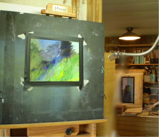
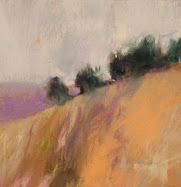
The Evening Light (Bald Ridge)

The Evening Light  (Bald Ridge)
7.2" x 11.2"
Pastel & Charcoal
Casey Klahn
pas camera


This image is from a view that I see out of the north window of my studio, quite a ways in the distance and to the side.  It is a butte that is 3 or 4 miles away.  I have done it, re-done it and done it again.  Perhaps I have it, now.

There is some trouble with my new blog project, but my enthusiasm is growing even with these speed bumps.  I can't wait to reveal it to you.

16 June, 2010

Orange Field and News

Orange Field
8" x 17.5"
Soft Pastel & Charcoal
Casey Klahn
point&shoot


The Prairie Series (soon to be renamed "Edge of the Prairie") continues.  I hope that this series will be my main exhibition at my art fairs this summer.  I am working on three series' at once right now.   

Hoquiam River, Boulders and Prairie. 

Kirkland Uncorked is July 16-18, 2010.  I'll be there and hope to see you. 

Sausalito is September 4-6, 2010.  See you there! I am cooking up a new blog project, which should be ready to go live by the end of the week. Stay tuned.


14 June, 2010

Kirkland Uncorked


Now my friends in the Seattle area can see my recent work at the upcoming Kirkland Uncorked.  This beautiful event is held by the shores of Lake Washington, and is adjacent to downtown Kirkland. It will be held July 16th through 18th - see the hours listed here.


See you there!

Kirkland Uncorked
Kirkland Uncorked Facebook

11 June, 2010

Try a Framed Print


I am offering a limited selection of my drawings and small still life images as prints and framed prints through the Imagekind service.  Search "Casey Klahn" when you go there. Here is your chance, for a limited time (unless I like it a lot and extend the offer forever) to get prints of my drawings at costs starting well under $100.


Casey Klahn at Imagekind.

08 June, 2010

Prairie Understory


Tangled Color
7.4" x 12"
Pastel & Charcoal
Casey Klahn
point&shoot

Here is where I'm keeping my point of view close to the ground.

04 June, 2010

Boulders

Boulders in Gray Woods
8" x 8.9"
Pastel 
Casey Klahn
point&shoot camera

I may have a new series on boulders.  Time will tell.

01 June, 2010

31 May, 2010

Memorial Day


This Memorial Day has been better represented in the news than some others.  Of course, you need to look for it.  Yesterday, our Fair Access Policy (Internet Kibbles) ran low, and so my web surf was slow to nothing.  I thought my days of party lines were over, but everything seems to come back around if you give it time.

Here are the good posts and videos I gathered from my searches.  I also took the time to read some more of a book I have about the World War II Memorial in D.C.  Classic art and architecture.  Bas-reliefs and statuary. I like the architect's words: "...there was a generation of Americans...that we must forever remember." Friedrich St. Florian.


Bas-Relief, US WW2 Memorial. Battle of the Bulge.

Sippican Cottage: Traditional Now; Do Flowers Grow On Pork Chop Hill?

Echo Taps.

Here is a video that I think is better for actual veterans.  Some things only initiates and those who pay close attention can understand and appreciate.  Respectful, grand and moving.

Parades and services are one thing.  I think that hearing a veteran tell stories is irreplaceable if you really want to pay respects.  This one is a helicopter pilot relating his Vietnam war experiences on Memorial Day. Emotional.


Memorial Day has morphed somewhat from a remembrance of our war dead to include all of our departed loved ones.  Here posted are some interesting vids about passed master artists, Henri Matisse and Andrew Wyeth.


Matisse Chapel at Vence: H/T Laura K. Aiken.


28 May, 2010

On The Other Hand - Artist's Quotes


Artist's Quotes.


"I begin with an idea and then it becomes something else,"  Pablo Picasso.

"Artists can color the sky red because they know it's blue. Those of us who aren't artists must color things the way they really are or people might think we're stupid,
" Jules Feiffer.

"Artists are, above all, men who want to become inhuman," Guillaume Apollinaire.

 
"Once, after finishing a picture, I thought I would stop for awhile, take a trip, do things--the next time I thought of this, I found five years had gone by," Willem deKooning.

"The first mistake of art is to assume that it's serious," 
Lester Bangs.

"Its hard to find the light when you're born in the dark," 
Emile Zola.

"I don't know what to do with my arms. It just makes me feel weird and I feel like people are looking at me and that makes me nervous,"  Tyra Banks.

"Poor is the pupil who does not surpass his master,"  Leonardo da Vinci.

"Very few people possess true artistic ability. It is therefore both unseemly and unproductive to irritate the situation by making an effort. If you have a burning, restless urge to write or paint, simply eat something sweet and the feeling will pass," 
Fran Lebowitz.


Note:

Loriann Signori is treating her readers to fresh quotes that she gleaned from attending master artist Wolf Kahn's recent talk.  One thing I like about Mr. Kahn is that he doesn't play the, "I know something you don't know" game.  He generously shares his painting wisdom, and then the challenge is on your shoulders.  Paint well, my friends!

22 May, 2010

Loriann Sees Wolf


Please read Loriann's after-action report on attending a Wolf Kahn seminar.  You will get much from his quotes.  My own Wolf Kahn studies lie here.


Also, around the blogosphere, see Katherine A. Cartwright's post of her Laws of Nature Series as it stands so far.  I am a fan.

12 May, 2010

Overdoing It


P5090233-1.jpg picture by caseyklahn
Studio Life
Overdoing It

Artists always want to know when a painting is finished.  A questioner once asked Wolf Kahn when he considers his painting finished.  Kahn said, "When it is no longer a royal pain in the ass to me."  Intuitive art is often a process of painting oneself into trouble, and finding the way out again.

I wrote recently about reclaiming sanded paper.  I have been taking used paper from my "failed paintings" pile and re-working the images.  The great thing I have discovered is that when I start out with a ghost image, I begin the process already in trouble!

09 May, 2010

Coffee Break - Hospitals, WW II, Kittens, and Bears


Brown-Bear.jpg picture by caseyklahn

So Embarrassing.

 There is never a dull moment around here.  I wanted to have a cup of coffee with my readers and bring you up to date.  Much of studio life takes place outside the walls of the studio.  My studio is on my property in rural eastern Washington, and my family life and other country happenings this week have kept me away from art and this screen.


1. My son, Carson, stayed overnight in the hospital last week with a skin disease.  His skin is now almost clear, and he is doing great.  It was hard for the parents of an eight year old, but for him it was like a stay in a luxury hotel.  He missed school all week except half a day, and last night, I took him to the movies.  I have been updating peeps via Facebook.


coffee.<span class=
2. Yesterday, May 8th, commemorated the end of WW II in Europe.  Sixty-five years ago the unconditional surrender went into effect and was dubbed V-E Day.  The US press was absent, for the most part, in commemorating this, but I see that the UK and much of Europe, and Canada did have ample press regarding this important date.  Since my US audience needs remedial history on this, I have prepared a set of five facts you didn't know about V-E Day, which is at the bottom of this post.


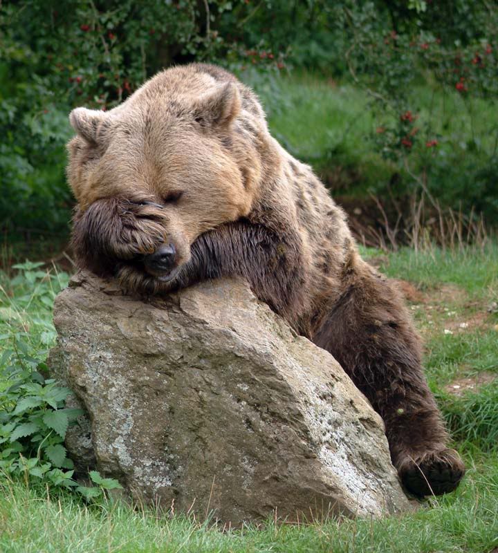
3. Let's do the bear story next.  Yesterday morning I found myself in the woods alone with a bear.  This has happened to me a handful of times, but I usually don't get too charged up about it.  The American Black Bear is pretty much like a big, cuddly dog who leaves you alone if you leave him alone.  This one was different. This bruin was very large, and uncomfortably close.  I estimated about 70 yards away, and above me.  His color was an amazing cinnamon brown, but not like the brown or blond that marks the back of Black Bears sometimes.  This guy was head to claw cinnamon brown, and flawless.  Because of the size, and the unusual color, I started doing the checklist in my head that is titled: "Is This a Grizzly?"


He was looking at me.  I was looking at him and doing the field taxonomy that any sane woodsman does in his head. First, you look for the hump at the shoulders.  Since he was above me, I couldn't make one out, but I did note the distance from shoulder to chest was massive.  The head also lacked that dog shape common to Black Bears.  Instead, it was big and round - I would say massive.  He turned his head once, and then gazed back at me.  He had heard me crashing over branches and had come up to see what the noise was all about.  He was calculating his moves, too.  Is this little thing dangerous to me?  Should I saunter off, or give him the growl?  What does he taste like?


coffee.<span class=The bear's decision was to walk in my direction, which is either the common curiosity of bears, or the run-up to you-know-what.  By this time, I had finished my list, and my new task was egress. He had me tactically, because he was on a level contour, and I had to ascend diagonally to get to the field and "outta there."  As I made my way up, I could see his bright red coat coming through the trees.


So, that was fun.  The neighbor saw a large bear track on the road the other day, too.  A guy looks for this kind of commiseration when he has an out-sized story to tell.  Was this a Brown Bear?  I'll never know.  If he was a Black, then he gets the prize for beauty, and is in my top 3 for size.  I did see a Grizzly in the wild one other time, but it was a roadside event in Banff.  That was a monstrous bear, tearing at roots like a machine, and I would say twice the size of my bear from yesterday.  Except yesterday, I didn't have a car.


4. How to top that?  All the news I have left is the two litters of kittens we have.  My 7 year old daughter finds them much more engaging than my bear story.


Now, all that energy can be channeled into the studio.  See you next time.

Five facts about VE-Day: 


1.  The unconditional surrender document was signed on the 7th of May, and ratified on the 8th.  The allies wanted to avoid the troubles surrounding the WW I armistice by having the German High Command as signators this time.
2. No head of state was present at either the German surrender ceremony or the Japanese one on September 2, 1945.
3. The surrender in the Mediterranean Theater was the 2nd of May, 1945.
4. Susan Hibbert typed the document of surrender in English.
5. The surrender of Italy on September 3rd of 1943 had some wiggle room at first, and only later became "unconditional."


Bear photo: Madfelix.
Kittens photo: Lorie Klahn

30 April, 2010

Degas, French Papers and Pastel Love

Do you need to save money on paper?  Do you have a pile of unfinished works on La Carte paper?  See my report on how I have been reclaiming this paper incorrectly identified as too sensitive to re-use.


While you are thinking about your pastels, indulge in some huge Edgar Degas visuals:


26 April, 2010

Artist's Quotes


"An artist is not paid for his labor, but for his vision,"  James McNeill Whistler.

"There are more valid facts and details in works of art than there are in history books,"  Charlie Chaplin.

"My theory is that all of Scottish cuisine is based on a dare, Mike Myers.

"There is no must in art because art is free,"  Wassily Kandinsky. 

"The creative artist seems to be almost the only kind of man that you could never meet on neutral ground. You can only meet him as an artist. He sees nothing objectively because his own ego is always in the foreground of every picture,"  Raymond Chandler. 

"Art is either plagiarism or revolution,"  Paul Gauguin. 

"Any artist should be grateful for a naive grace which puts him beyond the need to reason elaborately,"  Saul Bellow.

"Art is the proper task of life,"  Friedrich Nietzsche.

"What good are computers? They can only give you answers,"  Pablo Picasso.

19 April, 2010

Memorials and Memories

Pause


Sometimes a guy needs to pause and reflect.  "...a guy."  That's a phrase my late dad used to say.  His youngest brother recently passed away, and I said words and a prayer at his memorial on Saturday.  Uncle Don was 82, and is survived by only one sister, my Aunt Anita.  Don was preceded in death by his siblings.  All eleven of them.  The story of my grandparents, their thirteen children and their pioneering life is a unique American one.  Uncle Don's is unique, too.

Grandpa Max and Grandma Anna homesteaded in the land that time forgot, the Olympic Peninsula.  Think Twilight, only without the amenities.  By no amenities, I mean no electricity.  Did I mention no road, either?  Max hiked the Olympic beach to get to work during the Great Depression, which was a hundred miles plus a little.  The Indians rafted him across the rivers he couldn't ford.  He worked in the logging and port towns of Hoquiam and Aberdeen.

Max and Anna had 13 children, and the seven brothers all went off to war.  My father, Kenneth K. Klahn, saw heavy combat in Italy.  The youngest boy, Don, wanted badly to get in the army and fight the Second World War with his six brothers, but the Sole Survivor Policy prevented that.  So, he got drafted and fought the Korean War instead.  How is that for irony?  I can't say if my seven serving uncles and father is an unprecedented thing, but it is noteworthy.  Where will we get men like that now?

Link
My Grandfather, Max Klahn, is the young boy pictured @ the top right. Next to him at his left are Henry, my Great Grandfather and Charlotte, my Great Grandmother. Location: Quillayute Prairie, WA. Date: 1895. This place is about the rainiest spot in the US.


This weekend, in my home town of Hoquiam , I wanted to continue my series of paintings about the river complex.  Of course, it rained and so I sat in the truck and drew the mist on trees.  I made further arrangements for a show of these works and checked out the venues from the curb.  It will be a special event, I am sure.  The tentative date is a year from September.

My Hoquiam High School class of 1976 have found each other on Facebook, and 25 of us and some family and friends got re-acquainted in Olympia Saturday evening.  One thing we enjoyed so much in the seventies was dancing to loud rock and roll.  How sore can a guy be after dancing and making merry like we did that night?  Ouch.  I haven't had that much fun in a long time.  Every face I saw recalled for me endless good times and fun that we had in our school days.

I was to get together with another high school and college friend on Sunday.  We made the arrangements to meet because his wife was undergoing cancer treatments and he wouldn't be able to come out.  When I called that morning he informed me that his wife had passed away Friday night in the hospital in Seattle.

Can a guy have a fuller heart than I have right now?  I doubt it.  I am back home with my family, today.  I showed Lorie some photos that my aunt gave me when I visited with her.  Aunt Geri and I sat at the dining table, in front of the big corner windows that Uncle Don looked out of for so many years in Hoquiam.  Looking out at the rain, of course.  The week he died, he "saw" my late father as clear as day, she said.  He remarked, "here comes Kenny.  He's coming for me now."
Rest in peace, Melanie, Don, Dad and the Klahn siblings.  I love you.


Top Photo: Lorie Klahn

13 April, 2010

Copy of Mary Cassatt, After Degas

Mary Cassatt, After Degas
@ 24" x 36"
Charcoal & Pastel
Casey Klahn

See my hommage to Mary Cassatt here.

10 April, 2010

Sketching Right

Sketch Landscape
4.5" x 7.28"
Charcoal on Sketch Paper
Casey Klahn


I don't know if you can get more power from a methodical sketch, than from a quick one.  My vote is for the quick, intuitive drawing.  An interesting thing happened with this one.  I wanted to transfer it to a larger pastel sheet, and thought that it was close to the golden rectangle proportions.  In the studio, I always go straight to this tool to find the ratio of the golden rectangle.  I entered the short side of my sketch, which was about 4.5", and the long side was about 7.28," give or take .01".  When I plugged 4.5 into the finder, it said that the golden ratio would be 4.5 to 7.28 - what a coincidence!  I was duly happy.  The ratio for my transfer would be 9:14.56.

A short article on the Golden Rectangle at Pastel: Gimme Five.

For no particular reason, I'm needing some music with the next few posts. "Can't this train outrun those kids?"

05 April, 2010

Color Prairie

Color Prairie Sketch
Small
Charcoal & Pastel
Casey Klahn


Here is a charcoal thumbnail sketch and a color study.  The finished painting will be posted in the future.

01 April, 2010

Free Blog


I'm still blogging, and while I'm at it the studio has been in full fiddle.  Above is a studio on-the-easel image, and I want to begin posting from my sketchbook, as well.  Here is the first of these.

29 March, 2010

Rock Solid Neutrals

Erratic Boulder
6.25" x 8.5"
Pastel & Charcoal
Casey Klahn 


These car sized boulders are called glacier erratics.  They remind me of the way that neutral colors can mimic, or reflect, the colors around them.  This is true of the grays, and of the browns and tans that I used for the grass - they "adopt" the violets and blues that surround them.

26 March, 2010

Ten Life or Death StudioTips

Intent, After Degas
Small
Pastel & Charcoal
Casey Klahn


The other day I found Dadaist, Erik Satie, via Sippican Cottage, and I was amused by the story of the state of his studio after he died.  No one except Satie had there entered for twenty-seven years, you see.  Among the histoire his friends uncovered were love letters and his portrait rendered by his vrai amour, the painter and pastelist Suzanne Valadon.  Also they discovered seven velvet suits, many unpublished songs, some drawings and way too many umbrellas.  What will be found in your studio when they come to collect your corpus?


Since the studio has been my steady haunt, lately, I can offer you these ten tips for studio practice. Bonus: Here are ten that I published two years ago.


1.  Lay out all of your drawing tools, such as charcoal (all sizes), graphite, erasers, stomps, knife and so forth.  Once I did this, it increased my tendency to form my paintings around sound drawings.
2.  Have lots of surface area.  I have a ladder studio organizer, a custom made 2.5 foot by 7 foot by 3 foot table, an extra full size easel that lays down as a table, and several knock down tables of various sizes.
3.  Make some room for your art library.  I use a surplus bookshelf and some wall shelves that are bracket mounted.
4.  Lately I have been mounting my newly finished works on a piece of Fome core or GatorBord and hanging them with a bulldog clip on a nail.  I can reference my current direction that way.
5.  Peg board.  The young 'uns may not remember that funny board with holes and pegs that hardware stores used for all of their displays.  Find them at your hardware store - ask the kid there what it is.  Here's how to install one.
6.  On my pegboards, I hang rulers, tape, architects square, clips and clamps, my field easel and bag, utility knife, and so forth.  Everything's handy.
7.   My eye doctor has me washing my eyelids with baby shampoo.  It treats my lifelong blepharitis, but we all receive a lot of studio contaminates in our eyes.  I use Johnson's and apply with my fingers.
8.  Speaking of studio environmental hazards, I also use a hand barrier cream rather than gloves when I paint with pastels.  Works great.  I tried to find the one I use, but Murphy's Law took effect and it is discontinued.  This one looks a little more expensive, but not as much as others on the market, either.
9.  A pair of studio slippers helps keep you from tracking dirt to the house.
10.  You need a few breaks for the mind. I always have a pair of binoculars at hand in order to keep track of the prairie animals.  Of course, you never leave them on the windowsill, right?


24 March, 2010

Tree School - Green in Trees (New Material)


This Tree School post is a re-write of the one that was originally posted at Pastelsblog in January, 2009.

With a couple of exceptions, every landscape I have done has trees.  But don't expect to see green trees in these pictures.  I want to convince you to almost never use green as your departure point in painting trees.  


The color of your trees will either establish or enhance your overall color composition.  You want unity, and you want a proper color statement.  Sometimes, green just isn't part of that structure.


Green will key the color composition for you. If you wish green as a major element in your image, then use it. If not, then do a color study of your composition first to determine what color you will be making your trees.  The local color of trees is usually green, but if you think about it, there are other local colors of trees. Brown, orange, silver, gray and black are present. Trace or hints of red and blue are very evident to me in trees. Cast colors include violet and blue. When we view our trees in this manner, any color becomes part of the natural palette associated with trees.


Remember that color has much more value than associations with objects. Some assign emotional value to color, but I also think of it's plastic qualities.

Don't become a victim of the tyranny of green.


All images in pastel, by Casey Klahn.
1.   Blue & Gray River  10" x 14.5"
2.   Clear River  7.5" x 9"

3.   Violet & Green Tree  5" x 4.5"


19 March, 2010

Tree School - Tree Admiration


After Wolf Kahn, #1
9.5" x 6"
Pastel on Paper
Casey Klahn


First posted January 21, 2009. This post is updated to offer new links to artist's whose trees I think you should see, and the other set of links can be viewed at the original post, here.


Take a different approach to trees...


Learn from other artists whose renderings of trees you love. Mark me down as a Wolf Kahn follower. His forests of trees are gesture rich, and pure blocks of color are woven into the whole. I did the drawing posted here directly from a WK as a study to try to "get" more of what his methods are.


The Art of the Landscape community is a good place to start your overview of artists who paint nature.  Don't miss Martin Stankewitz, who has a blurb book on this subject.  His style is finely composed.
You might know Bill Cone for his exquisite views of California and the rocks of the Sierra Nevada Mountains.  Recently, he has favored us with tree compositions that are just what you should be looking at to understand the abstract elements of tree groupings.  A real delight.

All of the artists I've mentioned here take a very different approach to trees, and your tree style will become a signature of your own work.

See also:


Land Sketch
Loriann Signori
John W. Stinson
Randall David Tipton


17 March, 2010

Irish Warpipes & Amazing Grace


Irish Warpipes
16th c. Irish Missal,  Bodleian Library Holdings

15 March, 2010

Quotes Blast

 Under Riva Ridge, Italy
 @8" x 5"
 Charcoal
 Casey Klahn


Never interrupt someone doing what you said couldn't be done.  Amelia Earhart.

Fads are the kiss of death.  When a fad goes away, you go with it.  Conway Twitty.

In the dime stores and bus stations, people talk of situations, read books, repeat quotations, draw conclusions on the wall.  Bob Dylan.

Art is made to disturb, science reassures.  George Braque.

The history of modern art is also the history of the progressive loss of art's audience. Art has increasingly become the concern of the artist and the bafflement of the public.  Paul Gauguin. 

There's a lot of whiners in every crowd.  R. Lee Ermey.

I bought some batteries, but they weren't included.  Stephen Wright.

You would be wise not to finish a painting.  Wayne Thiebaud.
  
When you cease to exist, then who will you blame?  Bob Dylan. 

I make pictures and someone comes in and calls it art.  Willem de Kooning.

I always wanted to be somebody, but now I realize I should have been more specific.  Lily Tomlin.

In art the best is good enough.  Johann Wolfgang von Goethe.


Brainyquote.com

10 March, 2010

Shape Up - Abstract Organic Shapes

Originally posted January 19th, 2009.

Blue Trees in the Middle Distance
7 - 3/8ths" x 5.75"
Pastel
Casey Klahn


Consider the words of this blog title, "abstract organic shapes." For a sound and enjoyable study of shape, see Diane Mize's post, And Then There is Shape. An organic shape is one with a random pattern or irregular edges - just the opposite of geometri
c shapes. Abstract means non-specific or simplified. A non-tree tree, if you will. More of a shape than a technical study of leaves, foliage, branches and trunks.

Think twice before you include trunks, branches or leaves


If you want foliage, then make your tree as formless as possible.Irregular, and
abstract. Think twice before you include trunks, branches or leaves. A better direction to go instead is to ask yourself how this shape will effect your overall composition. Back all of the way out of the picture plane, and make a value and shape sketch. How big will the tree or trees be? Will they form a unified mass? What will the relationship of these trees be to the other elements in my painting?


Consider the image posted today, Blue Trees in the Middle Distance.

Since we are building a landscape here, albeit an abstracted one, we have chosen to model the form of our trees. Keep it simple, with roughly three values only. As with strict realism, we have opted to not go very broad with our value range. An almost black violet, a dark middle ultramarine and a middle violet do everything we need them to do to represent two trees on a slope. We keep the diagonal strokes all parallel, which heightens the gestural effect of our marks.

An unrelenting melancholy


Anchor the trees to the ground with well placed shadows, and a dark line where we interface with the ground. Higher key colors in front of and behind our trees help with modeling. Atmospheric effects of the ridge, sky and clouds push them back, and limiting the palette help with unity. Again, we keep our gestural effect with our marks - they don't conflict.

An almost unrelenting
melancholy pours down the picture plane, brought about by the blue and the clouds. A critique was written about this painting, here.


09 March, 2010

Trees On The Prairie

Prairie Bush
5.25" x 12.75"
Pastel
Casey Klahn


The Prairie Series is beginning to show a direction. I am starting to be able to enumerate the things that I am trying to say visually with these paintings. It is more about trees on the prairie than it is the open spaces. Perhaps the open spaces will be my next thing, but I feel these have a kinship with my last series, The River Series. It is a visual relationship - not a naturalist or descriptive one.

It could have been a series about abstract land masses, which is a great theme for these open spaces in the American west. But, I kept focusing on eye sumps, like dark masses and colored splashes in foliage. The relationship of the tree to the whole is also key in good
landscape paintings.

I wanted to add some words - essays and texts - to this series. Then I realized that I already have a series about trees, called Tree School, at my blog Pastel. Please enjoy these lessons on rendering trees. I think you'll find them unique, and I will be bringing them here interspersed with my new prairie pictures as I get them photographed. I also hope to write new texts to the Tree School, and together we can watch the Prairie unfold.


Originally posted January 15th, 2009.


Tree Study in Turquoise
@ 6" x 5"
Pastel
Casey Klahn


The title "Tree School" sounds like it belongs at an arborist's convention, or maybe a logging camp. But, I want to offer my artist's take on rendering trees with pastel.


Trees can be an awful distraction in a painting. Especially if they are present but not the subject, and if they take up too much of your effort.

We all enjoy graphite drawings in detail of a beautiful tree. Great texture, perfect modeling, and wonderful presence are what please us. But, that is the tree drawing where the tree is center stage; the star of the show. What about when the landscape is about things other than how the trees look? What do you do then?

Additionally, you can face a problem when the trees are the main content, but not the subject. I mean by that the painting where a color composition is the subject of the painting, or maybe something like the motion of one's eye through the woods. Trees have a built-in drama to them, and I propose that too much detail can distract from the message.

Return here to attend my short course on trees in pastel, and I leave you with this hint: don't begin with green.

04 March, 2010

Banner Banter - How To Make a Blog Banner


Banners and Badges Are Creative Blog Design Elements


Here is a special thanks to those of you who voted to choose a new blog banner. The gray banner has prevailed. There were 16 votes for gray, versus 11 and 10 for the brown and green ones, and some sentiment for keeping the old one was expressed.

A new and attractive blog banner
can be the most dramatic change for your blog, next to selecting a new template. Yesterday's post presented various types of creative blog banners for your inspiration.

This post will link you to the simplest tutorials I have found for creating and posting a new banner to your blog. I won't touch on platforms other than blogger, except to say that I think the information here on designing and creating your banner will benefit you no matter which platform you use. I will add the following advice that I found helped me. I use Photoshop Elements (version 2!).

  1. Determine the size that you want your new banner to be. I experimented with my old one and discovered that 717 x 426 pixels was my preference for a banner in my particular template. When you open a new file in Photoshop, designate the size you choose.
  2. A helpful hint in choosing a banner size is to find an image that you feel is an approximate of what you want to make and open the properties by right clicking on it. Use that as a starting point, but don't copy - you want to stand out.
  3. Notice that a few of the banners I linked make their statement in a small space, about 70 pixels tall. That may be your solution if you want to cut to the chase. Charley Parker's is 593 x 110.
  4. Why not allow your readers to participate in choosing a banner design by polling them?
  5. Make sure your finished product doesn't look pixelated, or fuzzy, when you post it at your blog. I suggest that creating it in the right size, by pixel dimensions and by dpi, will do the job. I try to create my designs in a 200 or higher dpi, and then I save them at 110 or so to make sure they look sharp enough. In my (uneducated) opinion, most people's web feeds can support at least an image of 110, rather than the old 72 dpi. Any other opinions on this?
Some have advised against big banners, and I sympathize with that opinion. I have gone with a big banner to make a graphic statement and to make my blog recognizable. I have found that there are many ways for readers to arrive here, and usually they have followed a subscription tool, which highlights the image or title of each post. The downside of having your post "below the fold," as Katherine van Schoonhoven says, is not too critical, in my opinion.


How to make a banner and post it:

Blogspot Tutorial
Photoshop Tutorials
Paul Stamatiou
Design Mom (embed code tutorial provided)


Don't forget to have a tag line. I like Angela Taylor's, "I have marks to make." Mine is "New School Color." Many bloggers make the name of their blog fit a tag line, such as "Robin Pucell, Watercolors in the Plein Air Tradition." I think it's important to include your name somewhere in your header, because people want to view and buy art from an artist. An internet nom de guerre doesn't help in building your artist profile.

Keep in mind the overall look of your blog, not just the header or banner. Also, your background color. The Colorist sported a mid-value blue-gray background for the first half a year of its life. When I went to white, the added light was well worth it as far as my art was concerned.


Why I'd never make it as an IT guy.


03 March, 2010

Banner Banter - Banners I Like


Blog banners I like are linked below. Tomorrow I'll post a "How To" for those who want to upgrade their own blog banner.

Paint2day (modest sized banner)
Chris Earnhart (irony and graphic pop)
Deborah Paris (has a new banner!)
Jennifer Phillips (artist in action)
JafaBrit's Art (story time)
Laura K. Aiken (remember to include your name like this)
Charley Parker (thin to win)
Brian McGurgan (definitive art image)

02 March, 2010

Blog Remodel Underway

Sketch WW II Climber
11" x 9"
Charcoal, Pastel and Compressed White Charcoal on Rives BFK
Casey Klahn


The Colorist blog is undergoing a
remodel, and that includes new tabs, a sidebar clean up and a new banner. The strategic concepts were aided by the rigorous mind mapping which I posted about here and here.

One thing already accomplished is a revamp of my profile by:

  1. Killing the blogger profile widget and adding a picture that links to my blogger profile;
  2. Updating my picture at my profile (and then I had to go around to my other communities, like Twitter, etc., and change those to match);
  3. Cleaning up my blogger profile page;
  4. Placing the profile in my tabs rather than in the sidebar.

Further cleaning will involve deleting as many sidebar widgets as possible. I have added a few that I feel I will want after the clean-up, so it looks more crowded than usual now. My criteria are that they have utility. I value widgets that link within the blog, those that link to other content I have placed on the web, such as an artist statement, other blogs, website or whatever, and those that link to other authors' blogs. Next, there are the blog awards, which gives a reader a sense that "this blog has enough merit for me to read." There is the Follow widget, which I have found to be my easiest way to read around the blogs I like. Ditto the bloglist with thumbnails, although I find it to be so space-filling that I keep mine short. Time to clean that one up to reflect current blogs, too.

More widgets are there, as well, but I admire blogs like Steven LaRose whose blog Fish or Cut Bait, is so devoid of marginal clutter that the result is a page that reflects a graphic statement I like very much. It points more readily to his content, but I also love the contrast it provides to his rigorous abstract art. Cool.


Tech crazy, yet?


Labels have become a tag cloud, thanks to the input of my readers who voted for this. For now, I opted for the blogger version. Maybe a better one will appear later.

Next post: Banner Banter (including a How To make a banner and post it).
Still to come: Keeping Tabs. Find out what have I decided to do for blogger tabs.


Abstract Expressionism, Art Criticism, Artists, Colorist Art, Drawing, History, Impressionism, Modern Art, Painting, Pastel, Post Impressionism