
Casey's Palette
Intensity was my self selected assignment for the two month color study that Katherine Tyrrell has been posting about. Here is what I found out about intensity, and how it relates to the elusive color space theories.
Consider me a convert to the linear color space proposed by Da Vinci. The reasons are that the spectrum lays out in a linear fashion when you view it through a prism, and that my actual palette is arranged in a line.
Also, I understand that violet cannot be produced in the additive system except by blending, and that red violet inhabits a pole opposite blue violet on the spectrum. I know that sounds horribly brainy and hopelessly immaterial to the pastelist. Let's just say that the visual perception side of the house teaches me that light is a dominant reason for intensity in color.

Put plainly, your eye sees wavelengths at their highest meter and this represents greatest intensity. See this page about wavelengths and color. Need it plainer? See this page.
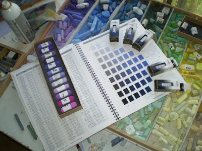
High key (more intense) blue is the peak of its wavelength, and so is high key green. I understood this intuitively before I knew the why of it, and made a special place in my palette for high key green. Later, I organized the blues by key as well.
I like Marie Meyer's use of the Munsell system as a number space, since their is a linear aspect to the numbered hues. Although the Munsell is a cylinder, I like seeing the linear description better. But, I find Munsell too abstract, and apropos to the additive people. My own color space will always be subtractive and pigment mixture based.
 Pastel Collecting 101

Katherine Tyrrell, at Making a Mark and her other web sites, is engaging in a two month long study of colour. I think this will become one of the best organized references available about color on the web. I will be participating by studying the characteristic of "Intensity".
First, some groundwork on color theory.
Of course color is a problematic study. Opinions vary, and dogmatism can be a booger. Artists may be dogmatic based on what they learned in art school. People who use computer-based color applications will be off in their own strange world, adding lights of various colors to their white base. Painters will vary a little from print makers, and the dye-using artists also differ in their color models.
The important thing to remember is that points of view exist, and to keep in mind that you need a point of view that works for you. But, it doesn't hurt to be grounded in reality, either. So, measuring results helps. Science brings us that.
If science gives us conceptual theories, we should also feel indebted to Modern Art for uncoupling artists from the hegemony of visual perception. What I mean is this: I don't care at all how other's "perceive" color, or what the "mean average" is for perception of a given color, What I care about is how I use colors!
Put a different way, there has been much written about the ineffable state of color. Colors are perceived differently from person to person; visual perceptions are the result of mental processes and even psychology; cognitive and computational variances; blah, blah, blah. I don't want to ignore the science, but there is an intrinsic color there in the pigment and it behaves the same from day to day, your "perception" be damned.
 My own recent studies of color have me occasionally pitching fits because the dominant paradigm on the internet is based on computer uses of color. When artist's use of color is addressed, it often is delivered through the lens of the new paradigm, and what results is misinformation, mistakes and generally not useful stuff for the pigment user.
In a rare entry of clarity, the Wikipedia on the Color Wheel has this to say:
There is no straight-line relationship between the colors mixed in pigment, which will vary from medium to medium. Whereas with a psychophysical color circle, the resulting hue of any mixture of two colored light sources can be determined simply by the relative brightness and wavelength of the two lights, a similar calculation cannot be performed with two paints. As such, a painter's color wheel is indicative rather than predictive, being used to compare existing colors rather than calculate exact colors of mixtures. Because of differences relating to the medium, different color wheels may be created according to the type of paint or other medium used, and many artists develop their own individual color wheels. These will often contain only blocks of color rather than the gradation between tones which is characteristic of the color circle.
The difference between the artist's pigment "color wheel" and the other color theories is best understood by the different colors anchoring them. Red, Yellow and Blue are the primaries of the pigment user because they cannot be mixed from any combination of other pigments. The science oriented, and the print maker or computer user, will identify some other set of base colors because of how light functions. I want to call that "experiential", and the pigment based paradigm I want to call "elemental".
I also want to wretch when someone wishes to impress on me that the "real primaries" are Red, Green and Blue because of so-and-so's color circle theory, or because of the way one's eye perceives color. Fine, I say. Show me that with paint on a palette!
So much for my color model position. Next: Intensity!
Skip these links if your brain hurts thinking about color as perception:
Qualia - Mind numbing experiential theories including color perception.
Paper on the Ineffability of Color.
Abstract Expressionism, Art Criticism, Artists, Colorist Art, Drawing, History, Impressionism, Modern Art, Painting, Pastel, Post Impressionism

 Casey's Palette


