Showing posts with label Art Criticism. Show all posts

09 December, 2013

Time and Grace


Saying Grace, 1951. Norman Rockwell.


I'm proud to describe myself as mostly self-taught.  My only formal art schooling was the unusual program founded by Norman Rockwell and his peers: the Famous Artists School for Talented Young People.  It was a matchbook correspondence course, but I noticed, to my lifelong delight, that the courses placed a high premium on the finer qualities of art, both contemporaneous and historical.  I recall that the first leafed picture in my big binder was a landscape by Vincent van Gogh.  

Norman Rockwell has enjoyed the popular confidence of the American public, but his narrative style has also been roughly handled by gatekeepers of the fine arts.  Turns out Rockwell is more eclectic than they.  Here is a quote describing his take on larger place in art:

I don’t see things the way modernists do, even though I enjoy studying their work.

He studied their work?  Go on!  I can tell, because he organized his paintings with incredible intelligence and an eye for the formal elements of art.

Norman Rockwell's painting, Saving Grace, 1951, achieved the mammoth auction price of forty-six million dollars at Sotheby’s on Wednesday, December 4th.

Rockwell agonized over his painting; he probably lost money on it, but he was the only one who did.  - David Apatoff.

Can illustrative art rise to the heights of the numinous descriptor "fine art?"  What about representational work, which has also been denigrated as too pedestrian for upper-strata tastes? The best commentary I've read is by blogger David Apatoff.  You will find some depth to this story at Apartoff's blog; do have a look. This sale is indeed a newsworthy event, and it is a thumb in the eye of Rockwell's host of detractors over the years.  

When will we ever learn?  The subjective parts of painting are important, but should they consume our every critical thought about a painting?  Even a formalist can appreciate, and indeed love, the form of Norman Rockwell's brilliant work.  His keenly observed art rises to the fine, and challenges the boilerplate of how art "must" be done. 

Norman Rockwell sells for $46 Million.

WARRING WITH TROLLS, part 5.

Illustration Art, by David Apatoff.

About the Famous Artists School Founders.

18 April, 2012

The Conversation, 1938: Henry Matisse' Timeless Drawing-Painting

###

San Fransisco Museum of Modern Art, SFMOMA


“...balance, of purity and serenity.” 

Matisse Describing His Art.


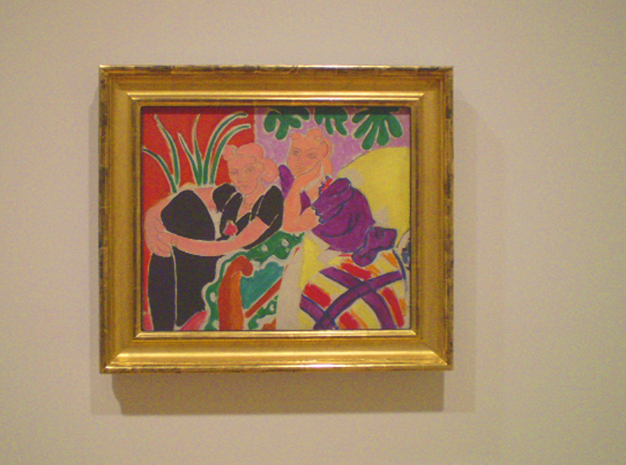
It would be too easy to spin tales about conversations, such as the one suggested by Henri Matisse's two women in The Conversation of 1938. Instead of that, let's listen to what Matisse has really said with his Modernist masterpiece.

It is fair of the SFMOMA to use Conversation in the context of a dialog in the exhibit on the second floor, where they have set up a “conversation” between the works of different artists in their permanent collection. Compare Marcel Duchamp to Picasso and Matisse. Does Matisse speak to Mark Rothko and Jackson Pollock, two rooms away, and if so, what does he say? Consider Jasper Johns or Andy Warhol: how do they interact with the history of Modern art? Then you have the obvious question: what are these artist's saying to the viewer?


The Trajectory of a Masterwork.

Henri Matisse named two paintings The Conversation, but the 1938 piece that I saw three weeks ago in San Francisco is more than just a depiction of parlor conviviality. The Conversation, 1938, is an effortless, masterful work that is a colorist piece and is rooted in the timeless elements of painting. It also unites the qualities of drawing and painting in thoughtful ways that only Matisse could accomplish.


“Matisse was an artist in the medieval sense of the word,” said the French historian Regine Pernoud. By referencing another era, Pernoud suggests the artist's aim was over the horizon, not just his own time.  Art is the root word of both artifice and artillery. Could Henri Matisse (I am borrowing a page from his World War II era) have shot a creative shell across the ages?


My Snapshot of The Conversation, 1938
SFMOMA official image here.


Back To Basics.


By the 1930s, Matisse was leaving behind Odalesques and returning to his bold and active earlier style. The Dance, 1932-3, featured monumental figures whose energy moved outside of the confines of the mural. His illustrations for Ulysses, 1935, were 26 line images that reinvigorated Matisse's sensibilities for the drawn figure. He said, “I do not reason when I draw; I don't know where I'm going.” For Matisse, drawing was an expressionist act, and his paintings were to become infused with this element again.

Although the faces of the two women in The Conversation may have been done with a rigger brush and paint, they give one the impression of transparent paint over pencil lines. To further emphasize this effect, Matisse draws each woman's hair and face together as one area and uses the same flesh color for both elements. Matisse outlines the figures and room elements – a total departure from a painter's desire to lose edges. Instead, Matisse draws in all of the edges; sometimes with negative white lines, and at other times with pencil-thin gray lines.


The Figure, The Color and The Space.

  • The woman on your left recedes in a pure black dress, while her companion springs forward in a violet, yellow and red dress.
  • The room is an effervescent pattern of colors, with compliments of red and green, blue-green with red orange, and the triadic relationships of violet and green and then the yellow and green sofa.  
  • Both women form a triangular mass, the wall is divided vertically and there is a diagonal line created by the sofa's edge, arm and a red triangular shape at the bottom.  There is an X formed in the center of the picture by the edge of the black shirt sleeve and the elbow of the woman on your right, and the arm of the sofa.  
  • Perspective is not achieved with  lines and atmosphere, but by the relationships of colors and  masses - Modern Art meets timeless divisions of the picture.
  • There is a heart shape to each face, and a heart shape can also be suggested by both faces together with the bottom being the elbow.
  • There is a a curvilinear pattern of lines and shapes around the interior of the space - they read gracefully.
  • One woman's eyes gaze to the left, and the other to the right, which adds to the expansiveness of the picture.  Dreamy and pleasant, the two are caught in a moment of happiness.


Someone has said that a painting can no more be about color than a party can be about Tupperware. Look again at Matisse and reconsider this. He uses colors as the space, suggesting both a scene and a pattern simultaneously.  The comparisons between the colors become movements, and the use of pure tones, without shading, arouse both excitement and harmony.  The feeling is one of a brightly lit midday, illuminated by the southern sun.


“Do you find perfect correspondence between the nature of the drawing and the nature of the painting? In my opinion, they seem totally different from each other, absolutely contradictory. One, the drawing, depends on linear or sculptural plasticity, and the other, the painting, depends on colored plasticity.” Henri Matisse.

<><><>


Art Is Long.

Physicists think about the properties of time; they wonder if it bends or slows down under special conditions. Can fine art add anything to the conversation about time? When I am standing in front of Matisse's The Conversation, time is folded for me. This artwork may have been painted seventy-three years ago, but I am experiencing it in the here and now. If I understand the artwork, even minimally, then the artist and I are having a conversation of sorts. 

 We feel old, and somehow wizened, when we enjoy a masterwork. Henri Matisse has made what is, for me, the greatest contribution to the gallery space at the SFMOMA with The Conversation. It appears graceful and effortless in comparison to Picasso, Braque and Morandi, whose works hang in the same space. Does Marcel Duchamp, whose urinal is presented in the next room, really diminish art by his funny and outrageous installations?  His "readymade object" seems even more absurd directly after looking at Matisse's superb contribution to the canon of Modern Art. More on Duchamp in a later post.

With energy and singularity, and with clear, bright pictorial statements, Henri Matisse has given us more than words.  He has brought grace to the conversation about the art of the twentieth century.


Henri Matisse
1869-1954


The beautiful photo of the SFMOMA by cbrady2 at Photobucket.  This post is republished from April, 2011.

26 April, 2011

The Conversation, 1938, by Henri Matisse

San Fransisco Museum of Modern Art, SFMOMA


...balance, of purity and serenity.” 
Matisse Describing His Art.


It would be too easy to spin tales about conversations, such as the one suggested by Henri Matisse's two women in The Conversation of 1938. Instead of that, let's listen to what Matisse has really said with his Modernist masterpiece.

It is fair of the SFMOMA to use Conversation in the context of a dialog in the exhibit on the second floor, where they have set up a “conversation” between the works of different artists in their permanent collection. Compare Marcel Duchamp to Picasso and Matisse. Does Matisse speak to Mark Rothko and Jackson Pollock, two rooms away, and if so, what does he say? Consider Jasper Johns or Andy Warhol: how do they interact with the history of Modern art? Then you have the obvious question: what are these artist's saying to the viewer?


The Trajectory of a Masterwork.

Henri Matisse named two paintings The Conversation, but the 1938 piece that I saw three weeks ago in San Francisco is more than just a depiction of parlor conviviality. The Conversation, 1938, is an effortless, masterful work that is a colorist piece and is rooted in the timeless elements of painting. It also unites the qualities of drawing and painting in thoughtful ways that only Matisse could accomplish.


“Matisse was an artist in the medieval sense of the word,” said the French historian Regine Pernoud. By referencing another era, Pernoud suggests the artist's aim was over the horizon, not just his own time.  Art is the root word of both artifice and artillery. Could Henri Matisse (I am borrowing a page from his World War II era) have shot a creative shell across the ages?


My Snapshot of The Conversation, 1938
SFMOMA official image here.


Back To Basics.


By the 1930s, Matisse was leaving behind Odalesques and returning to his bold and active earlier style. The Dance, 1932-3, featured monumental figures whose energy moved outside of the confines of the mural. His illustrations for Ulysses, 1935, were 26 line images that reinvigorated Matisse's sensibilities for the drawn figure. He said, “I do not reason when I draw; I don't know where I'm going.” For Matisse, drawing was an expressionist act, and his paintings were to become infused with this element again.

Although the faces of the two women in The Conversation may have been done with a rigger brush and paint, they give one the impression of transparent paint over pencil lines. To further emphasize this effect, Matisse draws each woman's hair and face together as one area and uses the same flesh color for both elements. Matisse outlines the figures and room elements – a total departure from a painter's desire to lose edges. Instead, Matisse draws in all of the edges; sometimes with negative white lines, and at other times with pencil-thin gray lines.


The Figure, The Color and The Space.

  • The woman on your left recedes in a pure black dress, while her companion springs forward in a violet, yellow and red dress.
  • The room is an effervescent pattern of colors, with compliments of red and green, blue-green with red orange, and the triadic relationships of violet and green and then the yellow and green sofa.  
  • Both women form a triangular mass, the wall is divided vertically and there is a diagonal line created by the sofa's edge, arm and a red triangular shape at the bottom.  There is an X formed in the center of the picture by the edge of the black shirt sleeve and the elbow of the woman on your right, and the arm of the sofa.  
  • Perspective is not achieved with  lines and atmosphere, but by the relationships of colors and masses - Modern Art meets timeless divisions of the picture.
  • There is a heart shape to each face, and a heart shape can also be suggested by both faces together with the bottom being the elbow.
  • There is a a curvilinear pattern of lines and shapes around the interior of the space - they read gracefully.
  • One woman's eyes gaze to the left, and the other to the right, which adds to the expansiveness of the picture.  Dreamy and pleasant, the two are caught in a moment of happiness.


Someone has said that a painting can no more be about color than a party can be about Tupperware. Look again at Matisse and reconsider this. He uses colors as the space, suggesting both a scene and a pattern simultaneously.  The comparisons between the colors become movements, and the use of pure tones, without shading, arouse both excitement and harmony.  The feeling is one of a brightly lit midday, illuminated by the southern sun.


Do you find perfect correspondence between the nature of the drawing and the nature of the painting? In my opinion, they seem totally different from each other, absolutely contradictory. One, the drawing, depends on linear or sculptural plasticity, and the other, the painting, depends on colored plasticity.” Henri Matisse.

<><><>


Art Is Long.

Physicists think about the properties of time; they wonder if it bends or slows down under special conditions. Can fine art add anything to the conversation about time? When I am standing in front of Matisse's The Conversation, time is folded for me. This artwork may have been painted seventy-three years ago, but I am experiencing it in the here and now. If I understand the artwork, even minimally, then the artist and I are having a conversation of sorts. 

 We feel old, and somehow wizened, when we enjoy a masterwork. Henri Matisse has made what is, for me, the greatest contribution to the gallery space at the SFMOMA with The Conversation. It appears graceful and effortless in comparison to Picasso, Braque and Morandi, whose works hang in the same space. Does Marcel Duchamp, whose urinal is presented in the next room, really diminish art by his funny and outrageous installations?  His "readymade object" seems even more absurd directly after looking at Matisse's superb contribution to the canon of Modern Art. More on Duchamp in a later post.

With energy and singularity, and with clear, bright pictorial statements, Henri Matisse has given us more than words.  He has brought grace to the conversation about the art of the twentieth century.


Henri Matisse
1869-1954


The beautiful photo of the SFMOMA by cbrady2 at Photobucket.

08 April, 2011

Have a Dish of Modern Art

Come with me, dear reader, on a walking tour of the San Fransisco Museum of Modern Art.  I'll be focused on the older holdings, since those are the artworks that have been subjected to the acid test of time. First, may I present my card?


Don't be fooled.  I will be praising here as much as criticizing, because I am an adherent of Modern Art.  But, it helps to have a healthy handful of skepticism when you are viewing the Moderns.  I don't let their notoriety get in the way of my having a go at the master artists' works.

The Tour.

The SFMOMA introduces their permanent collection exhibition with the Fauvists and Cubists who painted at the beginning of the Twentieth Century.  Matisse's be-hatted wife,  Amélie Parayre, invites you to enter. The layout of the second floor  weaves around different rooms, establishing a timeline of Modern works and telling the story of progressive ideas in art.

The first room gives way to anti-art statements by Marcel Duchamp, and an eddy-out shows off the museums proud holdings by Paul Klee.  I was attracted to the next room from an historical sense, if not as much for the art.  These were the large format Diego Rivera and Frida Kahlo paintings. Next are the mid-century rooms, where the larger-than-life heroes are presented, such as Mark Rothko and many, but not by any stretch most, of the Abstract Expressionists.  This was my favorite room, after the early Modernists.  More details on that later.

As you leave the rare air of Abstract Expressionism, and continue to the next rooms, you may become, as I was, lost at the soul-level.  Not for ignorance was I lost.  I am well aware of the movement to supersede painting with objects and experiences.  In these rooms you find the advancement of Pop Art, and the experiences of video and installations.  Thus begins the boredom.  That's me.  I love painting and sculpture, and don't feel the need to replace them in the Post-Modern sense.

Opinions.

Pride of place at the SFMOMA is given to Woman With A Hat, by Henri Matisse.  Even now, one-hundred and six years after completion, this painting appears different from anything else ever painted, except maybe by Matisse, himself.


Because this was my first opportunity to view a painting by Matisse, I spent a lot of time with Woman With A Hat, 1905.  I have been under Matisse's influence fairly heavily for the past year, having read the massive two-volume biography by Hilary Spurling, as well as a couple of lesser volumes on this master.  It is easy to see why HM is noted as an early, major influence on Modern Art.

Matisse is much better than I thought he was from even the glowing books and articles I have read.  This is a good example of how actual real life viewing is superior to the printed page or the CRT.  In those, I have to say I desired something else out of the man.  I wanted flow.  I wanted skill and expression.  

In the three Matisse paintings that the SFMOMA has on view, I found my wishes fulfilled.  Well, maybe more so in two of them, because the one still life looked just plain wrong to me.  It was forced, and especially it suffered from being hung next to a Morandi.  But The Conversation and the Woman With A Hat were outstanding paintings.

Woman With A Hat presents a mix of skilled brushwork, and savage beastly work as well.  Matisse flattens, pops, effuses and describes all at the same time, and he never does it meanly or without intention.  You get the tension between the flattering and the fatuous; the intimacy and the utility; the fine and the fierce.

I began to see a color that I have only been aware of in a minor way before.  It is the canvas color of old egg-white, with blushes of pale yellow and pink in this particular case.  This comes in better focus when we look at Joan Mitchell and some other works later on.

If you look closely at Edgar Degas' work of the same era, you see greens, blues and other wildly non-objective colors on the faces of his women.  But, Matisse is presenting the colorist view here, which is that the colors, along with the forms, are central to the ideas presented.  Not just as colors, or as not-true colors, but in the role of exposing new ways of seeing a painting.  Paintings are flat artifices, revealing other things about our world than rote description.  Their beauty is a transformational value; they are a tool for change and progress.  Amelie is beautiful in ways not under the tyranny of the caliper and the ruler.

Maurice Denis wrote that Woman With A Hat embodies "des noumènes de tableaux," which can be translated as the pure reason of ideas in the picture.  If so, it was a breakthrough of painting from abstract ideas; from instinct. It raised the bar.

I could go on.  I love The Conversation, 1938, Matisse, even more.  It is the greatest representational painting on view in the museum in my estimation, and it hangs in a room with Picasso, Morandi and Braque.  More on that next time.

Woman With A Hat
o/c, 1905
31.75" x 23.5"
Henri Matisse

Notes.

  1. Woman With A Hat.
  2. "Genuine points of comparison for Woman with a Hat are few." T.J. Clark.  In depth essay on Matisse's painting.


03 June, 2009

The Axe Falleth


Smackdown_2952009___Rey_Mysterio-2.gif image by caseyklahn
Smack Down the Axe

In the comments section of my recent post, Red Tree, a good conversation took place about the role of the artist as self-critic. In the post, I said:
"A thing I do is, after completing a run of artworks, I will spot a couple of dogs in the lot, and axe those. Then, I will look at the remainder, and axe the two or three weakest paintings, as well."

Here is the conversation.

Carolyn L. asks:

"While you are 'axing' what questions do you ask yourself? What do you look for? Do you have a specific set of guidelines you apply? While I am sure the process is not entirely objective, there must be a thought process you pursue. Learning to evaluate one's own work is not easy. It is not a skill directly taught in art class. I would like to hear your take on the subject."


My response:

Good questions, Carolyn.

Sure, the first thought is something subjective. A niggling something that isn't right (usually a compositional problem). Often, the compositional issue has to do with proportion. Some element is too big, or too small.

The big problem is when it's close to okay, and then the struggle starts.

Distance of a day helps. I sit and look at my work a lot. I tape or tack the series on the wall and stare and evaluate. I use mats or tape to frame them. I get the rejects out of the way, although they still reside on the wall somewhere out of the way. A stack of rejects (or 2 or 3 stacks) sit around the studio, and I can refer to those for ideas later.

No guidelines. That's a little too static for me.

I look for strength in a painting.

I don't outright reject a work for technique issues. Some mistakes are okay with me if the point comes across. And, meanwhile, I am on a program to improve my technique! There's a contradiction there for you.

Some very important reasons for rejecting an artwork are if they don't fit the series, or my style direction. In that vein, I will get rid of works that have too many sharp or defined edges, or too much detail, compared to the whole.

Another issue can be dull spots where the paper just packed up too much with pastel.

Another problem can be value comparisons. Bad value progressions - too stark or too similar, are a bad thing.

Maybe a shape of an element isn't right. Too regular; wrong size or direction.

Endless...and people think art is easy!


Diane Wenzel then followed up with this question:

"Casey, your review of critical axing is very useful. But how is it when you begin a series? When you are in the heat of creation, what do you do with your critical hacking voice? If the hacker is asleep, I can see how you might become caught up in one place adding unwanted, useless details."


Me:

Well, Diane, it sounds like you are asking two questions. One: how to edit a whole series at the start. The other: do I get caught up in a the process and add superfluous stuff?

Or, perhaps you are asking that if the series is in its infancy, how can I tell which parts belong?

I never choose a series from an idea. The series presents itself based on a successful image that needs to be explored many times. So, the series is already a successful image and hopefully never contrived.

What are the qualities of that first successful image (or two)? These become my criteria. Also, my whole art statement comes into play (color - modern treatment - realism - abstract heavy).

Superfluous stuff? I go down that road often. That's why I have to edit the works after they are done. Interestingly, I will be in the groove and create nice works with new and fresh passages, and all is well then. Other times, I won't even know what I am doing in the studio!


04 December, 2008

Riposte -Repost

I am making a fine recovery from my operation on Tuesday. It will be a while before I am 100%, as my medical professional wife and I agree, it would be hard to find a more painful operation to have done. Meanwhile, enjoy a re-posting of this Barn subject essay.


Elijah Shifrin at Art & Critique
has written about my barn and rural building subjects in his article, "Casey Klahn: Barns And The Abstract Wizard Of Washington".

Elijah is thoughtfully focused on the abstract qualities of my building paintings. I have carefully tried to avoid being cast as "the barn guy". The reason is that sentiment is so easily attached to this great American symbol, and yet sentiment is bygone content in contemporary art. The challenge has been to de-construct this awe inspiring structure and make it relevant for today's art.


My Barn
Photo: Lorie Klahn


Working against my efforts to keep the barn image down have been a number of forces. Sales, believe it or not, has been a force tugging at my shirt tail. The popularity of this theme and image, the American Gambrel barn, has been so high that sales of anything barn related are a fairly easy turn. The great thematic content that is associated with the barn is reflected by the book cover that has my Red Barn with Ramp image on it: An Anthology of American Literature, by McMichael. Another force is the fact that I live out here in the rural landscape where every farm has a big barn.


Barn Sketch
Pencil
Casey Klahn


Here in Davenport, WA, the barn isn't just American myth writ large, but an actual part of our lives. To be sure, the way of life is changing. The Heath family pioneered this farm at a spot about five minutes walk down canyon from my house. When the internal combustion engine started to replace livestock for locomotion, the farmers were able to build their houses and outbuildings uphill and farther from spring water sources. My family are the third owners of this farm, and the agricultural roots are gradually being eclipsed for a number of reasons. How wonderful for us to not see another house from ours!


Violet Oil Drum
7.5" x 10.5"
Soft Pastel
Casey Klahn


I'm heartened that Elijah has seen the abstract elements that are key to these building paintings. Shapes, colors and position are the content, more than the buildings themselves. Don't get me wrong. I'm as much a sucker for the deep meaning of the American barn as the next guy. My father built a barn once upon a
time. And, the building in my iconic painting is my own barn.


Thumbnail of Barn
Pastel
Casey Klahn


The architect who designed the Gambrel barn was a flat out genius. The way the barn structure occupies the open land in rural America is stunning in scope and even vision. My barn, which is no longer used for any working good, occupies a side hill and commands a territorial view. I have some pride in owning it, but the Great Horned Owl that frequents it seems to have a bigger claim by virtue of time spent there.


Behind the Garage
Graphite on Sketch Paper
7" x 8.5"
Casey Klahn


Wolf Kahn uses the barn image a great deal in his work. He has taken it down to the pictorial elements with content that describes the position of the building on a slope or prominence, and elements like through-looking doors and windows, and severe value gradients.


The Heins' Farm
7.5" 15"
Casey Klahn
Private Collection

The story of my Red Barn with Ramp image I have told many times. I received a box of twelve "Wolf Kahn" Terrage pastels made by Diane Townsend, and in a first moment of inspiration I made a very small thumbnail sketch with the colors. It was the barn image just as it is seen on the book cover, except that sketch was about 1 inch square. I was in the moment, entranced by pure color and by the tactile qualities of the big, thick pastel sticks. Abstract shapes were the tools, and color was the content.
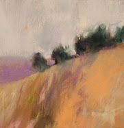
Elijah has written a good back story to the barn and building themes. The literary link to The Wizard of Oz is apt. The elemental truth of my surroundings is hard to contradict. Wind, sun, sky and agriculture. Can an artist overcome his environment long enough to forge content that aspires to higher art? I suggest not thinking too hard, but letting the hand and eye draw intuitively. Maybe that's the only way.


30 June, 2008

Rothko The Courageous

Do you ever argue with historians? You should. It keeps your reasoning fresh, and exercises your critical thought.

Not long ago, the BBC series, Simon Schama's Power of Art, aired in the USA. I had the unfortunate experience of seeing Schama's segment on Bernini. On the one hand, I learned a great deal about the artist, but decided to quibble with the historian.

Then I had the chance to see Schama's segment about Mark Rothko, in part, on You Tube. Having just re-read the TASCHEN book on Rothko, I was thrilled with this video. The Power of Art series reenacts key, historical artists' lives in vignettes, with narration and lecture by Schama, who is compelling in his writing and not a bad speaker.


Historian and art historian Simon Schama, in the year 1970, took a wrong turn in the Tate and was confronted, unexpectedly, by the Rothko Room. He admits, and I think very transparently, that when he realized it was the Rothko display, he expected to see the "cemetery of abstraction...a dead end". Instead, he was transported.

"This isn't about now,
this is about forever.
Can art ever be more complete; more powerful?
I don't think so."

Simon Schama on Rothko.

In this video, Schama illuminates Rothko's courage as an artist, and the essential quality of his art that transcends paint and canvas.
I have no argument with this opinion!

The Seagram Murals at the Tate Modern.

11 June, 2008

Atelier Update


Virgin and Child with the Infant John the Baptist and Saint Anne
1499-1500
Dry Media on Paper
Leonardo da Vinci


Artistic growth is a lifetime process. I recently reviewed Classic Drawing Atelier, A Contemporary Guide to Traditional Studio Practice,
2006, by Juliette Aristides of Seattle. Jen Graves, also in Seattle, has written a savvy article about the atelier, it's larger Academy of Realist Art context and the place of classicism in our contemporary art environment.

17 May, 2008

Late Breaking Rausch Up


Robert Rauschenberg
Detail of Erased de Kooning Drawing 1953
Collection SFMOMA and Rauschenberg estate


Here's my round up of the late Robert Rauschenberg buzz. The following will be the most comprehensive linkage to the esteemed man's obituaries, reviews and articles that you have seen.

My first impression anytime a famous contemporary artist passes from the scene is, "good on him for making it big and living an artist's life." Then, if I am at all curious, I read up on the subject and (graciously) pass my own judgment on their corpus. That means the work.

Rauschenberg is counted among the Pop Artists. They being the ones who supplanted the Abstractionists.

The story that sticks with me is Robert going over to de Kooning's studio with a bottle of liquor under one arm, and asking for a self portrait of the great Abstract Expressionist. Willem de Kooning says, "I know what you're doing," and graciously gives up the charcoal and graphite portrait. The young acolyte takes the art and erases it. It takes much effort and many erasers to destroy the master's work, and the point is well taken.

Links:

Rauschenberg defends his erasing of de Kooning (You Tube).
Tyler Green's incomplete round up.
Jen Graves
Regina Hackett
Roger Kimball
Is it okay to take a shot at the newly deceased artist? Kimball does, which rounds out this round up.


12 May, 2008

Third Critique Up at Art and Critique

Casey Klahn


In case the loyal readers here missed this, Elijah Shifrin, of Jerusalem, has kindly written about my art in his blog, Art and Critique. I usually have a response written to his wonderful crits, but since I am running to catch up in the studio, this will have to wait. Die hard fans of The Colorist will enjoy reading his short essay on my recent landscapes of trees and clouds.

He has added value to his blog by launching a forum related to the blog, and is offering the Art Interpretation Guide.

10 May, 2008

Trees & Clouds

See Elijah Shifrin's latest critique of my landscapes at Art & Critique: "Casey Klahn: Trees And Clouds, Transient Monuments."

I'll have a response up later. I lost some time this morning dealing with a Google lock-out of my blog, as well as all the art blogs (Blogger) that I tried to read. I see another one is still locked out, although I am "up" now. Scary stuff.


06 May, 2008

Barn Free


Elijah Shifrin at Art & Critique
has written about my barn and rural building subjects in his article, "Casey Klahn: Barns And The Abstract Wizard Of Washington".

Elijah is thoughtfully focused on the abstract qualities of my building paintings. I have carefully tried to avoid being cast as "the barn guy". The reason is that sentiment is so easily attached to this great American symbol, and yet sentiment is bygone content in contemporary art. The challenge has been to de-construct this awe inspiring structure and make it relevant for today's art.


My Barn
Photo: Lorie Klahn


Working against my efforts to keep the barn image down have been a number of forces. Sales, believe it or not, has been a force tugging at my shirt tail. The popularity of this theme and image, the American Gambrel barn, has been so high that sales of anything barn related are a fairly easy turn. The great thematic content that is associated with the barn is reflected by the book cover that has my Red Barn with Ramp image on it: An Anthology of American Literature, by McMichael. Another force is the fact that I live out here in the rural landscape where every farm has a big barn.


Barn Sketch
Pencil
Casey Klahn


Here in Davenport, WA, the barn isn't just American myth writ large, but an actual part of our lives. To be sure, the way of life is changing. The Heath family pioneered this farm at a spot about five minutes walk down canyon from my house. When the internal combustion engine started to replace livestock for locomotion, the farmers were able to build their houses and outbuildings uphill and farther from spring water sources. My family are the third owners of this farm, and the agricultural roots are gradually being eclipsed for a number of reasons. How wonderful for us to not see another house from ours!


Violet Oil Drum
7.5" x 10.5"
Soft Pastel
Casey Klahn


I'm heartened that Elijah has seen the abstract elements that are key to these building paintings. Shapes, colors and position are the content, more than the buildings themselves. Don't get me wrong. I'm as much a sucker for the deep meaning of the American barn as the next guy. My father built a barn once upon a
time. And, the building in my iconic painting is my own barn.


Thumbnail of Barn
Pastel
Casey Klahn


The architect who designed the Gambrel barn was a flat out genius. The way the barn structure occupies the open land in rural America is stunning in scope and even vision. My barn, which is no longer used for any working good, occupies a side hill and commands a territorial view. I have some pride in owning it, but the Great Horned Owl that frequents it seems to have a bigger claim by virtue of time spent there.


Behind the Garage
Graphite on Sketch Paper
7" x 8.5"
Casey Klahn


Wolf Kahn uses the barn image a great deal in his work. He has taken it down to the pictorial elements with content that describes the position of the building on a slope or prominence, and elements like through-looking doors and windows, and severe value gradients.


The Heins' Farm
7.5" 15"
Casey Klahn
Private Collection

The story of my Red Barn with Ramp image I have told many times. I received a box of twelve "Wolf Kahn" Terrage pastels made by Diane Townsend, and in a first moment of inspiration I made a very small thumbnail sketch with the colors. It was the barn image just as it is seen on the book cover, except that sketch was about 1 inch square. I was in the moment, entranced by pure color and by the tactile qualities of the big, thick pastel sticks. Abstract shapes were the tools, and color was the content.

Elijah has written a good back story to the barn and building themes. The literary link to The Wizard of Oz is apt. The elemental truth of my surroundings is hard to contradict. Wind, sun, sky and agriculture. Can an artist overcome his environment long enough to forge content that aspires to higher art? I suggest not thinking too hard, but letting the hand and eye draw intuitively. Maybe that's the only way.


02 May, 2008

Art & Critique

Casey Klahn

Casey Klahn

Casey Klahn


The arrival of a critique is a welcome thing for a working artist. Elijah Shifrin at Art & Critique has chosen to render a sensitive review of my abstracted landscapes.

In "Casey Klahn: How to Make Your Audience Weep," the critic sees some uncannily true aspects of my art that I haven't consciously voiced before. He seems to have nailed the elements of my landscapes in deep and psychological terms that unearth my artistic formative years.

How does Shifrin know that I grew up drawing hours and hours a day, in the land of the pouring rain? He writes:
...some of the pieces appear as if seen from behind a car’s front window when it’s raining. Objects (trees) look heavily smudged, lines break down and some areas of color appear to be still in the process of modulation. Second is the use of pure blue reminiscent of the sea; the patches of blue indeed bring to mind large bodies of water. And third is the thick, streaming down lines of the trees, resembling water pipes. All of these characteristics deal with water and raindrops in one way or another.


That large body of water was the Pacific Ocean, where I grew up in the land of giant conifers, and constant rain. The only rainforests in the lower forty-eight states, in fact, where my stomping grounds.

Much is made of the diffused and ambient lighting present in the works by artists of the Northwest School. Tobey, Callahan, Graves, et al. That love of gray, and the tendency to describe light without a direct source, or without cast shadows, has been my style as well. The apple doesn't fall far from the tree, eh?

03 March, 2008

Thoughts & Links on Abstract Expressionism & Color Field Painting

Yellow Gesture
18" x 11"
Original Pastel
Casey Klahn
CTA


The popularity of the Abstract Expressionist movement continues today. Although the conventional wisdom wishes to move on, the movement has legs beyond it's supposed demise.

In the light of this, I wish to ask a couple of questions. Why would an artist today wish to identify their work as Abstract Expressionist, when it is considered defunct? Is it actually experiencing a rebirth, then? Do contemporary artists "give a care," as the vernacular has it, whether a movement is alive or dead in order to be associated with it?

Are these contemporaries the ultimate nerds of the art world? Or, are they just blithely ignorant of conventional wisdom, and happy to make art as they please?

My own references to the Abstract Expressionists have been many:
Here are some current blogs closely associated with the Abstract Expressionist movement:
On a related fresh note, the Smithsonian is loving the Color Field movement right now (through may 26th):
Speaking of color field work, Peter Plagens, at Newsweek, wonders what ever happened to color in contemporary art? Oh please, Palgens! Click on Google and find me, for heaven's sake! If you'd do a little research, you'd see that it is alive and kicking in the New School Color theme.
Thanks, Martha Marshall, for the Novak link.

Abstract Expressionism, Art Criticism, Artists, Colorist Art, Drawing, History, Impressionism, Modern Art, Painting, Pastel, Post Impressionism