28 August, 2012

If Your Paintings Were Dances, What Would They Be Like?

<><><>


Studio Update.

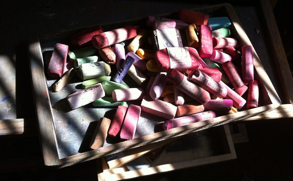
How could there be anything more important than my kids will be back in school Wednesday?  My son will be in the Fifth grade, and my daughter fourth. From a studio perspective, though, that means I will be back at full crank with daily pastelling, and also oil painting.

The barn studio for oil painting suffered some momentum loss when we went on vacation to the coast, but I am confident that things will get back to full speed there, soon.  My next effort will be a mid-size painting, and I feel that I can play much better with that extra space on the canvas.  Reports to follow.

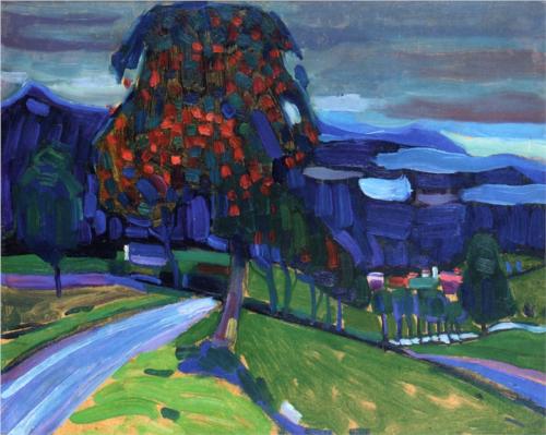
Although summer has kept me less active in the studio, I have made efforts to create almost daily and have moved the art forward.  I think you'll be surprised to see some of the works when I get them photographed.  

One interesting development has been the practice of working on pieces over longer periods of time.  I guess some artists describe that as rigor.  I feel that there are more things to be said, as well as some technical gems to be discovered, when one works the surface with more effort.  In some ways it hones the observational skills.

See you soon.


23 August, 2012

Ode To Blue


Low Tide, 2010.
Acrylic, collage, mixed media on paper
12.5cm x
Eric Adama


Erica Adama at CERULEAN has curated an exhibit of images from bloggers titled "Ode to Blue."  I am happy to be included, and especially because I enjoy the blue hue so much.

See Part 1 here.

Look for more posts from Eric Adama to follow.

What better way to celebrate the exhibit than to take in a little blues music at the after party?  Check it out:


21 August, 2012

Your Own Color Sense

Matisse's Palette

Trust your feelings entirely about color, and then, 
even if you arrive at no infallible color theory, you will at least have the credit of having your own color sense.” John F. Carlson.


Colorist Art at Pinterest.


20 August, 2012

Windbreak at Daily Paintworks

Windbreak
6" x 12" 
Pastel
Casey Klahn
Click on image to see full crop

Available, unframed.  Contact me via e-mail, or at Daily Paintworks.
$400

17 August, 2012

Colorist Coloring


This is the second post of an undetermined number of posts about the subject of color use.


There is some danger in this subject for both of us. For me, I risk either writing inanity, banality or nonsense. For you, probably the worst risk is that you will become convinced that these theories I write will impart some method. There will be no methodology about color use here. Just ideas, tips, and histories. That is about as good as it can get, because we enter this aware of the personal nature of one's color use, called color sense, and it is known by many who study color that people see and respond to color in a manner different each from the other. If there is any commiseration on color feelings, then these ideas are already widely known.


Some Thoughts:

  • Starting with a color idea involves, for me, either choosing one bright, pure color, or designing a color triad in my mind at the very first part of the process.
  • Reacting to the previous color involves intuitive choice, and/or some reference to known color properties, such as what compliments or what harmonizes the colors already laid down.
  • Keep looking at the work and making adjustments as you progress.
  • Respond to problems to create the harmony that you seek.

Fauvism is the first school or movement we think of when we are faced with funny color in artwork. The Fauvists were a crazy bunch of Frenchmen, mostly, who painted in the Modern era. Among their ranks were Vlamink, Rouault, Derain, and the King of the Fauves, Henri Matisse. The ideas they shared involved a reaction to earlier movements and the late  Impressionist school of thought. They wanted bright, pure colors versus enhanced local color and an explanation of light. Their work was also considered painterly in the use of bold brushstrokes.

There will be no methodology about color use here.

 
I don't seek color that is a response to local color, meaning that that I don't choose a color that is purposefully not the actual (local) color. I just choose the color I want, and usually for personal reasons. It may often be the local color, and that is perfectly okay with me, especially because I am now set to react to the color I just used. I am a terrible reactionary in the artistic sense!

This approach, I think, is better than aiming for the "wrong" color or the opposite of the local color, because these methods can be formulaic.  One is required to prejudice his choice when he will not choose the local color.

Watch here for more on color choices in future posts.

16 August, 2012

13 August, 2012

Wassily Kandinsky

Autumn in Murnau, 1908
o/p
 32.3 x 40.9 cm
Wassily Kandinsky

"THE ARTIST’S LIFE IS NOT ONE OF PLEASURE. HE MUST NOT LIVE IRRESPONSIBLY; HE HAS DIFFICULT WORK TO PERFORM, ONE WHICH OFTEN PROVES A CROWN OF THORNS. HE MUST REALIZE THAT HIS ACTS, FEELINGS, AND THOUGHTS ARE THE UNDEFINABLE BUT FUNDAMENTAL MATERIAL FROM WHICH HIS WORK IS CREATED; HE IS FREE IN ART, BUT NOT IN LIFE."  Kandinsky.


I think Kandinsky was so busy making the new painting that he rarely made the best.   But, his goal was not to please me, that's for sure.  Kandinsky, in his book Concerning the Spiritual in Art, 1911, theorized a periodic pyramid of the new in art. The main idea is that the vanguard of art, or the top of the pyramid, will be occupied in any given era by a precious few works that are ahead of their time.  A very lonesome place is Kandinsky's summit, as by definition, no one else will appreciate or understand your work.

I find a few of his works do please me, and it is a good thing to study his take on Modernism and Abstraction.  He was certainly a trend-setter and worthy of his star in art history.

Kandinsky at Wikipedia.
Wassily Kandinsky, 1866 - 1944 - friendsofart.net.
Tumblr blog dedicated to the man. Very nice resource.
Online University - extensive article and links.
Project Gutenberg - Concerning The Spiritual In Art. (I read mine via Kindle, which I do enjoy better than the PC screen.)


Kandinsky.  Always Thinking.


10 August, 2012

Workshop Review - Bainbridge Island

 Ed Center at Bloedel Reserve

Pierre Ouimet and Karen Sprague were two of thirteen students at the See Differently workshop.


Thirteen artists endeavored to provide something new to the world at my See Differently workshop, by making pictures authentically their own.  Bainbridge Island's Bloedel Reserve provided us with great subject matter (imagine me in the tall trees).

The Winslow Art Center hosted this event, and we anticipate more in the near future.  I want to follow-up with a workshop on blogging, and another on colorist methods.  Those will be new adventures!
Abstract Expressionism, Art Criticism, Artists, Colorist Art, Drawing, History, Impressionism, Modern Art, Painting, Pastel, Post Impressionism