This Tree School post is a re-write of the one that was originally posted at Pastelsblog in January, 2009.
With a couple of exceptions, every landscape I have done has trees. But don't expect to see green trees in these pictures. I want to convince you to almost never use green as your departure point in painting trees.
The color of your trees will either establish or enhance your overall color composition. You want unity, and you want a proper color statement. Sometimes, green just isn't part of that structure.
Green will key the color composition for you. If you wish green as a major element in your image, then use it. If not, then do a color study of your composition first to determine what color you will be making your trees. The local color of trees is usually green, but if you think about it, there are other local colors of trees. Brown, orange, silver, gray and black are present. Trace or hints of red and blue are very evident to me in trees. Cast colors include violet and blue. When we view our trees in this manner, any color becomes part of the natural palette associated with trees.
Remember that color has much more value than associations with objects. Some assign emotional value to color, but I also think of it's plastic qualities.
Don't become a victim of the tyranny of green.
All images in pastel, by Casey Klahn.
1. Blue & Gray River 10" x 14.5"
2. Clear River 7.5" x 9"
3. Violet & Green Tree 5" x 4.5"
After Wolf Kahn, #1
9.5" x 6"
Pastel on Paper
Casey Klahn
First posted January 21, 2009. This post is updated to offer new links to artist's whose trees I think you should see, and the other set of links can be viewed at the original post, here.
Take a different approach to trees...
Learn from other artists whose renderings of trees you love. Mark me down as a Wolf Kahn follower. His forests of trees are gesture rich, and pure blocks of color are woven into the whole. I did the drawing posted here directly from a WK as a study to try to "get" more of what his methods are.
The Art of the Landscape community is a good place to start your overview of artists who paint nature. Don't miss Martin Stankewitz, who has a blurb book on this subject. His style is finely composed.
You might know Bill Cone for his exquisite views of California and the rocks of the Sierra Nevada Mountains. Recently, he has favored us with tree compositions that are just what you should be looking at to understand the abstract elements of tree groupings. A real delight.
All of the artists I've mentioned here take a very different approach to trees, and your tree style will become a signature of your own work.
See also:
Land Sketch
Loriann Signori
John W. Stinson
Randall David Tipton
Originally posted January 19th, 2009.
 Blue Trees in the Middle Distance
7 - 3/8ths" x 5.75"
Pastel
Casey Klahn
Consider the words of this blog title, "abstract organic shapes." For a sound and enjoyable study of shape, see Diane Mize's post, And Then There is Shape. An organic shape is one with a random pattern or irregular edges - just the opposite of geometric shapes. Abstract means non-specific or simplified. A non-tree tree, if you will. More of a shape than a technical study of leaves, foliage, branches and trunks.
Think twice before you include trunks, branches or leaves
If you want foliage, then make your tree as formless as possible.Irregular, and abstract. Think twice before you include trunks, branches or leaves. A better direction to go instead is to ask yourself how this shape will effect your overall composition. Back all of the way out of the picture plane, and make a value and shape sketch. How big will the tree or trees be? Will they form a unified mass? What will the relationship of these trees be to the other elements in my painting?
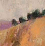
 Consider the image posted today, Blue Trees in the Middle Distance.
Since we are building a landscape here, albeit an abstracted one, we have chosen to model the form of our trees. Keep it simple, with roughly three values only. As with strict realism, we have opted to not go very broad with our value range. An almost black violet, a dark middle ultramarine and a middle violet do everything we need them to do to represent two trees on a slope. We keep the diagonal strokes all parallel, which heightens the gestural effect of our marks.
An unrelenting melancholy
Anchor the trees to the ground with well placed shadows, and a dark line where we interface with the ground. Higher key colors in front of and behind our trees help with modeling. Atmospheric effects of the ridge, sky and clouds push them back, and limiting the palette help with unity. Again, we keep our gestural effect with our marks - they don't conflict.
An almost unrelenting melancholy pours down the picture plane, brought about by the blue and the clouds. A critique was written about this painting, here.
 Prairie Bush
5.25" x 12.75"
Pastel
Casey Klahn
It could have been a series about abstract land masses, which is a great theme for these open spaces in the American west. But, I kept focusing on eye sumps, like dark masses and colored splashes in foliage. The relationship of the tree to the whole is also key in good landscape paintings.
I wanted to add some words - essays and texts - to this series. Then I realized that I already have a series about trees, called Tree School, at my blog Pastel. Please enjoy these lessons on rendering trees. I think you'll find them unique, and I will be bringing them here interspersed with my new prairie pictures as I get them photographed. I also hope to write new texts to the Tree School, and together we can watch the Prairie unfold.Originally posted January 15th, 2009.
 Tree Study in Turquoise
@ 6" x 5"
Pastel
Casey Klahn

Trees can be an awful distraction in a painting. Especially if they are present but not the subject, and if they take up too much of your effort.
We all enjoy graphite drawings in detail of a beautiful tree. Great texture, perfect modeling, and wonderful presence are what please us. But, that is the tree drawing where the tree is center stage; the star of the show. What about when the landscape is about things other than how the trees look? What do you do then?
Additionally, you can face a problem when the trees are the main content, but not the subject. I mean by that the painting where a color composition is the subject of the painting, or maybe something like the motion of one's eye through the woods. Trees have a built-in drama to them, and I propose that too much detail can distract from the message.
Return here to attend my short course on trees in pastel, and I leave you with this hint: don't begin with green.
Abstract Expressionism, Art Criticism, Artists, Colorist Art, Drawing, History, Impressionism, Modern Art, Painting, Pastel, Post Impressionism











 Posts
Posts


