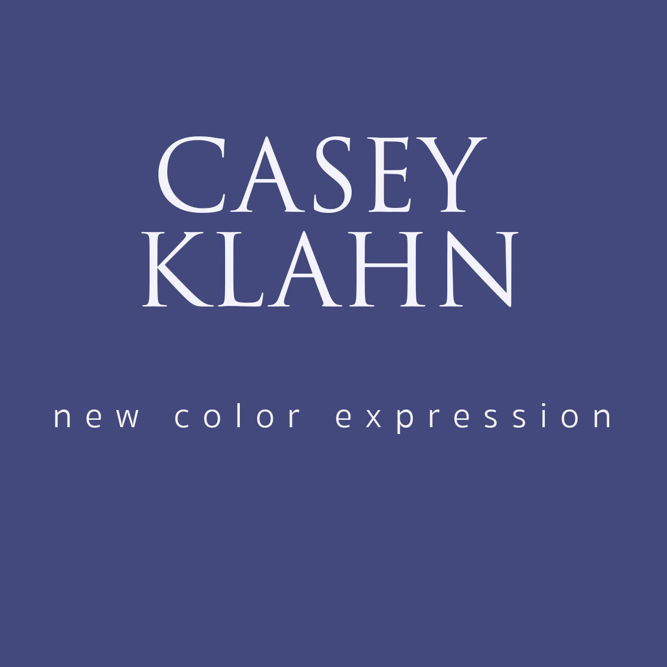
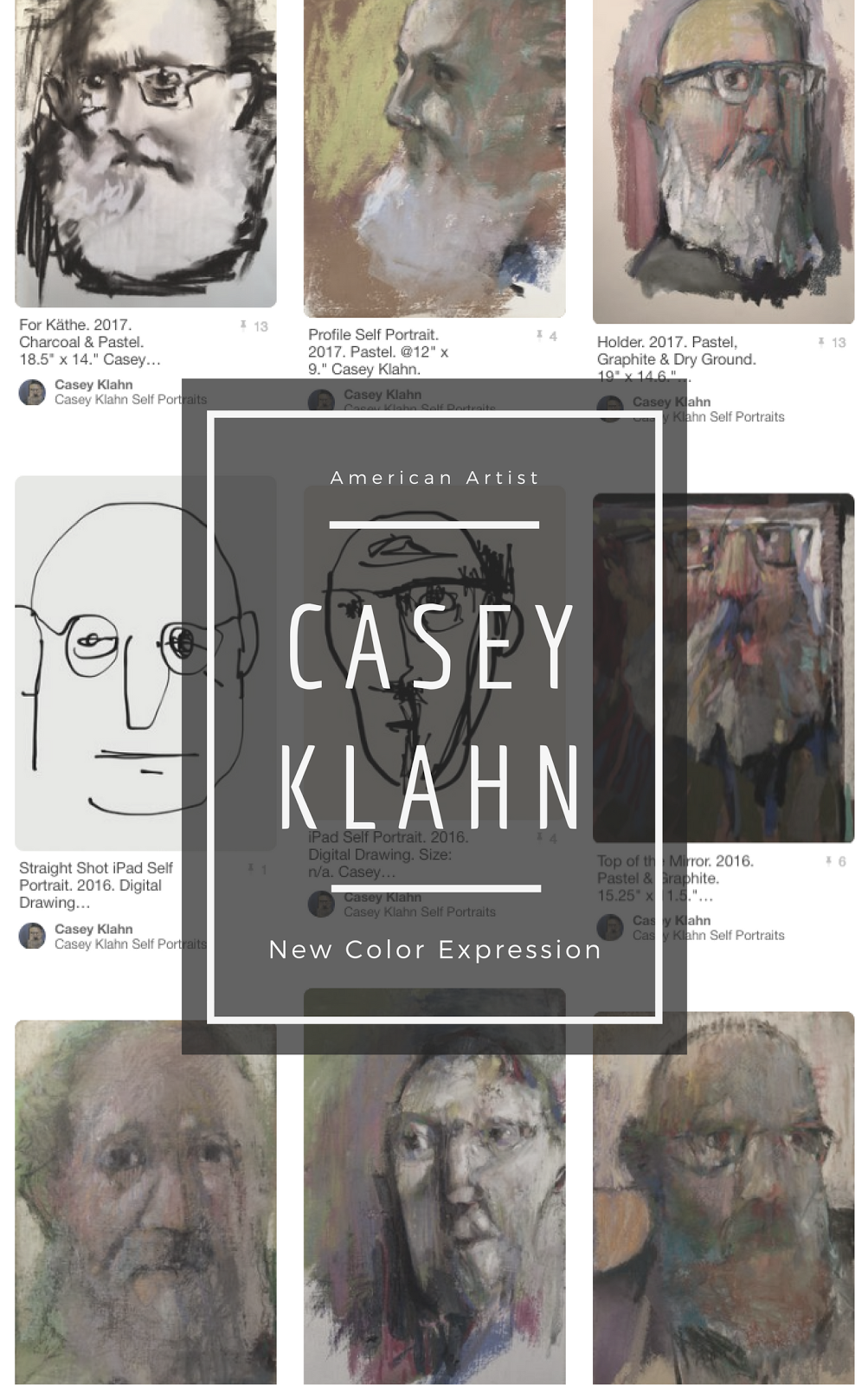
Thanks for your patience as I test these new blog banners. I am trying as hard as possible to get one that doesn't require scrolling, but so far this one just needs a minimum of that.
Not sure about the font, but we'll rest on this for a while.
Addendum:
Why post a new banner design at 3 AM? Obsessed with graphic perfection? Maybe. Or, maybe it's just that my Kindergartener has a bug from his first week at school, and slept in our bed, and then wet same. So, I already was up nursing my sore shoulder, anyway...you get the picture.
The new banner really needed to be a "no scroll" banner, anyway. I only worry, now, that people can't see the first post because of the mega banner being in the way. Hmmm...I wonder if I can re-do it until the sun comes up?
01 September, 2007
Subscribe to:
Post Comments (Atom)
Abstract Expressionism, Art Criticism, Artists, Colorist Art, Drawing, History, Impressionism, Modern Art, Painting, Pastel, Post Impressionism







8 comments:
Casey...Just checking back in. And figuring out how to use the comment feature on your blog. Here's my thoughts on your new "look". A person/viewer would not need to scroll down if you just deleted the text above your new banner. It's redundant and it's height makes folks scroll down to see the entire banner. After being wowed by your new graphic display...they could just scroll down to start reading your blog. Just an idea. Kristina
Great, Kristina.
I chose your tagline - it seemed the simplest, and to the point. Less is more, I say.
I think on the header that I have to have a text first header. These actually represent two headers, although they look seamless. The reason is for the tag, I guess.
I am still trying (although not very hard) to figure out how to "tag" my images for search engines.
For those of you who need to know how to get multiple headers on blogger, I think I googled something about how to design one's header. try this one for now: http://testing-blogger-beta.blogspot.com/
2006/09/adding-graphic-to-your-blog-header.html
Also, Blogger for Dummies
http://bloggerfordummies.blogspot.com/
Hey Casey...Another thought- your fonting should be another color in your banner for the New School Color and Casey Klahn texts...They're completely lost right now. Don't have any suggestions, but "The Colorist" will be able to come up with something. :-) Kristina
Which version??
Just kidding. It looks like you've seen the latest one, Kris. I am close to agreeing with you, but I'll ponder it. I want a low profile for them, for some reason. Maybe the blog title wants to be foremost. The right choice could be a dark value of a complimentary color- except my first thought is not to add a new color to the whole. Hmmnnn...
I am using the Open Office (free source) publisher, and don't know how to access the spiffy web colors like I do with Word. There must be a way, somehow.
If only I had studied in computer lab, instead of doodling all of the time...
I like the no-scroll banner idea. The one up there today (9/3) is a nice vertical size, but it isn't centered. Blogger isn't too flexible with width, is it?
Oh - I like this one a lot! Looks good (and there's no green in it LOL)
Also think the New School Color is a good one, agree with the less is more
Thanks for looking in, Meg. I fussed over the width, and it 's easy to change the pixels for width on Photoshop (some stuff I can do). But, then I thought I may like the bigger size, which fills the "above the fold area". If I try the width that fits the banner area, then I may get too small. And, the blue tray was a little over width, and I was fine with it.
I guess I'm mostly fine with non-balance. It creates more interest. We'll see, though. I may crump and change to centered, later.
Thanks, Gesa. I value your view on the language in of my tagline.
Post a Comment