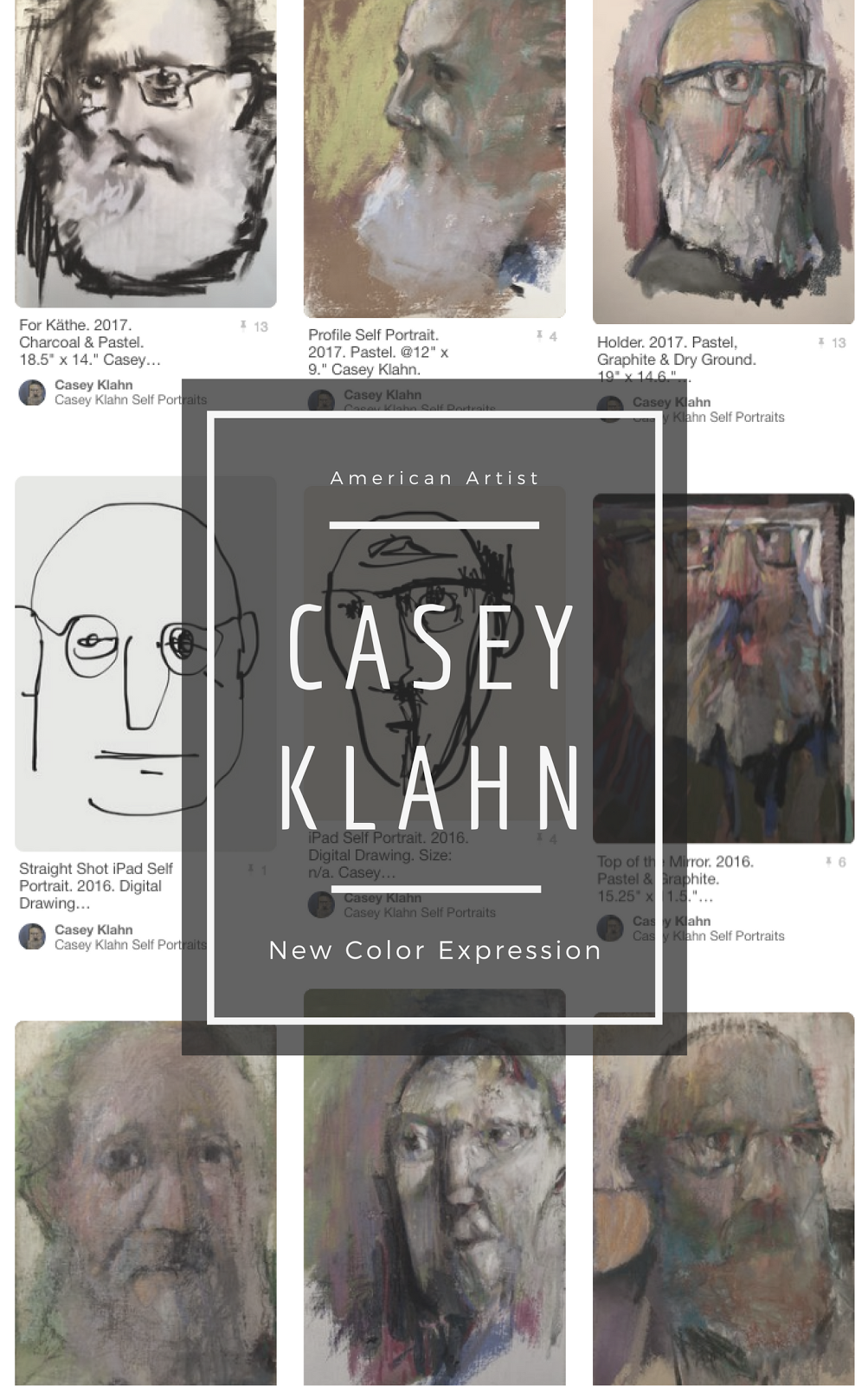
 Since the business hopper is hopping, I need to get the One Sheet finalized. Here is version 3.2. I'm not sure if I have it all proofed for errors, but here it is for design purposes.
Should I either write one more paragraph to the statement, or delete one entry from the resume, in order to make the two columns end evenly (justify)?
Thanks to the following bloggers for their help with this:
artBizblog - Alyson Stanfield
Dordogne Painting Days - Adam Cope
Paint and Pastel - Gesa Helms
Laketrees - Kim Barker
Katherine Tyrrell
Pastels and More - Miki Willa
Jean Victory
Risha






16 comments:
I think having the two paragraphs end evenly would look great. Also, it'd look nice if you can even out the ends of the left-hand paragraphs.
Good job with it!
I see the statement is poorly justified all around. That "squaring-up" would improve the look - I'm working with Open Office Writer, and you all know what a weez-uhrd I am with the computer.
Thanks, Meg.
cor casey - i can even see the the " L" in your name now ...
my opinion = i'd put the image on the right handside (not the left) above the artist's statement. also I'd make your name larger i & put a space between your address. wards underneath address. which should then balnce up the two columns.
nice statement, oh eloquent one
Ok, balance the text of name, tag line and address. Some spaces. Got it.
many express the switch of the image to the right. Alyson said to do the image below the name and centered.
I think I'll try both. The logic of the image to the right escapes me, unless it's some graphic secret about how people read scan a page. But, I trust my readers, so I will comply!
Maybe if you click on the image, it'll be big enough to see, Adam. har! I make the doc. in Open Office, save it aa a PDFD, then send it to Photoshop where I can save it as a Jpeg.
Thanks on the statement. I seek to make it straight forward, mostly. Simple. Concise.
It occurred to me that if you stretched the list on the left, and push up the statement on the right it would leave a nice space bottom-right for your address, instead of having it at the top with your name which I found a distraction. I also agreed with swapping the image to the right, the branches on the tree would balance nicely that way. But, this is not a democracy.
Thanks, Yellow. Someone else said to not make readers go looking for the contact info. I agree that it doesn't look right how it now is.
I think I'll need to make it smaller, and maybe gray, so as to not harm the overall layout. I liked it across the bottom.
I am so outvoted on my top left image layout. It will have to change (but it might wind up being in the center).
you can do it all in photohop CS with
1 the text function
2 a layer for each block of text or image allows you to move it around where ever - even screw whiff if you want.
then flatten image & save either as PDF or JPEG
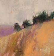
BTW, have the painting even larger...?
make more use of white space? a larger space between the columns? why square things up?
obiviously there's a million possibilities...and just your choice to guide you!
My photo lab guys do their docs in Photoshop, too. I'll try that again - it was floating in the back of my mind as a possibility.
I almost wonder if the OOffice has more text freedom. I'll have too see.
The columns are too close. Too bad I don't write code, but there are some things an old dog will never learn...
Thanks, Adam. Everyone go have a look at Adam Cope's wonderful rock paintings at his blog. They are not to be missed.
I am going out on a limb here, but I really like the way it looks. I am not a big fan of right/left justify in paragraphs. I like having the contact info where you have it. In the end, I am sure whatever you do will be great.
Thanks, Miki. I have been glad for every suggestion, and incorporated >90% of them, at least in draft form.
It's amazing how much "graphics" training this art blogosphere exhibits!
I like Alyson's suggestion I think because it makes the image your focus point.
I am not crazy on the justified text on the right, distracts me visually. Of course I am looking at this as a blank canvas and from a composition standpoint lol!
I think it looks great...
I'm not a wizard at graphics either Casey....
but this certainly inspires me to do one !!
Thanks, Kim and JGirls.
all these choices... mine will just be a short one: i like what you did to the statement - it read very well this way - clear, strong and inspiring.
Maybe stupid question: but is the type of competition clear on your first item - Juror's choice award (would that not need an exhibition/competition name?)
Yes, trying to remember why I dropped "Spokane ArtFest" from those awards. I must have been trying to justify right or end the left and right columns the same.
I think I can drop the gallery line, since it shows up later.
I'll put them back in - thanks for the crit.!
I am going to mock up the single image, centered, with my name on top. Don't know if I'll go one column or two.
Post a Comment