12 August, 2010
Red Sub-Text
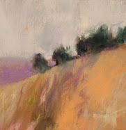
This image has been updated, which means that it is the formal, high quality photo of this original pastel. I go into this detail, because there are, believe it or not, people who don't discriminate between photos and paintings. Example: the lady who walked into my art fair booth this summer and declared, "you've been hitting the Photoshop pretty hard on these!"
No, steam did not come from my ears, but I did laugh to myself. As long as we persevere with painting, we will have to continue educating the public on what we are doing.
Labels:
Art Fairs,
landscape,
my artworks,
Prairie
Subscribe to:
Post Comments (Atom)
Abstract Expressionism, Art Criticism, Artists, Colorist Art, Drawing, History, Impressionism, Modern Art, Painting, Pastel, Post Impressionism






20 comments:
Casey,
It's always amazing to me how few strokes you need to complete the illusion. I hope I'll get there someday.
Photoshop, seriously?! I have a few stories of my own about art fairs:)
Yes, it's best for one's sanity to just make light of the comments that some people make...usually out of ignorance.
"Hitting the PS pretty hard" - that makes absolutely no sense to me in light of viewing original art, but it's funny nonetheless.
At any rate, the painting is very pleasing. Love that red peeking through, and as always, you do a great job at simplifying and distilling down to the essence of a scene.
Your comments are very considerate, Nika and Sonya!
In one way, I am happy that my art looked, at first blush, like reality. I actually try to "hit" the razor's edge between simplicity and representation.
wow. I guess I would have handled that comment the same way you did...with silence...I mean it would be tempting to explain, but then again....NO. I have a wonderful friend in her 80's who always hauls out all her Thomas Kincade when I visit. What can I say..I just "take it". hhaa
This is a beautiful painting.
Kinkade! That is a funny one, Celeste.
You're always beyond good with neutrals, but the lurking red reassured me that your flashy self is still in there.
Yes. The evil neutral.
Thank you very kindly for the compliment, Sam. I treat neutrals at arm's length, and perhaps they behave for me that way. I guess that's a good idea for a blog post.
This pastel is so good. As usual.
I could eat that lady on breakfast. And I would be sorry about that. But later.
Was she trying to sound complement:-))))?
Har har, Irina! She was trying to be snarky, but on the subject of photography practices.
What it shows is the dominance of photography and more than that the dominance of ways of seeing. What will happen to painting? Do we painters drag out knuckles when we walk about?
This is absolutely beautiful. Great post too,
Joan
Thanks, Joan!
I've been a fan of the colourist tradtion for ages but can't find that much of it online. When I google "how to paint like the colourists" (or "colorists" as you guys write it in the US) nothing much comes up. Any idea of articles, or how to choose the colours colourists choose? Thanks :-)
Thank you for following and commenting, Hillie (is that the right name?).
My favorite colorists are Matisse and Wolf Kahn. I look hard at their choices, and try to emulate those. Experiment!
Ha! I like to start the day with a laugh.
Shhh...I'm on Photoshop doctoring my pastels right now...
Sometimes its best to ignore.
Great work as always Casey
All the very best
Casey - Wonderful to see you working at such a rate again. Good luck with the art show and bless you for your patience for the people who don't know any better.
I have just discovered The Colorist Daily - Congratulations, full of perfect little gems and a lovely overall presentation.
Thank you, Trevor and Robyn.
Hello Casey
your take on colour is always like a fresh breeze.
I have never ever seen something like that done with photoshop:).
Danke, Martin. Very kindly said.
Post a Comment