***
There are many more of my new artworks to show you. But, I think I'll spread it out and keep my reader's waiting. Meanwhile, here is the next room in my walking tour of the San Fransisco MOMA. I favored two strong and large paintings in this room, and the first one was by Joan Mitchell. I'll tell you about the other one next time.
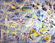
I had to reach my arms out to either side to gather the dimensions of this painting in my mind. I found it to be just the span of my arms. Then, I imagined it on its side, and again there was just the width of my arms. Gestural. Approachable. Edible.
The date interests me a great deal. The height of the the Modernist movement, in my mind, was 1950. This piece was done in 1960, and the hues are brighter than those used in the fifties. Modern, or Mod?
Also, I became more aware than ever of the canvas color, the same as Henri Matisse reveals in Woman With A Hat. Sort of a warm, barely reddish buff or egg-white color. These artists definitely are thinking about the dimension of the canvas itself, and you are immersed by the feeling of painting.
Could my kid do this? Of course, I know the answer is "no." But still, the work is far more approachable than Ingres.
Joan Mitchell
Untitled, 1960
83.4" x 74.5"
SFMOMA link to this image.
Joan Mitchell Wikipedia.
Joan Mitchell Foundation.
Bomb Magazine.
The Art Story.
artnet.








6 comments:
Hm...interesting. I'm not familiar with Mitchell's work, but "gestural" is certainly an apt description. Having done a small gestural painting recently that was borne out of a particular emotional state, I can certainly relate to it on that level.
Please don't hate me if I say that I'd still prefer to look at an Ingres, if for no other reason than to study his techniques and marvel at his skill as a draftsman.
Then again, to put things in perspective, I'm one of those people who enjoys reading reference books from cover to cover at times.
It's great that you spent some time with this painting. I love Joan Mitchell but have never seen her paintings in person. She has a series of paintings of the tree in her front yard in France and despite the gestural nature of the work, it still vividly invokes the French landscape.
A very interesting comparison. Mitchel undergoing a process in spite of the outcome, and Ingres creating a product at the expense of the process. But do you really think a pre-photographic nineteenth century guy would find black scribble on raw canvas more approachable than chubby naked ladies? I mean, Ahem--I'm just sayin... Seriously, this is truly a striking piece--visceral and yes, edible. Do you think it would have worked at say 6" square? Wm
Sonya, you have blanket permission to love/hate or in-between any artist's work I post about. Joan Mitchell's blob of gestures may turn one guy on, and the other one off. My thoughts are that not any yahoo can divide a canvas that well with only marks of the brush and colors.
I love Ingres in the same manner that Degas did: as a departure point. Ingres drew well, and then Degas drew life well.
I'll have to look into those works, Kat! Thanks!
Bill, your observations are keen. I like your description of the differences between process and outcome.
Ingres was before the camera really cam into its own, but I wonder if we don't suffer more nowadays from having the photograph? We cannot hardly think of an image that doesn't take something from the lens. Except, maybe, something like Mitchell's painting.
That is a great question about scale.
Post a Comment