<><><>
The studio has had my close attention for the past several weeks. Time to remove a few layers of dust, and go back at it. This year, my pastels are a little bigger, and my output is up. One thing that has helped my "go big" has been to not be too enamored with an image being a "full sheet." Full sheet means a standard size sheet of artist's paper, and many people relate that to sheets of watercolor paper. About 19" x 25" or sometimes a bit bigger.
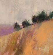
Subjects for me this year are the Hoquiam River, fields and prairies in my region of eastern Washington, and I am returning to the deep forest images that I used to do a number of years ago, only with an updated vision.
Please enjoy these studio snapshots taken with my new iPhone (more on how that effects the studio life later).








20 comments:
Nice studio shots, Casey; you're lucky to have all that dedicated space to create!
Re the larger paintings...I was just discussing yesterday with W that I'm not sure if I'll ever paint much bigger than 18x24 or so. I suppose it depends upon the direction my art goes (read: if there is a venue for it). Storage and expense of working in larger sizes are the issues now.
I do love both of the pieces in the second photo.
Casey, What a great looking studio....love all the shots of your work....and what a view!!! You are so right about not using standard sizes/formats just because those are the sizes that are manufactured.
Thanks for the kind words, Maggie!
You know it better than I on the standard sizes. I never compose within a given area, but as I see fit.
The view is territorial - at least the snow is gone for the moment in this shot!
Sonya, I know I'm blessed to have the big studio. An architect friend is coming over on Saturday to visit and discuss his new studio plans. I can't wait to turn his ear on my plans for growing the structure. You are very right on the storage - it is critical.
Thanks on the second photo, Sonya.
Casey, your new work is exciting. I'm loving the full shot piece - next to last image in this post. A true colorist's statement. It's lush & symphonic with an echo of Mondrian (for me), but obviously far looser and very wonderful. Wow!
Casey, I always enjoy your prairie paintings, as well as those of the river, but I'm especially looking forward to what you do with the deep woods.
I think it's very appropriate that both your work space and your view match your large talent. I'm sure none will be wasted. Speaking of the view, I love the last picture. The combination of your pastel box (which looks wonderfully well-used) and the awesome vista is a great portrait of potential.
All of that is fine, but YAY for your iPhone! It will change your life. Hyperbolic, but true. Just look at these fine photos!
It's wonderful to see the area where you work, Casey. I don't think I have ever done a pastel on a full sheet of paper - too scary for me! Your paintings look great on the black backing boards; the rich colors really sing.
Thanks, Sharon! I'm glad you saw Mondrian in this, because I named it "Mon Woods" for the same reason. I also want Matisse in there, and maybe when the professional photo goes up, that will be the case. It has some complex perspectival aspects, and the sideways candid photo hurts a bit.
Thanks for looking in and out from my studio, Sam. The iPhone was something I struggled about, but I'm the last guy on the planet to get one, anyway. I had to borrow my neighbor's at Sausalito last year!
Thank you, too, Donna. I always enjoy your comments.
What an exciting space and wow those paintings are gorgeous!
Thank you, Susan!
great sneak peek into your studio Casey. I agree with you about size...its all by feel, although i will plan my sizes to reuse frames sometimes ( my financial constraints dictate) Will you be adding to your studio?
I re-use frames, too, Loriann. I am not real successful at doing that - maybe two or three a year, but I try to pinch a penny that way, too.
Look out that north facing window, and imagine a new foundation and go from there. I especially need more ceiling height, outdoor access and more storage. The current space will be office/framing and storage.
Wow! Love the peek at the paintings you've been working on!! Once again, by your example, you challenge and encourage new thoughts and ideas. All the best at the fairs in the days ahead -- what fun you will have!! What makes you choose black boards for some paintings and not for others/all? They seem especially dramatic when put on the black.
I do like these photos! This is the type of studio that I like...it is a place to WORK and there is some gorgeous work being made there.
Thank you, Celeste! The kids are back to school after 2 days with fevers - so I have to spend this spectacular day on artwork!
Thank you for kind comments, Kvan.
I have some black fome core boards, some by Elmers and others are professional. I have one plywood board wrapped with black paper, and 1 Gatorboard wrapped with black paper.
My other boards are wood drawing boards, and I have another large Gatorboard just white.
The black helps to absorb light, which I have a surplus of in my studio.
Is it wrong to covet that box of pastels?
Maybe it's okay, Rosemarie, when it is a friend's pastel box.
Post a Comment