###
 |
| San Fransisco Museum of Modern Art, SFMOMA |
“...balance, of purity and serenity.”
Matisse Describing His Art.
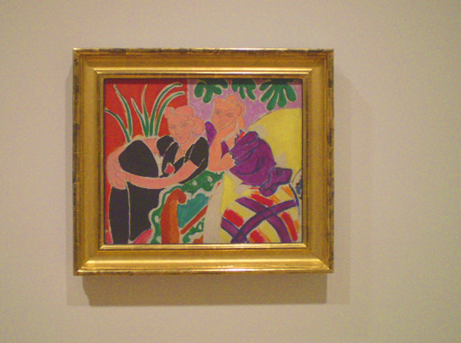
It would be too easy to spin tales about conversations, such as the one suggested by Henri Matisse's two women in The Conversation of 1938. Instead of that, let's listen to what Matisse has really said with his Modernist masterpiece.
It is fair of the SFMOMA to use Conversation in the context of a dialog in the exhibit on the second floor, where they have set up a “conversation” between the works of different artists in their permanent collection. Compare Marcel Duchamp to Picasso and Matisse. Does Matisse speak to Mark Rothko and Jackson Pollock, two rooms away, and if so, what does he say? Consider Jasper Johns or Andy Warhol: how do they interact with the history of Modern art? Then you have the obvious question: what are these artist's saying to the viewer?
The Trajectory of a Masterwork.
The Trajectory of a Masterwork.
Henri Matisse named two paintings The Conversation, but the 1938 piece that I saw three weeks ago in San Francisco is more than just a depiction of parlor conviviality. The Conversation, 1938, is an effortless, masterful work that is a colorist piece and is rooted in the timeless elements of painting. It also unites the qualities of drawing and painting in thoughtful ways that only Matisse could accomplish.
“Matisse was an artist in the medieval sense of the word,” said the French historian Regine Pernoud. By referencing another era, Pernoud suggests the artist's aim was over the horizon, not just his own time. Art is the root word of both artifice and artillery. Could Henri Matisse (I am borrowing a page from his World War II era) have shot a creative shell across the ages?
“Matisse was an artist in the medieval sense of the word,” said the French historian Regine Pernoud. By referencing another era, Pernoud suggests the artist's aim was over the horizon, not just his own time. Art is the root word of both artifice and artillery. Could Henri Matisse (I am borrowing a page from his World War II era) have shot a creative shell across the ages?
My Snapshot of The Conversation, 1938
SFMOMA official image here.
Back To Basics.
By the 1930s, Matisse was leaving behind Odalesques and returning to his bold and active earlier style. The Dance, 1932-3, featured monumental figures whose energy moved outside of the confines of the mural. His illustrations for Ulysses, 1935, were 26 line images that reinvigorated Matisse's sensibilities for the drawn figure. He said, “I do not reason when I draw; I don't know where I'm going.” For Matisse, drawing was an expressionist act, and his paintings were to become infused with this element again.
By the 1930s, Matisse was leaving behind Odalesques and returning to his bold and active earlier style. The Dance, 1932-3, featured monumental figures whose energy moved outside of the confines of the mural. His illustrations for Ulysses, 1935, were 26 line images that reinvigorated Matisse's sensibilities for the drawn figure. He said, “I do not reason when I draw; I don't know where I'm going.” For Matisse, drawing was an expressionist act, and his paintings were to become infused with this element again.
Although the faces of the two women in The Conversation may have been done with a rigger brush and paint, they give one the impression of transparent paint over pencil lines. To further emphasize this effect, Matisse draws each woman's hair and face together as one area and uses the same flesh color for both elements. Matisse outlines the figures and room elements – a total departure from a painter's desire to lose edges. Instead, Matisse draws in all of the edges; sometimes with negative white lines, and at other times with pencil-thin gray lines.
The Figure, The Color and The Space.
The Figure, The Color and The Space.
- The woman on your left recedes in a pure black dress, while her companion springs forward in a violet, yellow and red dress.
- The room is an effervescent pattern of colors, with compliments of red and green, blue-green with red orange, and the triadic relationships of violet and green and then the yellow and green sofa.
- Both women form a triangular mass, the wall is divided vertically and there is a diagonal line created by the sofa's edge, arm and a red triangular shape at the bottom. There is an X formed in the center of the picture by the edge of the black shirt sleeve and the elbow of the woman on your right, and the arm of the sofa.
- Perspective is not achieved with lines and atmosphere, but by the relationships of colors and masses - Modern Art meets timeless divisions of the picture.
- There is a heart shape to each face, and a heart shape can also be suggested by both faces together with the bottom being the elbow.
- There is a a curvilinear pattern of lines and shapes around the interior of the space - they read gracefully.
- One woman's eyes gaze to the left, and the other to the right, which adds to the expansiveness of the picture. Dreamy and pleasant, the two are caught in a moment of happiness.
Someone has said that a painting can no more be about color than a party can be about Tupperware. Look again at Matisse and reconsider this. He uses colors as the space, suggesting both a scene and a pattern simultaneously. The comparisons between the colors become movements, and the use of pure tones, without shading, arouse both excitement and harmony. The feeling is one of a brightly lit midday, illuminated by the southern sun.
<><><>
Physicists think about the properties of time; they wonder if it bends or slows down under special conditions. Can fine art add anything to the conversation about time? When I am standing in front of Matisse's The Conversation, time is folded for me. This artwork may have been painted seventy-three years ago, but I am experiencing it in the here and now. If I understand the artwork, even minimally, then the artist and I are having a conversation of sorts.
We feel old, and somehow wizened, when we enjoy a masterwork. Henri Matisse has made what is, for me, the greatest contribution to the gallery space at the SFMOMA with The Conversation. It appears graceful and effortless in comparison to Picasso, Braque and Morandi, whose works hang in the same space. Does Marcel Duchamp, whose urinal is presented in the next room, really diminish art by his funny and outrageous installations? His "readymade object" seems even more absurd directly after looking at Matisse's superb contribution to the canon of Modern Art. More on Duchamp in a later post.
With energy and singularity, and with clear, bright pictorial statements, Henri Matisse has given us more than words. He has brought grace to the conversation about the art of the twentieth century.
Henri Matisse
1869-1954






11 comments:
I've always thought contemporary art is a conversation between artists. I don't know when the general public was cut out--probably at the Salon of the Refused. A lot of Matisse's work looks like it could have kicked off the Art Deco artists. It has that flavor. I adore Matisse. His spacial use of color and form is exhilarating.
Several years ago, there was a show put together by the Whitney at the Walker Center in Minneapolis,
which was comprised of all the artists influenced by Picasso. Matisse influenced all of us, as well as well as Picasso. he wasn't in the show. That would be a show worth traveling to, wouldn't it?
I really like your new header Casey.
i haven't been to the art museum here since i have moved, but you just reminded me to make a date with hubby to head out and enjoy the evening.Well, maybe when he is free from work. which is in a few days.til then i will have to wait. i am excited now...thanks casey.
BW: That will be a wonderful event! I enjoyed the permanent collection floor at SFMOMA.
Hi, Linda! I am still so far from adopting Matisse in even a little of my work. He is a giant to me. That's why doing this post was important to me. BTW, I looked on the interwebs, and don't believe there is anything written @ this painting elsewhere. That was fun to just go on my own ideas and inspirations @ The Conversation.
Hey, Linda. Also your point @ contemporary artists conversing reminds me of the thing Gauguin said about art cutting out the public. very interesting. Maybe an idea there.
The Beebe did a thing on HM and the design influences of Matisse - he enjoys a very deep penetration of the visual landscape today.
I remember "The Conversation" from a post last year...I love it. Great post
Thanks, Celeste.
Love your observations on the painting. By the time I got to the end of your post I wanted to stand up and shout "Here here!"
I'm happy you commiserate with me, Dan. HM is an inspirational figure.
Love this post, Casey! I paid careful attention to the many Matisse paintings I saw in museums across the country this winter. I kept thinking: line, shape, color! Matisse gets them all right. The National Gallery of Art in DC has a nice collection (room-sized) of his cut outs. Stunning! Thanks for posting this!
This is a great post, Casey. I wonder if Matisse was aware of all this when he designed the painting? Or was it instinctive for him?
Post a Comment