Let's get out and about, as they say, and visit some great art & artist's sites that I have recently discovered. I make these discoveries over time, and it's a slow process. I haven't got a clue what I am looking for, just things that appeal to me artistically.
First, blogs that are new (to me):
Ann McMillan's blog, Fresh from the Easel. Ann is a California pastellist who really has the landscape down, with a fresh and colorful perspective. I have never met Ann, but hope to someday. Her web site is here. Don't miss Blue Barn.
Lisa Call. Lisa isn't really new on the block, but I did add her blog to my links recently. She is an important figure in the world of art blogging, with a well crafted site and killer quilts. I don't have a lot of fine craft stuff on my blog, which reflects my personal tastes in general. Don't get me wrong, I have crafter friends on the circuit who I respect greatly. I collect Raku pottery, myself. Ancient art was as much about the clay pot as it was about the picture. And quilting is as much a part of Americana as Country Music, and by that I mean authentic. I guess I will require a whole set of posts at some point to fill out my links to craft web sites.
Artist's web sites (AKA artist's without blogs, or AWB):
1. Jean-Michel Blanc is a French artist with a web site entitled: Art Pastel. I will take the privilege of sharing his entry quote here:
" The use of bright and warm colours in order to give a presence to the landscapes,
the individuals and situations in daily life. Put into scene, spontaneous and privileged
instants which we would like to live, " JMB.
I really like Jean-Michel's large scope in his cityscapes, and his personal color choices. He also has a strong unity to his figure work that is refreshing.
2. Eric Merrell. Another of those Californians! Eric has a pleasing twist on colors, and he pins this talent to well organized shapes in the landscape. And, he is prolific in his range of subject matter. Enjoy this sea stacks offering in his painting, Stability.Sites that I label, "About Art" are third party sites such as museums, art news sites, and art commentators/critics. Here are my recent additions to my links:
Venice Biennial, and Florence Biennial. The Venice venue (or set of venues) is a long standing (established in 1895) showcase for important world art. Our local boy, Mark Tobey, made a splash there in 1959, and the big city art clutch us still trying to live that one down. Time for another one of those, I'd say. The Florentine venue is juried by the "most authoritative in the world", according to it's Wikipedia entry. Is there any other city in the world with a foundation in art like that of Florence?
The Peggy Guggenheim Collection in Venice creates a nexus with the Venice Biennial by hosting the American Pavilion.
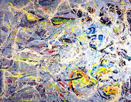
And, before I finish, I want to draw attention to Wolf Kahn's new works in pastel. They favor green, at one time, and others favor yellow. Really great work!






6 comments:
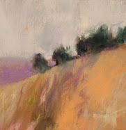
Casey, I lovelovelove the piece you have posted today! Great colors!
Wow! That took you all of 2 minutes to see it, because I just posted it. I had to re-edit this post 4 times, since I didn't like the text alignment.
I veryveryvery much thank you for the comment on my little pink&green work.
I'll share a little back story on it. I visualized pink and green (my favorite color combo) as a landscape, but tried for literally months to achieve a painting that worked with that composition. This one is the first that succeeded, and I was able to then produce two or three more (they seem very different to observers, but not to me) based on what I learned.
That story helped to sell this one at an art fair this summer, too. Further, I have been hesitant to post it, because of the CRT/camera/reality interface going on. What that means, is that the colors come out about right using the big, expensive Nikon D80, but for some reason the placing of it on the monitor changes the quality just enough to make me uneasy. The darkish gray paper (La Carte) shows more intense than in real life, maybe.
Anyway, you can tell that I am pleased to have an instant happy response, can't you? One thing's for sure - Tracy has her monitor calibrated exactly right!
The orange and the pink sings as well. It's a joyous painting.
The orange seems to bridge the colors, somehow.
BTW, I got a nice e-mail from Jean-Michael, in French. But, he kept it understandable and it was a pleasure to receive it.
I love it when people come up with new sites for me to look at!
The painting is looking pretty good too! ;)
Thanks, Katherine.
One has to get up pretty early in the morning to put one over on you, and I don't just mean the (vast) time zone difference!
Post a Comment