Here comes an old favorite post of mine:
Process Sketch - Italy
Casey Klahn
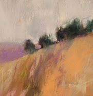
Since I missed the Wolf Kahn pastel workshop in Manhattan, I decided to "channel" him through this sketch. He makes these squiggly lines with unpredictable colors, you see. The end result, though, is a rather built up set of layers, and an expressionist landscape that pleases the eye.
In fact, I have never done one like this, and when I finished it, I said: "How did I do that? It looks like a Wolf Kahn!" I guess it goes to the "seeing" operation. If you look hard enough, and long enough at art that you like, it will find its way down your arm and out your hand, eventually.
I couldn't be happier.
Another factor is the sketch paper. I'm used to working on (expensive) Wallis Museum stock, or Sennelier La Carte, both of which are sanded heavy stock. The regular laid paper allows the sketchy look.
The big difference between a WK and my own pastels (besides about $2,000) is that he is a little more interested in the scene, or nature, than I. He uses pastels as a drawing tool, and I make a finished painting. Indeed, I visualize WK's Oil Paintings when I make my Colorist American Landscapes.
I wrote somewhere in a comment (probably Tracy Helgeson's blog) that I made the effort to go see Kahn's art at the Ameringer-Yohe in New York, while I was in transit to Italy last summer.
I was rewarded with a ring bound catalog of their last Wolf Kahn pastel show. And, I had to suffer through the assistant (not the main staff person, who was top notch) describing the artist's layer build-up as probably done in oil pastel. (steam coming from my ears, here)
Back to my drawing. I also played a lot with the colors, by building up as many layers as the cheap paper would take. I was thinking of van Gogh's Auvers church, and looking for a complex of colors for the main building and tower. I was thinking of his letter where he describes the pink road in his painting.
Postscript: Thanks Robyn Sinclair for the photo reference for the Italy sketch.






7 comments:
Whenever I pass that little church in Cortona these days I think of it as 'Casey's Church'. You've made the reference your own and I love the way you revisit it.
That makes me chuckle, Robyn. I guess it's not too far from realism, then!
I like this sketch a lot... and I am curious to try out more explicitly particular artist's approaches to colour/form/markmaking - I did this once or twice but never in as much detail as you did with the Kahn project. Yes, there is much to be learned that way... can't wait :)
Yes, I need to be outside doing some of my own Kahn-inspired drawings!
Thanks for the comments on the One Sheet, too. I will implement the suggestions!
Hello Casey.
Greetings from the "the east coast" aka-NYC. Thanks for the "free advertising" via the mention about "Artscad and my painting" on their main page for several days now...Your posts are full of insightful material, as well as your "magnetic pastels." I really like this one...I am taking(finally) a class at Cooper Union this fall on pastels...It is one thing to paint them, but a whole other process on preserving them (as I have learned).
I have a few questions on the subject, but I won't go on here...Again,Casay- beautiful work, as usual.
julianne
Casey,
I've been doing some reading in my Kahn book and am amazed... again... I've gone through your numerous posts on WK (again) and wondered if you knew which pastels he uses? The reason I'm asking is that they must be a bit harder than my usual unisons, right? I am struck by the clear squiggly lines, which I'd struggle to achieve on a small format.
Besides the trees, I'm having a look at water reflection achieved in a dry medium and fairly abstract.
Thanks for the encouraging comment on my blog writing, today, too... That made me smile this morning :)
Gesa, you guessed it right, I think. The marks have to be hard pastels - you know, like Rembrandt or W&N. Even the square hards, such as my Sakura Carre or the more common Nupastels.
I will add that the gallery pieces I saw were about 9" x 12" and the high key colors looked distinctly like Sennelier - such as the blues they have. I know that Diane Townsends are as pigmented, but anyway that was my impression at the time.
I would suggest the old school pastels that I mention above (medium soft), then Unison soft, then high sat. colors.
I do enjoy your pond works, too, Gesa. The compositions are yummy and not unlike the actual photos - which means you have found an awesome subject.
Remember he uses a certain paper, but I find that my Rives BFK heavy weight produces a good result.
Post a Comment