30 September, 2009
Commit
With your focus placed on what to paint for your award winning show, it is now appropriate to ask yourself if you have the commitment to make it happen. If you are going to win the prize, much time, pain and treasure will be poured into your efforts.
In my mountain climbing days, commitment was a tangible quality of some climbs. A given climb is described as "having commitment" if you ascend to a given point after which retreat becomes either undesirable or impossible. Going down is more difficult than going up to the summit. Or more deadly.
Having experienced this kind of palpable commitment in my past helps me in my artist's life now to commit to greater effort. Early wake ups. Late hours in the studio. Isolation. The amount of concentration required by your best efforts in the studio may leave you less focused on everyday life activities. Your friends may wonder where you've been. Conversations may be hard to carry on at first, and people may feel that your mind is "somewhere else."
Commitment means hard work. Commitment is also an attitude. Do you have the capacity to let your art live and flourish in you?
If you make the commitment, and you know what you're up against, then the prize awaits.
28 September, 2009
How to Paint for the Prize
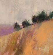
Blue & Gray River
10" x 14.5"
Pastel
Casey Klahn
10" x 14.5"
Pastel
Casey Klahn
How to Paint for a First Place or a Best in Show.
It occurred to me that you might like to hear my secrets for painting to win a prize. When I knew that I was going to be in the prestigious Sausalito festival this year, I wanted to up my game, and bring the best artwork that I could. First, I decided to paint specifically for a first place prize. Cheeky, to be sure, but I hope that every serious artist would think the same way.
Very much to my surprise, I did receive First Place in my category, which was Drawing. As proof of the difficulty level, my award was a tie with the incredible Sheila M. Evans. Sheila seems to win awards everywhere she goes, and it isn't hard to see why. She's probably the most talented artist I know.
But for me, it was a hat trick. And, while the thoughts are fresh in my mind, I'll share the How To in the next few posts. We will consider the following:
Focus
Commit
Content (have ideas)
Narrow the time frame
Edit
Focus on a body of work that will "read" easily and quickly. The judges with the clipboards are looking at the work of 100-300 artists. That can mean a dizzying assortment of thousands of pieces of eye candy, all popping out and screaming "Love me! Look at me!"
The judges are on their feet, and they are there with their own sets of ideas of what they like. How will you be able to appear great, or even appear present, to these judges?
Don't bother them. If they are over ten feet away from you, just leave them alone. Ideally, your booth/display will be neat and orderly when they show up, and your best work will be available to see.
One year, I built an actual wall out of 2x4s and drywall. It was painted white, with some texture, and in the back, or deep, part of my booth. I won a top award from one of the nation's leading arts professionals, Michael Monroe. He actually gave me the award (Juror's Choice/ 2-D) two years in a row. At that show, there are three Juror's Choice awards presented for broad categories like Fine Craft and Wood and Visual Art. It looks great on my resume, and fits well in my shpeal to gallerists and collectors.
This year, I couldn't afford the space and decided to do my best with just my dark gray Pro Panels. As it turned out, that was good enough and the judges found my booth just fine.
Focus for me this year meant staying with a theme based, at one level, on subject. The River Series depicts typical American rivers. I stayed primarily with landscape (long) aspects and similar points of view (slightly high viewpoint from the near bank).
But wait, there's more! I had deeper meanings to my theme. There were fairly meaningful art related ideas as well. They included the unusual use of dark passages as "eye sumps" in the composition. Also, my ideas of coupling Modern Art ideas with Contemporary ideas. Half real and half abstract. Intensity of color, and keying on the primaries. More on this when I post on content.
Focus for clarity and to bring forward the merits of your art, and the award givers (and patrons) will beat a trail to your door.
Next, in a day or two I hope, I'll cover commitment. See you then.
24 September, 2009
Coffee Update

You are owed an update of my studio activities. First, pour yourself a cup of coffee.
The studio sits all a mess after my return from Sausalito, California. Since my two children are, for the first time, full time in grade school, I have time on my hands. What am I doing with that time? Catching up on the home with cleaning, reorganizing and general Daddy duty. The impact of a large art fair is not limited to the 3 days of the event!
Another cup? You drink fast, huh? I promised you a post about how to paint for a first prize, and it is in the hopper. Soon, dear reader. Let's just say the basics are focus, content and heavy doses of self critique.
Meanwhile, I have posted an interview with Stephanie Smith, of the U.K., whose new floral pastel works are very great and worth your look. See this interview at my other blog, Pastel.
New interest in me teaching some pastel classes is causing me to push that forward. I hope to teach one locally, soon. Then, I'll organize for a class that I can take on the road. Do you have an art society or pastel society and want to know my methods for making intuitive pastel landscapes? Contact me and we can talk.
Thanks to my readers for the wonderful comments on this post.
16 September, 2009
Like a Mouse in a Maze
Among artists there is much interest in how to set-up at art fairs. I offer this post that I originally published elsewhere, with updates.
Don't be like the artist I once saw at a noted national venue. He set up his dark booth with paintings on the walls, and cut a 6 inch by 1 foot hole in the back, and peered out at hapless patrons who stepped into his space.
If he can't see a way out, that guy won't enter your art fair booth.
That's one of the curiosities of setting up your booth's walls. Make a critical error, and kiss many of your potential viewers goodbye. Of course, your display walls can be re-arranged to suit your given site, can't they? While some do choose a static display set-up, which changeth not from show to show, I highly recommend a movable structure. The main reason is each fair offers you a different set of opportunities and challenges for your little "gallery-away-from-home".
Think like a customer at the art fair. By now you should already have shopped a number of different art fairs yourself, and focused like an army missile on your target category. For me, that's the visual art category, or 2-D.
In addition to the rule given above about the exit strategy for each customer's comfort, think about the following:
Let's stop now with these basics understood, and walk out in front of our gallery (booth). You may have already done your map reconnaissance, and considered the approaches to and lines of sight to your booth. You have, as a bare minimum, checked to see which aspect your booth faces-North (the golden direction), South (the scourge), or maybe even Southwest (sun in the hot afternoon perhaps).
Now that you're on the ground walk down the aisles and check for the direction of travel that people will likely use, and check for long sight lines. Will the neighbor have a wall there? Is there a tree in the path? Worse yet, is there a Starship Flagship Booth that will suck up all possible humanity from your aisle? Don't laugh - I just moved my location at a key fair because the aisle I have been on had one.
Orient your whole wall set-up based on direction of travel and lines of sight.
Unfortunately, you may have to react to major obstructions, like trees, columns, and even sculptures occupying the aisles. Other bothersome things include extreme sunlight, or even too much shade, lack of traffic on a backside location, food vendors, loud music venues, dusty pathways, and the ultimate bad thing: uneven ground. Is there a pathway that creates a deep rut?
Back to our bullet list of arranging our display walls.
At that fair, one young artist decided to experiment with the counter-intuitive, and placed her tables or walls in the middle of the booth , for complete 360 access and views. It was interesting to see, and out-of-the-box behavior. The conclusion I reached was that the exterior wall design is more of an "event" or a known space that says: "I have an art show in here". People want to come into the artist's lair and get the art directly from you.
Now let that patron out of your booth, but hopefully with a framed original under the arm.
Links:
Pro-Panels
Flourish Mesh Panels
Here's a good time to have a look at art fair photography and Zapplication guru Larry Berman's web site. I direct you to his page about Selling Photography at Art Shows. I have appreciated Larry's efforts at providing help to the art fair community when it comes to applying to juries that use the Zapplication process. His site is a must see when it comes to tackling that daunting and new jury process.
BermanGraphics
Wire Grids (If you have arms "like a Dude" to heft these bad boys). Every major city has a local resource for this kind of stuff. And, the world is replete with going-out-of-business surplus events for this kind of thing. Do yourself a favor and skip this burdensome option completely, if you can.
Karl Pace & the Utah Arts Council has prepared a nifty fair checklist that I'll include here, although we're off topic a bit. It does include a list of good Western fairs (I notice that the West is sort of left out of lists prepared by East coasties). What he doesn't include, I'm almost sure, is a Dixie cup for that pull of Whiskey that many of you vagabond artists opt for at take down. Can't say I blame you, partner. It's a hard (but fun) business!
Don't be like the artist I once saw at a noted national venue. He set up his dark booth with paintings on the walls, and cut a 6 inch by 1 foot hole in the back, and peered out at hapless patrons who stepped into his space.
If he can't see a way out, that guy won't enter your art fair booth.
That's one of the curiosities of setting up your booth's walls. Make a critical error, and kiss many of your potential viewers goodbye. Of course, your display walls can be re-arranged to suit your given site, can't they? While some do choose a static display set-up, which changeth not from show to show, I highly recommend a movable structure. The main reason is each fair offers you a different set of opportunities and challenges for your little "gallery-away-from-home".
Think like a customer at the art fair. By now you should already have shopped a number of different art fairs yourself, and focused like an army missile on your target category. For me, that's the visual art category, or 2-D.
In addition to the rule given above about the exit strategy for each customer's comfort, think about the following:
- The average person needs fully 6 feet to walk through at the entrance to your booth. Think about your outstretched arm span as an absolute minimum entrance width. That's a big challenge when you may only have a 10 foot front. Even less if you expect rain, and have set your side walls in @ 6" -1' to protect yourself from drippage. "But I need that socko painting in front to entice people in!" you may say. Balderdash! Didn't you take your applied military sciences in school? You don't have to occupy that spot to succeed. You simply need to overwatch it! Put that bigger painting where it can entice inside of the booth. That's a better way to bring 'em in. I can still fit a 3.3' Pro Panel in the front of my booth and allow that ever-needed 6+ feet of entre for Nervous Nellie to fit through.
- How many possible entries do you have? Some spaces provided have a potential two, three and maybe even four sides of customer access. It never ceases to amaze me that some artists resist giving full access to their potential buyers. The key reason for blocking may be to deny access to a non-retail area, such as a small alley way that boothers are using for administrative reasons, such as storage. Some admin alleyways may be quite large, and it doesn't help to channel patrons back there. The same thinking goes for passage between neighboring booths, too.
Let's stop now with these basics understood, and walk out in front of our gallery (booth). You may have already done your map reconnaissance, and considered the approaches to and lines of sight to your booth. You have, as a bare minimum, checked to see which aspect your booth faces-North (the golden direction), South (the scourge), or maybe even Southwest (sun in the hot afternoon perhaps).
Now that you're on the ground walk down the aisles and check for the direction of travel that people will likely use, and check for long sight lines. Will the neighbor have a wall there? Is there a tree in the path? Worse yet, is there a Starship Flagship Booth that will suck up all possible humanity from your aisle? Don't laugh - I just moved my location at a key fair because the aisle I have been on had one.
Orient your whole wall set-up based on direction of travel and lines of sight.
Unfortunately, you may have to react to major obstructions, like trees, columns, and even sculptures occupying the aisles. Other bothersome things include extreme sunlight, or even too much shade, lack of traffic on a backside location, food vendors, loud music venues, dusty pathways, and the ultimate bad thing: uneven ground. Is there a pathway that creates a deep rut?
Back to our bullet list of arranging our display walls.
- Where will your one knock-'em-dead painting be? Probably on the deep wall that presents the best long distance line of sight.
- Consider your administrative needs at an early stage, since they may be impossible to fulfill after you get your walls set. I organize a small "hootch" area behind some walls for administrative clutter. Some artists create a small box out of panels, and open the back with a hinged wall (door). Some want a podium style table that breaks down, and stores primarily cash box or check-out supplies. The main question you have to ask is what you may need to store. The worst case scenario is that you may not be able to return to your van to store the boxes that your art was stored in. (Note to fair organizers: DUH!) That can happen when your van is blocks away, you are solo and your set-up is the morning of opening. Will you have something that takes a large footprint, such as a table or cash stand?
- Now pull out a pencil, take a sip of that coffee (if you don't drink coffee, START! You'll need the crutch as an art fair artist) and find a cardboard box lid to rough out your wall plan. Again, you may have a static look at every fair. I envy your efficiency, but I want to be reactive to any potential need. My best advice is avoid too much of the mouse maze effect. Sure, you want to maximize wall space, and want some interior walls that create interest and allow front and back displays. Be conservative, Che. Customers don't want to feel trapped in your creative vortex.
- Sometimes it is possible to design your booth based on the fair map before you pack for the fair. I drew one up for Sausalito 2009 and executed it when I got there.
- Think now about the engineering aspects of your wall structure. If it helps, turn your ball cap around backwards, and bite your tongue. I use the stiffeners and top bars that tie my Pro-Panels together into a cohesive and stronger arrangement. Also, tie-in the ends that intersect with the legs of your booth (even the scissor struts overhead!). I use these short bungee cords with balls (not the deadly and condemnable hooked kind).
At that fair, one young artist decided to experiment with the counter-intuitive, and placed her tables or walls in the middle of the booth , for complete 360 access and views. It was interesting to see, and out-of-the-box behavior. The conclusion I reached was that the exterior wall design is more of an "event" or a known space that says: "I have an art show in here". People want to come into the artist's lair and get the art directly from you.
Now let that patron out of your booth, but hopefully with a framed original under the arm.
Links:
Pro-Panels
Flourish Mesh Panels
Here's a good time to have a look at art fair photography and Zapplication guru Larry Berman's web site. I direct you to his page about Selling Photography at Art Shows. I have appreciated Larry's efforts at providing help to the art fair community when it comes to applying to juries that use the Zapplication process. His site is a must see when it comes to tackling that daunting and new jury process.
BermanGraphics
Wire Grids (If you have arms "like a Dude" to heft these bad boys). Every major city has a local resource for this kind of stuff. And, the world is replete with going-out-of-business surplus events for this kind of thing. Do yourself a favor and skip this burdensome option completely, if you can.
Karl Pace & the Utah Arts Council has prepared a nifty fair checklist that I'll include here, although we're off topic a bit. It does include a list of good Western fairs (I notice that the West is sort of left out of lists prepared by East coasties). What he doesn't include, I'm almost sure, is a Dixie cup for that pull of Whiskey that many of you vagabond artists opt for at take down. Can't say I blame you, partner. It's a hard (but fun) business!
10 September, 2009
First Place Award
 I am pleased to announce that I was awarded a First Place in the Drawing category at the Sausalito Art Festival. It was a big surprise, and I am grateful to the festival and the patrons who visited the event.
Coincidentally, Sheila Evans also received the First Place Award. I say coincidence because we are both from the Spokane area. What are the chances of two artists from the same area winning this, given that the Sausalito draws artists from throughout the US and even from overseas?
I did have this prize in mind when I painted for the festival, but I never imagined actually winning. I'll give you the lowdown on how to paint for an award in a future post.
03 September, 2009
Sausalito!
Sayalessandra covers Otis Redding
Did you know that the dock of the bay that Otis Redding sat upon was in Sausalito, CA? And, coincidentally, so am I.
Sausalito Art Festival.
01 September, 2009
Seventy Years
 Two Tyrants in a Motorcade
Seventy Million - the high-end estimate of war dead resulting from WW II.
Seventy percent - the proportion of American service members who were in the Army in WW II.
Stephen Ambrose wrote that 70% of US casualties were incurred by 10% of the troops (the infantry).
Seventy percent - the proportion of American service members who were in the Army in WW II.
Stephen Ambrose wrote that 70% of US casualties were incurred by 10% of the troops (the infantry).
The outstanding individual leader of the war was Winston Churchill, who turned seventy at the Tehran Conference.
Today was the day, seventy years ago, that the Nazi German invasion of Poland sparked the wider conflict that was the Second World War.
Subscribe to:
Comments (Atom)
Abstract Expressionism, Art Criticism, Artists, Colorist Art, Drawing, History, Impressionism, Modern Art, Painting, Pastel, Post Impressionism


