30 May, 2012

Pastel Studio, Canada


Pastel Studio Art Supplies

I'll be at the Pastel Studio shop in Ontario, Canada,  this weekend.  The See Differently workshop participants will be making new art - never seen before in the history of the world.  It is a thrilling experience for me, and I am always inspired by these classes.

You may see a report via iPhone, but otherwise I won't have my laptop with me on this trip.  See you soon.


29 May, 2012

Carole Buschmann - WBM!


Time for another important episode of When Bloggers Meet!  Here are Carole Buschmann, who blogs at Color Creates, and myself. We have followed each other's blogs for a long time. She was one of several bloggers who participated in my Denver See Differently workshop, taught two weeks ago.


As you can see, there really are people at the other end of the inter-tunnel, and it is wonderful to actually meet.  My previous WBM post was here.


I dug around for that Starbucks cup in Denver, but it was just a prop.  

26 May, 2012

Memorial Day


It was a tremendous honor to participate in creating this memorial at Ft Logan Cemetery, Denver. This is dedicated to the men of the Tenth Mountain Division (including my dad) who fought in WW II. I was privileged to render the climber and the mountains seen in the granite and the marble faces of the stone. Presented in 2009, it is a place to honor our fathers who had the task of seizing one island in the Aleutian chain, and countless mountain redoubts in north Italy. My dad remembered that the German bunkers were also cast into granite mountains; the major ones had walls 200 feet thick!


Photo: Ken Elliott.

25 May, 2012

Canola Field Trip


It's too bad I don't have any subject matter around here to paint.  Just joking.  I have been trying to get out and paint these canola fields in May for nine years, and finally made the effort.

Pastels Available, unframed.  $500 each/ $900 both.


24 May, 2012

When Bloggers Meet - Cynthia Haase

Cindy Haase & I meet at the Denver Workshop

This edition of When Bloggers Meet is brought to you by the talented artist Cynthia Haase & myself.  There were four of us blog-heads there, and we caused much of the trouble that occurred.  


Editor's note:  In spite of the presence of three Starbucks cups in this photo, DO NOT go to Denver looking for Starbucks.  They are few and far between.  Sorry to be so brutal, Denver, but...

Author's note: There is no editor.

23 May, 2012

Demo in Denver

I Demo in Denver

At the last minute while packing for the trip to Denver, my new grays arrived on the doorstep: Thunderstorm grays and a set of gray Diane Townsend Terrages!  I didn't really need them, but I opened up my luggage and crammed them in - I wanted the "jazz" that comes with getting really yummitudinous sticks.  I felt that energy going into my demos, and really had fun making three pictures for the class.  This big violet one sold, but I was the most jazzed by another one that depicted the urban energy of Denver metro.

Denver Metro on the easel
@ 7" x 9"
Pastel
Casey Klahn


21 May, 2012

Denver Workshop Report

Take the oath to paint your best


My student artists had a great time at the Denver workshop this weekend learning about painting and having fidelity to their own ideas.  I enjoyed seeing them creating pastels and paintings that were new and fresh.

18 May, 2012

In Denver, With a Trivia Question

Me posing in front of a Robert Motherwell.  He & I share one thing that few people know about.  Can you guess what that is?

The Denver workshop, See Differently-Authenticity & Your Art, is all set to go this weekend, and I am enjoying a visit with my host, Ken Elliott.

I will report back here, soon.

11 May, 2012

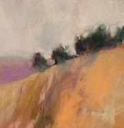
Dusk Horizon


Dusk Horizon
3.75" x 9.75"
Pastel on la Carte
Casey Klahn

Simplicity.
Be self-limiting.
Work fast.
Don't think! See!


06 May, 2012

The Subject Bucket List


Violet Mountain
3.5" x 3.75"
Pastel
Casey Klahn
l


Because of my personal history with the mountains and mountaineering, it has been my hip-pocket goal to do a series of alpine scenes. I wonder when I'll start that project?

Currently I am working on Bainbridge Island scenes, and have begun to do barn interiors.  About a year ago I started the shoulders of the butte series.  Then, the Hoquiam River series is ongoing. Also on my plate for the near term are some plein air works.  Oh, don't forget Italy - I am revisiting my old Italy pastels to re-imagine them, and also pouring over old photos I took there.  The other day I took a "drive around" the Florentine hills via Street View, and might try to do some practice works from that.  Then, there is my return to doing figures.

Do I have enough subject matter to work with?


03 May, 2012

Munch's Scream Speaks Loudly


Follows is a re-posting of my essay on The Artist's Ideas, illustrated by The Scream, Edward Munch.

Edvard Munch
The Scream, 1893
o/c, tempera & pastel


A work of art can't be questioned or dismissed. Saul Bellow.

The obscure word ethos has a different meaning today than it did seventy years ago, and it has traveled a malleable path since the days of Aristotle. Whereas, today, it is a corporate creed, it formerly held a deeper meaning. Pre-war artists owned the word - it was the artist's ethos. My 1936 Webster's dictionary has the following:

Webster: From the Greek, ethos, ἔθος, character. The moral, ideal or universal element in a work of art as distinguished from that which is emotional in its appeal or subjective.

How do the artist's ideas exhibit themselves in an artwork? Is it important for an artist to express an ethos through the making of art?

We have been considering 
The Artist's Ideas, with these previous posts:
Have Ideas
Quotes - The Artist's Ideas
The Inner Meaning
The Artist's Ideas
Paint Better Now


The Artist's Ethos.

The Greeks saw ethos as the first proof of debate, and it had to do with trusting the moral competence of the 
rhetorician.Fast-forward to our concerns and the artist's ethos. Let's unpack the definitions of moral, ideal and universal elements.

The Moral Function of Art.
Webster describes a moral element in a given artwork, which is, by definition, an illumination of right or wrong. As concerns the formal parts of art, there is no right or wrong. "There is no must in art because art is free," Wassily Kandinsky. So, we are left with artworks that reveal a moral quality intended by the artist, such as in the case of Sacred Art. See below some artworks that reveal strong moral qualities in a broader context. See The Sistine Chapel for Sacred Art.

John Dewey said that 
“Art is more moral than moralities.” Artist and blogger Katherine A. Cartwright is reading Dewey's important 1934 book, Art as Experience, and hosting a community discussion on The Moral Function of Art. See here, here and here, and remember to read the comment fields.

Here is the "see below." For my part of the discussion at Katherine's blog, I have been illustrating the moral function of art by identifying individual artworks that I see as strong moral forces in the canon of Western art. Blogger/artist Linda W. Roth had the idea first, and she chose Edward Munch's The Scream for its moral content. I think she's right on with that, and I thought of Andrew Wyeth's Groundhog Day, and Willem deKooning's Woman 1. These artworks are linked below.

The following opens a window into Dewey's thinking: Art is morally powerful because it is indifferent to moral praise and blame (loosely quoted). Do you agree?

Ideals - The Artist's Ideas.

N
otice that the Websters definition relates to a work of art, and not the group known as artists. My understanding of "the ideal" is that an artwork must, to be true to the artist's ethos, reflect his ideas. See these quotes on The Artist's Ideas.

Universal Elements.

Art is a universal mode of language. John Dewey. Philosophers will tell you that language is wanting in descriptive power - it falls short of expressing what man is able to think. Art is a huge bridge in "speaking" to mankind aught words.


Edvard Munch, The Scream.
Andrew Wyeth, Groundhog Day.
Willem de Kooning, Woman 1.


Ethos at Wikipedia.
John Dewey, Art As Experience.


02 May, 2012

Inversion Dusk

Inversion Dusk
5.25" x 7.8"
Pastel
Casey Klahn

This was one of my demos at Morristown, New Jersey.  I resolved it at home in the studio.


30 April, 2012

27 April, 2012

All Water is Abstract

Forest Pond
Bloedel Reserve, Washington
8" x 12"
Pastel
Casey Klahn

Click on image to see the full crop.

26 April, 2012

25 April, 2012

Pastel Studio Canada


I will be teaching the workshop, See Differently, Authenticity & Your Art, June 2-3, 2012, in Cambridge, Ontario at the Pastel Studio Canada.


Visit the web sight of Pastel Studio Canada here, to sign up.  Workshops page.  Openings are few.

24 April, 2012

23 April, 2012

22 April, 2012

Sometimes History

...in its simplest form is also the most revealing.  I mean the under-story: the secrets hidden behind the veil of time.  You cannot know the way a person in the past felt or thought without a bit of digging.  The gold nugget lies in catching a glimpse of the heart.


I am one of those artists who loves history, and especially if I have a touch-point, or some connection, with the past.  The more distant the connection is to the past, the sweeter.  

1865-1906: Henri Roché (father) takes over the "Maison" 


It is exciting to deliver this link from La Maison du Pastel, in Paris.  Nobody else has the rich history of the pastel company of M. Henri Roche.  What is history, without character?  These sticks have that, and I am finding it out for myself by trying out 15 of the sticks in my studio.  


I am a very intuitive pastelist, or I try to be.  I don't go forward very scientifically, or in an organized fashion.  How do I find the new sticks?  It is an emotional response.  The range of textures and the purity of the hues in these pastels are not found in any other stick that I have tried.  They are the secret weapon; the game changer in any picture.  My respect for what will happen when I use them is estimable, because they offer the opportunity for very high intensity.  If you haven't observed by now, let me tell you that intensity is the focus of my contemporary work.  


There you have it.  The circle has been completed: the past can speak to the present, if you will just listen quietly.  


boîte Degas


Images: the website of La Maison du Pastel.

18 April, 2012

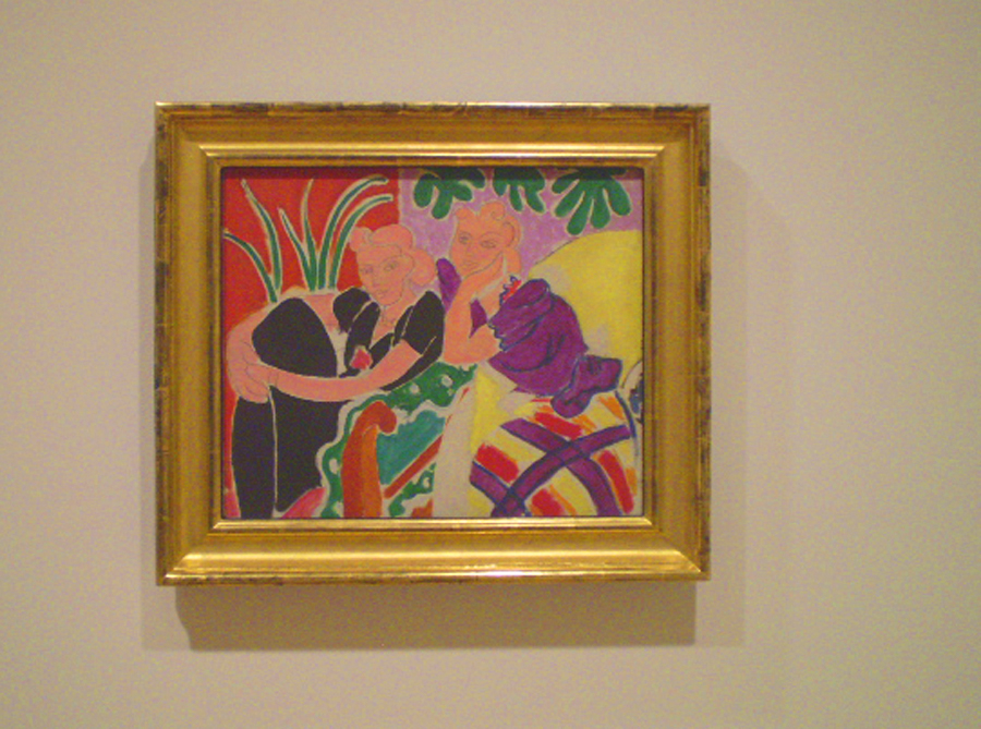
The Conversation, 1938: Henry Matisse' Timeless Drawing-Painting

###

San Fransisco Museum of Modern Art, SFMOMA


“...balance, of purity and serenity.” 

Matisse Describing His Art.


It would be too easy to spin tales about conversations, such as the one suggested by Henri Matisse's two women in The Conversation of 1938. Instead of that, let's listen to what Matisse has really said with his Modernist masterpiece.

It is fair of the SFMOMA to use Conversation in the context of a dialog in the exhibit on the second floor, where they have set up a “conversation” between the works of different artists in their permanent collection. Compare Marcel Duchamp to Picasso and Matisse. Does Matisse speak to Mark Rothko and Jackson Pollock, two rooms away, and if so, what does he say? Consider Jasper Johns or Andy Warhol: how do they interact with the history of Modern art? Then you have the obvious question: what are these artist's saying to the viewer?


The Trajectory of a Masterwork.

Henri Matisse named two paintings The Conversation, but the 1938 piece that I saw three weeks ago in San Francisco is more than just a depiction of parlor conviviality. The Conversation, 1938, is an effortless, masterful work that is a colorist piece and is rooted in the timeless elements of painting. It also unites the qualities of drawing and painting in thoughtful ways that only Matisse could accomplish.


“Matisse was an artist in the medieval sense of the word,” said the French historian Regine Pernoud. By referencing another era, Pernoud suggests the artist's aim was over the horizon, not just his own time.  Art is the root word of both artifice and artillery. Could Henri Matisse (I am borrowing a page from his World War II era) have shot a creative shell across the ages?


My Snapshot of The Conversation, 1938
SFMOMA official image here.


Back To Basics.


By the 1930s, Matisse was leaving behind Odalesques and returning to his bold and active earlier style. The Dance, 1932-3, featured monumental figures whose energy moved outside of the confines of the mural. His illustrations for Ulysses, 1935, were 26 line images that reinvigorated Matisse's sensibilities for the drawn figure. He said, “I do not reason when I draw; I don't know where I'm going.” For Matisse, drawing was an expressionist act, and his paintings were to become infused with this element again.

Although the faces of the two women in The Conversation may have been done with a rigger brush and paint, they give one the impression of transparent paint over pencil lines. To further emphasize this effect, Matisse draws each woman's hair and face together as one area and uses the same flesh color for both elements. Matisse outlines the figures and room elements – a total departure from a painter's desire to lose edges. Instead, Matisse draws in all of the edges; sometimes with negative white lines, and at other times with pencil-thin gray lines.


The Figure, The Color and The Space.

  • The woman on your left recedes in a pure black dress, while her companion springs forward in a violet, yellow and red dress.
  • The room is an effervescent pattern of colors, with compliments of red and green, blue-green with red orange, and the triadic relationships of violet and green and then the yellow and green sofa.  
  • Both women form a triangular mass, the wall is divided vertically and there is a diagonal line created by the sofa's edge, arm and a red triangular shape at the bottom.  There is an X formed in the center of the picture by the edge of the black shirt sleeve and the elbow of the woman on your right, and the arm of the sofa.  
  • Perspective is not achieved with  lines and atmosphere, but by the relationships of colors and  masses - Modern Art meets timeless divisions of the picture.
  • There is a heart shape to each face, and a heart shape can also be suggested by both faces together with the bottom being the elbow.
  • There is a a curvilinear pattern of lines and shapes around the interior of the space - they read gracefully.
  • One woman's eyes gaze to the left, and the other to the right, which adds to the expansiveness of the picture.  Dreamy and pleasant, the two are caught in a moment of happiness.


Someone has said that a painting can no more be about color than a party can be about Tupperware. Look again at Matisse and reconsider this. He uses colors as the space, suggesting both a scene and a pattern simultaneously.  The comparisons between the colors become movements, and the use of pure tones, without shading, arouse both excitement and harmony.  The feeling is one of a brightly lit midday, illuminated by the southern sun.


“Do you find perfect correspondence between the nature of the drawing and the nature of the painting? In my opinion, they seem totally different from each other, absolutely contradictory. One, the drawing, depends on linear or sculptural plasticity, and the other, the painting, depends on colored plasticity.” Henri Matisse.

<><><>


Art Is Long.

Physicists think about the properties of time; they wonder if it bends or slows down under special conditions. Can fine art add anything to the conversation about time? When I am standing in front of Matisse's The Conversation, time is folded for me. This artwork may have been painted seventy-three years ago, but I am experiencing it in the here and now. If I understand the artwork, even minimally, then the artist and I are having a conversation of sorts. 

 We feel old, and somehow wizened, when we enjoy a masterwork. Henri Matisse has made what is, for me, the greatest contribution to the gallery space at the SFMOMA with The Conversation. It appears graceful and effortless in comparison to Picasso, Braque and Morandi, whose works hang in the same space. Does Marcel Duchamp, whose urinal is presented in the next room, really diminish art by his funny and outrageous installations?  His "readymade object" seems even more absurd directly after looking at Matisse's superb contribution to the canon of Modern Art. More on Duchamp in a later post.

With energy and singularity, and with clear, bright pictorial statements, Henri Matisse has given us more than words.  He has brought grace to the conversation about the art of the twentieth century.


Henri Matisse
1869-1954


The beautiful photo of the SFMOMA by cbrady2 at Photobucket.  This post is republished from April, 2011.

13 April, 2012

Rain van Gogh

Wheat Field in Rain, 1889
o/c,73.5 x 92.5 cm  
Vincent van Gogh


Philadelphia Museum: Van Gogh Up Close.


h/t Katherine van Schoonhoven.

12 April, 2012

The Scribbler Article


"Authority is as uncommon now as it ever was."


Authenticity & Your Art

Here is an outtake from my article in The Scribbler, the newsletter for the Pastel Guild of Europe.  Is there authority in art?

  Authentic art is the sacring bell of the artist's experience. If you are able to say something new with your pastels, people will beat a path to your studio door.

  Developing authority as a pastelist is achieved by creating authentic artwork that is singular and unique. Authority is as uncommon now as it ever was. I once lunched with the archaeologist, Donald J. Wiseman; the man who excavated ancient Babylon! There at table with me was a living footnote; a true authority in his field.

  One forgotten meaning of the word authentic is: authoritative. That is where my focus lies. An artist who has the merit of authority creates unimpeachable work. Remember, you are the first-person authority on your own ideas.


11 April, 2012

Spring Snow Plein Air


Spring Snow in the Distance 
6" x7.5"
Pastel
Casey Klahn
iPhone record

The distant view north from my studio last week.  If I paint it from the studio window, does it still count as plein air?

10 April, 2012

A Selection of Favorite Banners


Yesterday we learned where to find tutorials on how to make blog banners.  Today we look at examples of artist's blog banners of many types and designs.


The Drawings of H. Edward Brooks
The Paintings of Paris by Regis Pettinari  
Marc Hanson
Ralf Bohnenkamp
Pencil Ink comic book artists blog
Anita Stoll Pastels Sublime
Antti Rautiola Personal Blog


kim denise fine art
Laura K. Aiken Mosaics
layers - Donna Watson
Adebanji Alade: My Art, My Passion For Sketching
Pastel Workshop


This banner is for my new blog, which will be a private instructional blog: Online Intensive Critique  It goes live April 25th., by invitation only.


09 April, 2012

Banners, Business Cards & Graphics


Placing a new banner on your blog is the fastest way to brand your blog.  Why do this?  Because you want (I think) to make your blog instantly recognizable for the "click-through" audience that you are reaching.  The banner should identify you, and set up the visual character of your blog and your art.

This post features my new e-mail banner, and at the top of The Colorist you will see my newest blog banner.  I used Photoshop to create these, and I recommend that you get good with whatever design tool you have and learn how to work with layers.  Once I cracked the code on layers, my design life improved dramatically, and I have fun making these things, whereas before it was like pulling teeth for me!  The links at the bottom of this post shed light on using Photoshop: working with layers and making graphic products.

There are so many You Tube vids for this topic, that you ought to be able to find one that makes sense for you.  My only advice is that you match the tutorial to your design software.  Many videos show how to make a blog header with freeware, but find one for your tool.  Also, if the tutorial shows how to upload the banner to Blogger, realize that the latest version of Blogger is dirt easy to use for headers. Just open Design, and use the widgets at the top of the template.  You should do fine.  I use the header widget, and then I add a banner photo below that.

The widgets for your header or banner offer three options: 
Behind title and description
Instead of title and description
Have description placed after the image

For Pastel Workshop, my instruction blog, I chose the "Instead of..." option.  I created it this way so that clicking on the banner brings the reader back to the home page.  Here at The Colorist, I add the blog title and description above the header.  This makes it clear that the reader is at my flagship blog, and clicking on the title and subtitle/description brings one back to home. The oversize header works as a logo for The Colorist, and lets the reader understand instantly what blog they have landed on.

Experiment with different settings for your header.  Many bloggers choose a low profile header, which gets the content on the screen and above scroll.  Have fun!


    Your version of pse may vary from the video.

Note:  I took an online workshop to learn how to make a business card with Photoshop.  It was inexpensive and has served me in making all of my graphics.  I think that instructor has moved on to other tutorials, but I recommend that type of thing for those of you who, like me, aren't completely computer savvy.

07 April, 2012

Easter, 2012


Christ at the Column, c. 1607
Caravaggio

Descent from the Cross, c. 1603
Caravaggio

Deposition, 1925Ludvig Karsten (1876-1926)


Il trasporto di Cristo al sepolcro
Antonio Ciseri (1821-1891)

Caravaggio

Wikipedia on the "Descent from the Cross" theme in art.

This post was first published in 2008.


04 April, 2012

Color Sketch


Barn Interior Color Sketch
7" x 6"
Pastel
Casey Klahn


Just thinking out loud.  In color.

This image was first posted in January.


Abstract Expressionism, Art Criticism, Artists, Colorist Art, Drawing, History, Impressionism, Modern Art, Painting, Pastel, Post Impressionism