

#1. New banner, gray with green.

#2. New banner, brown with green.

#3. New banner, green with orange.
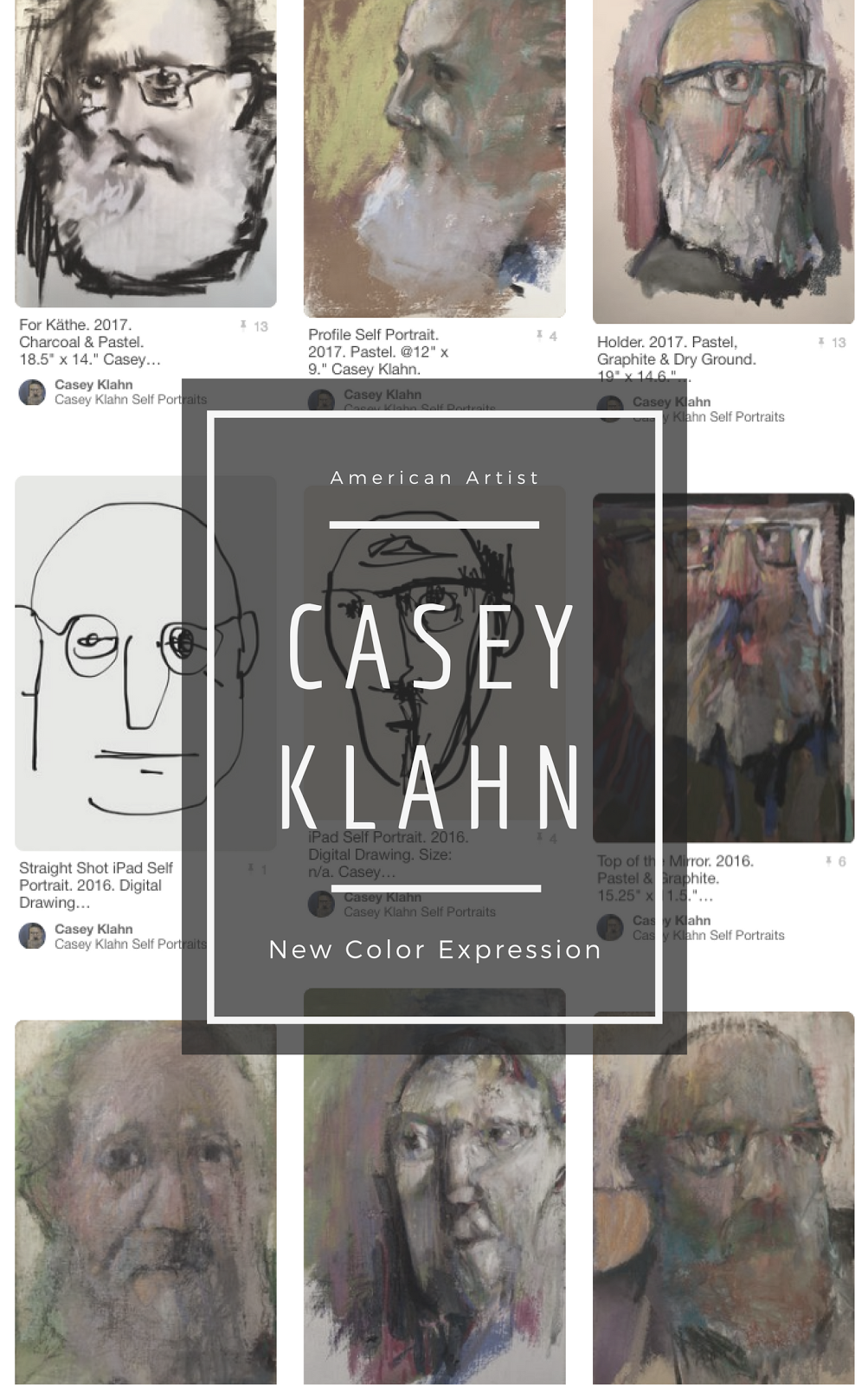
The time has arrived to replace my aging blog banner. Here are some designs, and I am asking you to vote on your favorite. You might expect me to be a whiz at design, but I have too much respect for that profession to think that I can just rip out designs like a pro. It is a skill I struggle with. Help me out by voting for the one you think should top The Colorist blog.
There is a school of thought that says you should get straight to the content in your blog, and not delay everything with a big banner. The idea is to either dispense with the banner and go with text only, or place the thinnest banner at the top of your blog. My own view is that I write an artist's blog, and I want visual impact. The little picture icons that are now part of blog rolls do a nice job of headlining each new post, as does the post title. The majority of readers are fed by their subscriptions, and recognize the blog plenty well when they get here.
Except that now you'll be seeing a fresh banner. But which one? Please vote in the poll at the right hand sidebar. In addition, I will offer a brag banner for those who so desire to advertise that they are one of the smart readers who visit here often. Whichever banner is chosen, I will be complimenting it with a badge like the one below.

The How to Mind Map Your Blog post is written, but I need to tweak it a little more. Stay tuned, mind travelers.












 Posts
Posts


