30 September, 2007

Starbucks & Moleskine Sketching

Starbucks @ "The Y", Spokane
September 29th, 2007
Graphite in Moleskine
8.25'" x 10"
Casey Klahn

Here is an interior that Americans are familiar with. I look and see a lot I could've done differently. Whats more, I forgot my eraser, and only had the little bitty one that comes on the end of a standard school pencil. My sketching pencil is an all graphite one, which has no wood case. But, that's what sketching is all about. Mistakes yes, but impressions absolutely!

I would make sure that the table standards don't line up, and I would omit the wooden box that hides the computer that is floating in the upper right and blocking the baristas' heads. I would "push" some things, and "pull" others. Anyway - I have to get used to posting these Moleskine sketches, warts and all!

28 September, 2007

Wolf Kahn Pastels Review - Part 1

The Big Drawing Book Review will be going on in October. I am early, being an overachiever by nature. Not really, I just had it in my mind that I had to have this done before the end of September!

In reviewing my drawing book, I chose the first one I could think of: Wolf Kahn Pastels.
It is hard to create a format for a review about a book which has very little format, itself. It is a series of petite essays that have titles like: Dry, and Celebrating a Single Color, or Bright Orange.

Kahn certainly has the heart of a teacher, himself. It comes through in his writing, and you can just picture him in a workshop or seminar imparting his wisdom to his acolytes. Much of his subject matter is about art as art. And he isn't pretentious about it, either. He is just genuine - true to himself and his own motives about making art.

I find myself in virtually complete agreement with him about art matters. He doesn't get on a soapbox about these great issues, but he parlays about them in a conversational manner. For instance, in his chapter on The C&O Canal, he takes a shot at the art historians who deconstruct artworks to find the hidden motives of the artist. But, he does it in the wryest way possible.

It is a sure sign that his book is effective, as I find in my second full read of it that I want to go into my studio and start creating pastels that ooze the stuff that I have absorbed by looking intently at his drawings. How much I missed the first time! How great it is to have a little more context myself in order to better understand what he is talking about!

Read it. Re-read it. Do some pastels (even if you don't consider yourself an artist!). Write your own essays about your art. The next level? Make a colored drawing with the subject in the very middle. Paint a painting with some (much) of the ground showing through. Instead of hatching, choose scribbling. Start with high key orange.

The following is an interview that WK had in a venue called, "Artist's talk About Art", in which he addresses the subject of art, and I focus on his comments about the Pastels book.


November 7, 2003

Dialog between Wolf Kahn and Donna Marxer, "Wolf Kahn's America"

WK I tried to write a "how to" book with metaphysical pretensions. (Kahn is speaking about his Pastels book, here-Casey)

DM What makes a great painting? That's a hard question.
WK You’ve got to some
how be going after something which finally is violated in your picture, because your picture goes much further than the thing that you tried to make. I say that somewhere unless a picture has ten times as much as the artist consciously put into it, it’s not even made by an artist . . .

I think each great painting has its own attribute. I think it is a mistake to generalize. In fact, most teaching I'm against. And in my pastel book, I have a section called "Composition" and I say that composition in my lexicon is a dirty word. Because it presupposes an ideal painting that exists somewhere and which all the laws that the teachers are teaching are exemplified. For example, "Can't cut off a corner." "You can't cut off a painting in half in the middle." "There's got to be a center of interest." And all this bullshit that gets taught. And I think the whole idea of an ideal painting that exists in some kind of imperiun is a mistake. Like, as soon as I heard that you can't cut off a corner, I immediately made a painting that cut off a corner. Because our perversity has to be satisfied. It is very important to satisfy our perversity.
Because we don't want to be hemmed in; we don't want to be put into confining fences and most art teaching has to do with fences, for example, you read the Pastel Journal. I mean the lady who runs it is very nice and she even gave me a good review for my pastel book and I shouldn't speak against that magazine but hovering in the back of everybody's mind in that magazine is the idea that there is such a thing as a perfect pastel that you have to make in which the shadows are just the right colors and the mood of the landscape is exemplified and so on. I think all of these things come secondarily, you know, they come out of you doing the best you can on some kind of a wild goose chase. I think art is a wild goose chase. I just came up with that now. (Laughter)
http://www.atoa.ws/sales/kahn.htm

Book:

Wolf Kahn Pastels
Wolf Kahn, Intro by Barbara Novak
2000
Harry N. Abrams Books, NY


Random Link:

Be prepared to have your mind blown. Follow this link to a Little Rock, Arkansas high school lesson plan based on Wolf Kahn's pastels. Don't stop before you have paged to the bottom and seen the student results that are posted.

26 September, 2007

New Pastel Blog!


Announcing Pastel at PastelsBlog.Blogspot.com!

Because my tags are top-weighted with the subject of the pastel medium, I felt the need to step this subject out into it's own blog. What's more, there seems to be a demand unmet by the current blog world. I am by no means the leading authority on the medium of pastel, but I am willing to open up a venue like this to cover this popular and growing artist's tool.

Now that The Colorist is close to 1 year old, I want to continue to narrow and define it's direction. This blog is more about process and art than it is about tools and techniques, and so I am splitting out the vast world of Pastels as a stand-alone blog.

So, please continue here for my art process story, the broader world of fine art, and essentially a manifesto* on New School Color. And, for an exciting and growing discussion of all things pastel, please go to Pastel, at http://www.pastelsblog.blogspot.com.

*Manifesto: in art a public declaration or exposition in print of the theories and directions of a movement. The manifestos issued by various individual artists or groups of artists, in the first half of the twentieth century served to reveal their motivations and raisons d‚etre and stimulated support for or reactions against them.

Computers Scare Me

Don't hit this inert button. Hit the one in the right column.

Is it any wonder why computers scare me? I have been laboring under the belief that I had the subscribe button all spiffy and clean, working in my right margin column like everyone else in blogland.

On the contrary. The little bugger was linked to some other random page at Feedburner, or Bloglines. Probably the Shanghai office of lost links, I'm sure.

Anyway, dear readers, if you haven't gone the long way around to subscribe to this, your favorite art process and color crazy blog site, you are welcome to do so the easy way by hitting that little button at the top right (for now) of this page.

22 September, 2007

Van Gogh Update

The Fields
1890
van Gogh

Here's the latest on my sad friend, Vincent. I have it that he was beside a barn or some type of structure, not really in a field when he took the fatal shot. But, let's not quibble.

Looks like a private party has put this one up for bid at auction. It has been displayed in Amsterdam and London, but here you are.

Was this his "last" painting? I think that matters more to the sales hype, than to the history. Anyway, I'm putting together a fund to make my bid. Any helpers, out there? (Just kidding, folks).

20 September, 2007

My Discoveries

Pinks & Greens
7.8" x 6"
Pure Pigment Pastel
Casey Klahn


Let's get out and about, as they say, and visit some great art & artist's sites that I have recently discovered. I make these discoveries over time, and it's a slow process. I haven't got a clue what I am looking for, just things that appeal to me artistically.

First, blogs that are new (to me):

  1. Ann McMillan's blog, Fresh from the Easel. Ann is a California pastellist who really has the landscape down, with a fresh and colorful perspective. I have never met Ann, but hope to someday. Her web site is here. Don't miss Blue Barn.

  2. Lisa Call. Lisa isn't really new on the block, but I did add her blog to my links recently. She is an important figure in the world of art blogging, with a well crafted site and killer quilts. I don't have a lot of fine craft stuff on my blog, which reflects my personal tastes in general. Don't get me wrong, I have crafter friends on the circuit who I respect greatly. I collect Raku pottery, myself. Ancient art was as much about the clay pot as it was about the picture. And quilting is as much a part of Americana as Country Music, and by that I mean authentic. I guess I will require a whole set of posts at some point to fill out my links to craft web sites.

Artist's web sites (AKA artist's without blogs, or AWB):

1. Jean-Michel Blanc is a French artist with a web site entitled: Art Pastel. I will take the privilege of sharing his entry quote here:

" The use of bright and warm colours in order to give a presence to the landscapes,
the individuals and situations in daily life. Put into scene, spontaneous and privileged
instants which we would like to live, " JMB.

I really like Jean-Michel's large scope in his cityscapes, and his personal color choices. He also has a strong unity to his figure work that is refreshing.

2. Eric Merrell. Another of those Californians! Eric has a pleasing twist on colors, and he pins this talent to well organized shapes in the landscape. And, he is prolific in his range of subject matter. Enjoy this sea stacks offering in his painting, Stability.
Sites that I label, "About Art" are third party sites such as museums, art news sites, and art commentators/critics. Here are my recent additions to my links:
  1. Venice Biennial, and Florence Biennial. The Venice venue (or set of venues) is a long standing (established in 1895) showcase for important world art. Our local boy, Mark Tobey, made a splash there in 1959, and the big city art clutch us still trying to live that one down. Time for another one of those, I'd say. The Florentine venue is juried by the "most authoritative in the world", according to it's Wikipedia entry. Is there any other city in the world with a foundation in art like that of Florence?

  2. The Peggy Guggenheim Collection in Venice creates a nexus with the Venice Biennial by hosting the American Pavilion.

And, before I finish, I want to draw attention to Wolf Kahn's new works in pastel. They favor green, at one time, and others favor yellow. Really great work!


New Logo

Logo: Casey Klahn, New School Color


The thing about going with a logo, is that you really ought to "nail it" the first time. Maybe that's one thing that has kept me from deciding to field one. But, since this gallery packet project is now officially keeping me up at night, I think the timing is right to "brand" my business mailings.

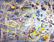
It's hard, don't you think, to distill a whole body of art into one "blurb" image? So, going out on a limb here, I chose this abstract image that I drew at a workshop a couple of years ago. It very much says "color", and yet it doesn't pin me down to any one of my landscapes. And, at the same time, it is an artwork, rather than a symbol or construct of some letters.

I don't have a background in graphic art, although when I took the Famous Artist's School course (I was @ 10 years old), the focus was on commercial art. It's a whole different discipline than fine art, but there is some cross over.

18 September, 2007

This

Old Sketch
Casey Klahn

...is how I feel, sometimes.

15 September, 2007

Windbreak & Tractor

Windbreak & Tractor
Graphite in Moleskine
Casey Klahn

I don't often make these sketches that aren't "perfectly" composed or balanced. Even this cropped in area lacks good composition. Sometimes, I get caught up in the details, too.

This scene is outside of my mother-in-law's farm kitchen, and features her little orange Kubota tractor. I liked it because of the repetition of vertical trees, and anyway it's well committed to memory for some future painting. It helps to have some objects to add to a painting once in a while.

14 September, 2007

Moleskine Pastel Sketching


Above Kimball Junction
8.25'" x 10"
Pastel Sketch in Moleskine Book
August 6th, 2007
Casey Klahn

One can sketch with pastels, and it is very good fun. This image is done on sight, from the back of the WalMart parking lot near Park City, Utah. Probably the most beautiful WalMart parking lot view anywhere. If I remember correctly, you can turn 90 degrees to the right from this scene, and you will be looking at the monumental Olympic Ski Jump, from the 2002 Winter Olympics. Follow the highway to the right, and you are on the Tenth Mountain Division Memorial Highway (Highway 224), which honors the storied unit that my late father served in during WW II.

It helps to have meaning and context, I think, to realist art. Sort of "fills it out," in my opinion.

The sketch itself is something of a mess, which is the best start for many good pastels that will be finished later. As long one gets the composition of lines and masses looking like he wants, and a few color notes established, then he's good to go. And, I'll give myself points for being loose, goose.

Before I leave the story of this drawing, locals to Park City will wonder which body of water I must have seen from the Kimball Junction location. None, of course. I just wanted to establish a unified base of blue-violet in the middle ground here. Artist's prerogative, you know. If I ever finish this one, I'll probably go ahead and stick a lake in there, and change the title of the piece.

Of special interest to me is the materials used for this outing.
The pastel sets included the Basic Values Set from Terry Ludwig Pastels, which happens to be way overkill for an on sight day of sketching, in my own opinion. I prefer a smallish set, which I may post about in the future.

The sketch book is the famous "Moleskine" of Ernest Hemingway and Jack Kerouac fame. Those are two literary giants whose footprints I have crossed over this past year during my art travels. They are leather bound, for those who value permanency in their books, and they lay flat.

The Squidoo Lens on this spiffy little leather-bound sketchbook's form of biblophilia is:
Moleskinerie.com

12 September, 2007

My Moleskine

Artist's Tape, Moleskine and Pencil


Sketch Box, Moleskine & Mouse


A Moleskine owned by
Pablo Picasso (1881-1973)
Notebook No. 53, June-September 1912,
9 x 13.5 cm
kept in the Musée
National Picasso of Paris


The sketchbook of
Vincent van Gogh (1888–1890)
Kept in the Van Gogh
Museum of Amsterdam


Moleskine Sketch books are the grail of bibliophiles, such as myself. I will post the few sketches that I do, warts and all, as I create them.

Face and Hands

Face & Hands
Graphite
Casey Klahn

More process stuff in the figures vein, this time a portrait sketch, from the imagination.

This sketch is @ 12 years old.

11 September, 2007

Subscribe

Because of the windfall of visitors that I am getting from Alyson's blog, I invite you first time readers of The Colorist to subscribe using the feedburner tool at the top right column. Thanks!

Patriot Day

My House; Flag at Half Mast

I remember my son was only 12 days old the morning we watched world history unfold on our T.V. set. Because all air traffic ceased for a period of time, we had the eerie silence at night when we fed him. We live where there is no noise whatsoever, out in the country.

Then, one night while doing a middle-of-the-night feeding, came the sound of a plane at altitude flying West. Seven minutes later, another. Then, in perfect intervals of seven minutes each, an aerial convoy of US Air Force jets flew to war in tactical formation. War. Over American soil, our forces were deploying to the Middle East, already on a war footing.

Remember.


Poll Results

Quickly, the results of last week's content poll are, so far, an even spread for the following three subjects:

  1. Colorist Art
  2. Casey Klahn's Art
  3. Pastel

I want to thank the readers for this input, and it gives me a great start in my search for what to continue to write about here at The Colorist.

10 September, 2007

Linky - Linky- Greety


Casey Klahn in Studio

The post title is blogger slang for saying "greetings" to the visitors coming in from Alyson Stanfield's ArtBizBlog, where she has a post entitled: Artist's Blogs to Fall in Love With.


Casey and Vincent at a Paint Out


So, welcome if you're new here. My blog is a process-type space where I post about "Colorist Art", in a new and modern sense. Also, things that I enjoy, such as art history that isn't too stodgy. An example would be my posts on Vincent van Gogh (who I interview here).

You know, there are precious few photos of the old keener, van Gogh. He hated the camera so. Here's an image he allowed me to have of our virtual visit in Paris, but only of his back.

Vincent and Moi Hold Forth

Another popular subject here at The Colorist is the medium pastel, which I favor. Here's a post about my chums in the pastel world. If you like, see my post about the founding pastelist herself, Rosalba Carriera.

My art can be viewed by clicking on My Artworks.

Now, I'll be going back to Alyson's blogs list and finishing my tour of bloggers to love!

07 September, 2007

Figure Drawing

Lead Climber
11" x 6.75"
Graphite on Paper
Casey Klahn


The figure used to be my primary subject back in my drawing days. This one of a rock climber, drawn from the imagination, was done about ten years ago.

Why don't I do the figure now? When I decided to go full time, and professional, in fine art, I reasoned that I had not explored the landscape very much. Also, my knowledge of color was shaky, I felt. So, the colorist landscape developed as my "growth subject".

The figure is, in my opinion, the pinnacle of artistic subjects. Nothing expresses so directly to the viewer what an artist is saying than the human form. As far as mastery is concerned, the lack of it is never more obvious than in a rigidly drawn figure. Rendering the human form is basic to my own "inner artist". Without it, I would always wonder, "can I draw?"

As I slowly move my studio to it's new location (across the lawn), I hope I can uncover some more of those old drawings and share them. I like what they say about process and my own philosophy of art.

05 September, 2007

Reaching for Motivation

Photo credit: Lorie Klahn

Finger Crack,
Leavenworth, Washington

It's good to reach back in the memory files for personal motivation. I have so much to do, and the progress feels like one inch at a time. Packets, printing of materials, follow-ups, planning, and (Oh Yeah!) art all vie for their place in my priorities.

Ah, for those halcyon days of granite climbing in fair Leavenworth! Adventures galore in the stunning North Cascades! Concerned only for gravity and friction, sun, wind, snow and rain!
The impossible was at hand, in those days. Maybe it still is today, huh?

This is a great Hollywood style photo taken by my wife and climbing buddy, Lorie. Too bad I never could figure out what that rope was for.

02 September, 2007

Content Poll

What subjects speak to you here at the Colorist? Which one is your favorite? Based on my past stats, one subject that was superstar great was Vincent van Gogh. The pastel medium gets high marks, but I think it's a narrow segment of this audience. What about my art process (the only area where I can claim any authority)? The truly strange among us read here for jokes about royalty and their pet monkey.

Where do you come down on the content of this blog? Vote the poll to the right top margin, please. Your friendly author will make every effort to consider these. If you have other ideas, post a comment here.

P.S. : My quick thinking readers have pointed out to me that they cannot vote for "subjects" in the plural, as the poll only accepts one answer. I'll have to go back to the code and change the word to "subject" because I need a hierarchy showing the most popular on down. Thanks for voting and sorry for the mistake.

01 September, 2007

New Blog Banner

Thanks for your patience as I test these new blog banners. I am trying as hard as possible to get one that doesn't require scrolling, but so far this one just needs a minimum of that.

Not sure about the font, but we'll rest on this for a while.

Addendum:

Why post a new banner design at 3 AM? Obsessed with graphic perfection? Maybe. Or, maybe it's just that my Kindergartener has a bug from his first week at school, and slept in our bed, and then wet same. So, I already was up nursing my sore shoulder, anyway...you get the picture.

The new banner really needed to be a "no scroll" banner, anyway. I only worry, now, that people can't see the first post because of the mega banner being in the way. Hmmm...I wonder if I can re-do it until the sun comes up?

Casey Klahn Fine Art

Casey Klahn Fine Art

You are invited to see my web site, post-makeover. I spent an intensive week of online fussing, with a group of about eight other artists and crafters, and moderators Alyson Stanfield and Patricia Velte. The professional and peer critiques were useful, although when I went about giving crits to my peers, I felt like a drive-by shooter. The whole process ends up well, though.

If you're after a "from scratch" professional design for an art website, I highly recommend Pat's White Wing Designs. She knows her stuff and will make for you, I am sure, a very spiffy web presence.

The free side of the house would be to go to Google Page Creator and "do it yourself". My Google web site is here and here. Notice the links are dead because I am not using the tool as a web site. What I have done there, is to create some extra pages to link from my web site, which limits the number of pages I get.

Then, I also favor my own choice, which is a template site (like the blog). It is Fine Art Studio Online. Not much money, and relatively easy even for an old fart like myself.


Abstract Expressionism, Art Criticism, Artists, Colorist Art, Drawing, History, Impressionism, Modern Art, Painting, Pastel, Post Impressionism