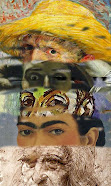
 Here are some examples of my favorite posts at The Colorist.
30 April, 2008
I Am, I Said
29 April, 2008
Newsletters That Kill
It is not everyday that I get to conduct an interview here at The Colorist. And even rarer still the chance to hob-nob in the greater world of art business. Are you an artist in need of guidance in marketing your wonderful art? I'll take that as a yes.
Alyson Stanfield, the ArtBizCoach, has written a new book you must read:
I’d Rather Be in the Studio! The Artist’s No-Excuse Guide to Self-Promotion.
Yesterday, I linked you to her terrific web sites and the book info page. Everything at the ArtBizCoach is action-oriented. "Do This" is Alyson's catch phrase, and she is sure to get your business side up and running if you'll read this great reference and motivational book.
Perhaps because I have been remiss in getting out proper mailings, I was interested in the artist's newsletter. Some artists live entirely off of patronage from their mailing lists, and I wanted to know the best way to crack that nut.
Alyson, thanks for stopping in.
Casey, I'm really happy to be here. I knew you before you had a blog and I've enjoyed watching you build up your online presence. You're doing a fantastic job! What's on your mind today?
I want to know more about newsletters, both hard copy and e-mail types. Do you support the idea of a special newsletter for gallerists and/or museum curators?
Casey, I really don’t. I think they’re too busy to read your news and you’re too busy to write a couple of different types of newsletters. I’d feed them information the old-fashioned way: letters, brief email updates, etc. I recommend newsletters as a way to keep in touch with patrons.
Also, my patron newsletter I plan to make twice yearly, due to my slow studio production. Plus, I have the daily blogging for frequent news. What wisdom can you offer about newsletter frequency.
It depends on the format. A printed newsletter can be costly, so it doesn't make sense to do it more than two or three times a year. But I might bundle up some of your blog posts and do an e-newsletter in between the two printed versions.
As you know--since you read the book--I believe the most important criteria for writing good newsletters is having news. Everything else is secondary. If you can create good content that people want to read, you can easily do a monthly newsletter. Reread what I just said. I said, “that people want to read.” It’s not about what you want to tell them, but about what is of interest to them. People will make time for things they can relate to or are entertained by.
Also on newsletters, the best one I saw in Googling examples was a short and to the point one from a bar which included a discount coupon for hot wings. It had the brevity, the reminder and the hook. Can you offer some examples of artist's newsletters you feel hit it out of the park?
Very few artists hit a home run with their newsletters. One I particularly love is in I’d Rather Be in the Studio! and that is Elia Woods’ newsletter. It’s not all about her, but about the subjects (vegetables!) in her photo-transfer quilts.I particularly liked the chapter title: "Send a Killer Newsletter". Right away the task has gone from a business obligation, to how to excel and get results with one's newsletter.
I also enjoy Anne Leuck Feldhaus’s newsletter. Her brightly-colored paintings are always uplifting to look at and she features her animal rescue groups as well as another local artist in each issue. I commissioned two pair of earrings from an artist I found in her newsletter last fall!
I will tell you that the most boring newsletters I get are from artists I’ve never heard of who tell me about their exhibit that’s on the other side of the country. I don’t ever read these and I don’t recommend sending newsletters to people who don’t know you.
As I see it, you have two options for hitting it out of the park with your newsletter: (1) Be a fascinating storyteller or (2) Be funny. All you have to do to see that I’m right is to recall why you read something and why you pass it along to your friends and family.Thanks for these answers, Alyson. Looks like I'm on track now to publish my killer newsletter. If you're reading my blog, and wish to be on my mailing list for a newsletter, send me your mailing address (snail mail) to caseyklahn (at symbol) Gmail dot com, no spaces. I also send a high quality postcard with an artwork image.
Interested in winning a free copy of I’d Rather Be in the Studio! The Artist’s No-Excuse Guide to Self-Promotion? Visit this site, read the instructions, and enter. Your odds are good as she’s giving away a free copy on most of the blog tour stops. You can increase your odds by visiting the other blog tour stops and entering on those sites as well.
28 April, 2008
I'd Rather Be in the Studio

True to the title of Alyson Stanfield's book for artists, I'd rather be in the studio than almost anywhere else. My family went to Seattle for the long weekend, and left me to get some headway on my deadlines. The studio time has been wunderbar!
Speaking of the book, this blog will be participating in Alyson's Blog Tour. I'll be interviewing her on April 29th, which is tomorrow. Don't miss this opportunity to get the extra insight that the Art Biz Coach has to offer you.
27 April, 2008
24 April, 2008
Alphabet Art
Lisa Bachman's Alphabet Art project is not to be missed. Sheer whimsy, and a fun look at all things art.
23 April, 2008
Award

The Arte y Pica award has generated quite a buzz around the blogosphere. I'd like to thank Corrine, the JAFABRIT, for awarding this gem my way. I wish to recognize my fellows in this awarding, who are the following bloggers:
I have some kinks to iron out in my awarding of this bling thing going forward, and so the presentation announcement will be forthcoming. Please stand by.
21 April, 2008
Blue Trees in the Middle Distance
 Blue Trees in the Middle Distance
@8" x 5"
Pastel
Casey Klahn
Because these latest works do diverge from my New School Color style a little, I am creating a catch phrase for them. So far, I am want to say, "I'm doing landscapes, now". Don't worry, though, the colorist pieces are still being created in my studio.
One thing I discovered recently is that the less detail I give to these distant and middle distant trees, the better I like the painting. Shapes! Color notes! That's the thing.
Via Katherine, and then Robert Genn, comes this quote by Clive Bell:
One thing I discovered recently is that the less detail I give to these distant and middle distant trees, the better I like the painting. Shapes! Color notes! That's the thing.
Via Katherine, and then Robert Genn, comes this quote by Clive Bell:
"Detail is the heart of realism, and the fatty degeneration of art."
18 April, 2008
Jaunty Lake Garda
17 April, 2008
14 April, 2008
Pastel Ascendance
Casey Klahn
The Plein Air Project at pastelsblog (Pastel) is finally out of the door and basking in the sun. Well, not today, when it's raining. Tomorrow, the forecast is for snow again! Now you know why I had to get out on the weekend while the getting was good!
The Plein Air Project, at Pastel, has been linked to the Wolf Kahn Project at this blog. The main reason is that WK is interested in nature, and I am trying to infuse a little more nature in my own art. Also, I love Kahn's drawing style, and wish to learn from it. I notice that I am straying a bit from that, and want to get back to studying the master's scribbley drawings. Perhaps I'll have to make a few trips with sketchbook only, or take along a few images by Kahn for reference.
13 April, 2008
Art Review Weekly

The new posting project at The Colorist: a weekly review of art seen and appreciated. I'll be making these posts on the weekends, either Friday, Saturday or Sunday. Perhaps they will be weekly, but more likely they will be occasional.

Adam Cope - A Contemporary Artist's Personal Response to Prehistoric Cave Art.
A British artist living in France, Adam has painted the rock walls we revere for prehistoric art and has given us some revealing abstracts at the same time.

Mr. Zip - The Vaporetto Series
British artist Harry Bell has a new idea for an old subject, which is to organize water taxi commuters into compositions both formal and romantic at the same time.
11 April, 2008
Snow Curve
 Snow Curve
7.5" x 7"
Pastel
Mar 08
Casey Klahn
The art studio "automobile" is cranking along on one cylinder, it seems. I am desperate to get well from my operation that occurred two months ago, and now am trying to get past a nagging sore throat. Chronic pain and feeling tired doesn't help when you're needing to get up at 4 AM in order to do your art work.
And, just when I get well enough, the kids will be out of school for the summer!
O.K., Maggie says no excuses. And, she is the Future Queen of the World, so I had better listen to her sage advice and quit belly-aching.
Let's see, where did I put those goals?
And, just when I get well enough, the kids will be out of school for the summer!
O.K., Maggie says no excuses. And, she is the Future Queen of the World, so I had better listen to her sage advice and quit belly-aching.
Let's see, where did I put those goals?
09 April, 2008
Kahn Bio

The famous American, Wolf Kahn, is an octogenarian who lives in Vermont, and has been involved in the New York art scene for over fifty years. His family fled Germany in 1939 to escape Naziism.
He is considered a member of the "New York School", or a second generation Abstract Expressionist, and studied under Hans Hoffman. His art is collected by top tiered American museums, and is represented by several noteworthy galleries, including the Ameringer-Yohe in NYC.
Mr. Kahn's career can be explored through a number of books, including
Wolf Kahn's America and Wolf Kahn Pastels.
My own affinity with Kahn's work has no relation to our name similarity. When I took up landscape painting, I realized that I had an academic understanding of color, but little experience with it. Did I have that natural ability, or knack, for making colors "sing" that some artists have? There was only one way to find out.
I knew, by the way, that my mother had a way with colors. She wasn't a painter, but she knitted and did various other crafts. My own path was to look intensely at Wolf Kahn's works and seek to understand what he was doing with color that stood out.
Also, the flattened perspectives and vertical lines speak to the formal qualities of modern art, which interests me greatly. One trick I used early in my research was to take a color composition of Kahn's, and turn the wheel one color to the left or right and see what could be done. After doing a few paintings this way, I just evolved my own color ideas. Walked on my own, so to speak.
It bothers me not the least that my pastels look much (or something) like Kahn's artwork. He is a noted master, and derivation is the natural path of art. I am interested in the vision of current artists who are focused on color first. What makes them authentic? Is the contemporary colorist work saying anything that the fauves didn't already say?
My pastels are more like Kahn's oil paintings than his pastels. I am interested in the medium of pastel to the extent that it offers some very new and current content to the art world. Kahn's pastels are more in the realm of drawing. And they are the best of drawing - loose, free, formalistic, and new. They do, however, smack of the traditional study-for-a-painting methods that have been a hallmark of pastel work for years. Nothing wrong with that. Drawing is the original art, and must be connected to the past somehow.
New School Color
Wolf Kahn dot Com
08 April, 2008
Subscription Straightened Out
10" x 7"
Mar 08
Pastel Drawing on Rives BFK Heavyweight
Casey Klahn
Mar 08
Pastel Drawing on Rives BFK Heavyweight
Casey Klahn
The Colorist may now be subscribed to at Feedburner at this address:
http://feeds.feedburner.com/blogspot/GtMt
Once I get comfortable that this new feed is working, I may rename that address suffix. For those of you who have wished to subscribe via Feedburner in the past, but couldn't, I hope this remedies that. I use Bloglines and enter the URL manually, or you may also wish to try Google Reader.
If there are any lingering problems with my subscriptions, please let me know.
Special extra thanks to Katherine for her bird-dogging this pesky problem with me. She cared enough to let me know how my blog was issuing weird and annoying pop-ups that somehow related to my having a bad address at Feedburner. Take home lesson? Don't type-in third party boxes while sleepy!
07 April, 2008
Speaking of Oops
A subscriber informs me that her feeds to my blog create an unwanted pop-up that tries to open a dial-up connection. I have taken down all of my Widgets and third party links from my right hand column. Anybody else get unwanted pop-ups from my blog? Pollock linking by accident?
Additionally, I have attempted to kill any feed utilities that are my option to do so. That shouldn't, as far as I know, end your actual subscriptions. Personally, I use Bloglines, and I subscribe to URLs manually. That means I don't click offered subscriptions at blogs. It isn't a security thing, but I just find it the easiest method of using Bloglines.
I did not take down Statcounter or end my Technorati association.
Apparently some problem exists with Google Reader not recognizing this blog. I found that to be true myself.
Update: Google Reader is catching my posts with no problem. I entered the http:// by accident, and it just wants the name without the subscript.
Anyone else have subscription issues here?
05 April, 2008
OOPS
I'll be enjoying an Out Of Pocket Session, for Turkey Camp, through Monday. See you then!
02 April, 2008
One Sheet 3.2
 Since the business hopper is hopping, I need to get the One Sheet finalized. Here is version 3.2. I'm not sure if I have it all proofed for errors, but here it is for design purposes.
Should I either write one more paragraph to the statement, or delete one entry from the resume, in order to make the two columns end evenly (justify)?
Thanks to the following bloggers for their help with this:
artBizblog - Alyson Stanfield
Dordogne Painting Days - Adam Cope
Paint and Pastel - Gesa Helms
Laketrees - Kim Barker
Katherine Tyrrell
Pastels and More - Miki Willa
Jean Victory
Risha
01 April, 2008
Transmorgification of an Image
The word "transmorgify" is one of those wonderful new words that is becoming popular, and yet has no meaning. I use it to describe the transition that takes place when I take a scene drawn on-site, and then change it in the studio to be almost a completely different image.
Such is the case with this image, as it started out as this image. I added a building that is taken partly from some studio references and partly from imagination. The horizon is obliterated mostly because I dislike the horizon in landscapes.
Maybe spring has been transmorgified back into winter, too. Both Saturday and Sunday it snowed and we received a foot or more of new snow each day. I went skiing. So much for my plein air program. It will be continued when spring returns!
Subscribe to:
Comments (Atom)
Abstract Expressionism, Art Criticism, Artists, Colorist Art, Drawing, History, Impressionism, Modern Art, Painting, Pastel, Post Impressionism


