31 May, 2009
Emily Mason
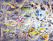
The American abstractionist, Emily Mason, uses color the way it ought to be used: with gusto! If your coloristic spirits are lagging, go see her work for inspiration.
I read an interview where she says she thrives on spontaneity, and do-overs deaden pictures for her. I relate to that, and it's nice to hear commiseration of this experience.
Emily Mason Paints with an Instinct for Color.
Three Generations of Abstract Painting: Alice Trumbull Mason, Emily Mason, & Cecily Kahn
30 May, 2009
Red Tree
"If I could say it in words, there would be no reason to paint," Edward Hopper.
Just turned around and noticed that I have @ ten more River Series' for Lorie to photograph. I haven't even gotten every one of the first set posted, yet! My cup runneth over, but in more than just finished artworks. I am learning more in this session than I have in perhaps the past couple of years.
Actually, it looks like twelve new works. A thing I do is, after completing a run of artworks, I will spot a couple of dogs in the lot, and axe those. Then, I will look at the remainder, and axe the two or three weakest paintings, as well. I am a brutal boss to work for...
If I am smart about this series, I will quit on the medium sized works and just focus on large, small and bigger medium works now.
29 May, 2009
Funniest Name of an Award Award

The Noblesse Oblige Award receives my funniest name of an award award. Nevertheless, it does contain some rather strict requirements, and so I am happy that Loriann Signori thought to elevate me to the level of this award. Thanks, Loriann.
The Noblesse Oblige Award is for the following accomplishments:
1.The blogger manifests exemplary attitude, respecting the nuances of different cultures and beliefs.
2. The blog inspires, strives to encourage and offer solutions.
3. There is a clear purpose at the blog and it is one that fosters a better understanding of social science, politics, economics, the arts, culture, science or belief.
4. The blog is refreshing and creative.
5. The bloggers promotes friendship and positive thinking.
The rules are as follows:
1. Create a post with a mention and a link to the blogger who presented the award to you.
2. Display the award conditions.
3. Write a short post about what your blog has thus far achieved.
4. The blogger must present the award to blogs in concurrence with the award conditions.
5. The blogger can display the award at any location on their blog.
I don't feel very nuanced, in general, but I do try to send out my light wherever I can.
I choose Victoria Ryan for this award.
28 May, 2009
Reflections in the River
 Light River Reflections
7.25" x 13.25"
Pastel
Casey Klahn
This image more directly reflects the Hoquiam River Series that began all of this river work. For one thing, it is a composition from life, and the color and mood are a match to the Hoquiam series. The only thing lacking is the formal match - it isn't really the Little Hoquiam River. I'll have to make another trip to the coast soon to refresh my Hoquiam images. For now, my imagination will suffice for the extended river series.
27 May, 2009
Nordic Start
We used to call an early start up the mountain an "Alpine Start." And, conversely, the late start was the "Nordic Start." I am in bad need of some Nordic starts, after the active holiday weekend. Yesterday's studio day was fruitful, but I was all in before evening, that's for sure.
The hot post this week was Sue Smith's music video post of singer Leonard Cohen. I was gobsmacked at the performance, and it was a great pick-me-up. This video system could go viral, IMO. I am now a fan of myplay, but the available media is still a bit thin.
This is post # 16 of 30 for my month of posts project. So far, I am learning more about content and what pleases me (and readers!) the most. Worth trying, artist bloggers. Hint: write some posts a few days in advance.
I want to introduce you to artsetter, a social and commercial community supporting art , collectors and artists. The video introduction and layout of this site are outstanding. The launch date is still to be determined.
Anyway, I am in the studio as much as possible so as to have a cohesive show this September in Sausalito. I need to figure out how to work longer days, so I feel some Alpine Starts coming up...
26 May, 2009
Buck River
A simplification of the River Series.
I am in a daily posting mode for a month. This would be a good time to subscribe or to follow The Colorist.
25 May, 2009
Our Nation's War Dead
Remembering our nation's fallen on Memorial Day.
When my father told a war story from his World War II experiences, he would sometimes end it with, "that guy got kill't."
Today, less than 1 % of our American population serve in the military, and only about 12% have once worn the uniform. Which makes it somewhat difficult for us to arouse memories of our nation's war dead. Families who have lost loved ones remember, usually in silence.
Be it in World War II, Korea, Vietnam, the Gulf War, our present conflict or some unheralded action in freedom's cause, young Americans have given their lives for us. Often, they were only seventeen, eighteen, nineteen or a young twenty-something years of age when they did so.
No better words have been written than in this essay from a third grader:
As the flowers rest on the decorated graves and the sunlight shines on the beautiful sailboats, Uncle Sam whispers in my ear about how we should care for the soldiers and remember the ones that have died.Poem: © 2001 Ali M., 3rd Grader, Academy Elementary School, Madison, Connecticut.
Swimming pools open, BBQs fry.
Today is the day to think of what they have done for us.
There are blurs of red, white and blue marching down the street and flags are lowered at half-mast.
But we should always remember and never forget what set us free, from this very day on.
Over 42 million men and women have served our nation in wartime. We remember them, and also our peacetime veterans, on Veteran's Day. About 1.2 million have paid the ultimate sacrifice, and we decorate their graves on this Memorial Day.
My Illustration for the Tenth Mountain Division Memorial in Denver, CO.
A remembrance of the costs of the war in Italy. Portal.
24 May, 2009
23 May, 2009
Down the River
What's waiting around that bend of the river?
While we're on the subject of rivers, stringed instruments and Americana, let me indulge you in a memorial to the art of folk music.
22 May, 2009
Intuitive Art
 Yellow Gesture
18" x 11"
Original Pastel
Casey Klahn
CTA
The gesture embodies the intuitive approach to art. Sure, color choice looms large. Linear composition, also big.
And I am holding drawing up as the most fundamental pursuit within the big tent that is fine art. No offense, ceramic and glass. No offense print media, and photography. But drawing is the alpha (if not the omega) of artistic expression.
So, consider the gesture. Robert Henri denigrated the gesture in his seminal book: The Art Spirit. His opinion was that the gesture cannot stand without some purpose, or composition to be a part of. However, taken as an element of expression, what else goes so close to the bone of the artist's intention as the curling, bold, climactic gesture?
I offer the gesture as a pigmented mark pregnant with feeling. Grab a pastel; scumble it on it's side to tone your paper. Don't think about the next color. Grab the pastel stick and make a gesture with your whole arm - No! Your whole body! How does that look to you? Can it be improved upon? Should you add some definition to it? Or should you just discard it? Another color, perhaps.

Have a seat, now, square in front of you easel, and ruminate. That's it! Get up, choose another pastel stick and gesture along the paper. Now that precious mark has been covered; changed forever.
This post is a re-post from March, 2007
And I am holding drawing up as the most fundamental pursuit within the big tent that is fine art. No offense, ceramic and glass. No offense print media, and photography. But drawing is the alpha (if not the omega) of artistic expression.
So, consider the gesture. Robert Henri denigrated the gesture in his seminal book: The Art Spirit. His opinion was that the gesture cannot stand without some purpose, or composition to be a part of. However, taken as an element of expression, what else goes so close to the bone of the artist's intention as the curling, bold, climactic gesture?
I offer the gesture as a pigmented mark pregnant with feeling. Grab a pastel; scumble it on it's side to tone your paper. Don't think about the next color. Grab the pastel stick and make a gesture with your whole arm - No! Your whole body! How does that look to you? Can it be improved upon? Should you add some definition to it? Or should you just discard it? Another color, perhaps.

Have a seat, now, square in front of you easel, and ruminate. That's it! Get up, choose another pastel stick and gesture along the paper. Now that precious mark has been covered; changed forever.
This post is a re-post from March, 2007
21 May, 2009
20 May, 2009
Still The Wall
"After a half century of hard work and reflection the wall is still there!"
Henri Matisse
I took down the early post today because the color of the image wasn't correct. I have the worst time evaluating photos. I suspect it has something to do with the Kelvin setting of the camera, but then what do I know about photography?
Henri Matisse
I took down the early post today because the color of the image wasn't correct. I have the worst time evaluating photos. I suspect it has something to do with the Kelvin setting of the camera, but then what do I know about photography?
19 May, 2009
Latte Burns Hand No More
Lorie got this pattern off of Ravelry, the big knitting site. I call the paper holder from the latte stand a "chicken sleeve," but this is classy enough to merit the name "Latte Cozy."
Can't wait to see the look on the barrista's face when he sees this baby.
Another great fiber arts site is Pin Tangle.
18 May, 2009
17 May, 2009
Daily Posting Month and Andrew Wyeth
If you haven't noticed, I am posting daily for a month. Tracy Helgeson did this recently, and I am now up to the challenge. Since May 11th., I have posted about all things that interest me, as well as some of my new River Series works. More of those to follow soon, as I actually have eleven photographed.
I picked up Andrew Wyeth, Memory & Magic, Knutson, 2008, at a bookstore today. I was challenged by Wyeth's recent art (which I saw in a few of his obituary articles), and am interested in his view of things.
Some thoughts from this collection of art and essays are:
- I like Wyeth's very spare take on waterways.
- His usage of black and white paint is interesting.
- I have much to learn from his subject choices.
- Wyeth's vision hangs together well.
- Wyeth is an important American painter, in my opinion.
- His rendering of the grass and ground is very intriguing - he often has a pathway like a deer trail running through.
Bookmark The Colorist to follow my month of daily posts.
16 May, 2009
15 May, 2009
Good Stuff to Know for Bloggers

Brushing up on my article writing powers. This was the best advice I found, and you'll thank me for linking it. Now we can all write like the pros.
Public Service Announcement. Trouble with Alien Abductions? Your solution may be here. Haven't tried it myself.
14 May, 2009
13 May, 2009
Everything Matisse
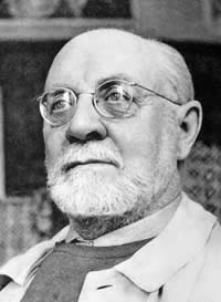 "Exactitude is Not Truth," Henri Matisse
I finally found the mother lode of internet data on Henri Matisse. Why did that take so long? henri-matisse.net rocks! Thanks to Museworthy for the link.
12 May, 2009
Native Tree
Here comes a series of landscapes based on a river theme, with strong color notes and tonal expressions.
11 May, 2009
Twitter-Pation. Social Networking and an Online Poll
In a surprise to myself, I have to say that I am really liking Twitter. Social networking sights are low on my radar, but I got talked into following Twitter and the pool of acquaintances one makes there is bigger than at Blogger. It must be because the commitment required for art blogging is significant, but Twit-ting is easy as pie.
Here are some great artists and others whom I have "met" on Twitter.
Diego Sierro at Diego Sierro.
Liz Massey at Write Livelihood.
Alissa Fereday at Fearlessartz.
Jennifer Robin at Robin's Woods.
Not to be left behind, Twitter has a blog.
To follow me on Twitter, go here. CUL8R.
Online Poll. Did you notice that I am trying a stretch template for The Colorist? I am evaluating whether stretch makes text more readable, but don't want to diminish the graphic content of my artist blog. Turns out that the images are the same physical size, but relationships of text, negative space and images are different. Please take the poll at the top right, and choose "New Stretch is Better," "Old Style with Neg. Space Much Better," "Unsure" or "Whatever! Blog On!" A quick look at my peerage shows that most artist bloggers are using the basic layout template, which provides healthy negative space at the left and right margins of the page.
Administrative Artist. My administrative tail is getting too long, and so I will need some time at the desk soon. To complicate matters, two articles will need to be written for purposes other than The Colorist. For you writers out there, look at it this way: go draw two illustrations for your next articles. Now you know how I feel. I should have listened to the Art Business Coach, Alyson Stanfield, and had these ready and on file for when the opportunity arose. Live and learn. Maybe I'd better write four, so I have two to spare! On the bright side, I can write one article as a presentation for a gallery talk - two birds with one stone.
AFN (That is all for now).
08 May, 2009
Julianne Richards Returns
Artist Julianne Richards has been notably absent from blogging for the past several months. When a consistent artist blogger like Julianne disappears for a short while, the expectation is that their computer has given up the ghost. Longer absences create other fears, and as it turns out our Julianne (The Colorspeaker) was hospitalized with a critical heart infection.
Her trouble is described at her blog as beginning in late January. I received an e-mail from her about 2 weeks ago with the news about her sickness and recent release from the hospital. While this firecracker of an artist and blogger was happily blogging, she presented like a freight train going 100 miles per hour. The crack-up of serious health problems reminds one of hitting the wall at about that speed. I imagine the emotional challenges of this kind of setback, especially for a young person, are daunting.
Julianne has kept her apartment in New York City, and her fiancé and family are her support structure. In a funny, removed way, the blogging community is another support structure. Well wishes go out to "The Firecracker" who is back at blogging.
07 May, 2009
Watching the River Flow
The river of my studio life flows on. Thanks for stopping here to watch the progress.
Brian McGurgan has provided us with a review of his visit to the current exhibit at the Ameringer-Yohe Gallery in Manhattan: Wolf Kahn, Toward the Larger View: A Painter’s Process. I found the following quote inspirational: "...color and tone are pushed to their extreme," Wolf Kahn. Note the pdf catalog at the gallery web site. A feast for the heart and the eyes.
Color and tone are
pushed to their extreme,
Wolf Kahn
That WK quote about his recent work is like balm to me. I struggle with the blown-out look of extreme value ranges, but still go there like a moth to the flame. Such is the attraction of pure color in all of it's permutations.
National Day of Prayer. My prayer is to be looser in my art, at the same time as my technique is improving. My God is certainly the God of paradoxes, and so I have faith that He'll answer my prayer!
Incidentally, Twitter Casey Klahn is here.
05 May, 2009
Colorado Front Range & Studio News
 Colorado Front Range
Ink
1" x 10"
Casey Klahn
This mountain image will become the banner over the memorial stone that I am designing for the Fort Logan National Cemetery in Denver, Colorado. Below the mountains, which will be in raised relief on bronze, will be the header: WORLD WAR II TENTH MOUNTAIN DIVISION, UNITED STATES ARMY.
My previous entries of this project are here and here.
When you hail from a mountain state like Washington, it is important that you don't just throw up mountains that look like your own area! I wanted to be sure to get the look accurate to the Colorado Front Range, which is where the memorial will be placed. Maybe only a climber would notice, but it was one more thing in the process of creating this granite and bronze memorial.
So much for my foray into the world of illustration. I see that commercial art has much more to it than one may think. Research into the actual look of things is troublesome and time consuming. For my WW II climber, I happened to have an original US Army alpine rucksack in my studio, and I made my wife pose wearing it in the same aspect that my climber would be adopting. I also posed a mannequin to back up the image. I had to look up the M1 Garand rifle to be really sure of the authentic look. The helmet is another bugaboo, which can be difficult to get right because of it's cast three dimensional shape (and its iconic status). Luckily, when I served in the infantry, we still wore the old WW II style helmet, and so the look is well impressed on my mind. But, I still got photo references to be sure. Then, let's not forget the actual climbing moves. It helps to have been there and done that, since photos and images of rock climbers can often look so foreign to the eye that sometimes it's hard to tell which way is up.
Now I have new respect for guys like Milton Caniff (one of my favorite cartoonists), whose studio can be seen via Gurney Journey. I grew up reading his Sunday strip about Steve Canyon, who always got around in a jeep or a C-47 airplane. And, they always looked correct.
Back to fine art, which is my actual day job. Since we cannot take pictures until night in the studio, finding the evening time to get photos of all my new work has been challenging. By the time we get the kids to bed, often the mommy and the daddy are too pooped to make the long trek across the yard to the studio!
Here is a sneak peek at my studio activities during this busy time. New river landscapes are on the left, and the famous rucksack and climber image are below and to the right.
P.S. Just got the Twitter news (thanks, Alyson) that today is National Cartoonist Day. How about that?
01 May, 2009
Rainy Day River Sketch
 Hoquiam River in the Rain
2.6" x 4.6"
Charcoal
Casey Klahn
The river series' continue to keep my interest in the studio. I am having a grand time and wanting to steer the series back toward the first Hoquiam River scenes that got the whole thing started. Here is a sketch of the rainy waterway, with emphasis on the gray scale.
Pastels will be posted, soon.
Subscribe to:
Comments (Atom)
Abstract Expressionism, Art Criticism, Artists, Colorist Art, Drawing, History, Impressionism, Modern Art, Painting, Pastel, Post Impressionism


