29 March, 2007

Pastel Chums

Local Chums. And, more than that, the artists listed here are representing the passion, merit and quality of the pastel medium. Some also work in oil and other media, but I note them here in their work as pastelists.

Susan Ogilvie
lives on the remote Olympic Peninsula, an area close to my heart. Her use of color is graced by expertise and energy. She confides that her latest passion has been working with textural hand applied grounds, and she is always pushing artistic boundaries.

Jennifer Evenhus
is a Master Pastelist with the PSA, whose work makes every advantage of surprising and stunning color choices. She creates the loosest, most fascinating images I have ever seen. Eclectic subject choices also compliment her local subject matter (Beautiful Central Washington).
She's the only one of this group of chums with a blog. Way to go, Jennifer!

Sheila Evans
lives very close, in Spokane. Her work in botanical subjects graces the catalog cover (and web banner) of Dakota Art since she won the juried contest last year. She continues to earn well-deserved awards, and it is no wonder as she is a fantastic artist.

Marla Baggetta
of West Linn (by Portland), Oregon is my favorite landscapist in pastel. A self-described representationalist, she pushes the landscape motif beyond the real and imparts every bit as much expression in her art as any abstractionist ever does. A joy to view, her art is active and painterly. (Don't think: "trite" when I say painterly - her pastels are authoritative and original!)
Her hubby, Mike, is a talented abstract expressionist who works primarily in oil.

Patty Forte-Linna
of the Seattle area does interiors, which is a genre fresh with possibilities, I think. Degas was, of course, big on figures but almost always in an interiorscape. Patty is doing passionate work that always offers some original perspective. Even her outdoor cafe and veranda images have an interiorscape sensibility, which is testament to her consistency of viewpoint.

It seems like my tastes trend towards originality and freshness.

I also want to add some other very notable pastelists whose work I am nuts over, but who are from other parts of the country, and whom I hope to meet someday.

Terri Ford
I only recently became aware of Terri Ford's work. How could I miss her beautiful cover of The Pastel Journal? Her work titled Florence Night was fresh air to me, as I am looking for examples of colorist
Italian Landscapes.


Jane Lincoln
Usually, when you say that you are influenced by an artist's palette, you mean the colors they use. While I love and admire the color use of Jane Lincoln, I was really influenced by the physical palette that she puts her pastels in! See it here. Jane teaches color theory, and practices what she preaches.

M. Katherine Hurley
Like me, Katherine Hurley is much influenced by Wolf Kahn. The great, big difference is that I am influenced by Hurley, too! Her other-worldly take on realism keys on abstracted landscape compositions. Her use of color is expressive and pleasing, too. Her work influenced me to create a series of the four seasons, as she has done, that turns on bold, original and unexpected color compositions. Ever seeking original ideas, she has done some black and white pastoral scenes in pastel that make you still think of color.

28 March, 2007

Monet Report

Katherine Tyrrell has this report on The Unknown Monet: Pastels and Drawings installation which is going on in London now.

Is the old boy rolling over in his grave, or beaming with pride? I vote for the latter.

Pastel Month Results - The Bunkhouse

The Bunkhouse
6.5" x 8"
Original Pastel
Casey Klahn
$375

This is the first Colorist American Landscape I have done in some time. It's nice to be doing these very free, yet challenging works. I have been wanting to get back to barns and outbuildings, too. I also wanted to get some cropped barn compositions that worked.

Another good feeling is finding a method for working on Townsend Pastel paper. You can really abuse this stuff, and the more the merrier. I did a wash of deep red, then mixed as many contrasts and compliments as it would hold without "filling up", as we say.

Lots of goals coming together!

27 March, 2007

Colorist Ruminations

Casey Klahn

Competing priorities today. I need to post a "daily" painting (which I cunningly post only every 100 hours) over at my Project blog. I also want very much to keep my promise to manufacture some pastel sticks to show the readers who have been following my March pastel materials threads. Thankfully, my little kids are at pre-school again today, after missing all of last week with the flu.

I am also on the fence between two ideas for April's theme here at at The Colorist newsletter. I have been wanting to do a study of the Abstract Expressionists, complete with bad photoshops of me rubbing elbows with Lee Krasner and Robert Motherwell. That's going to be a kick in the pants! The other idea is a project relating to art criticism. It will be a participative project for the artists and writers out there in blogland. Don't worry, though, I will keep it active and interesting for everyone as I endeavor to keep my promise of "no artspeak".

Which ones to do first? I have no idea. All of the buzz right now is on my previous post where the war between commercialism and creativity has been raging. I am happy for a rousing discussion, and it makes me think that I will go ahead with my art critic thread for the month of April.

26 March, 2007

Which Artist Lives Here? Abstraction vs. Realism vs. Process - A Tag Team Battle

@7" x 6"
Graphite on 70gr. Sketch Paper
Casey Klahn

In the past, before I had this blog, I worked hard at unifying my work. My Colorist American Landscapes are a nicely coherent body of work, where abstracted landscapes reveal color stories that speak immediately to the viewer.

Now I have started posting both finished and process sketches, realist paintings (usually of Italy), realist farmscapes, and some abstracts. You may be asking yourself, "How many artists live here?"

I am not, as far as I know, Schizophrenic. In fact, I'll go out on a limb here, and assert that I am not. But, I do enjoy expanding my limits. Growing my artistic abilities, if you will. I have had an urge for some time to return to my realist roots. So, I started the 100 Paintings Project which stays focused on the Italian Landscape and realism, with effects of my colorist tilt. Then I put it on another blog, hopefully to reduce confusion between my styles and genres.

It's perfectly okay for Pablo Picasso to inhabit any number of genres. But not an unknown such as myself. BTW, I saw an awesome artist's tagline the other day : "So-and-so, the nation's favorite unknown artist". Anyway, my goal is to stay focused for both artistic and marketing reasons. At the art fairs, I am rigidly focused on one style for just those reasons. You have mere seconds to impress the passerby, and they don't want to be confused about how many artists are showing in that booth. Also, the fair committee takes a dim view of non-coherency.

But, here in blogger-land, I have become motivated by so many of my blogging chums and also by the famous artists that I research and oogle at on the web. So, first came some drawings. Then I fell totally off of the wagon and posted some of my abstracts, too.

Plus, I have gallerists looking in on me. They probably say, "this guy's not focused".

I am happy to be more inspired and ready for growth in my art. I want to return to figurative work, too. But, I am determined to always have a fine art body of work that stays unified. I make sure that I always have at least 40 framed pieces of these, as well. That way I can go to the art fairs and not run out, and I am ready to hang a gallery show at the same time. The probable solution for me is going to be to put up a static website that houses my Colorist American Landscapes, and keep this blog for process and broad subjects.

I am really pleased to have painted a new Colorist American Landscape around the subject of barns and outbuildings. Look for me to post it here at the end of the month.

One thing that I discovered has been the answer to a question I have been pondering for some time. I always felt that the abstracted works (see a page of them here) were harder to do for me than strict realist work where the subject is more centered on the illusions of perspective and the goal is to allow the viewer to "read" the landscape as they expect it to be. That's a forest, leading down the hill to that set of buildings. Stuff like that.

I kept thinking, "If I return to stricter reality, will the requirements of perspective and rendering be harder than these intentionally abstracted ones?" Turns out that the realist ones are easier for me, just like I suspected. They are improving as I go along, but I fail less often, and I can leave them on the easel to change a diaper, put in a movie, make lunch, etc.

On the other hand, the Colorist Landscapes require strict focus, and the finished painting needs to be done in one (or close to one) sitting. More failures happen, even though I have been at it for a number of years, now. I have found that the requirements of good abstract work are more taxing on my brain, and simple compositional mistakes have a greater impact.


25 March, 2007

Contemporary Biggies

I will leave some one out, and for that I am sorry. I have already touched on some prominent pastelists whom I favor, such as Wolf Kahn, Diane Townsend, Diana Ponting, and Kitty Wallis. Please have a look at a few more great lights of contemporary pastel work.

Daniel Greene.
I ducked into the Art Students League, by accident really. I was just passing on the street on my way to view some Wolf Kahn art on 57th in Manhattan. In the lobby of the ASL hangs a famous portrait by Greene:

Robert Beverly Hale
Former Curator, Metropolitan Museum of Art
Collection: Art Students League, New York, NY
Pastel 50" x 36"

I was mesmerized by this chance opportunity to get up close to a great work. I could see free gestural strokes not easily noted by just looking at the work in print. The life in the colors, and the whimsical border given to a conservative subject - fantastic!

See also:

Harvey Dinnerstein.
Short bio. If anyone makes the case for the supremacy of figurative work, it is Dinnerstein.
I first became aware of his work through The Pastel Journal, which featured his pastels. I get the feeling he works primarily in oil, but I include him here as one of the great lights of pasteldom.

Is there anyone in NYC with a desire to fill a need? Get Harvey Dinnersteins' presence on-line spiffed up. He is the most underrepresented genius artist on the net.

When I grow up I will return to the figurative work of my youth, and I will stick myself to Dinnerstein like a fly to paper. In fact, I am moving to NYC to begin classes tomorrow. CYaL8r!
  • Try this one.
  • Here is a stunning one at The Art Student's League.


Alan Flatmann Cover, TPJ
Alan Flatmann
of New Orleans was this years' Hall of Fame honoree at the PSA Annual Exhibition. He likes cityscapes and figures. Also, this artist makes the case for darks (black?) in his lively images.


Albert Handell is a man of accomplishment, who has spread the wealth, so to speak, by authoring a number of books including many in the pastel genre. You don't need to feel compelled to send me this one, but I wouldn't refuse it, either.

24 March, 2007

Alpine Italy

Morning Buttress
4.5" x 4.75"
Original Pastel
Casey Klahn
$100
Plus Tax & Shipping
Buy it Now via Comment or E-Mail

Post Day at my 100 Paintings Project.

Italy Post Day


La Ca, Italy
4.5" x 4.75"
Original Pastel
Casey Klahn
$100
Plus tax & shipping, still no bidding required.
I invite you to buy it now by posting at my comments or via e-mail.


Up early this morning to wash a blankey that my 4 year-old Ameilia is crying about. It's okay, though, because I wanted to post an Italian Landscape today over at the
100 Paintings - Colorist Italian Landscapes. It looks like I've succeeded in an alpine scene. Being a broken-down alpinist, myself, I have a thing or two to say in my mountain drawings.

Meanwhile, while I wait for my intrepid photographer to chronicle that one, please enjoy this favorite from my other blog.


23 March, 2007

Getting Out of the Studio

I will be getting out of the studio a bit. Call it "Spring Cleaning" for the mind. I think it might be healthy to look at BOTA (Blogs Other Than Art) for a while. Also, the stats go down on the weekends, and I have some powerful pastel posts (that's triple P) waiting to be posted for the uptick of readership that comes on Monday.

Here are some non-art blogs that I happened upon:

http://www.bitegeist.com/
http://www.bleedingespresso-sognatrice.blogspot.com/
http://www.melindagallo.com/blog/
Okay, these last two are Italy related, which is related to my 100italianpaintings.blogspot.com. Hard to get away from the art subject!
http://kchomedad.blogspot.com/
http://www.angelfire.com/zine2/athomedad/
(Mr. Moms) Talk about a bunch of sad sacks...wait a minute! I'm one of these!

(WARNING: Potty Content & Religious Jokery, too) You will bust a gut:

http://www.funspoofs.com/View_movie_farting.html

I want to begin a general interest blog called Second Hand Sushi. Please don't steal that name! It's all my own.

Admin Note: I am having a hard time getting down to the basement to make those pastels, photograph the session, and post it. I promised to make pastels with you, so I will endeavor mightily to get 'er done. We lost a week and a half to the Flu and the whole family was laid up. Thank goodness for draft posting!
I gave some thought to making it a lens, like in Squidoo or something. But, I decided that it is not going to be an exhaustive "how to", but rather a personal "just what I do". Save those easel tailings (dust that falls off the paper will make awesome grays).
Anyway, if I fail to get it done, I will just have to post it in early April. Who knew that the pastel medium could so easily consume an entire month?

Mary Cassatt

French Legion of Honor
Mary Cassatt
click here to listen


Mother Feeding Child, 1898
Mary Cassatt

Allow me to present: Mary Cassatt (1844 - 1926).

The account in Wikipedia of Cassatts' family resisting her choice of art as a profession, and her pressing her nose against the glass of the art dealer's window to see Degas' pastels and being transformed by seeing these watershed artworks, is enough to give you goosebumps. Then, to be invited by Degas to show with the Impressionists at the height of their powers in Paris - what a story! I don't know about today, but there certainly was a glass ceiling in the 19th century when our heroine came up. She was an American, living in Paris, who was invited to show in the Impressionist exhibitions.

She is another of the great lights whose eyesight failed in the latter years of their lives. Also in the significa department are her being honored with the French Legion d'honneur in 1904, and the naming of a Liberty Ship after the old girl during WW II. Wonderful recognitions of a worthy and great pastellist.

Cassatt Self Portrait, 1878

Admin note: Republished so that you may now comment.

21 March, 2007

Good Beer and Pastels; Matched in Heaven

This gal, Crash Octopus, doesn't know that she's my long lost cousin. She posts about art, and every other post is about beer. Stout Beer.

How cool is that?

Left Hand Milk Stout and Pastels
Pastel Addiction

BTW, consume not thy pastels. That is what beer was created for.

Art Links

Sunflowers
Casey Klahn

You are invited to have a look at Rob Chunn's Art Links. Anyone else have a good list of arts and artists links?

Ever wonder what art looks like from the collector's point of view? Enjoy reading Lisa Hunter's blog here.

Seattle seems to be revving up it's art scene. See these links:

http://www.seattleartblog.com/
http://blog.seattlepi.nwsource.com/art/
http://www.artguidenw.com/

20 March, 2007

Post Day at My Other Blog


Ponte Vecchio in the Snow
Colorist Italian Landscapes
Casey Klahn

Have a look at 100 Paintings - Colorist Italian Landscapes, which is my blog project featuring small realist pastels about Italy.

Intuition and Gesture

Yellow Gesture
18" x 11"
Original Pastel
Casey Klahn
CTA

The gesture embodies the intuitive approach to art. Sure, color choice looms large. Linear composition, also big.

And I am holding drawing up as the most fundamental pursuit within the big tent that is fine art. No offense, ceramic and glass. No offense print media, and photography. But drawing is the alpha (if not the omega) of artistic expression.

So, consider the gesture. Robert Henri denigrated the gesture in his seminal book: The Art Spirit. His opinion was that the gesture cannot stand without some purpose, or composition to be a part of. However, taken as an element of expression, what else goes so close to the bone of the artist's intention as the curling, bold, climactic gesture?

In keeping with my pastel feature this month, I offer the gesture as a pigmented mark pregnant with feeling. Grab a pastel; scumble it on it's side to tone your paper. Don't think about the next color. Grab the pastel stick and make a gesture with your whole arm - No! Your whole body! How does that look to you? Can it be improved upon? Should you add some definition to it? Or should you just discard it? Another color, perhaps.

Have a seat, now, square in front of you easel, and ruminate. That's it! Get up, choose another pastel stick and gesture along the paper. Now that precious mark has been covered; changed forever.

How does the drawing look, now? Was your intuitive choice of color agony, or ecstasy?

19 March, 2007

Carriera, The Proto-Pastellist

Rosalba Carriera
Self Portrait with The Artist's Sister, 1715
Image courtesy of the

Rosalba Carriera (1675 - 1757), a lifelong Venetian, became a sought-after portraitist and was the world's first "pastellist".

The actual paste formed from dry pigment and water, and then dried is considered pastel (almost always with binder added to some degree or another). The first mention of this medium was by Leonardo da Vinci in 1495. Some artists used the medium thereafter, such as Quentin de La Tour, but Carriera popularized pastel works in the eighteenth century, and established a large corpus of such.

*Not incidentally, the blessed Scots also invented Whiskey in about the same year.

18 March, 2007

Pastel News


Claude Monet was no stranger to the pastel medium. The link takes you to a report about The Unknown Monet: Pastels and Drawings (short pdf. exhibit catalog here), which opened yesterday in London's Royal Academy of Arts.

Of interest is the factoid that he exhibited seven pastels at the first Impressionist exhibit (Paris) in 1874. There are 20 pastels at the current exhibit, some of which are rather large. I am curious how they are framed. Are they in their original frames? Glass or plexi (if re-framed)? Katherine, any chance you have seen them?

The London duration of exhibit is 17 March - 10 June, 2007. Then the Clark Art Institute in Massachusetts will have the old boys' art from 23 June - 16 September, 2007.

Kitty Wallis of Portland, Oregon does some fabulous water lily pastels that remind me of Monet.

Paper Choice

Gestural Detail: Abstract Reds Over Blues
Soft Pastel
Casey Klahn
Collection The Artist

The work on my easel now, The Bunkhouse, is being done on Townsend Pastel Paper. This choice I make based on my prior experience with that support. I want to over-work the colors and put down layers above layers ad infinitum.

Diane says that her daughter collaborates with her to produce this line of hand coated pastel paper. It is Rives BFK that has been hand coated with silicas, adhesive and other things that create a fine sanded surface. It doesn't take as much abuse as Wallis, but more than La Carte. It doesn't mind water, though. The Sennelier La Carte can be ruined by a drop of saliva, a random water spot or any floating drop of liquid spray that lands on it. There are repair methods for this tragedy, but if you want to tone your own paper you want something like TPP or Wallis.

My abstract that I posted here, I did on TPP paper. Because the paper likes to be rubbed and buffed, scraped and smeared. A favorite technique is to lay down a color, and then take it mostly off by rubbing with a chamois cloth, or a tissue paper. Try it with a kneaded eraser, too. If you over-apply pastel, and you need more re-working than simple fixative can provide, brush on some PVC diluted with water. Keep on working over the top of this patch, as if you had fresh paper.

As I work on The Bunkhouse, I notice that the Townsend paper is very good at accepting finger smears, and will accept just about any type of mark I want to make. I think I'm experiencing a breakthrough with it that I have been trying to achieve for some time, now. Looks like I'd better check the piggy bank, and order some new sheets.

In Praise of PVA


Gamblin PVA

When I took Diane Townsend's workshop on abstract pastel work, she was "all about" PVA. I, for one, am happy that she turned us on to Poly Vinyl Acetate sizing.

When diluted somewhat with water, one can paint it right over that otherwise irreparable Boo Boo on your expensive pastel paper. Viola! New paper to work your pastel magic on!
Let's say you filled the tooth with two too many layers of extra soft pastel, and "she won't take anymore, Captain"...

Whip out your little bottle of archival sizing, and go to town on the repaired surface. DT likes the stuff so well, that she even states "pastel and PVA" as the medium on some of her works.

Alternative: Get out your .22, find a rabbit and shoot it. Skin the hide, and scrape the... (you get the idea)

16 March, 2007

H.S.P.D.

Irish Palm Pilot
thanks, Blackfive!

High Speed Internet at The Klahn Household

We live so far out in the sticks, that we had to put up an antennae to gain cell service. Now, we've finally bitten the bullet and had a dish installed for our internet. My dial up was so slow, that I joked that it came in on "Det Cord" - which is a one use and discard it wire. Slllooooowww.

Wooooooh-Hoooooo! Am I happy, now, or what?


Get your motor runnin'

Head out on the highway
Lookin' for adventure
And whatever comes our way

Chorus 1
Yeah, darlin' gonna make it happen
Take the world in a love embrace
Fire all of the guns at once and
Explode into space.

I like smoke and lightnin'
Heavy metal thunder
Racin' with the wind
And the feelin' that I'm under
Repeat of Chorus 1

Chorus 2
Like a true nature's child
We were born, born to be wild
We can climb so high
I never wanna die.
Born to Be Wild
Born to Be Wild...

15 March, 2007

Intuitive Choices

Abstract Reds Over Blues
20" x 12"
Original Pastel
Casey Klahn
CTA

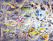
Under the tutelage of Diane Townsend I painted this abstract work. It has some elements of color field painting, like Mark Rothko, and extensive gestural elements. The gestural nature is in keeping with the drawing roots of the pastel medium. I like the way the paper's surface is evident, and yet the color blending, and heavily worked nature of the piece makes it work as a painting for me.

Let's talk a little bit about intuitive choices in fine art. The choices that a child makes are very intuitive, because their knowledge base is limited. The hands start moving, and the limitations are the length of their little arms, and the characteristics of the tools. They are mostly trying these tools out for the very first time.

A great deal is made of technique in art. The pastel medium is no exception. In fact, technical skill is probably too emphasized in this medium. It's supposed to be hard, you see. And, admittedly, there is much to know (much that I do not know!). Sometimes beginning steps are not rewarded very well by the outcomes.

"Only when he no longer knows what he is doing does the painter do good things."
Edgar Degas said in a quote posted at Expo Degas.


So, intuition! First sketches with bold gestural marks always work better for me than deliberate and measured work. The thing is to have years and years of drawing from memory in one's back pocket, and then the quick marks made on the paper will seem intentional. I don't subscribe to the subtle and tentative working that is often required of detailed realistic work.

The same goes for compositional choices. It is not easy to describe, but I think that studying good composition is necessary, and then ought to be put out of one's mind. If you can internalize compositional knowledge, it will come out naturally as you draw. The best thing I can say is: "try it".

The ability to critique one's own art becomes more important when you want to be an intuition-driven artist. Did this one really turn out to have the best composition? Color Choices? Does it have too much to say for one painting? Ask these questions of yourself.

Wolf Kahn has a chair that he sits in and ruminates over his finished art. Most artists do take some time and distance away from their works to try and get an objective perspective on their own creations. It's challenging.

The pastel medium is "made to order" for the artist who wants to favor intuitive creation. It is a direct, and rewarding tool. It's interesting to consider that in the book, Wolf Kahn's Pastels, the great colorist chose to make the text a collection of essays on artistic process. A natural fit, I think.


Details

Mary Richmond asked me about fixative and brought up framing, and I provided my humble two cents in the comments here. I won't go any further into the fixative debate, as I think the only thing I can offer there is my own experience.

I decided to stay with some highlights about the great pastel medium, and leave the details to
Wet Canvas and the other great resources out there in cyber world.

14 March, 2007

Catching Up

High Intensity Blue Tray, Various Brands of Pastels

Playing catch-up today. I want to get a Colorist American Landscape back on the easel, today. A farm building, from a detailed area of The Heins' Farm.

Here it is, the middle of March, and I am still on pastel brands, and I want to do a hand-made pastel session with my readers, and post some more images.

The good news is, my review of brands winds down pretty quickly. The Diane Townsends, Senneliers, and my own pastels are my favorites. The others that I use are mostly on the softer end of the range of types available. The reason I keep to the softs are to preserve hue intensity, and to limit detail.

If I were to become a detailed realist, I would have to buy a complete set or two of the harder pastels, like Rembrandt and Windsor & Newton. I do use pastel pencils, especially for my small works (Colorist Italian Landscapes). The brands I use are Derwent and Faber Castell. Of course, one must have that General white charcoal pencil, as it's hardness is preferable. Use a sandpaper pad to sharpen your pencils.

The remainder of my palette are Schminke, Unison, and a few of the harder ones already mentioned. The general intensity of these are modest, except in a few of their colors, and so they perform limited tasks.

I will say that Hersey's Unisons are great for consistency of handling. That's not what floats my boat, however. I am all about "dealing" with the materials that are in front of me. Every paper - pastel combination presents the artist with a new set of challenges. That's part of the creative pursuit, and leads to a lot of unfinished or ruined projects! But, the freshness of the successes! That's the bomb ( as the kids say).

So, the Unisons have some great low-intensity greens, and the Schminke light value, both low and high intensity, yellows are indispensable to me. I will say that Unison has some high intensity umbers and sepias (browns) that are terrific. I don't use these as a rule, however.

Others will have more to say about their favorites and the handling characteristics of various brands. But, now you know my own take on these mysterious tools.

I will finish by saying that I have no great love of paper around my pastels. I don't feel compelled, for instance, to make my own sticks, and then go wrap them in paper. So, I salute the few manufacturers who don't "paper" their sticks, such as Girault and Terry Ludwig.

Let me add one other thing. You want a set or two of hard pastels. I highly value my Sakura brand set (an actual line of artist's quality hard pastels), which I have no current resource for. Anyone out there know where to buy these?

More Products from France

I don't want to overlook some of the other good pastel products that come out of France.
Have a look at Pastels Girault, whose sole focus is pastels. Unfortunately, I have only tried a few of them, so I can't give a critique.
Additionally, there is the legendary Henri Roche pastel line. The story line for decades has been: "Good luck trying to get a hold of any of these beauties". You had to hire a private eye, or a French-speaking guide to help you find the secret location of their lab in Paris. Then, if you had a bottomless wallet, you actually found the shop, and you also have found it to be open (only Thursday afternoons), you may then be privileged to purchase a handful of these goodies for yourself.
The apparent key is the pigment to binder ratio. I will say no more.
Now, we are blessed to have a distributer in the US: Fine Art Store of Rochester, NY.
I don't have any, myself, but I do accept both bribes and gifts...
If you enjoy funny stories, don't miss Barry Katz' search for the legendary pastels, here.

13 March, 2007

Those French Products

Detail
Soft Pastel
Casey Klahn

Say what you will, the French have certainly cornered the art media market, big time. I cannot do without my Sennelier pastels ( A L'Ecu ) and my La Carte sanded paper.

Oh yes, I suppose one could stay with some very excellent American products and make out quite well. For instance, I feel that the Diane Townsend Artist's Pastels (Pennsylvania) and the Kitty Wallis' ( Oregon) Sanded papers are maybe the best products in their field anywhere.

But, when I scumble a DT Terrage pastel over the vegetable matter surface of a La Carte card, I have experienced a technique that is unrepeatable, to my knowledge, by any other set of tools. The Wallis is superior for other things, but not that particular move.

And, those Sennelier extra soft pastels are the best for keeping to the original characteristics of each pigment as much as possible. Sure, the sticks break easier in certain colors. But it is all about the color, isn't it? It's better, in Gustave Senneliers' mind (by modern extension, his company's collective mind) to keep the color of the pigment, than to satisfy the needs of consistent handling from stick to stick.

This is as close to artistic integrity as it can get, I think. It's absolutely none of my business, but if I were a Frenchman, I would want a Sennelier for President of France.

I am no chemist, nor am I anything more than a punter when it comes to making pastel sticks, but I hold the Diane Townsends and the Sennelier up as my two favorite sticks. Why not stay with just the DT's, which have the more pleasing shapes and overall characteristics? Because there are certain intensities of color that Sennelier has that I find no where else. Also, those big, monster size Sennelier sticks are off the hook.

Sure, Sennelier sticks are expensive, but when I purchase powdered pigment at retail, and roll my own sticks, the value of how much blue is in a Sennelier Ultramarine pastel stick becomes well apparent. In fact, when I find a Senneleir standard or jumbo stick on sale, I feel that the thing is coming to me at a net loss to Sennelier. That is when compared to what it costs me to buy the pigment to make them, without even factoring in the cost of my labor. Until I find a shipwreck of pigment jars washed up at the beach, or figure out which dumpster to dive to get pigment cheaper, the Senneliers seem like a great value to me.

Postscript: The Jerry's Artarama link (jumbo) above has an old picture of the Jumbo Senneliers in a wood box. Those are not being produced, I understand, and are replaced by the La Grande, which is still a big stick. I have some of all three sizes, and the monster ones rock. If you find some on clearance, buy them. You are taking them at way under cost.

12 March, 2007

All Things Pastel - A Comprehensive Look

Making a Mark is posting today about resources on her blog.
Katherine Tyrell's lens for all things pastel is likely the most comprehensive I have seen.
We have dubbed KT "The Queen of Content". Am I "The Joker of Trivia"?
Heads up! William Lehman is cooking up an interview of your Colorist for the near future. Should be fun, as well as content-rich, and less trivial on my part than the usual fare here in the land of "No Artspeak".

Diane Townsend

Diane Townsends in flat light outside. Good thing I'm not a photographer.

I would like to feature a few of my favorite brands of pastels and pastel products, now.
Other than my own hand made pastels, I favor the products of Diane Townsend. I consider Diane a friend, and love her art as much as her great pastels. It looks like she has posted a new gallery of art at her website, and I'll be delighted to look at these for quite a while!
I favor her Terrages, but who wouldn't love a hand made, chunky, very pure-hued pastel, with an addition of pumice to increase adhesion? Her pastels take the form of Terrages (big, with more pumice content) and Soft Form and Fine Line (more of a regular shape, with less pumice, and a unique fine shape which favors gestural marks).
Diane has a broad grasp of art, art history, and she takes a seriously astute and skilled approach to mixing her colors. I am as pleased with her colors as I am with Sennelier's, and maybe more so. The French Sennelier's (featured in my next post) are good for purity and for certain colors being very intense, but I think the DT's are all great for their intensity. Of course, you may not always want intensity, but Lord knows it isn't hard to kill intensity in a color.
They are consistent in handling, and they allow for techniques unparalleled by other brands.
I can scumble (lay down a thin, non-opaque layer over bare paper, or another color layer) in a way that cannot be done with an overly soft pastel.
The Dakota Art Pastels people rate Dianes's two product lines as Numbers #6 and #7, in their hierarchy of softness among pastels. Number #1 means the softest, which is Schmincke, and so on. See that chart here.
Have you heard of her daughter's sanded paper? Very high quality, and the coatings are hand applied. I favor it for doing abstract pastels, and it is completely unlike any other paper I have used. Looks like they now have it in smaller packs, rather than just full sheets.
Diane also seems to be a big fan of Wolf Kahn, with whom she collaborated on some of her colors.

11 March, 2007

Pastel Resources

The Heins' Farm
7.5" 15"
Casey Klahn
Private Collection

A good source to study multiple pastel brands is certainly Dakota Pastels. Too bad I'm not getting paid to represent them, but I will haul some water for them, nonetheless. They focus on the pastel medium, and know their stuff. They have a sideline with brushes, and they also facilitate the La Conner Art Workshops, to round out their business.
The things that I like about them are that they carry a wealth of brands (nineteen!), especially my favorites, and many of those come in open stock. That means one may order the sticks individually. Also, their flat rate for shipping in the U.S., and they ship them correctly.
I once had another giant art cataloger ship a large set of expensive pastels in a box with cubic feet of dead space. The poor pastel case inside the box rattled around at will, like a ball in a gorilla cage. Broken sticks, a refund, and my resentment followed.
So, try Dakota. I also go through Jerry's Artarama, who provide patron discounts occasionally. They also publish a Pastel Center Catalog annually (I think). I will highlight some other specific retailers when they come up in my content through the remainder of this "Pastel Month".

10 March, 2007

Degas

Entrance of the Masked Dancers
1878 - 90
Edgar Degas
General of Pastels


I can't resist adding this eye candy after the longish post full o' content.

The Pastel Palette - Part II

Before we get into pastel brands and types, I want to add a little to yesterday's post about the palette box, or tray system for organizing one's pastels. It is typical I think, when starting out, to keep the little gentle gems in their foam cut-out lined boxes, and to place the boxes on a table to the side of one's work. I'd like to suggest some ways to get better organized, and provide some reasons for this.


My large studio tray I had to hand make. Jane Lincoln, a contemporary pastellist whom I admire greatly, used to have a graphic of something just like this on her website. After I saw that, I went straightway to the local cabinet-grade (or plywood) store, and found as many large sheets of wood that were less than or equal to 1/4" thick as I could get my mitts on, and came home and built that bad boy to my own specs. Arrr-uuhrr-ahhr.
Sorry. Power tool work makes me all funny inside.
Get a hold of some 1", or even 3/4" strips of wood, as well. These become the walls of your tray, and the dividers if you want. Fome-Core makes good dividers, also. Keep to the plywoods, and steer clear of the MDFs and manufactured/oriented woods. The lighter weight of the clear or ply wood is the reason.
There you have it. Make it big, and assemble it with glue and clamp it. I made mine with a floor of Fome-Core on top of the wooden bottom, and put the dividers on top of that, and routed little grooves on the vertical walls for the dividers to go into. My tray turned out to be: 18.5" x 34.5" x 1.25".
Anyone out there have a brother-in-law with cabinet making skills and time to burn? Maybe we need to go into business, here.
So, now you have your big tray. Ready for the really fun part? You want to have your pastels as handy as possible, and all in one place, so-to-speak.


Okay, now we're set to organize our palette. Here is where you get a multitude of different theories on how to arrange the little beauties:
  • Arranged by value, or dark to light.
  • Arranged by hue, or color.
  • Arranged by brand ( I don't subscribe to this one, but that's what you are essentially doing when you leave them in their original boxes).
  • Arranged by temperature.
I want you to express yourself by doing it your way.

Progressing from top left to bottom right; dark values through light.

My own method is based upon the way I am going to work. Yesterday's smaller plein air palette (seen above) is arranged by value almost completely. The idea when working outside is to get the values down well, and finish the color work later on in the studio. You must decide how many values you want to work with. Not being very sophisticated, myself, I have essentially a four value system. Add two more for the extremes of dark and light, and that makes six total, or three in the top tray, and three in the bottom one. More on my outdoor kit later.


My big studio tray is organized mainly by hue. One section for reds, the next for oranges, next yellows, etc. all the way down to the violets. The reddish browns are divided into two trays, one redder, the other yellowish browns. Then, these two browns are arbitrarily placed.
Wait a minute, you may say! The photo shows ten sections! I happened to have just that much space, given each section's width of about 1 and a half full length pastel sticks, and given the length of board that I resourced.
It turns out that my choices for each section have been a good working organization for my personal tastes and methods. Red, orange, reddish-browns, yellowish browns, yellows, high-intensity greens, greens, blue-greens, blue-violets, and violets. I later added a floating section for high-intensity blue-violets, as well.


Then, I arranged the middle values in each hue from the center down to darks, and up to lights. Put another way, the pure values, or mid values of each color are found in a horizontal band from the left all the way to the right. The dark values are also arranged in a horizontal path from left to right, if you were to overlook the vertical dividers. Ditto the light values.
As I've already said, some of my sections represent the higher intensities of a given hue. I prize intensity over temperature, and so my palette organization reflects this.
The best way to describe my pastel tray (besides the obvious word that starts with an "A" and ends with an "L"), is that it is arranged by hue, then by value, and with a bias towards specific intensity.
Get the idea? Just do some thinking about how you use your colors, and key the organization to your own personal tastes.
Whoops. I never got to brands! I Guess we'll have to plan on another post for that.
For the abrasive surfaces that we enjoy using our pastels on, have a look at the very detailed descriptions of several popular brands that Katherine Tyrell has given over at Making a Mark.
I wouldn't doubt that she may be planning a similar review of pastel brands. Don't worry about repetition, though. My own review of brands and types of pastels will be more oriented towards my own experiences, rather than the technical specs.

Whoa, Nicole!

Can you get a data recovery service to mine the memory in your PC to at least recover any pages that may be stored in there?
What about customer service at Blogger?
What about your Norton Go Back? (Probably not?)
Wish I had the expertise to help more, but those pages are out there somewhere. Maybe Google cache?
Well, get someone with a clear head to helt you trouble-shoot this problem.
Cheers, and good luck!

09 March, 2007

Degas Pastel


The Artist's Cousin, 1873
Edgar Degas

This wonderful portrait shows some of Degas' process and technique with pastels. I couldn't resist sharing it with you.

The Pastel Palette

Since the Diana Ponting lessons are going fast and furious over at Wet Canvas, I thought I might add some pastel trivia and tips, history and information to keep the enthusiasm up for pastels.
Many of my blog chums around the net have taken up the subject af pastel this month, and I think quite spontaneously.
Yesterday, we looked at the Pastel General, Edgar Degas. I intend to also have a look at a few other luminaries from the past and also the present who work with pastel. If all goes well, we'll peek in on a few of my pastel chums.
This post will be in two parts: 1. (Today) A simple palette box system, 2. (Tomorrow) A brief and simple look at pastel brands and types. I may add a third on how to get outside with them, as that seems to be a big area of 0f interest.

Since I am not in my big studio during my remodel, I am working in the house with my plein air kit. I make my kits from shallow cigar boxes. This one is a PADRON (Nicaraguan, Hand Made) cigar box: 6.5" x 11.25" x 1.75". The shallow depth allows for security of the sticks, and I find that wood's gentle touch is the kindest to my pastels. I notice that few cigar shops actually sell their empty cigar boxes, but those kind ones that do, get my return business. Cardboard is also gentle; plastic transfers too much shock, IMO. For extended trips (air travel), I add a sheet of thin foam bought at an upholstery shop, or scrounged from other places.
Further, I have constructed a tray out of foam core, with foam core dividers glued in place with Elmer's (children's) glue. A ribbon allows me to get the top tray out. When I do go (rarely) out the door, I put a couple of extra long rubber bands around the box.
The little wooden trays are gathered from second hand stores where one may find dried fruit trays, and from tobacconists. They become my working palette.
It is important to get the pastel sticks out of their original boxes, where they seem to be organized randomly, and into something that you can organize and work with. Don't worry about breaking them. They will all be broken eventually. I will show you how to fix that later.
It is a great help to take the paper off, as well. Some artists, like the venerable Daniel Greene, I think, carefully break each one of their multi-thousand dollar full set of Senellier pastels in two. They dutifully store away the halves to use one for painting, and the other for a reference from which they may match the little stub and then be able to re-order individual sticks.
Now, I will gladly do anything that DG does, as he is THE MAN, and a master of pastels. If he enters the studio from the right, I will enter the studio from the right.
But, you are blessed, dear reader, with the fact that you are beginning your pastel life in the digital era. Take a picture of your beautiful new box of expensive pastels. Then, take it apart, and organize it in with the others. Your $250 box of 100 pastels will be absorbed into the vast whole of your palette, and you will be left in shock at how few they actually appear to be. You will shed a tear.
Also, be aware that most art stores have a few color charts relating to the brands of pastels that they sell. And, for the picky, like me, one can get hand made charts (true representations, not ink!) for most brands from Dakota Pastels.

07 March, 2007

Edgar Degas (1834-1917)

La Chanteuse Verte, 1884
The Green Singer
Pastel
Edgar Degas

As often happens, I find that the Wikipedia entry for Degas is the best overview I've read.
His art was produced with planning and slow deliberation. He seems quite the opposite of van Gogh, who worked (although with direction and forethought) very quickly.
Degas' freshness of color I attribute to his masterful use of the pastel medium. Many aren't aware that he worked in pastel, given the popularity of oil paint among the Impressionists. As a matter of fact, Degas was very progressive in his use of media. He painted in oil and pastel, was a sculptor, a printmaker, and was an early practitioner of photography.
Pastel, however, is the hallmark media of Degas' legacy. He is considered to be the greatest figure in pastel's pantheon of artists, given his advancement of the medium at an historical turning point in art history.
A born Parisienne, Degas studied art in France, but also made a pilgrimage to Italy for study in classical principles of art. He is also noted for having traveled to New Orleans, in the U.S.
Additionally, the great artist lived 83 years, and never married. It is sad to read of his eyesight degeneration, and to imagine how he was supposed to have wandered, near his death, aimlessly on the streets of Paris.
Degas was part of a movement of artists who spanned the Nineteenth and Twentieth centuries, and whose vision would replace allegory and morality in artistic subject, with modernist realism and what has been described as artistic "looking" at man.
Towards the latter part of his long career, he did loosen up his sense of detail, and began to value the abstract qualities of his paintings a little more. He was a studio artist, preferring to work from studies and memory.
Degas had his fair share of difficulty dealing with his public. "Why do you paint women so ugly, Monsieur Degas?" he was once asked by a hostess. "Parce que la femme en general est laide, madame, " came the reply. "Because, madam, women in general are ugly."
And to print this on International Women's Day! He had his uncouth way of acting, as many life-long bachelors do. In point of fact, his female nudes and figures did not suffer from sympathy or idealization. To his credit, he created new and fresh figurative works that respect the actual forms, presence and gestures of mankind. And he did it in a colorist fashion, as the incredible The Green Singer, demonstrates.
I like the idea that he did not destroy the past, in the so-called avant-garde way, but rather built upon it.
I recommend Expo-Degas for an online collection of his art.
I very much recommend the following article by Robert Hughes, for a highly opinionated criticism of the artist's life and work.
The only book I own about the paragon of pastel is: Degas by Himself, Richard Kendall. Does anyone out there recommend a good monograph of Degas?

Pastel History

High Key Green Trees
14" x 10"
Original Pastel
Casey Klahn
$1,000


Let's have a short look at a few great pastellists in history. I want to feature Edgar Degas, Mary Cassatt, and Rosalba Carriera for starters.
Then, I'd like to showcase some of the current great artists who use pastels. Daniel Greene and Wolf Kahn come to mind. If all goes well, I will introduce you to some of my pastel chums locally.
We can also get into the dissection of what goes into these little sticks of pigment, and by the time we're done, who knows? I may have taken you all down to my basement and we can make some home-made pastels according to my super-secret and mysterious recipe.
Tomorrow: Degas
Post script: I was just over at Making a Mark, and Katherine has posted an opportunity for you to participate online in a pastel class by the highly accomplished Dianna Ponting. Also, I will be posting on 100 Paintings - Colorist Italian Landscapes about all things pastel and Italy.

06 March, 2007

Pastel


The sound of harps playing in the background; a little bell ringing. Those sounds accompany the conversion of one more soul to the pastel medium.
Okay, okay. I'm making too big a deal of it. We pastellists are sure "into" our little misunderstood medium. I won't bore you right now with the whole French-Revolution-and-what-it-did-to-the -pastel-medium story.
Mrs. Snowy has purchased a box of the little addictive sticks. Pastels, I mean!
Here is a link to a nice, short summary of what the pastel medium is. Go here to get another peek at my own pastel palette. The first view is free, kid...

05 March, 2007

Synchronicity

The following comment appeared the other day relating to an old, old post. Go see The Colorspeaker here. It is a small world, and an even smaller cyber world!

"hi Casey, I am "the Colospeaker,"
AKA, Julianne Richards. Funnily enough, I never saw your generous comment until a friend of mine told me about it, but just this past weekend, i was admiring your work, and then today my friend told me your name and i realized you were the same artist i had been looking at all weekend! What a coincidence! If there is such a thing... thank you so much, I will put a link to your site on my blog. Happy painting, write anytime.
the Colorspeaker"

Little things like this keep one going. I am trying to get three more Italian Landscapes to the photog., and put together a couple packets. One for the local gallery and one for the PSA slide registry. Meanwhile, the whole family has been suffering from the flu.
Never a dull moment, the artist's life...

03 March, 2007

Post Day at 100 Paintings


La Ca, Italy
Casey Klahn


This is the finished work from my La Ca sketch. Visit it at http://www.100italianpaintings.blogspot.com.


Olympic Mountains


Violet Woods
6.25" x 9.2"
Original Pastel
Casey Klahn
Sold

The Olympic National Park is part of my DNA. It's easier to name the trails I haven't hiked there, than the long list of those I have. My climbing tick list is also full of memories.
This image was done from memory, based on the way the Quinault Ridge (Kwi-nawlt) lies at an acute angle, yet still supports behemoth cedar, fir and spruce trees. The largest on the planet, in fact.
Great rain forests (temperate jungles) form multi-canopy overhead cover. When I lived there, my palette was mostly grays. Now, I suffer in the sunny inland region of Washington State. But my palette has come alive!

02 March, 2007

Your Opinion, Please

How do you, my daily readers, feel about the new white background, versus the old blue-gray one?
I know that the old color was sort of a signature part of my layout and look. The argument for the new white bg is that it facilitates the header image, which blogger simply won't justify to center.
Any geeks out there with a suggestion on that issue?
Look here tomorrow for my weekend Colorist Landscape, and don't forget to see my other blog for my 100 paintings of Italy posting.

Let's Try a New Look


The old saying goes,"if it ain't broke, don't fix it!"
Without regard for that sage advice, I wanted to at least try an image on my header. I have monkeyed around with different images, especially a blue palette tray. Because blogger works for the new picture in some other templates, I tried them out. The confines were too, well, confining.
So, I feel like the page can breath better with this classic template. But, to overcome the little picture creep on the right side, I had to re-size the header image, and go with a white background.
We'll have to see how this look "feels". I will miss the blue background, for now. I did like a neutral tone background to make images look brighter.
So, enjoy the red palette tray and the white background.

01 March, 2007

Process Sketch - Italy


Bell Tower Process Sketch
Casey Klahn

Since I missed the Wolf Kahn pastel workshop in Manhattan, I decided to "channel" him through this sketch. He makes these squiggly lines with unpredictable colors, you see. The end result, though, is a rather built up set of layers, and an expressionist landscape that pleases the eye.
In fact, I have never done one like this, and when I finished it, I said: "How did I do that? It looks like a Wolf Kahn!" I guess it goes to the "seeing" operation. If you look hard enough, and long enough at art that you like, it will find its way down your arm and out your hand, eventually.
I couldn't be happier.
Another factor is the sketch paper. I'm used to working on (expensive) Wallis Museum stock, or Sennelier La Carte, both of which are sanded heavy stock. The regular laid paper allows the sketchy look.
The big difference between a WK and my own pastels (besides about $2,000) is that he is a little more interested in the scene, or nature, than I. He uses pastels as a drawing tool, and I make a finished painting. Indeed, I visualize WK's Oil Paintings when I make my Colorist American Landscapes.
I wrote somewhere in a comment (probably Tracy Helgeson's blog) that I made the effort to go see Kahn's art at the Ameringer-Yohe in New York, while I was in transit to Italy last summer.
I was rewarded with a ring bound catalog of their last Wolf Kahn pastel show. And, I had to suffer through the assistant (not the main staff person, who was top notch) describing the artist's layer build-up as probably done in oil pastel. (steam coming from my ears, here)
Back to my drawing. I also played a lot with the colors, by building up as many layers as the cheap paper would take. I was thinking of van Gogh's Auvers church, and looking for a complex of colors for the main building and tower. I was thinking of his letter where he describes the pink road in his painting.

Abstract Expressionism, Art Criticism, Artists, Colorist Art, Drawing, History, Impressionism, Modern Art, Painting, Pastel, Post Impressionism