22 July, 2007

Urgent Help Needed - Book Pricing

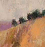
Rip from my book

The book is about ready to go, although the customer service at MyPublisher is telling me to wait while they figure out why I had a mis-print on the spine of the "proof". I'm going to push it forward anyway, since there have been so many changes to the book, it will "send" as a new book with a new file name, anyway.

I need your help,. dear readers, on pricing. Maybe a few of you will wind up buying a copy, too. Here's your chance to "open source" solve the pricing issues I have.

The "wholesale" to me is going to be significant, even with the standard discounts that MyPub offers, and with grouped shipping. I had originally had a retail in mind of @ $49 for the 8.75" x 11.25" linen hardcover. The catch comes when I realize that it will be competing in the broader book market, but it only has 29 pages. It features 35 images, 32 of which are in color, and essays about my art process. Prints of my Colorist American Landscapes are offered nowhere else. And, at that price, I will be earning in the single digits. Call it cheap advertising!

I looked up Wolf Kahn (my sage) on Amazon, and his (much longer) hard bounds are retailed at @ $45, but of course they are older now and get discounts to about $30. My venue, though, will be the art fair and not the bookstore or Amazon. I think I'm going to be OK with the mid forties price, especially with the perceived demand that comes with standing in front of the artist in his booth and in the presence of an installation of originals. The package has "whollop", to coin a phrase.

In the fully steamed department, I see Amazon sellers trying to unload their Wolf Kahn opening catalogs for greater than $100! Don't get me wrong, it's a free market, and it is perfectly legal. But please! Those are ( I know in a commercial setting) given free as a token for attending the gallery during his shows. Is no one polite, anymore? Well, I'll get off of my soap box, now, especially since my English is deteriorating...

Your opinions on my price? Could it be a little more? Or, is $45 too much and they will just languish, in your opinion?

BTW, the text in the rip above is new for the book, and I share it here:


"The fact that one usually begins with drawing is already academic. We start with color," Mark Rothko.

The great Abstract Expressionist, Mark Rothko, has taught us a great deal about color. Don't begin with a subject at all, but rather a color composition. He found it imperative to kill the subject completely, but my approach is to devalue it by repetition.

I have been influenced by the idea that, instead of using a three hue palette such as red, blue and yellow, an artist may arbitrarily choose to function using a two color base. Say, red and blue.

Here's an analogy to help you understand my two-color theory. When I was heavily into mountain climbing, we approached ski-waxing theory by simple numbers. There was the three wax system: Red, Blue and Violet, perhaps - each color was for a different snow temperature. Some wanted five waxes for the ever-changing Cascade Mountain's temperature conditions. I wound up devolving to a two-wax system: Red and Blue Extra. Similarly, the artist may wish to see two halves of the color wheel, and think of the blue side of yellow and the red side of yellow. This is as opposed to seeing three "rote" and separate hues, and instead viewing something like a continuum. The advantages may be that the artist will focus more on the split of each hue, and get a better use of every color (even yellow!).

By the same token, consider a two color system where we have a red-influenced blue and a red-starved blue.

In my current series of blue-centric works, I am discovering the freedom of the one-color composition! How much can I learn about the enduring color blue? What is the importance of line to the one-color work? The same question may be asked of form. The pastel: "Blue Wandering" is in many ways a break through for me. I have added more cobalts, and found new avenues to drive abstract shapes down. The "exploding" violet trunk would never have worked in a multi-colored palette.

Am I traveling two roads at once-a monochromatic one and a limited color-theory one? Perhaps that's what artistic license was invented for.

20 July, 2007

Book Report

The book has arrived via Fed Ex and I was surprised at the quality! See my "book report" at the Endless Sumer Art Fair blog.

19 July, 2007

Der Farbenkünstler


Der Farbenkünstler

That's the German for The Colorist. This is a shameless post to try and net more readers from Germany. Do you ever look at your StatCounter and groove on all of the places that your readers come from?

I notice a number of things about my StatCounter. It doesn't catch all of the lurks out there. I wonder what the percentage of captures to misses is? It reveals that my audience (all of our audiences, probably) is heavily balanced with Americans. No doubt, the English-language is responsible. But, the plain fact is that Americans are "hooked-up" to the Internet in large numbers.

Speaking of English, the UK, is a large percentage of my non-American readers. Also a goodly amount of New Zealanders and Aussies. But, that stuff makes sense, given language. Canada is a little under-represented, but one forgets that Canada has a large land-mass, and a small population (my idea of heaven on Earth).

Now, this is interesting. I have a very good amount of Italian readers, and a fair amount of Spanish. Also Romania, Norway, Sweden, Iceland, Denmark, Poland, France, you get the idea. In fact, Europe is very well hooked-up, as they say. But way under-represented is Germany. I think that's odd, given the size and economy of Germany. Where are you, German readers?

I wonder sometimes if the German ISPs just do a really great job of hiding their referrals. Any ideas out there?

So, I am trolling for German readers here, as an experiment. I can't wait to see what happens. BTW, it has been said that Berlin is a world center for modern art, which is another reason for my curiosity about this.

I might as well list some of my other fun "hits" from the StatCounter. Those who read here that have mega-audiences, like Katherine and William, will be bored silly by this. But my readership is pretty modest. I am pleased when I see the ticks of page loads go over a hundred, and the Unique Visits go over 60 or 70. My averages are 70+ loads and 40+ UVs. I suppose a guy could spend more time on promotion, but that would come out of my content-producing time. To say nothing of my time in the studio!

Other interesting hits:

Brunei ( I have a "brush with fame" relating to the Sultan, but I'll save that for another post)
Anywhere in the Middle East
Russia
The Ukraine
Korea
Japan (not surprising)

My favorite all-time visit came from the Guggenheim Museum in Venice. That was a spit-your-coffee at the the CRT moment. In case anyone wants to know, I am open to the Venice Biennale...anybody? Anybody?
(Sound of an echo chamber here)

17 July, 2007

Clyfford Still

The Denver Post has this on the current DAM installation about our Abstract Expressionist, Clyfford Still. The city of Denver will have a Still Museum, targeted opening: 2010.

http://www.clyffordstill.net/
The definitive site
http://www.albrightknox.org/ArtStart/Still.html
An interactive bio on the old boy
http://www.clyffordstillmuseum.org/
the proto-museum of CS
http://en.wikipedia.org/wiki/Clyfford_Still
Worth a read. I discovered that he has a Spokane connection, which makes him a local boy, sort of
http://www.artandperception.com/2007/03/610.html
This research led me to a nifty art blog called Art and Perception
http://www.clyffordstillmuseum.org/news/NYT-200703-18.pdf
NYT article relating to a Time Capsule of Still's art-very unusual stuff

15 July, 2007

Museum Installation

View full

View full

Dream big, everyone.

Podcast

Artist and art promoter William Lehman, of Artist's Hideout, has a Pod cast that samples art blogs and other tidbits.

Pods scare the heck out of me, and I have no Earthly idea what a pod cast is, and even less of an idea how to rip it to this space, but I'll leave you with a link to his post.

12 July, 2007

Atonement and Automatism

Atonement
Soft Pastel
7" x 5"
Casey Klahn


Many cuts from this blog made it in my new book/portfolio. Here's a new quote, though:


Gesture and intuition combine in my abstract art. Intuition, not intention. Color choices are simply not derived from nature, but from internal sources.

"Automatism" is an old term that could be applied here. Drawing for drawing's sake, without idea or content. Color has it's own intrinsic purposes and reasons - ideas of it's own.

Am I controlled by my medium? Perhaps, but no more than most.

What are my ideas? To express color as the dominant element in the formal qualities in painting. Color can be the strongest element, and I think that in this age we have yet to plumb it's complete depths. No content; no meaning. No subject, other than red and blue. Yellow, green...these are my subjects.


11 July, 2007

Book Project Update


The book project is on the front burner. Better not say: "burner". That reminds me too much that today will be another 100 degree Farenheit scorcher. Where I come from originally, it's much like I think the Northern U.K. is: the "foggy land" of myth. 70 degrees was considered hot, and we still put on our coats to go outside. We didn't have seasonal clothing, given that we only had one season!

I reviewed Lulu, MyPublisher and Blurb, but found some areas wanting. Kevin Kelly's Cool Tools has this great comparison of POD outfits. Here is a UK blog that did an extensive test of 3 brands of photo book. Mavie did a wedding book review between MyPub and Blurb. She agrees that Blurb's pages are too lightweight. WeddingBee has a user that loves her MP book. I felt Specifically, the business plan of Lulu is nice, but their printer is the same quality as my in-home printer (dry ink). They receive high marks from the world of writers seeking to publish and distribute their novel or whatever text-centric vehicle they choose. Hello, Twenty-First Century!

I did find this tidbit: you may browse for creative commons images to use on this page at Lulu.

Another issue is formatting. The various POD, one-off (meaning that you may print one book at a time), services have you download a simple program with templates. You drag and drop your jpegs, and the formatting is easy-cheesey.

Me being a fan of monkey-business, and always trying to re-invent the wheel, have decided that the next time I do a layout, I want to do it all myself. This method is also necessary for me when I produce low-quantity layouts such as a brochure for my packet or for my booth. I'll cover self layout issues that I have researched, or suffered personally, in a future post.

Blurb and MyPub use a much better printer, the HP Indigo 5000, which is a 7 color liquid ink offset look digital printer. Much better choice for image-centric books. Also costs more than Lulu, and for good reason, I think.

I am, so far, pursuing MyPublisher for a few reasons. The day I went to "pull the trigger" on laying out my book, I couldn't get the Blurb download to work, had trouble with my member log-in, and also didn't like the paper stock in my example book from Blurb. The photos "bled-through" from the reverse side of each page! They use an 80 lbs. paper, apparently, but the example book they sent me seemed lighter than that.

So, I spent all day Sunday early morning to late night formatting my pages for MyPub, and am just in the clean-up stages. Especially trying is my slide list. Unlike some complainers on the web, I found their interface pretty easy. All text pages, partial text pages, 1-6 images per page, no problems. Photo uploads - easy.

I also have a reader in Valhalla, NY (MP's address). The MYPublisher product, if I understand it correctly, is printed in the USA. The UK people who tested it on their blog, referenced above, did receive theirs from the US.

I cannot find any information on self-pricing or marketing a MyPublisher book, so I am currently in limbo on this. I resist the low quality paper and reverse bleed-through of Blurb, which also won't even download to my computer, so they're a non-starter, anyway.

Now, I am in the throws of Googling everything and anything on MyPublisher, etc. The research continues...

Review of findings:
  1. Lulu uses dry ink printing, poor for images
  2. Those that use the HP Indigo 500 are best, like Blurb or MyPublisher
  3. Complaints exist for all of these publishers, with a wide variance of satisfaction. There is ample evidence of people happy with the quality of MyPub's pages and photo quality.
  4. Most will use these services for "vanity" publishing, which means essentially not for profit purposes
  5. MyPublisher is not savvy to the for-profit guy like an artist trying to publish a portfolio style book
  6. A few bad eggs come out of the basket from time to time, such as page cuts off, photos not present or flipped, even wrong address delivery
Addendum: I pulled the trigger and ordered an 8.5" x 11" tome that will be 22 pages and contain about the same number of images. The hardbound volume, with shipping, comes in at just short of Fifty dollars (I opted for 2 day air/UPS). If I re-order after I approve this draft, then shipping will be cheaper for a multiple purchase. I think the final book may still come out to retail too expensively, at whatever plus @ $40. Hopefully, the margin on softbound can make up for that. On pins and needles, folks...

02 July, 2007

Untitled: Red, Gray, Blue

Untitled: Red, Gray, Blue
8" x 5"
Original Pastel
July 1st, 2007
Casey Klahn

Remember we were talking (in my post: Color Field Painting) about Rothko and the Abstract Expressionist's desire to take their art to the final or ultimate expression of art. The critic Clement Greenberg was an influential voice for the art movement that would take abstraction to absolute and near-absolute expression.

The Encyclopedia Britannica offers some insight here into Greenberg's reasoning for going whole hog into abstraction:

The intellectual justification for his approach had been articulated a few years earlier in two essays published in Partisan Review. "The Avant Garde and Kitsch" (1939) was a manifesto in which Greenberg made a sharp distinction between "true culture" and "popular art." He asserted that quality in a work of art had nothing to do with contemporary social and political values. "Retiring from the public altogether," he wrote, "the avant-garde poet or artist sought to maintain the high level of his art by both narrowing it and raising it to the expression of an absolute…." This was necessary, he argued, because of the ways in which modern society had debased high art into kitsch. In "Towards a Newer Laocoon" (published in Partisan Reviewin [sic] 1940) Greenberg explained the necessity for avant-garde artists to break away from the traditional dominance of subject matter and place a new emphasis on form.


We're still emphasizing form, or formal qualities of art, today. I was talking with another artist the other day who takes after Andrew Wyeth, and he was extolling the abstract values in all styles of painting that succeed. My friend, Stan Miller, was saying that one of the great artist's patrons insists on hanging a large Wyeth upside down. The abstract composition is that good, even though it's a "realist" work.

29 June, 2007

Studio "Event"

Studio, Meet Terry Ludwig

Sometimes when I spend a week or more at the farm (that's my house in Eastern Washington) even small events seem a little bigger than they ought to be. A package at the door from UPS? You'd think it was Christmastime.

In my studio picture above, taken with the point-and-shoot that I call "Sparky", the keen of eye will spot a nice overview of my current works. In the upper left is a small Rothlo Response; upper right see a medium sized work of my Colorist American Landscapes; at the lower left is a color study in my sketch book.

Groovy stuff, but the big news is that I just got my new set of pastels! I know, I know - I told you I was house happy!

I have been meaning to try Terry Ludwig's pastels for some time now, and I had just discovered that my ultramarines seem to be scattered about between my studio tray and various plein air boxes. I am working in all blue landscapes, and couldn't seem to put all of my intense ultramarine blues together.

My first-line sticks in blue are my own homemade and my Diane Townsend Terrages. I'm pretty sure I can't find the time to get down to the basement and roll some blue sticks any time soon, so I decided to give Terry's pure tones set a shot. This set is the Maggie Price Basic Values Set of 60. I can use the colors in his set to register the colors that I want to make myself (excuse meter: moderately high). Note the nifty color chart they included for registering the colors. Nice touch.

I really thought that I just made the order online yesterday, too. It's as if the diligent staff at Dakota have an underground pipeline right to my door. I'd better go out in the yard right now and probe for that secret cover they must have over the hole...

I gotta get out of the studio for a while!

28 June, 2007

Color Field Painting

Untitled: Red, Gray, Violet
5.5" x 4"
Original Pastel
June 20, 2007
Casey Klahn

This is one of my recent Rothko responses. I did another two this morning (photos are pending).

Let me share the following quote from our author:
"Art therefore is a generalization. The use of the plastic elements (editor: the artist's tools) to any other ends, which are most usually particularizations and descriptions of appearances, or which serve the stimulation of separate senses, are not in the category of art and must be classified in the category of the applied arts." Mark Rothko
Rothko indicates that abstraction is the ultimate end "type" of art, which is a main theme in Abstract Expressionism. Obviously, art has moved on from then (the Forties and Fifties through roughly the early Seventies), and artists are producing realist work again. We'll get into DeKooning later, who had to explain to his peerage why he went back to the figure instead of pure non-figurative abstraction. Link here to Wiki on abstraction, and here to ArtLex definition, which you must scroll or page to under the letter "a".

Anytime you say that "thus and such" is the last word on something, you get into trouble. I don't blame the AEs for looking for the ultimate definition of art, since the urge to be your best is what takes even artists to the top of their field. Certainly that happened for this group of American painters in the post-war years.

And, since they insisted on being "of the age", they did feel apocalyptic overtones to their time. Think: Atom Bomb. Pollock brought that up in a famous quote, and the times also were influenced by the overwhelming and then-present effects of the Second World War. Of course they needed an end-all art, since maybe they were in an end time.

But, when you get over the apocalyptic hump, you return to the studio and make some art. Will it be realist, or abstract? There are shades of each, and abstraction can be at the level of the idea, not just the subject or style of a painting. Today we live in a post-abstract world, where new things have to be created for art to flourish. Is there something new for abstractionists to say? I think so. What about realists. Of course there are new things to say!

William Lehman has a good brief on the whole mess at his post: Design VS Art.

Links:
http://www.artlex.com/
http://en.wikipedia.org/wiki/Abstract_art
http://www.artisthideout.com/design-vs-art/

27 June, 2007

Fear My Avatar

There must be a gremlin in my Blogger site. In order to get my inexplicably lost avatar back, I had to post an image to Yahoo, then Flikr, then Photobucket, and nothing would "take".

I suspect blogger, but now I'm afraid to delete the "Avatar" post for fear of offending the Blogger Gremlin.

BTW, Photobucket does have a slick method of copying a URL, HTLM or whatever for each photo. It looks easy to use, except on the Blogger side I can't confirm that!

26 June, 2007

Rothko Response Revisit

Untitled,
6.5" x 4"
Original Pastel
10 June 2007
Casey Klahn

Here's a "bump" of this one, taken with the D80 instead of scanned. I have completed a few other Rothko responses which I'll be posting over the next few days.

Still wrestling with the great artist's philosophy (Mark Rothko). Amazon solicited a review today, since I bought it from them. How slow can I be?

Actually, I'm getting up at 4:30 AM these days in order to get some studio time before the "Daddy Day Care" opens at shortly after 7. Maybe the old guy's art philosophy is starting to sink in, after all.

25 June, 2007

Seen in My Comments

Here's a comment that I wrote to Terri at my other blog when she wondered what I was up to these days:

...I wanted to start 50 drawings and now I have an idea to turn this blog ( 100 Paintings) into abstracts, but my regular stuff is so engaged at the art fairs that I think I want to go back to staying focused.
And, my reading of the Abstract Expressionists is proving to me that a unified content in my art expresses a better philosophy of art. Not that I couldn't express my art philosophy some other way. It's just that a unified "look" keeps me focused on growth and getting better. It's coherent, like, ya know?
And, being at the art fairs lets me see my work all at once in one place (instead of packed in boxes at home). It creates quite an impression.
A unified corpus of work makes a powerful statement to collectors and gallerists. Even the casual observer sees it, as well. My art has stood with similar (not the same, but closely styled) palettes and subjects for about two and a half years, now. It makes a big difference.

21 June, 2007

Art of This Century

What I Bought Myself in Seattle

After reading a very interesting post on Rothko, links and all, I am getting more and more Rothko-ized by the day. Because I want to create a few really excellent posts, I'll be taking a little time to write them well. Be patient, dear readers.

In the meantime, I'd like to share with you the recent addition to my art library:
Peggy Guggenheim & Frederick Kiesler, The Story of Art of This Century, by Davidson, Rylands, editors. Link. AOTC was the famous gallery that Peggy Guggenheim established in the Forties and where she was instrumental in launching the careers of many (if not all) of our Abstract Expressionists. Kiesler was the architect of the far out gallery space that became a hang-out for the avant-garde of the art world.

I had the strange experience of (unknowingly) visiting the location of the famous gallery at 20 West 57th Street in NYC. The actual place (Washburn Gallery ?) is a story or two above the Ameringer-Yohe Gallery, where I went to pay hommage to Wolf Kahn's pastels. During the same trip I bought a book at the MoMa that identified the location's place in history, and I thought about the serendipity of my chance visit.

20 June, 2007

19 June, 2007

Gallery Run

On Monday, after the fair, I did a gallery "run" through downtown Seattle. It's like a gallery walk, only a lot faster.

I'll let you know what I saw a little later. Of course, I had to duck the flying fish!

17 June, 2007

Hey, Everyone

As brief as it gets:

I am here in Edmonds at the fair. All is well and it's raining like crazy. May get the good gallery referral I have been after.

13 June, 2007

Untitled

Mark Rothko,
apparently without a cigarette in his hand.


Welcome to Katherine's readers. We have been spending a great deal of time on the Abstract Expressionists, who are a major influence on my own art. Jackson Pollock came first (complete with movie review) and we are still in the middle of studying Mark Rothko.

The Rothko book from the grave has been a terrific influence on me . It has helped to widen my own philosophy of art. I'll need a little more time to be able to write about it though. In the meantime, I refer you to the best review of the book that I've read by Sheldon Nodelman in Art in America.
A quote from Nodelman:

Art and philosophy, for Rothko, are parallel enterprises, the only two human activities that aim to articulate a totalizing representation of human reality. They alone have the full capacity to "generalize"--a term of great significance to Rothko--i.e., to ascend from particular experiences toward universal truths. For Rothko this reality was dual-natured, objective and subjective, embracing equally both the circumstances of the world in themselves and the human experience of and imaginative response to them. The artist's mission is to reduce all experience, external and internal, to its essential unity. Rothko insists on the need to keep this goal firmly in view and to differentiate between true art--an activity defined by artistic intention--and its pseudomorphs proliferating in the contemporary world, all those appropriations of its techniques and languages for merely instrumental ends that we now call "visual culture."


Links:

The Artist's Reality, Rothko
Abstract Expressionism Timeline, Met Museum
Book Review, Nodelman
Front Page of Art in America Magazine

10 June, 2007

Response to Rothko


Untitled,
6.5" x 4"
Original Pastel
10 June 2007
Casey Klahn

This is a response to my Rothko research. I'd like to do more of these.

I know it looks moody to some, but you have to remember that my personal response to gray is 180 degrees opposite yours. I grew up under a cloud, you see. Gray is my comfort color!

When thinking Rothko, I think of Myth and Tragedy. Those were two of his benchmark meanings for art.

09 June, 2007

Endless Summer Blog


My new blog is about the art fairs of summer. It's called Endless Summer Art Fair, at http://summerartfair.blogspot.com/ . You may go there to satisfy any number of reasons:
  1. You are a patron who has seen me at an art fair, and want to do some follow-up research of my art fair life.
  2. You are an artist who either does art fairs or who is seeking information about them.
  3. You have received an e-mail or a post card from me and want to preview the fairs.
  4. You are a rolled-up hippie from the Sixties who thought you would find some cool blog about the never-ending surfer life. If this describes you, go here instead. Peace out, dude.
Look to this new blog for promotional info about my summer art fair venues. Who knows? Maybe we'll share a beer somewhere out there on the open road, or if nothing else I may yet get my legs to tan before the summer is over.

07 June, 2007

Rothko at Other Blogs

Black on Gray, Rothko, 1969/1970

Sometimes our peerage out in Blog-land have more valuable resources than the web at-large.
What follows are some very interesting links for our artist, Mark Rothko, from unlikely sources:

1. O SECULO PRODIGIOSO
A very nice, clear collection of jpegs from the Rothko corpus. A must see.
I particularly like Tentacles of Memory, which reminds me of a Mark Tobey type of work.

2. A not-as-yet published monograph about Rothko, by French author Geneviève Vidal. She considers that Rothko, by his universal dimension, is "the painter of our becoming".
"Monumental dimensions, a totally frontal perspective, and loud colors characterized their output." Vidal
3. Looks like I've found my Thinking Blogger award recipient: Lessons in Art Appreciation, by blogger "Outre". Her live journal may be on hold, but she has given us a shotgun blast of artist after artist after artist. I like that.

"the fact that one usually begins with drawing is already academic. We start with color", is a Rothko quote that she brings to us.

4. If you will be in Israel soon, visit the first Rothko retrospective, co-curated by our editor, Dr. Christopher Rothko. Also has input from Rothko's daughter, Kate Rothko Prizel. The announcement is as follows:
The American Friends of the Tel Aviv Museum of Art is pleased to announce that the first retrospective exhibition in Israel of works by Mark Rothko (1903 - 1970) will be on view from March 29 through June 30, 2007 at the Tel Aviv Museum of Art’s Sam and Ayala Zacks Pavilion.
I just signed up for an e-mail alert for Mark Rothko entries on Google. Watch out, world.

Links:

http://www.jewishculturela.org/2007/04/03/
first-rothko-retrospective-exhibition-in-israel-on-view-at-
the-tel-aviv-museum-of-art-through-june-302007/

http://oseculoprodigioso.blogspot.com/2007/03/rothko-mark-expressionismo-abstracto.html

http://perso.orange.fr/vidal.genevieve/rothko/

http://community.livejournal.com/the_art_lessons/4685.html

05 June, 2007

New Picture


Casey Klahn

Messing around in Photoshop one day, I created this over a photo of myself. At first, I just filed it under: "whatever", but when I saw it yesterday I did like it.

It may or may not "read" better than the B&W of me at the easel that I used before. The full-faced images that Corrine Bayraktaroglu (Jafabrit), Nicole Caulfield and Maggie Stiefvater use are the best ones for really showing the artist's likeness. Why do I feel the need to have a "funny" looking image for my profile and comment icon?

02 June, 2007

Running...


Light in Branches
Casey Klahn

Thanks to all of my great friends and readers. While I'm so busy at ArtFest in Spokane, I'm running at full speed and my comments and e-mails are piling up.

On the first day of the Spokane Museum of Arts & Culture and Spokane Art School Artfest I was presented with a Juror's Choice Award. Three "Best of Show" awards are presented in Spokane, and mine was in the paintings and fine art category. While it's always an honor to get merit awards at my regional juried fair, this one is especially exciting because of the person who juried the awards. This excerpt from a web page:

AWARDS
Juror Michael Monroe, Director and Chief Curator of the Bellevue Art Museum, former Curator-in-Charge of the Smithsonian American Art Museumʼs Renwick Gallery (Washington D.C.), and the past Executive Director of the American Craft Council, will select winners of over $3000 in media specific monetary and gift certificate awards. Selections are made during the first day of ArtFest.


Mr. Monroe's expertise is in the area of modern art. I have been informed by the museum staff that this one needs to be in my resume with his name.

Now I just have to figure out how to write that one up. You know me, I'm a big name-dropper and all.

29 May, 2007

Rough Drafts

My soon to be (self) published book is in it's rough draft. The subject, so far, is about intuitive process and color choices. I am spending so much time with the writing and formatting of the book, and with preparation for my first art fair of the summer, that I am going to put a "hold" on the historic Abstract Expressionist posting.

Don't worry, I'll still be reading and studying up on the famous artists. Have you found that the busier you get, the more important it becomes to still read?

The first "rough' text:


Red Veiled Forest
14" x 19", Pastel
Casey Klahn


Red curtained forests are a staple of my images created in the early part of the decade beginning in 2000. Don't assign too much meaning to the red in them; to me it's just an attractive color! The challenge comes in trying to make a believable landscape-one that reads as a landscape without too much thought on the part of the viewer-without pushing the red subject over the top. Will it hold up? Will it be a balanced composition?

Repetition is an old and venerable artist's tool. How much can this idea yield? Anything good enough for a successful painting must also have more than one story to tell. For me, the red theme has also provided a unifying element to the works made in these few years. And the lessons learned about controlling intense pigments have been invaluable.

Red Veiled Forest is an image that no matter how I tried, I just could not repeat. Some of the techniques used are understandable in formal terms. A partial sky, a few areas of paper peeking through to provide a depth to an otherwise (intentionally) flat composition. Alternating bands of temperature "compliments". These things are repeatable.

But it turned out that I couldn't even get close to the structure or composition again with any amount of success. Nothing else looked right. So balanced, so deep and full of red, so mysterious. I decided that it should remain in my own collection, thinking that some day I would understand the key to the mystery of how to make a painting like this.

28 May, 2007

Memorial Day


Last year at this time
I was overseas attending a Memorial Day service at the American Cemetery in Florence.

Memorial Day, and a mixture of thoughts borne to me by my readings and my memories are giving me pause.

My Mark Rothko book has arrived in the mail, and I have mixed feelings as I open it to read. Christopher Rothko, a psychologist and the late artist's son, has organized and published The Artist's Reality, Philosophies of Art from a long stored manuscript written by the late artist.

Imagine the labor that went into this book. Christopher was left an orphan by his father's sudden suicide in 1970, and his mother Mell's passing only 6 months later. Can there be any doubt as to the trauma felt by the six year-old boy after his father slit his own wrists? On top of the emotional loss came the endless and brutal legal battles over his father's estate.

The Jackson Pollock and Vincent van Gogh stories have also made sobering reading for me of late.

What's more, I also just finished watching Flags of Our Fathers. The kids and I were renting a Sponge Bob classic, and I spotted the Clint Eastwood flick. The idea of the movie came from the James Bradley book, which is a post-mortem research by the son of one of the famous servicemen who raised the US flag on Iwo Jima. I had trepidation seeing it, because of the historical redaction that is beginning to torture our historical memory of the great conflict of my father's generation. It turned out to be a faithful and, IMO, an honest story telling of the dramatic events surrounding the Iwo Jima saga. The same February of 1945 that this Pacific Theater battle was being fought, my own father was in combat in a far less publicized theater of the global conflict: Northern Italy.

A year ago this Memorial Day I was honoring my late father's service in the Second World War at the US Cemetery in Florence, Italy. My dad, Kenneth Klahn was in the famous Tenth Mountain Division, which was a super-elite organization that created a great legacy in battles known by the names of places: Riva Ridge, Mount Belvedere, and the Po River.

Maybe the memories of my own father has a little to do with my emotional connection to Christopher Rothko's story. He, too, is remembering his father's life.


Links:

Flags of Our Fathers-Movie
Florence American Cemetery
Flags of Our Fathers, James Bradley's book about his late father, John "Doc" Bradley.
Tenth Mountain Division

26 May, 2007

The Duke


It's telling that even the The San Fransisco Chronicle can't help but dish out praise on The Duke's birthday. Good on them.
Wayne gave us the mythic American man.
Does that sound like nothing? Are we not impressed? Then try watching the last minute of Ford's "The Searchers" or "She Wore a Yellow Ribbon" (1949) -- or Hawks' "Red River" (1948) or "The Shootist" (1976), Wayne's lovely valedictory -- and see how it makes you feel. I predict one minute of cold skepticism followed by heart-in-mouth awe. John Wayne is in our collective bloodstream.

http://sfgate.com/cgi-bin/article.cgi?f=/c/a/2007/05/25/DDGRHQ0E2K1.DTL

25 May, 2007

Happy 100, John Wayne


"Westerns are closer to art than anything else in the motion picture business" - John Wayne


I don't think I've mentioned it before, but I hold that the premier art form of the USA is the motion picture. And the most enduring movie star of all time is the great John Wayne, who would have been 100 years old tomorrow.

Don't worry, I'm not going to turn my art blog into a movie site. But I couldn't let this landmark day go by without a salute to The Duke.


Congressional Gold medal
Presidential Medal of Freedom


Born in Winterset, Iowa on May 26th, 1907, this quintessential American man would go on to make over 175 films, become the only person ever to be posthumously awarded the Congressional Gold Medal and the Presidential Medal of Freedom, and in 1969 he earned his industry's top merit, the Oscar for Best Actor. That was for his role as Rooster Cogburn in True Grit.

Quotes:

"As far as I'm concerned, Americans don't have any original art except Western movies and jazz."
— Clint Eastwood
"Fill your hand, you sonofab!tch!" John Wayne as Rooster Cogburn (True Grit)


Links:

Clip (Real Play) from "She Wore a Yellow Ribbon":
http://www.jwayne.com/media/she_wore_a_yellow_ribbon_T1.rm


My favorite TV commercial of all time:


24 May, 2007

Tagged Again!


The meme where bloggers are tagging each other to produce 7 factoids, and then tag 7 others, has come back around to me. I am opting not to play according to the rules, as I don't want to be a "double-dipper" in the well of tag mammon.

Tina Mammoser, London Artist, has tagged me this time. So, because I really like her blog site and her art, I will do a tag-back. Maybe that will become a new rule for this game: "If tagged a second time, the taggee may tag-back the tagger".

I introduce Tina Mammoser, who is an American ex-pat in London. Check out her wonderful web site as well.
She does contemporary abstracts in acrylic, which remind me of landscapes in the broader sense.

We are probably long lost cousins, I think. Her work involves water because she has always lived by the water. I get up-tight when I get too far from a body of water-something to do with growing on at the Pacific coast. She is exploring horizontals, while my own landscapes find interest in vertical elements. Can you tell I really love her work?

22 May, 2007

Rothko Record


White Center (Yellow, Pink and Lavender on Rose)
81" x 55.5"
Mark Rothko

On May 17th, 2007, this Rothko painting sold at auction for $72.8 Million. That more than doubles the record auction price for a post-war era painting, which was $27.1 Million
(De Kooning, Untiltled XXV, 1977).

Love him or hate him, Rothko is absolutely original in many ways. There is a pleasing unity to his color field paintings that immediately place my thoughts on the colors, the painting and the canvas. The interaction of the colors is attractive, yet remain in the abstract realm-giving no "handle" to hold onto except the experience of looking at the painting right now.

21 May, 2007

Rothko Vision


No. 3/No. 13 1949
Mark Rothko

We are studying the Abstract Expressionists at The Colorist. Jackson Pollock has been covered, and we continue now with Mark Rothko.

His book from the grave, The Artist's Reality, arrived from Amazon late last week, and I find it interesting that I agree with what I've read so far of this great "color field" painter's philosophy.

I offer the following principles or vision for abstraction from the introduction of the Rothko book:

  1. Unity
  2. Generalization
  3. Ideas
  4. Emotion

What are your thoughts when you read these "abstract" words?

17 May, 2007

Link Love

Here's a quick shout out to my friends at FLA, Nicole Caulfield and Katherine Tyrell.

Nicole, who draws a mean cup of coffee, has included me in her favorites links. Katherine has uncovered the new blog at The Pastel Journal, and graciously included me as one of the blogosphere's pastel bloggers. "We few, we happy few..."

I did get in a comment on the PJB's thread where one can nominate their favorite pastel work of all time. Guess which one I chose?

If you picked Degas, The Singer in Green, you were right!

American Art Collector

Hill with Red Sky
12.5" x 9.5"
Original Pastel
Casey Klahn


Today, I received word that my artwork, Hill with Red Sky will be published in the next American Art Collector, Alcove Books. The book is sent to museums, galleries and other venues, but other limited distribution is provided through Baker & Taylor. I have a number of copies myself, and could be talked into selling you one, but numbers are very few, sorry.

I have enjoyed having my artwork published in the West Coast edition for the past three years running, and vouch for the very high quality of this eclectic showcase of art of various media. The next issue will be a nation wide version, rather than regional.


http://www.alcovebooks.net/index.html
http://www.btol.com/

Note: I am reviewing the options available to me for self-publishing a book featuring my
Colorist American Landscapes. My goal is to make books available to my patrons only, and to keep the distribution small. Because I don't produce prints of my work, I am exploring the book medium as an alternative way of providing access to my art for more patrons. Any ideas or experiences with self publishing out there?

15 May, 2007

Edmonds Arts Festival

Pink Forest
7.3" x 5.3"
Original Pastel
Casey Klahn

This work, Pink Forest, has been juried in to the Edmonds, Washington Arts Festival Gallery. The festival, where I will also have an outdoor booth, is in it's Fiftieth year. The scenic city of Edmonds anchors one of the numerous ferry lines in the Puget Sound region.


If you would like to get an early look at the Gallery installation, the Preview Party provides the opportunity:

EDMONDS ARTS FESTIVAL PREVIEW PARTY
We are inviting patrons to preview and purchase art in the Juried Gallery by attending the Edmonds Arts Festival Preview Party on Thursday June 14th. Over 600 loyal patrons of the arts attend this event, which includes dinner, drinks, and entertainment. For more information contact Edmonds Arts Festival Juried Gallery email: festivalgallery@comcast.net.

See this blog for my outdoor booth number when the information becomes available.


Mark Rothko's Posthumous Book


The late Mark Rothko (1903-1970) is my favorite of the Abstract Expressionists. Allow me to share the following quotes; one from a National Gallery of Art bio and the embedded quote from the artist, himself.

One of the preeminent artists of his generation, Mark Rothko is closely identified with the New York School, a circle of painters that emerged during the 1940s as a new collective voice in American art. During a career that spanned five decades, he created a new and impassioned form of abstract painting. Rothko's work is characterized by rigorous attention to formal elements such as color, shape, balance, depth, composition, and scale; yet, he refused to consider his paintings solely in these terms. He explained:

”It is a widely accepted notion among painters that it does not matter what one paints as long as it is well painted. This is the essence of academicism. There is no such thing as good painting about nothing.”

Rothko is everywhere on the web taken out of context as saying "There is no such thing as a good painting about nothing". Of course, when read in context we see that he absolutely asserts the opposite.

Further to the subject of letting the great "color field" painter speak for himself, his son and daughter, Christopher and Kate Rothko have published The Artist’s Realities, Philosophies of Art, Mark Rothko, 2004. Walmart. Amazon.

The artist died by suicide, and apparently left a royal mess of his affairs. His estranged widow, Mell, died the following year, only exacerbating the legal disarray of their estate. The fallout from all of the hassles is said to have been so overwhelming for the Rothko offspring, that the handwritten notes that later comprised this memoir were not discovered or read for decades. I found this great, great piece quoting Christopher about his feelings while organizing the manuscripts.

As a matter of marketing and presentation, it's a lucky turn for the unlucky progeny of the artist. Who doesn't love to "discover" the long-lost history of a great man? It remains now for the art historians to review the writings of the "Theologian of the Abstract Expressionists" and give them some context within the broaden understanding that we have of Rothko's vision.

Rothko

Personally, I'd like to find a box of van Gogh's long-lost letters to his sister.

A blogger in Seattle has a short take on the book.

Links:

http://www.nga.gov/feature/rothko/

http://en.wikipedia.org/wiki/Mark_Rothkohttp

http://en.wikipedia.org/wiki/Rothko_Case

http://www.walmart.com/catalog/product.do?product_id=4529520


http
://smallpressures.blogspot.com/2006/02/artists-reality-philosophies-of-art-by.html

http://www.estatevaults.com/lm/archives/2004/10/14/he_was_in_my_hands_in_some_strange_way.html

10 May, 2007

Tagged and Bagged


Mount Rainier, Washington 14, 411 Feet

Tagged & bagged.

That's what they say at the morgue when they "process vics".

I have been tagged by the Graywaren artist, Maggie Stiefvater. A tag is a type of meme, which is the blogger version of chain mailing.

But, since linkage is the way ahead for the blogger, I heartily accept her "Tag".

Ahem. 7 Random facts/habits about me:

  1. I am a "Mr. Mom" to my 5 year old boy and 4 year old girl.
  2. Their mom, I, and the 2 rug rats live on 32 acres in Eastern Washington, on a farm where I have no neighbors in my line of sight.
  3. If you are not squeamish about (non-gratuitous photos of) animal blood, a link to my just finished Turkey Hunt is here. 19 pounds, 9 inch beard (the turkey!)
  4. Last year in May - June I went to Northern Italy to walk the same ground that my late father fought on in World War II. I went with veterans (and family-members) of his unit, the U.S. Army's Tenth Mountain Division.
  5. I once held Bill Gates (yes, The Bill Gates) by his short hairs on a rope 61 feet in the air. We were doing the rope work for a photo stunt which was published in National Geographic in October, 1995. The article was titled The Information Revolution, and I made $750. Maybe I should have held him up for more...
  6. Where I grew up, the average rainfall was over 10 feet a year.
  7. I have summited Mt. Rainier in Washington State 5 times, and I used to be a mountain guide.

Now, the rules want me to select 7 more bloggers to tag. Who shall I pick on?

  1. Robert Chunn of ALLA PRIMA has a hefty set of blog links that I keep finding around the net. He has a strong hand at drawing, and I like his primary colors and graphic sense.
  2. Agnes Caldwell at Lines and Sidelines. She is a regular reader of The Colorist, and a dedicated drawer.
  3. Marina Broere at Introspection. She's a new blog acquaintance and in another group that I participate in.
  4. Lisa Bachman at The Studio News is into Piet Mondrian and has taken one too many trips to the Mondrimat, I think. (Just kidding, Lisa!)
  5. Emma Pod in Portland, who is also a habitual drawer and was kind enough to link to my blog.
  6. Syngibjörg. For obvious reasons - I dig having readers from really out there locations like Iceland!
  7. Elizabeth Love in New Zealand. I can't get enough of her colorful art, and I value her spiritual direction in her abstract art.
Whew! That was hard to do, because I wanted to send shouts out to bloggers who I don't get comments out to often enough. These are excellent artists and blog writers who I hope you'll check out soon. I just have to remember to tell them all now, that they have been "tagged".

Links:

http://alla-prima.blogspot.com/

http://linesandsidelines.blogspot.com/

http://marinabroereart.blogspot.com/

http://bachmanart.com/wordpress/

http://www.stephen.com/mondrimat/

http://emmapod.blogspot.com/

http://nzart-lizzie-l.blogspot.com/
Abstract Expressionism, Art Criticism, Artists, Colorist Art, Drawing, History, Impressionism, Modern Art, Painting, Pastel, Post Impressionism